Black Mountain Honey
Creative direction, visual identity, and website redesign for the UK’s leading beekeeping company.
The story of how I helped Codeboxx distinguish itself from its competitors.
Codeboxx is a Welsh business that supplies specialist printing equipment to the food, packaging, and pharmaceutical industries. With their launch approaching, they gave me free rein over their brand, messaging, visual identity, and website design.
Before I started on the visuals, I wanted to address the messages the company wanted to communicate. Most companies in their industry sound the same. They talk about products, specifications, and inventory. That is technically correct, but sounds weak, so I proposed a different approach.
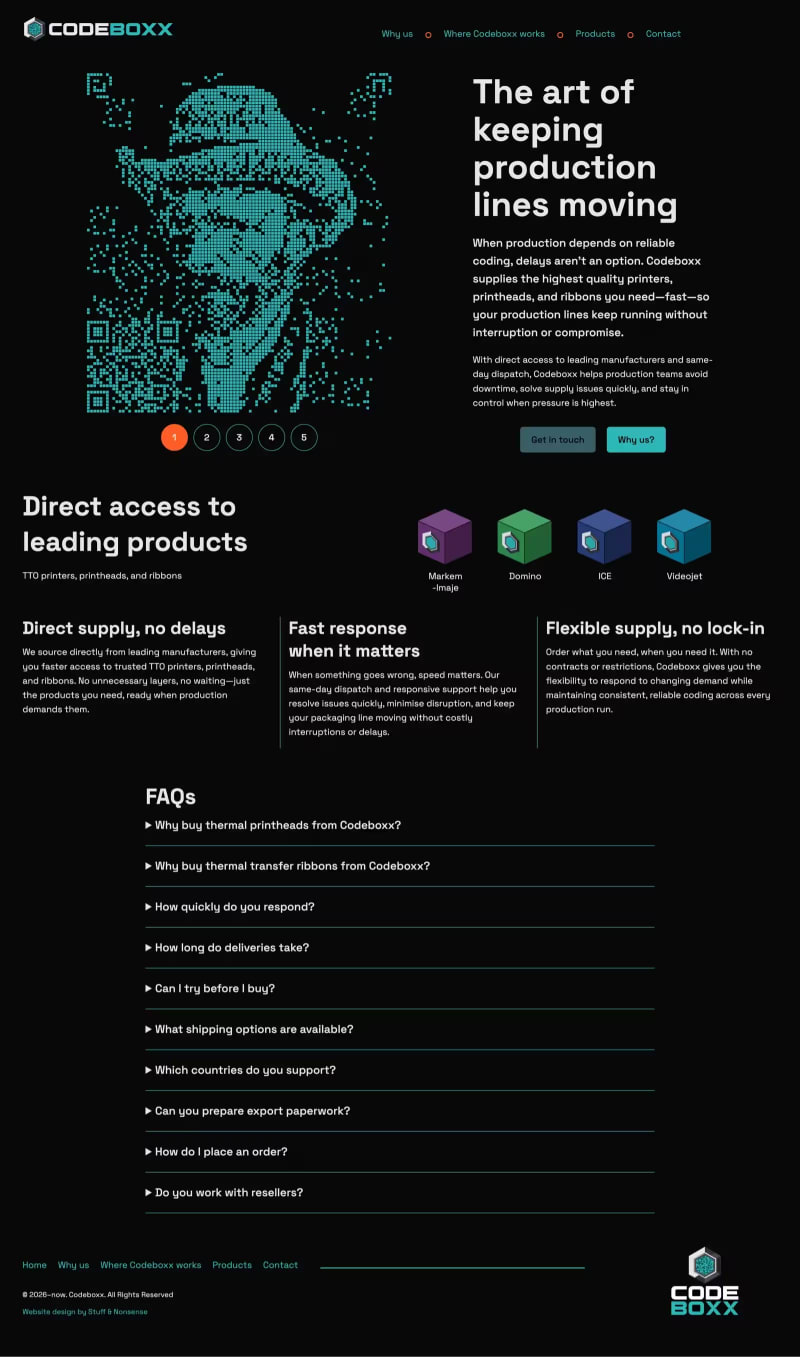
Instead of describing what Codeboxx sells, I focused on what Codeboxx does for its customers. It does not simply supply printers, ribbons, and printheads. It helps keep production lines running. When a line stops, the cost is immediate. That led to a clearer position and a stronger idea: "Keeping production moving."
The company supplies products which keep production lines running. If there’s a break in supply, those lines could stop. “Knowing what customers will need and when is an art,” they told me. That gave me the idea to recreate famous works of art from QR codes.
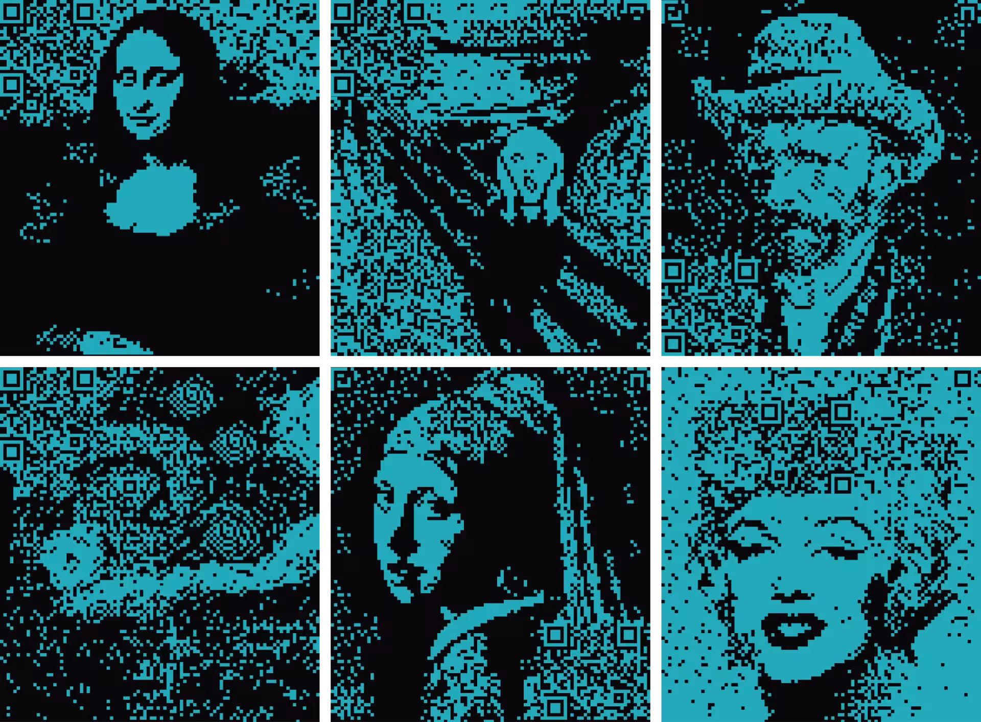
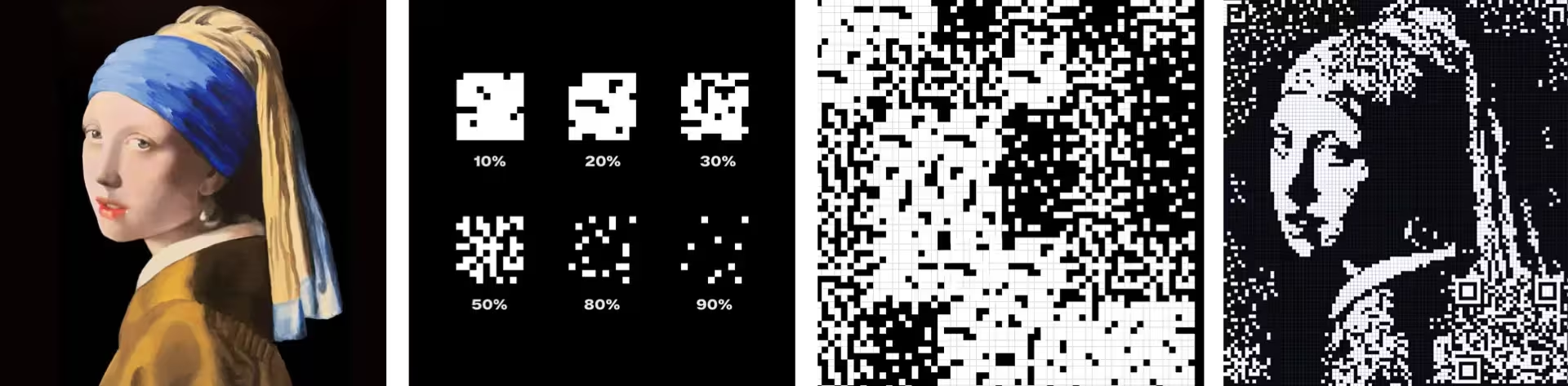
I made a series of artworks—including the Mona Lisa, Munch’s The Scream, and several by Vincent Van Gogh—by creating a set of QR code textures with different densities from light to dark. Then, I placed these shaders over reproductions of the paintings.
I hadn’t initially intended my QR code artwork to be used offline, but we decided to turn four of the pieces into a set of postcards, which Codeboxx can include in their deliveries.
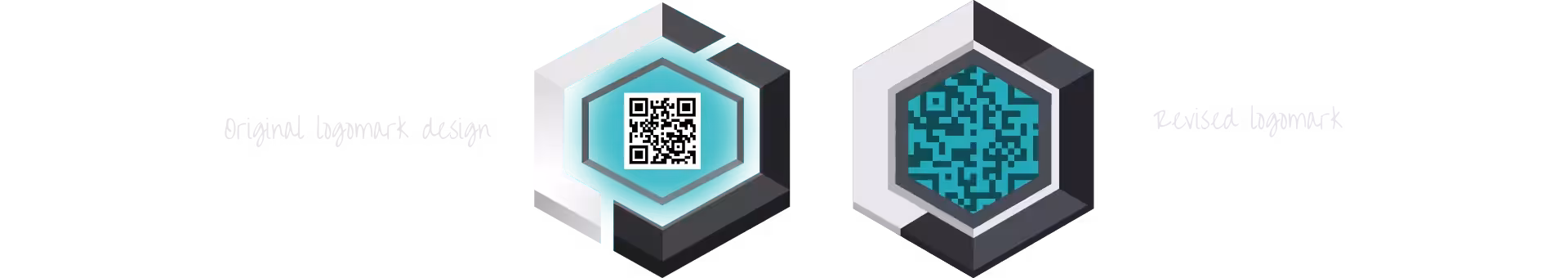
The recently commissioned Codeboxx logomark featured an ill-fitting QR code at its centre, which felt disconnected from the rest of the design. Keeping the spirit of the original design, I refined the mark by simplifying its shape and better integrating the QR code at its centre.
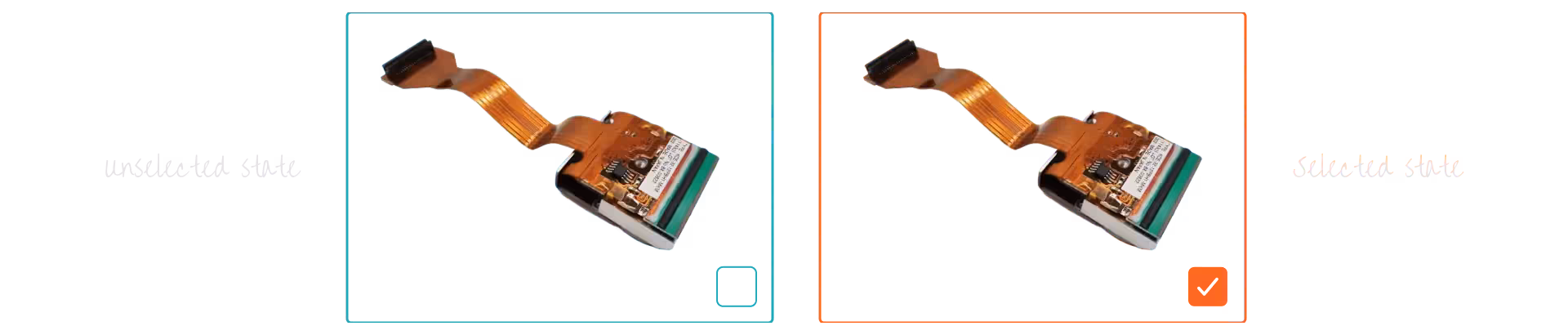
Product images from this industry are, well, dull. Even the manufacturers’ own product shots look dreadful. So, instead of showing dozens of printheads and ribbons that all look identical, I made animated graphics that represent each product category.
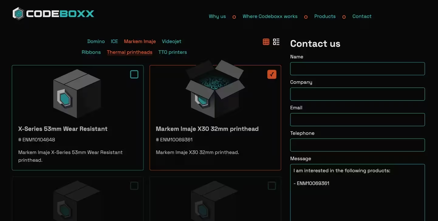
So I replaced product images with a literal “code in a box” graphic that opens when a product is selected.
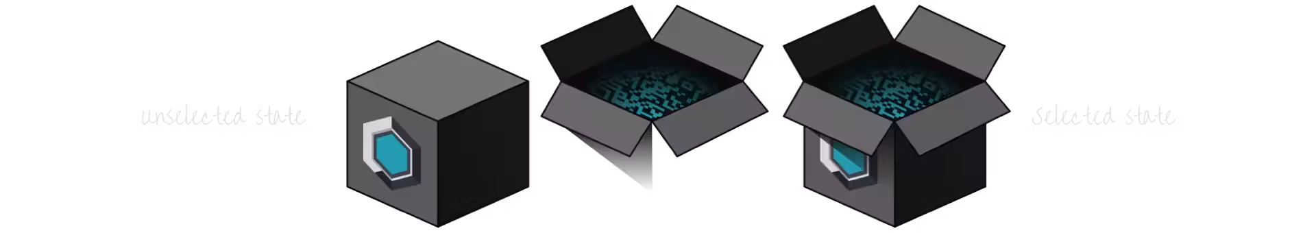
Now, when someone selects a product, its box opens, and the contact form is populated with the item number.
Really pleased to have worked with Andy and to now stand out in our industry with a fresh and unique website. If you want something bold and different I highly would recommend Stuff & Nonsense.
Creative direction, visual identity, and website redesign for the UK’s leading beekeeping company.
Website design for a composer, combining editorial layout, typography, and expressive visual storytelling.
Visual identity and website design with bespoke graphic illustrations.
Portfolio website design combining editorial layout and typography design.
Website design for a cultural and political initiative, combining editorial layout, typography, and structured content to communicate complex ideas.
Website redesign for a music organisation, focused on content discovery, video-led learning, and increasing member sign-ups.
Website design for an Emmy award-winning composer, combining SVG animation, character illustration, and a highly graphical, story-led approach.
Portfolio website design combining expressive animation and graphic design.
Portfolio website design combining expressive animation and graphic design.
Portfolio website design combining expressive animation with editorial layout and typography.
Business website design combining classic colours with stylish typography.
Website design using bold graphic elements, structured content, and typography to encourage young people to get involved in politics.
Ecommerce website design for a spoof condiment jewellery company. It’s not a real business, but it could be.
Political campaign website for this satirical political candidate and intergalactic space warrior.
Website design and visual identity for a family-owned care business.
Portfolio website design combining expressive graphic and typographic design.
Website design for a family-owned dental practice, using expressive visual storytelling.
A website design for film and TV director and producer Emma Bodger which showcases her creative talents.
A website design for a community council which keeps their constituents updated.
Creative direction and website redesign for one of North Wales’ leading construction companies.
A spoof campaign used to explore new visual ideas, AI image generation, and modern CSS techniques.
A website designed to help this training company reach a wider audience.
Brand identity design for Ethos, a cybersecurity cooperative founded by Nozomi Networks and its partners.
The story of how, as Director of Product Design at Nozomi Networks, I helped design their suite of cybersecurity products.
Designing a brand new subscription-based product for this leader in cybersecurity.