Lockrose
Website design and development with bespoke graphic illustrations.
Although this project was for a comedy political candidate, my design process was the same as for any client: creating a distinctive identity and designing a memorable user experience.
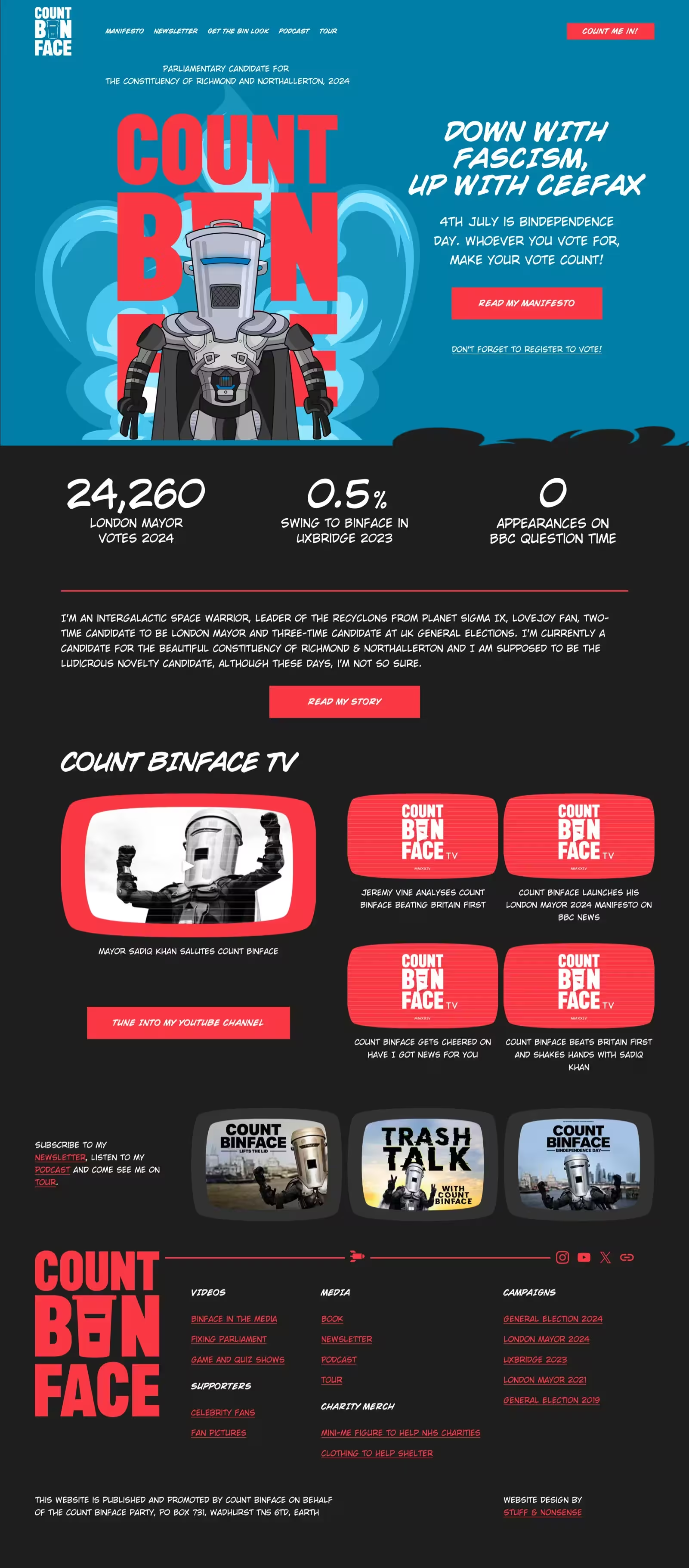
Count Binface is a satirical political candidate created by the British comedy writer, director, and producer Jon Harvey. In June 2024, my post about “Imagining what I’d make if Count Binface came calling” caught The Count’s attention and he demanded I design and develop a new website for his 2024 General Election campaign against Prime Minister Rishi Sunak.
Who was I to argue? People find Count Binface’s antics funny, but I was completely serious when I approached his website redesign. I reorganised his content, improved the user experience, and filled the website with his personality.
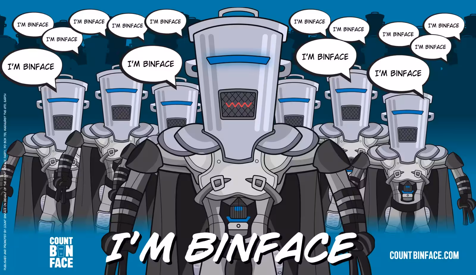
I designed a colour palette, created graphics, a logo mark, and a new graphic Count Binface portrait. As we had only one week to turn my designs into a website, I chose to stick with Squarespace, adding custom CSS to achieve design elements not possible out of the box.
Let’s binface it, not everyone’s a comedy candidate for elections. But, that doesn’t mean the approach to a website redesign can’t be the same for a business, charity, or other organisation as it is for an intergalactic space warrior like Count Binface. There are questions to answer whatever the project.
For businesses, goals might include feeding the sales pipeline or increasing conversions. Charities might aim to increase donations or raise awareness of important issues. Government organisations might want to communicate information better, and political parties might aim to increase their memberships. I begin each project with in-depth discussions on these goals, how I might accomplish them and ultimately measure if our work has been successful.
Discussing the project goals with Count Binface made the importance of building a personal brand and a following clear. While the initial goal was to provide a platform for his campaign in the 2024 general election, the longer-term goal was to increase paying newsletter subscribers, podcast listeners—which helps raise money through advertising,—and promote tour ticket sales, another important source of revenue.
Regardless of an organisation’s size or type, developing and maintaining a consistent and distinctive identity is crucial throughout everything its customers read or see. In practice, this means using colour, graphical and illustration styles, and typography consistently across printed materials, signage, social channels, and websites. I typically create new identity styles with distinctive colour palettes and non-generic typography, while avoiding common fonts and stock imagery, always keeping the long-term vision in mind. Other-times, I extend or refine existing brand guidelines to ensure they’re flexible enough to work across a variety of media.
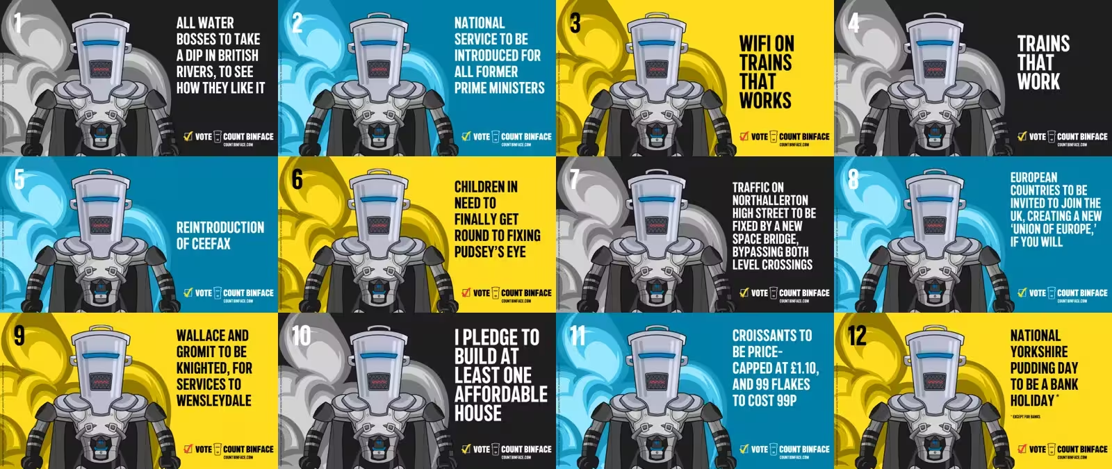
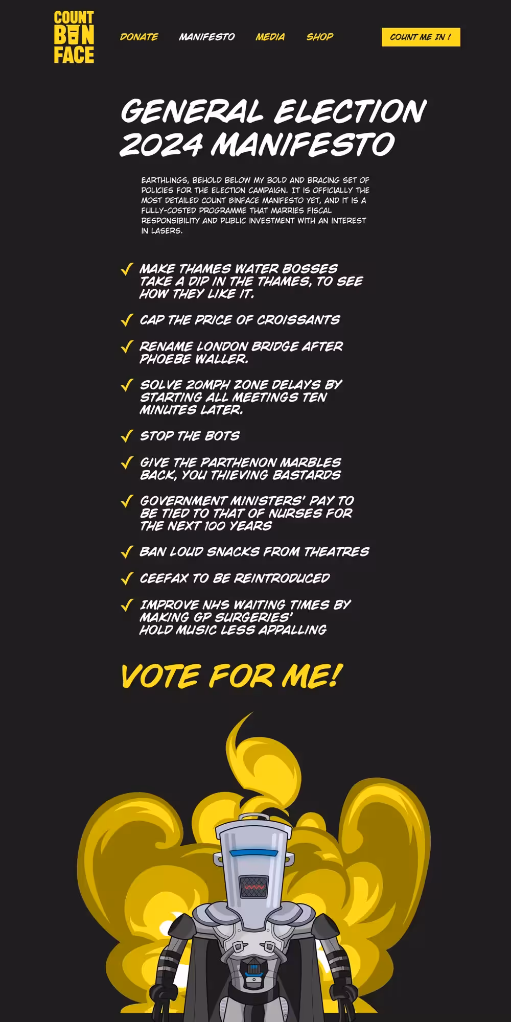
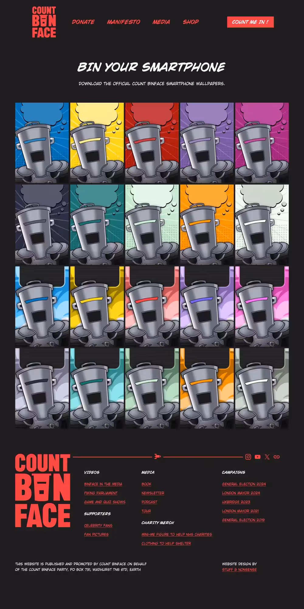
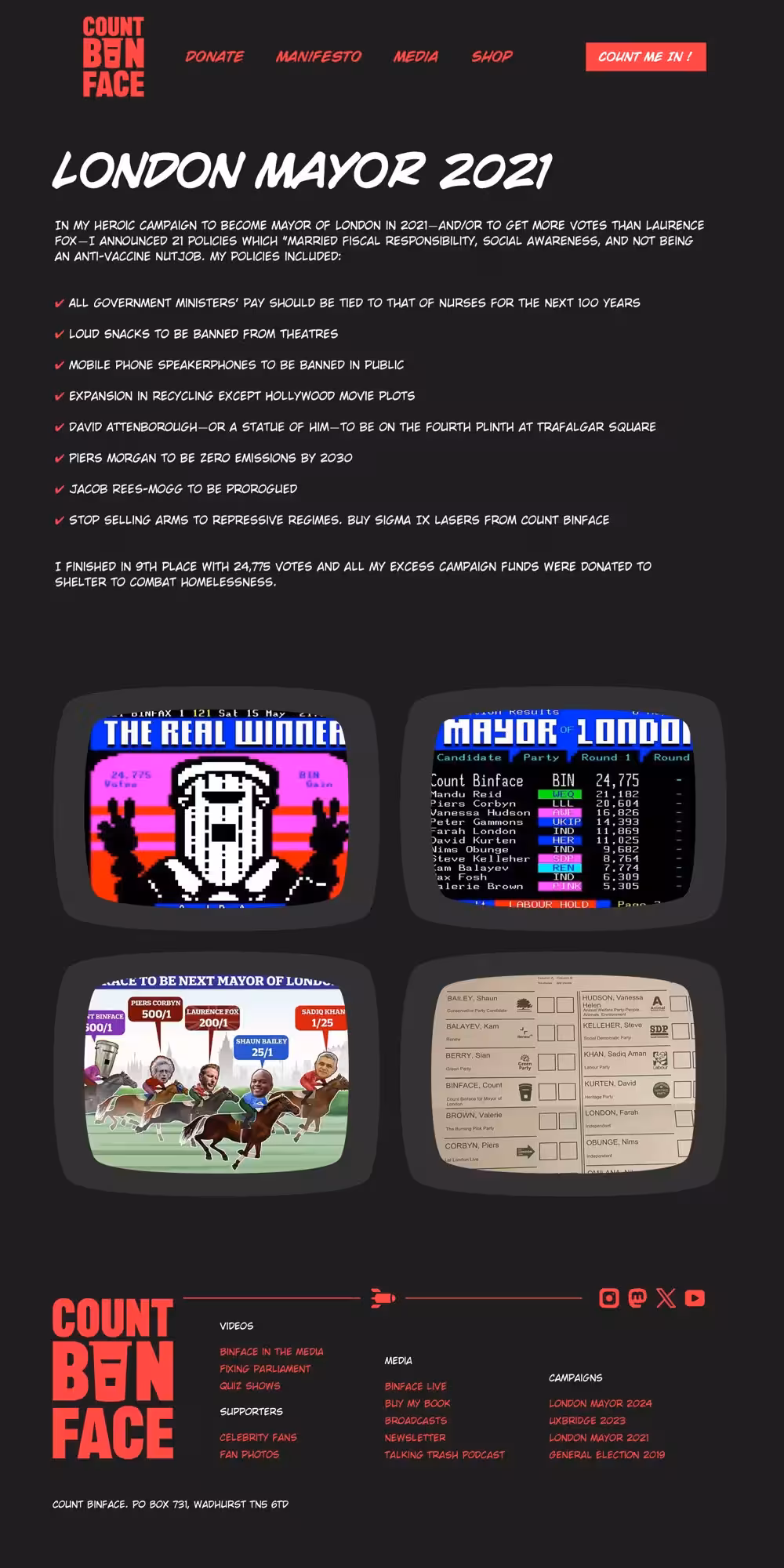
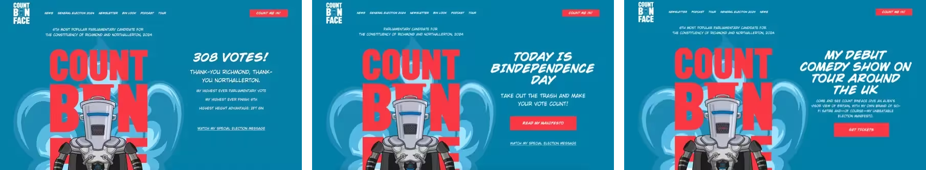
Count Binface himself is instantly recognisable, but his visual assets were less so and weren’t consistent across channels. I designed a bold new palette of colours which include Refuse Red and Bindependence blue and used them to create a striking visual identity. I chose two new typefaces to give his website a distinctive identity and make it consistent with campaign, print, and social media assets.
Page layout is a crucial element in visual storytelling. Still, far too many websites use grids from Bootstrap and Google’s Material Design frameworks. Those frameworks—and plenty more besides—include a generic grid with twelve even-width columns. The result is an endless sea of carbon-copy products and generic-looking website designs. Brands have individual stories about their products, work, and themselves; designers can use layouts to tell them. Just as colours evoke feelings and typefaces have tones of voice, layouts—including compound, modular, and ratio-based grids—make similar statements.
Count Binface has chosen Squarespace with its out-of-box 16-column even-ratio grid. My challenge was making a design that utilised the built-in layout without the result looking like a generic template. To accomplish this, I designed organic-shaped visual elements and used rounded frames for images and video to mask the grid structure.
Whether you’re launching a campaign, promoting a business, or refreshing an established organisation, I can help you create a website that’s impossible to mistake for anyone else’s.
Andy’s reputation reached across the omniverse to my home planet Sigma 9. So, after seeing his ideas, I commanded him to turn them into what humans call a ‘website’ for my 2024 General Election campaign against Prime <del>Binister</del> <ins>Minister</ins> Rishi Soon Axed.
Website design and development with bespoke graphic illustrations.
Website design and development bespoke graphic illustrations.
Website design and prototyping with bespoke graphic illustrations.
Creative direction, visual identity, and website redesign for the UK’s leading beekeeping company.
Visual identity and website design with bespoke graphic illustrations.
Website design for a composer, combining editorial layout, typography, and expressive visual storytelling.
Visual identity and website design with bespoke graphic illustrations.
Portfolio website design combining editorial layout and typography design.
Website design for a cultural and political initiative, combining editorial layout, typography, and structured content to communicate complex ideas.
Website redesign for a music organisation, focused on content discovery, video-led learning, and increasing member sign-ups.
Website design for an Emmy award-winning composer, combining SVG animation, character illustration, and a highly graphical, story-led approach.
Portfolio website design combining expressive animation and graphic design.
Portfolio website design combining expressive animation and graphic design.
Portfolio website design combining expressive animation with editorial layout and typography.
Business website design combining classic colours with stylish typography.
Website design using bold graphic elements, structured content, and typography to encourage young people to get involved in politics.
Ecommerce website design for a spoof condiment jewellery company. It’s not a real business, but it could be.
Website design and visual identity for a family-owned care business.
Portfolio website design combining expressive graphic and typographic design.
Website design for a family-owned dental practice, using expressive visual storytelling.
A website design for film and TV director and producer Emma Bodger which showcases her creative talents.
A website design for a community council which keeps their constituents updated.
Creative direction and website redesign for one of North Wales’ leading construction companies.
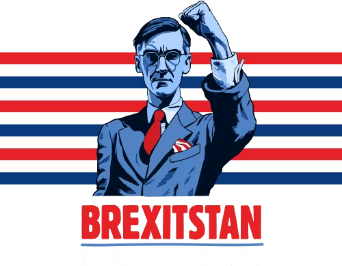
A spoof campaign used to explore new visual ideas, AI image generation, and modern CSS techniques.
A website designed to help this training company reach a wider audience.
Brand identity design for Ethos, a cybersecurity cooperative founded by Nozomi Networks and its partners.
The story of how, as Director of Product Design at Nozomi Networks, I helped design their suite of cybersecurity products.
Designing a brand new subscription-based product for this leader in cybersecurity.
Planning a new website? I’d love to help you create something memorable.