Lockrose
Website design and development with bespoke graphic illustrations.
The story of how I helped The Shared Homeland Paradigm create a website which offers solutions to the complex political issues in Palestine-Israel.
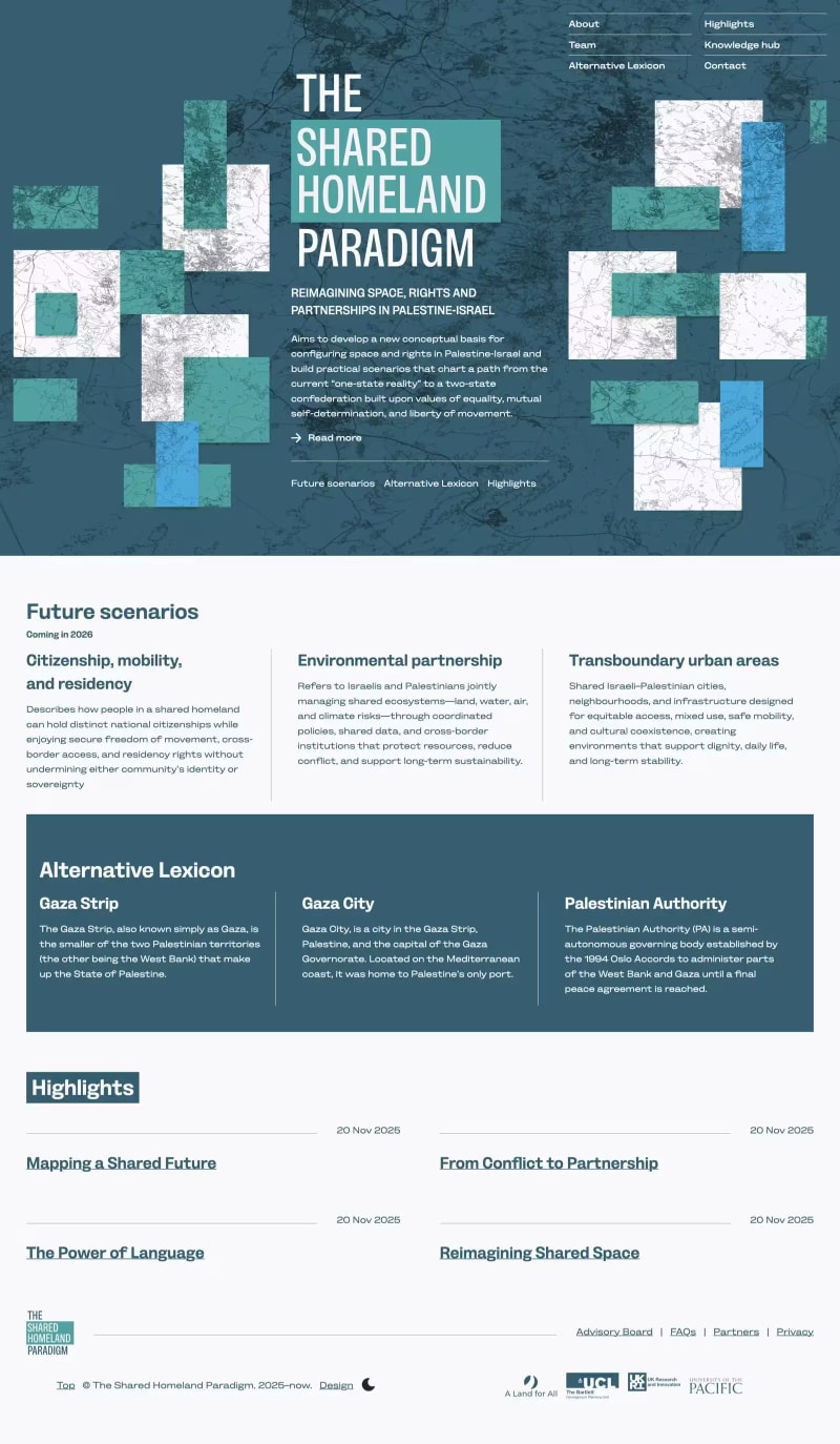
The Shared Homeland Paradigm is a collaboration between A Land for All, University College London, and the University of the Pacific. The project aims to develop a new conceptual basis for configuring space and rights in Palestine-Israel.
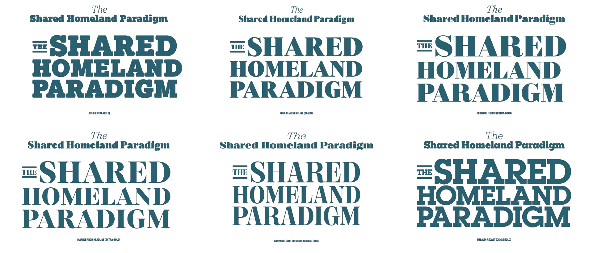
I always start with type because it sets the tone for everything else, and for this project I needed a readable typeface that would not feel overly academic. I tested typefaces in real contexts, using copy that was as close as possible to the final content, before settling on Bankside Sans for its balance of clarity and seriousness.
Then, I test typefaces in real contexts—headlines, lists, and paragraphs—so I can see how they behave in the design, not just in isolation. I create what I call type sheets and always use copy as close as possible to what I’ll be setting in the design. If copy’s not available—which it often isn’t at the start of a project—I write my own, rather than use dummy lorem ipsum.
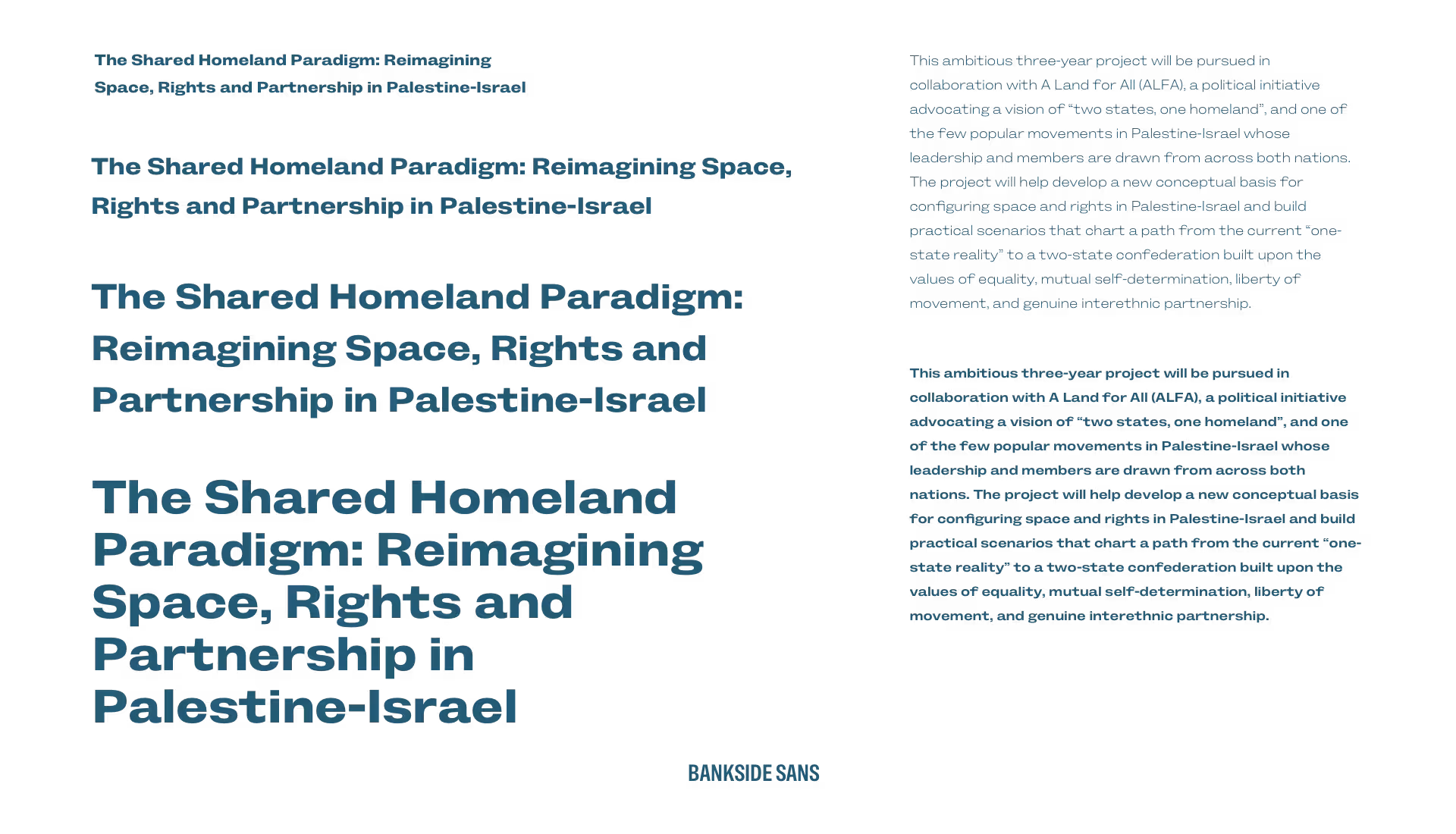
Finally, I settled on Bankside Sans—designed by Dalton Maag. Bankside Sans has “clear, classic letter shapes (that) convey intent, while its extreme widths deliver impact.” It perfectly balances approachability and seriousness.
One of the parts of a project I enjoy the most is thinking of creative ways to tell stories through my choice of graphics, illustrations, and photography. Many ideas never make it past a first iteration—and that’s never a failure. Design decisions are often subjective, so every attempt becomes a conversation. My first creative concept included illustrations of birds which are native to Israel-Palestine, including the Eurasian Hoopoe and the Palestine Sunbird. Birds cross national boundaries, and using them seemed like a concept worth developing.
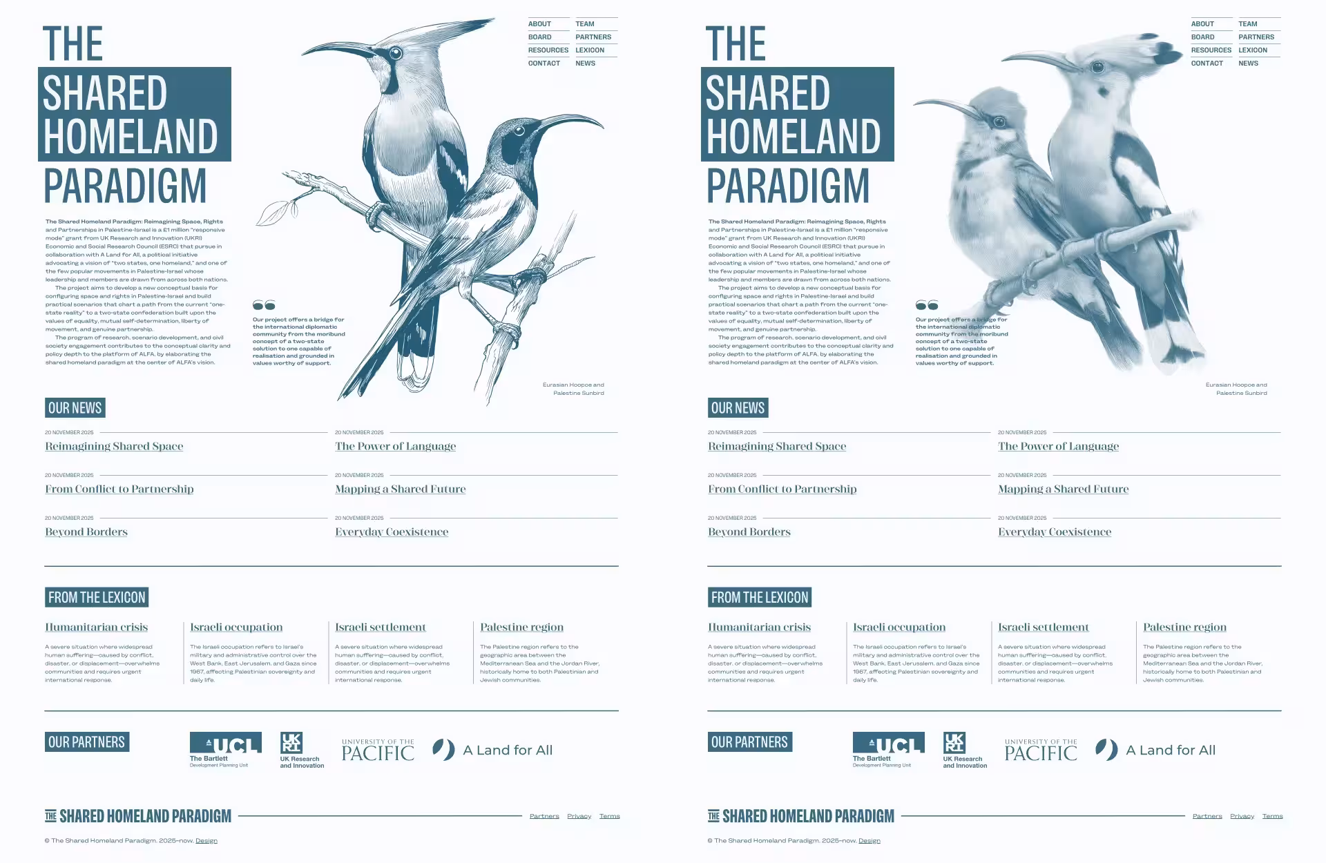
Then, I incorporated topographical maps of the region and other ancient maps which were drawn before the state of Israel was formed.
Colour is highly evocative and needs careful consideration, especially when dealing with sensitive subjects like Israel-Palestine. First, I devised a set of colours which have cultural associations for people in the region. Then, I created a second palette of blues, greens, and greys, which represent the earth, sea, and sky.
The Shared Homeland Paradigm team needed a website on which they could add background papers, resources, scenarios for peace in the region, and terms for their Alternative Lexicon. To make that happen, I developed their website using the open source Eleventy CMS.
When I design content-rich websites, I use layout, typography, and graphics to tell the story—not just the words on the page. This project brought together everything I care about in story-led web design—graphic design, layout, and typography, working together. My typeface choice echoes their voice, and the SVG graphics help to tell their story.
Andy exceeded every expectation. He didn’t just build us a website; he expertly guided our branding and design to ensure our project was presented in the best possible light. Professionally, he is top-tier; incredibly patient and always available to provide helpful guidance, Andy is one of the kindest people you’ll ever work with. I recommend him with all my heart.
Website design and development with bespoke graphic illustrations.
Website design and development bespoke graphic illustrations.
Website design and prototyping with bespoke graphic illustrations.
Creative direction, visual identity, and website redesign for the UK’s leading beekeeping company.
Visual identity and website design with bespoke graphic illustrations.
Website design for a composer, combining editorial layout, typography, and expressive visual storytelling.
Visual identity and website design with bespoke graphic illustrations.
Portfolio website design combining editorial layout and typography design.
Website redesign for a music organisation, focused on content discovery, video-led learning, and increasing member sign-ups.
Website design for an Emmy award-winning composer, combining SVG animation, character illustration, and a highly graphical, story-led approach.
Portfolio website design combining expressive animation and graphic design.
Portfolio website design combining expressive animation and graphic design.
Portfolio website design combining expressive animation with editorial layout and typography.
Business website design combining classic colours with stylish typography.
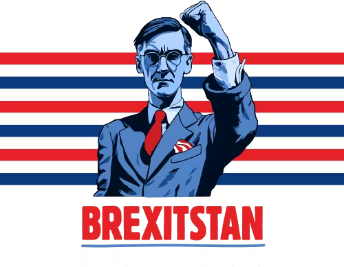
Website design using bold graphic elements, structured content, and typography to encourage young people to get involved in politics.
Ecommerce website design for a spoof condiment jewellery company. It’s not a real business, but it could be.
Political campaign website for this satirical political candidate and intergalactic space warrior.
Website design and visual identity for a family-owned care business.
Portfolio website design combining expressive graphic and typographic design.
Website design for a family-owned dental practice, using expressive visual storytelling.
A website design for film and TV director and producer Emma Bodger which showcases her creative talents.
A website design for a community council which keeps their constituents updated.
Creative direction and website redesign for one of North Wales’ leading construction companies.
A spoof campaign used to explore new visual ideas, AI image generation, and modern CSS techniques.
A website designed to help this training company reach a wider audience.
Brand identity design for Ethos, a cybersecurity cooperative founded by Nozomi Networks and its partners.
The story of how, as Director of Product Design at Nozomi Networks, I helped design their suite of cybersecurity products.
Designing a brand new subscription-based product for this leader in cybersecurity.