Eleventy in a Box
A premium Eleventy starter kit for designers and developers who want to spend less time setting up the same project structure and more time designing distinctive websites.
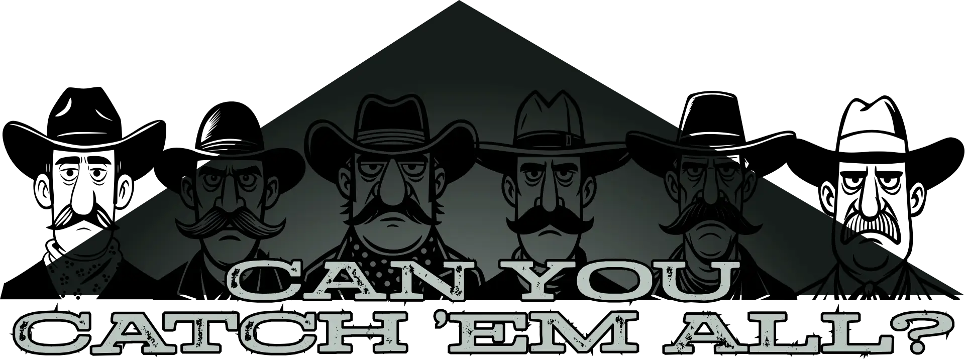
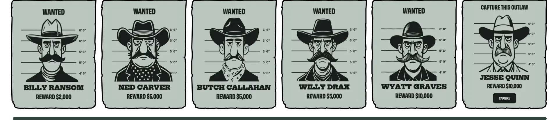
I’d been tinkering with animations last week and wondered what else I could do with my Magnificent 7 characters. I love surprising people with hidden Easter Eggs, so I decided to use them in a little hidden game.
Press the mysterious-looking question mark under any of the animated graphic banners, and a collection of wanted posters pops up in a dialog. One of them is catchable. Press the button to capture him and collect the reward. Only one of the characters is catchable at a time, and there’s a different character to capture on each page.
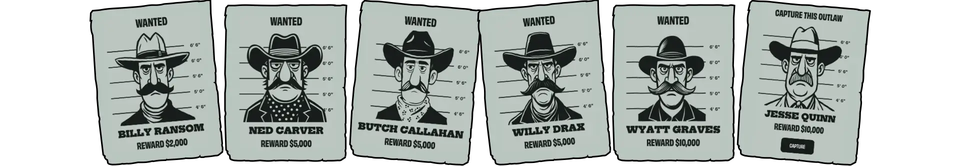
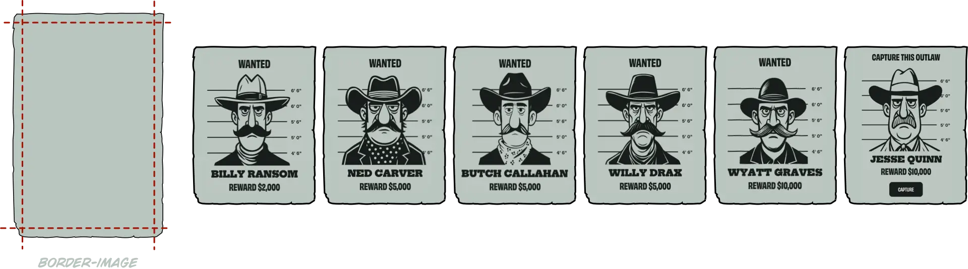
I started building the game by making a black-and-white wanted poster version of each character’s face. These are SVGs and optimised; each weighs around 8kb.
Then I made a torn paper border, which weighs less than 1kb, so all the graphics combined weigh more than 50kb. I really love SVG.
Once I had all the outlaws staring back at me, I needed to present them in a way that felt like part of the site rather than a separate element. A <dialog> turned out to be perfect for that. It contains a header and a placeholder for the posters:
<dialog class="game-dialog">
 <button id="close-dialog">×</button>
 <header class="game-header">
 […]
 </header>
 <div class="game-content">
 <div id="posters-container">
 <!-- posters -->
 </div>
 </div>
</dialog>
A script then creates each of the posters:
<div class="game-poster">
<p class="status">[…]</p>
 <div class="game-svg">
  <svg>[…]</svg>
 </div>
<p class="game-reward">[…]</p>
</div>
It adds a data- attribute for each poster, plus another class attribute if the character has been caught:
<div class="game-poster game-captured" data-id="1">
 […]
</div>
I turned my attention to writing the CSS, starting with the dialog element. It fills 80% of the viewport width and 90% of its height and is centered horizontally and vertically:
.game-dialog {
height: 90vh;
max-width: 1200px;
position: fixed;
top: 50%;
transform: translate(-50%, -50%);
width: 80vw; }
When the dialog is open, the ::backdrop is slightly transparent to allow a hint of the page behind to peek through:
.game-dialog::backdrop {
background-color: #161d1a;
opacity: .75; }
With the dialog and its ::backdrop working, I could focus on how the posters should look and behave. The posters needed to look like they’ve been tacked to a wall, while still adapting to different screen sizes.
On small screens, the posters are arranged in a horizontally scrolling panel.
So I placed them into a grid container with six columns:
#posters-container {
display: grid;
grid-template-columns: repeat(6, 1fr);
gap: 1rem;
max-width: 100%;
overflow-x: auto;
scroll-behavior: smooth;
-webkit-overflow-scrolling: touch; }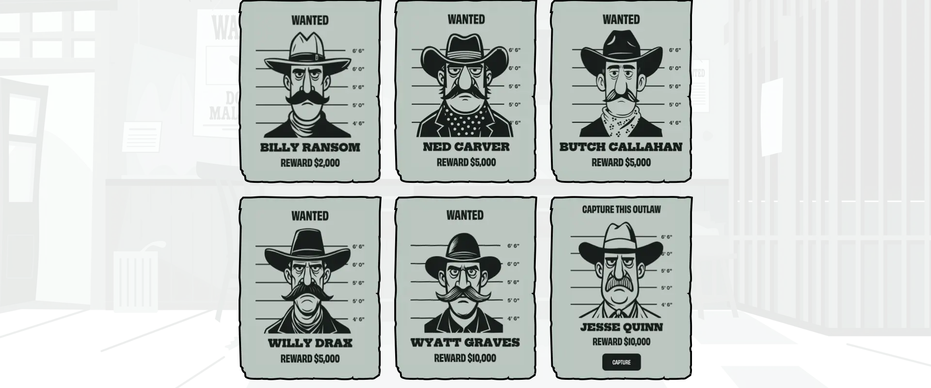
For larger screens, I reduced the grid to three columns:
@media screen and (min-width: 64em) {
#posters-container {
grid-template-columns: repeat(3, 1fr);
overflow-x: visible;
max-width: none; }
}The posters themselves have a torn-paper border applied with border-image, one of the least-used CSS properties:
.game-poster {
border-image-slice: 40 fill;
border-image-width: 40px;
border-image-repeat: stretch;
border-image-source: url("[…]");
border-style: solid; }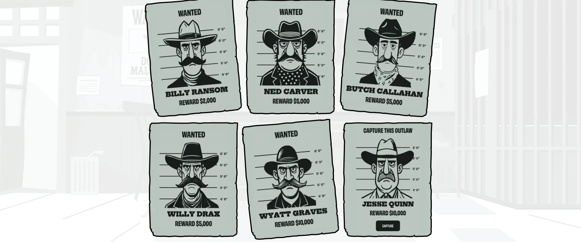
Finally, to break the rigidity of the grid, I rotated some of the posters:
.game-poster {
rotate: 0deg; }
.game-poster:nth-of-type(1),
.game-poster:nth-of-type(5) {
rotate: -2deg; }
.game-poster:nth-of-type(3) {
rotate: 2deg; }
Now that the posters looked the part, it was time to add interactivity. A few subtle animations can turn what’s essentially a static grid into a design that feels tactile.
Elements that respond to someone’s actions can help elevate what would otherwise be a static design. So first I reset those rotations on :hover:
.game-poster {
rotate: 0deg;
scale: 1;
transition: all var(--animate-duration-faster) ease-in; }
.game-poster:hover {
rotate: 0deg; }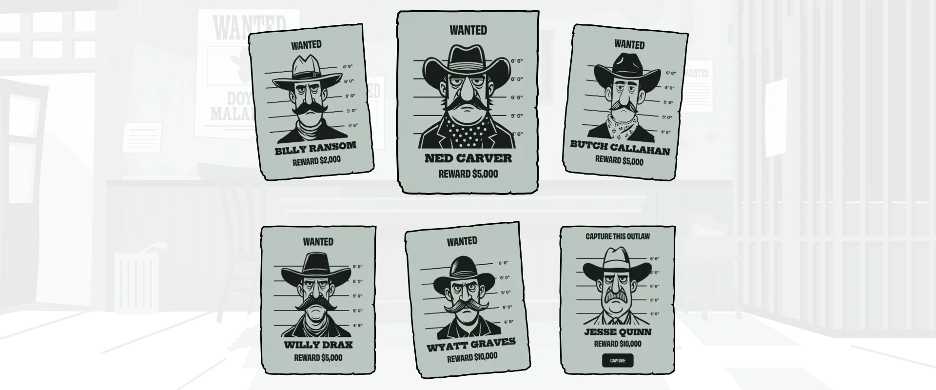
Then—using one of my favourite :has techniques—I reduced the size of the posters except for the one being hovered over:
#posters-container:has(.game-poster:hover) .game-poster:not(:hover) {
scale: .95; }
Finally, to make a poster shake when someone presses the capture button, I defined a shaking animation and applied it to a poster when it contains an :active capture button:
@keyframes poster-shake {
0%, 100% { transform: rotate(0deg); }
25% { transform: rotate(-1.5deg); }
75% { transform: rotate(1.5deg); }
}
.game-poster:has(.game-capture:active) {
animation: poster-shake .2s ease-in-out infinite; }
With the animations in place, the next step was to show which characters had already been caught.
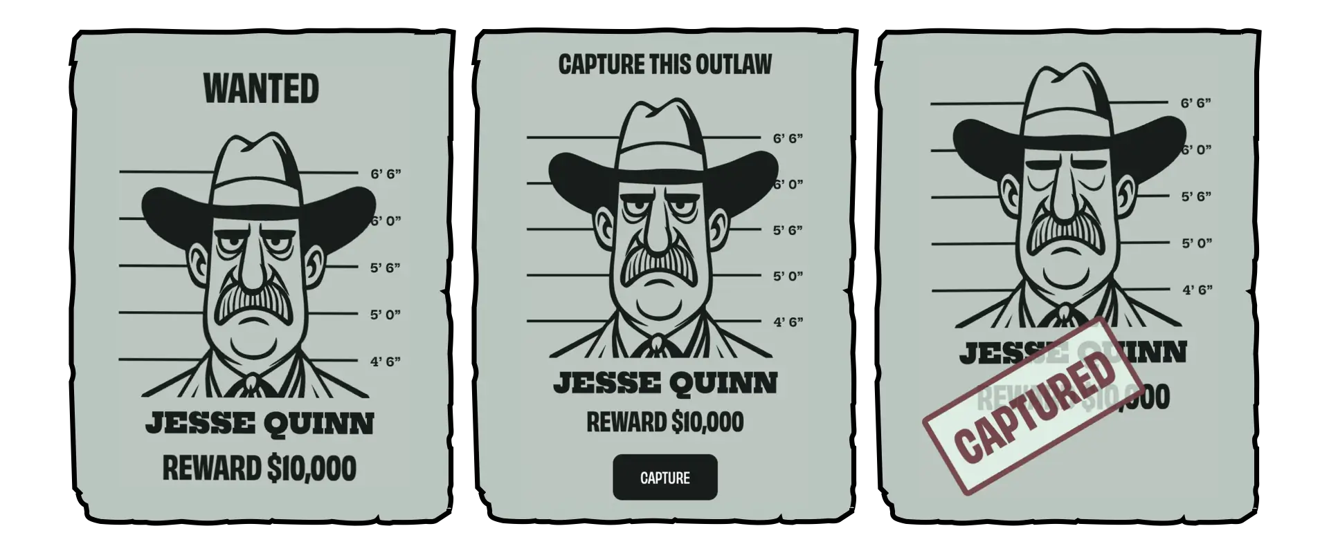
Each poster contains a class attribute which indicates whether a character has been captured. It also includes a status paragraph with values including “game-available”, “game-captured”, and “game-wanted”:
<div class="game-poster captured">
<p class="status game-captured">[…]</p>
[…]
</div>
When a character is available to capture or is just wanted, this stamp is included at the top of a poster.
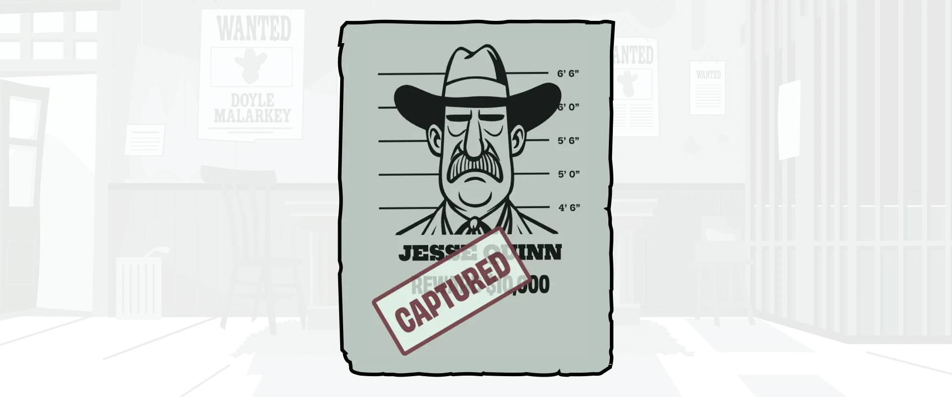
But once they’ve been caught, this status turns into a red rubber stamp across the poster. For this, I styled the status stamp, positioned, then rotated it on the poster:
.game-poster.captured {
position: relative; }
.status.game-captured {
background-color: rgba(230,250,240,.75);
border: 5px solid var(--game-accent);
border-radius: 5px;
color: rgba(90,10,25,.75);
left: 10%;
padding: 1rem;
position: absolute;
rotate: -30deg; }I’ve written about ambient animations a fair bit recently (1, 2) and wanted to add a few subtle animations to my posters to indicate which characters are available and those who have been captured. I decided to do this by opening and closing their eyes.
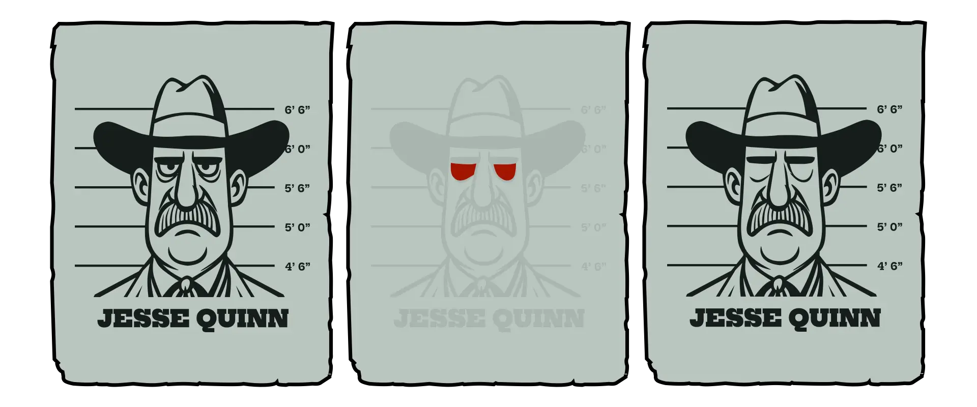
First, I added extra paths for each character’s closed eyelids into their SVG:
<svg xmlns="http://www.w3.org/2000/svg" viewBox="0 0 1800 1800">
<g>[…]</g>
<path class="game-eyelids" d="[…]"/>
</svg>
Each poster has a data-id and includes its character’s status:
<div class="game-poster" data-id="1">
<p class="status game-available">Capture this outlaw</p>
<svg>[…]</svg>
</div>
When a character is available to be caught, I change the eyelid opacity to 0 and apply a blinking animation:
.game-poster:has(.status.game-available) .game-eyelids {
animation: eyelids 4s infinite;
opacity: 0; }
@keyframes eyelids {
0%, 92% { opacity: 0; }
93%, 94% { opacity: 1; }
95%, 97% { opacity: 0.1; }
98%, 100% { opacity: 0; }
}
But when a character has already been captured, his eyes stay closed:
<div class="game-poster" data-id="1">
<p class="status game-captured">Captured</p>
<svg>[…]</svg>
</div>
.game-poster:has(.status.game-captured) .game-eyelids {
opacity: 1; }Not everyone experiences motion the same way. For some, even a small shake or flicker can feel distracting or disorienting. That’s why I always wrap animations inside a media query that checks for the user’s motion preferences. The prefers-reduced-motion feature lets me detect when someone’s system is set to limit motion, so I can adapt the design accordingly. I only apply the shaking animation when someone hasn’t asked for reduced motion:
@media (prefers-reduced-motion: no-preference) {
.game-poster:has(.game-capture:active) {
animation: poster-shake .2s ease-in-out infinite; }
@keyframes poster-shake {
0%, 100% { transform: rotate(0deg); }
25% { transform: rotate(-1.5deg); }
75% { transform: rotate(1.5deg); }
}
}
This means the posters stay still for anyone who prefers less motion, while others still see the playful shake when they hit “Capture.”
I’ve always believed that the web should reward curiosity. Hiding this little Magnificent 7 game beneath my banners isn’t about gamification or engagement metrics, it’s a nod to the early web, when people built weird things for their own amusement.
Technically, this project reminded me why I still love SVG. The fact that I can fit my characters, a torn-paper frame, and all the surrounding interaction into less than 150kb still feels magical.
A premium Eleventy starter kit for designers and developers who want to spend less time setting up the same project structure and more time designing distinctive websites.
Contract Killer is plain and simple and there’s no legal jargon. It’s customisable to suit your business and has been used on countless web projects since 2008.
Free compound grid and modular grid layout generators, plus a set of HTML/CSS layout templates you can call on to make more interesting layouts, available to buy.