Eleventy in a Box
A premium Eleventy starter kit for designers and developers who want to spend less time setting up the same project structure and more time designing distinctive websites.
While the smart people finish the Academy of Scoring Arts website’s CMS development, I’ve been rummaging through my design files and rediscovered several concepts that didn’t make it into the final design.
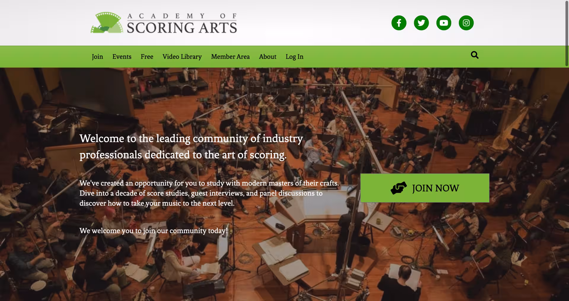
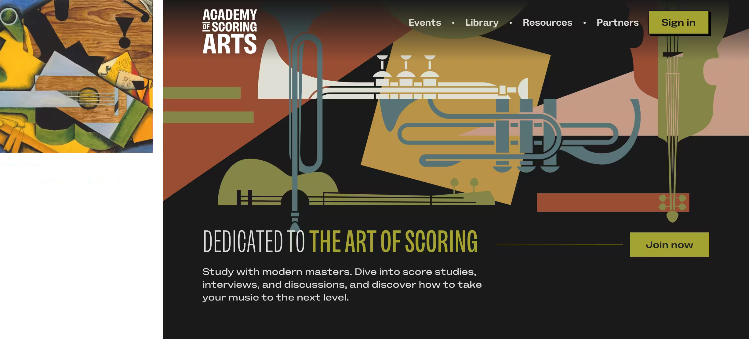
Like 20,110,000* others, the Academy of Scoring Arts website was topped by a full-width banner with a faded background image, intro text, and a big ol’ button. The image was somewhat relevant; the text did, at least, explain what the website is about; and the button was, well, big. But by now, most people have trained their brains to scroll straight past banners like this to get to the real content.
What I wanted instead was something that reflected the messages I cared about communicating—community, connections between musicians, and musicality.
I’m a big admirer of Erik Nitsche’s work. He’s best known for the annual reports and posters he designed for General Dynamics, but it’s his album covers—those mixes of colour, shape, and distinctive typography—that I return to most often.
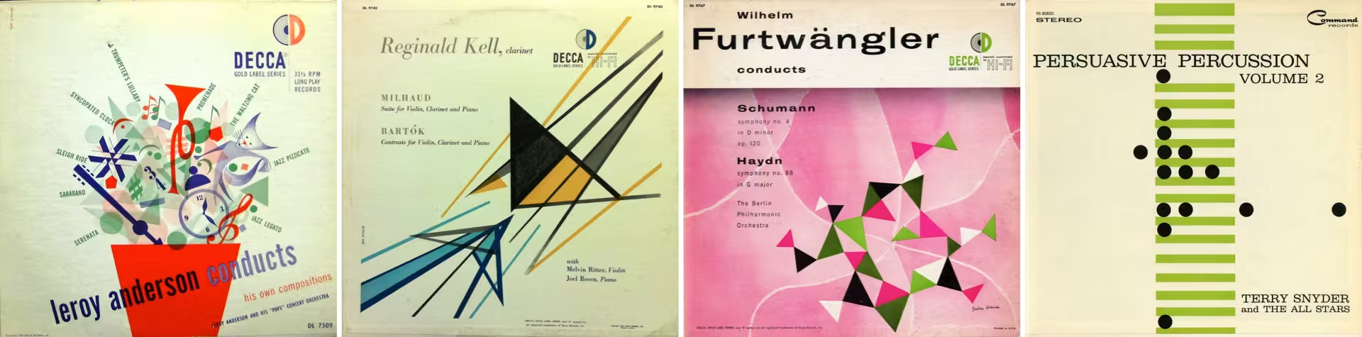
Dozens of Nitsche’s covers went into my research folder, but the piano-key graphic from The Amazing Bud Powell, Vol. 5 stood out. Early in the design process, with only placeholder graphics needed for first concepts, there was very little difference between my version and Nitsche’s original.
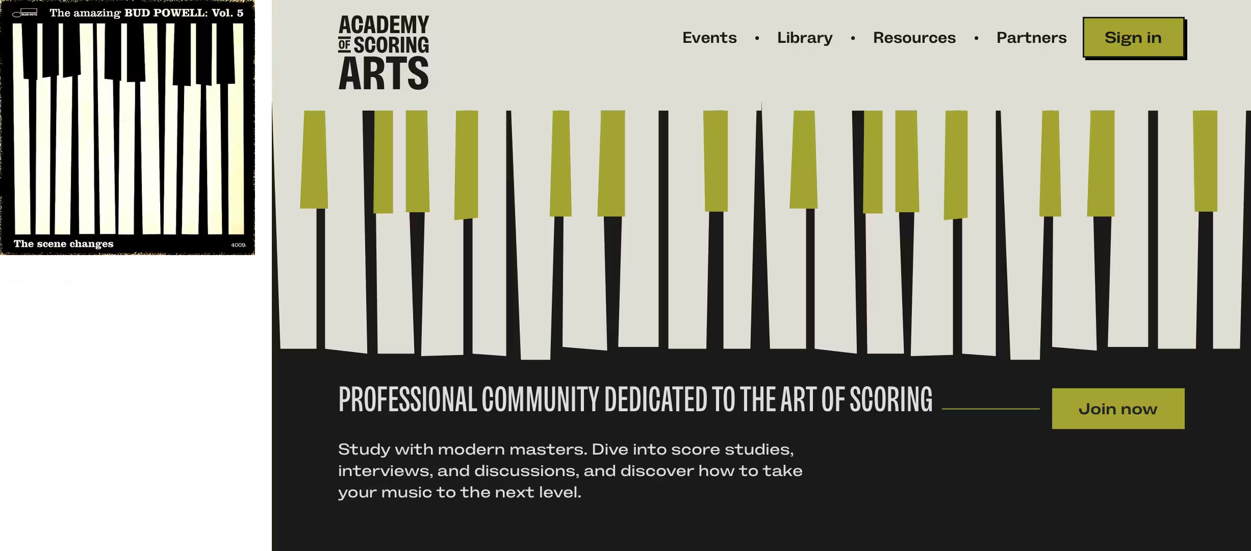
At this stage, graphics like these are valuable talking points as I get to know a client and their likes and dislikes. The feedback was clear: the Academy is less jazz-oriented and more orchestral. More importantly, the graphic didn’t convey a sense of community or connection. That sent me in a different direction.
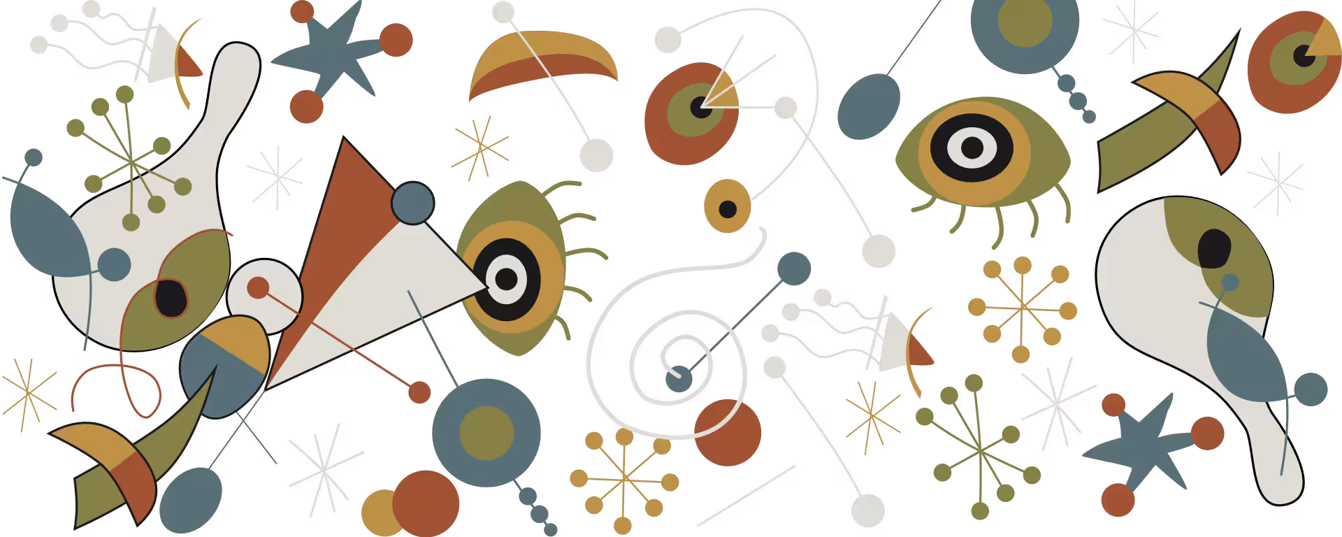
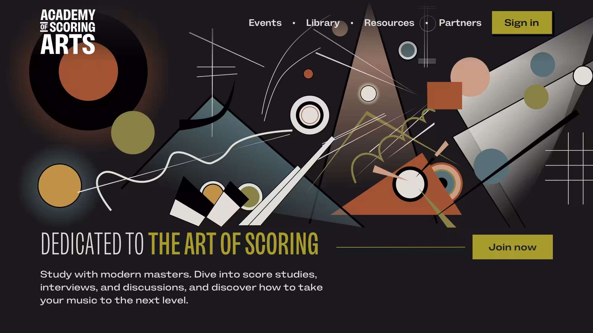
While visiting an abstract art exhibition in the summer, I saw work by Juan Gris, Wassily Kandinsky, Joan Miró, and Pablo Picasso. Gris’s cubist paintings resonate with me more than Picasso’s, so experimentation began with a graphic inspired by his 1913 painting Still Life With a Guitar.
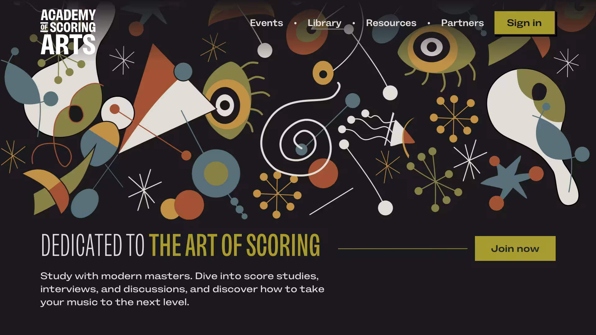
These sketches used flat colour and no texture—enough to test the idea with the team without over-committing. The increased energy landed well, but the concept itself didn’t. It still felt too literal. The idea was worth pushing further, though. To make it more abstract and energetic, I looked to Kandinsky. His paintings are full of movement, and that sense of motion felt right for a community of composers.
Drawing abstract lines and shapes, with added shading and transparency, created more depth. The result was closer to what I had in mind. From there, I also explored a looser, more free-flowing direction inspired by Joan Miró.
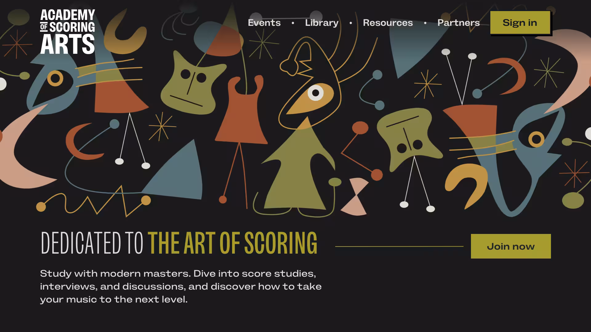
These were by far my favourite artist-inspired designs. The Academy team weren’t convinced and asked me to explore a different direction, including images of their members to emphasise the community aspects of their work. I still wanted to communicate connections, so I added lines connecting the people and made parts of them pop out of the shapes to loosen the composition and give it more energy.


This was the direction the Academy team felt best reflected their brand and what they aimed to communicate to their members.
Looking back through my folders, I’m reminded how many ideas never make it past a first iteration—and that’s never a failure. Design decisions are often subjective, so every attempt becomes a conversation. Those conversations matter, because they’re how I move past my own preferences and get closer to what a client is trying to express. In the end, it’s those conversations that shape the final result far more than any single idea.
* May not be entirely accurate, but what the hell.
A premium Eleventy starter kit for designers and developers who want to spend less time setting up the same project structure and more time designing distinctive websites.
Contract Killer is plain and simple and there’s no legal jargon. It’s customisable to suit your business and has been used on countless web projects since 2008.
Free compound grid and modular grid layout generators, plus a set of HTML/CSS layout templates you can call on to make more interesting layouts, available to buy.