Last week in the studio (CW28-26)
I have a couple of smaller projects to work on before we close the studio for the August break. I started one of them, for property investment consultants Portico Investments, last week.
Portico Investments brand guidelines PDF
The Portico Investments team told me they had a brand guidelines PDF they’d like me to follow.
I get this type of document sent quite a lot, so I was curious what this one would include. Turns out, not that much for me to work with.
Like most brand “guidelines” documents I’ve seen, this one includes the usual dos and don’ts for using their logo. What it doesn’t include is how their mark should adapt across different sizes, and there’s no indication of what the home screen or favicons should look like.
The colour section is also lacking in depth as it contains just black and three green tints, but there are no accent colours to cut through them. Also missing is anything resembling a system for using these colours; for example, what colour should interactive elements like buttons and links be? And what should be the difference between things I can click, am currently clicking, or have clicked?
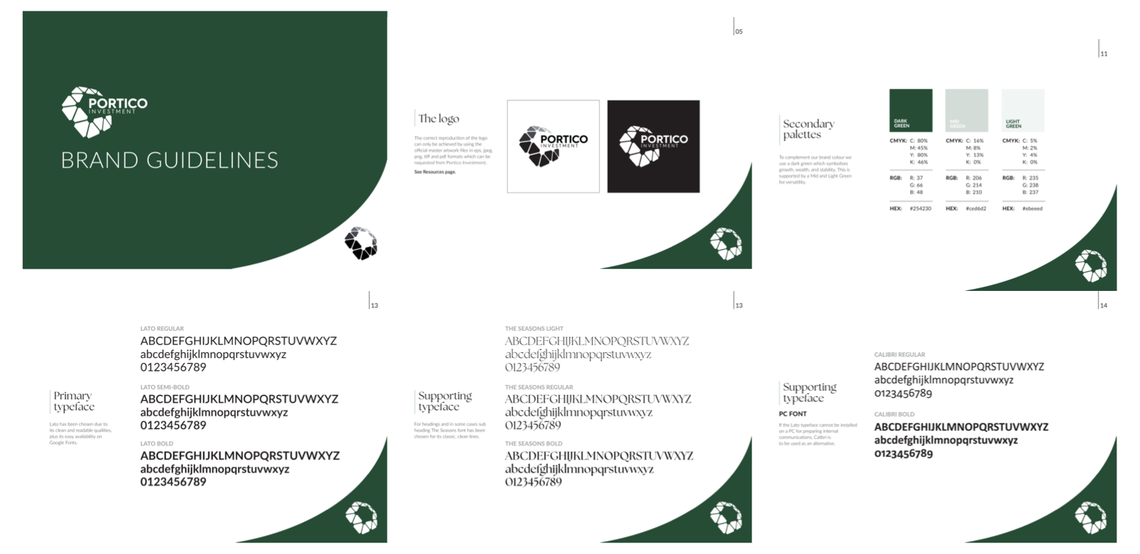
Then, there’s the typography section. It mentions primary and secondary typefaces, but there’s no guidance on when to use one or the other. Also missing is a description of typographic hierarchy and details of which typographic scale to use. These are as important to a brand’s visual identity as the typefaces themselves.
Look, I don’t want to appear disrespectful to anyone, but apart from basic colour and type information, this brand guidelines document was next to useless in helping me understand how to use Portico Investments’ visual assets.
As I said, I get given this type of document a lot and have to adapt, extend, ignore, and often change much of it. My first job was to rework the Portico Investments colour palette to make it useful for the website I’m designing.
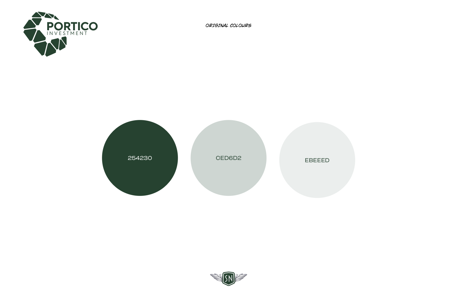
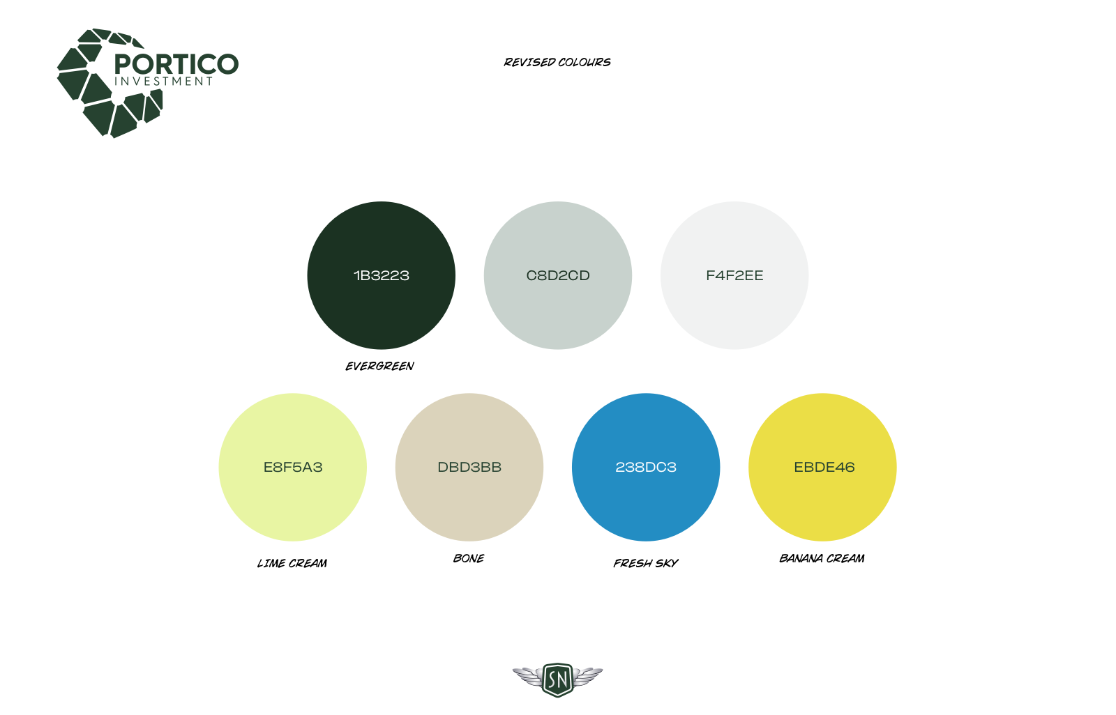
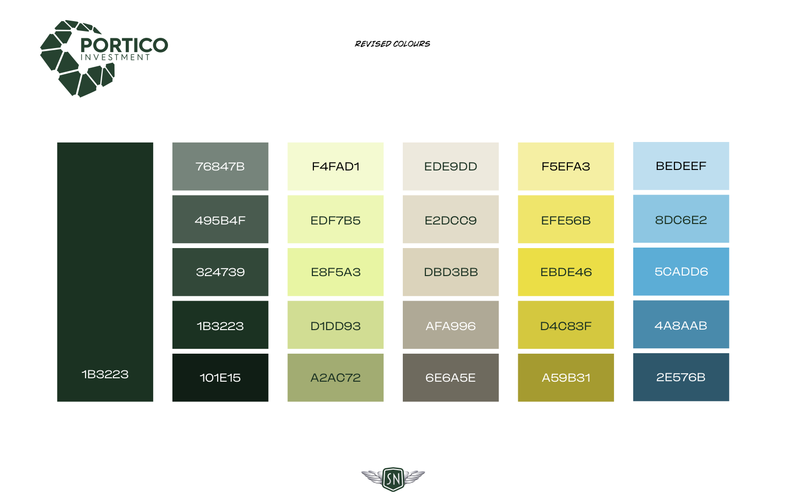
Pure black and white don’t belong in a colour palette, so I darkened and desaturated their darkest green to use for text against a light background and as a dark base for reversed-out pages and panels. Then, I increased the lightness of the light green to make it usable as the site’s main background colour and text on reversed-out backgrounds. I also introduced several new accent colours which will add variety and be useful for interactive elements.
Moving on to Portico Investments’ use of typefaces, the guidelines included The Seasons, a deliciously high-contrast serif that is beautiful to look at at display sizes. Sadly, The Seasons’ contrast makes it a terribly poor choice for readable running text, which is presumably why the guideline writers opted for the horribly generic Lato.
I wanted the personality of The Seasons to appear at all text sizes, so I decided to replace it with the similar but far more flexible Calibra by FontSpring. Calibra has a subtly lower contrast, which makes it appealing at large sizes while remaining readable when set at small sizes.
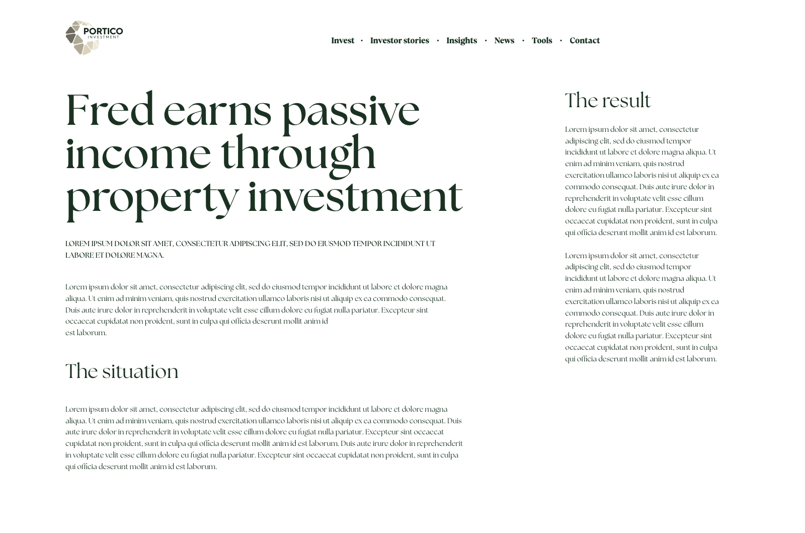
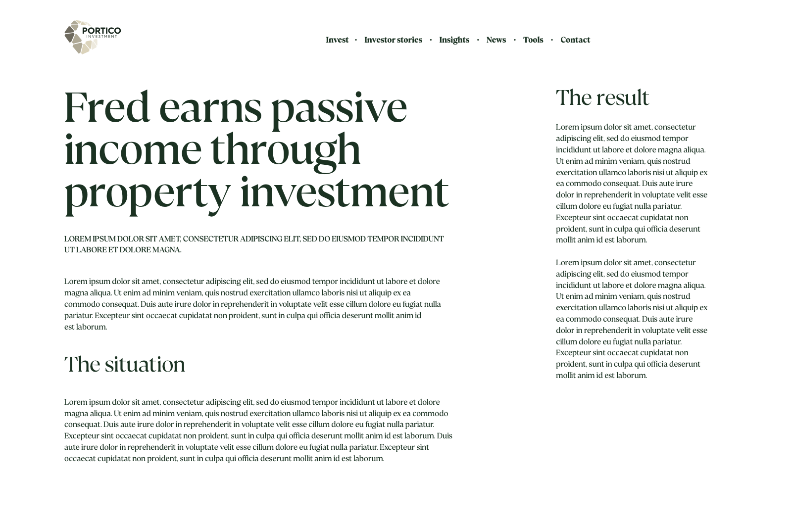
You might be wondering what the point of making a brand guidelines PDF is if I’m going to change so much. Honestly, that crosses my mind regularly too. To me, guidelines like these are relics written for print work, and they have little or no relevance to web work. That’s why I spend time at the start of any project creating an HTML/CSS design guide that’s more relevant to my work, as it contains on-screen colours and examples on how to use them. It also includes how to use the typefaces, plus a typographic scale that adapts to different screen sizes.
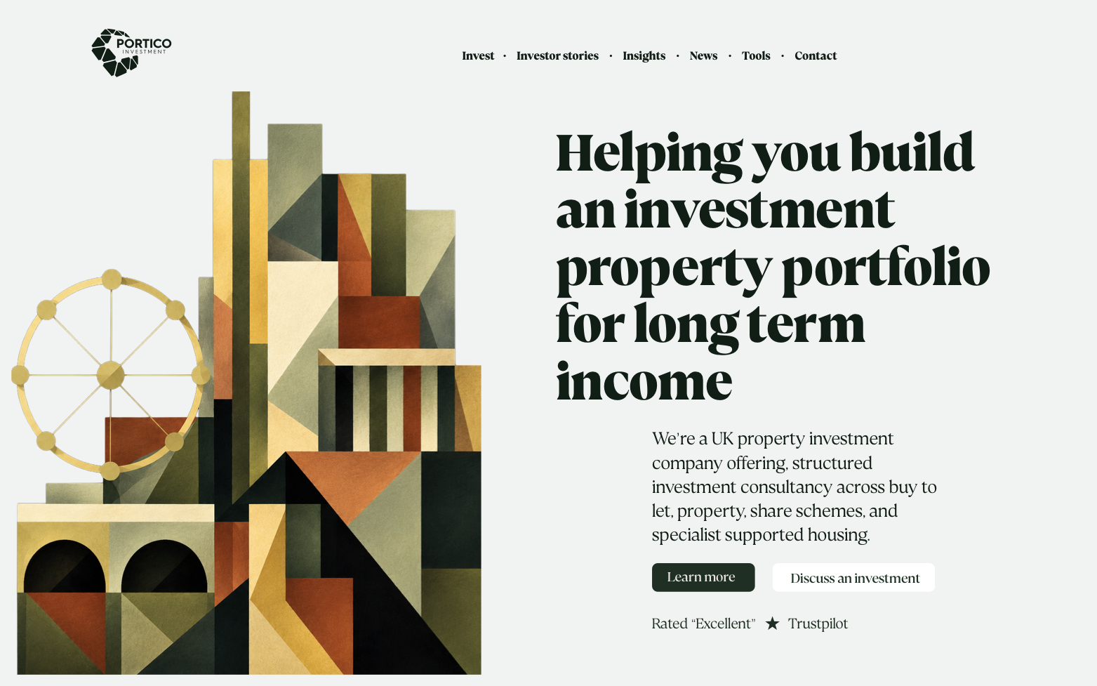
Right now, I’m happy with how the Portico Investments visual identity is developing, and interested to see how it changes during the coming week as I carry on working on the new design.
July 14, 2026 • Andy Clarke • design