Eleventy in a Box
A premium Eleventy starter kit for designers and developers who want to spend less time setting up the same project structure and more time designing websites.
Apple doesn’t have what many of us would consider to be a fully responsive website, but that doesn’t mean they don’t sometimes use two of Ethan’s ingredients; flexible media and CSS3 media queries, to improve the placement of some elements on an otherwise fixed page.
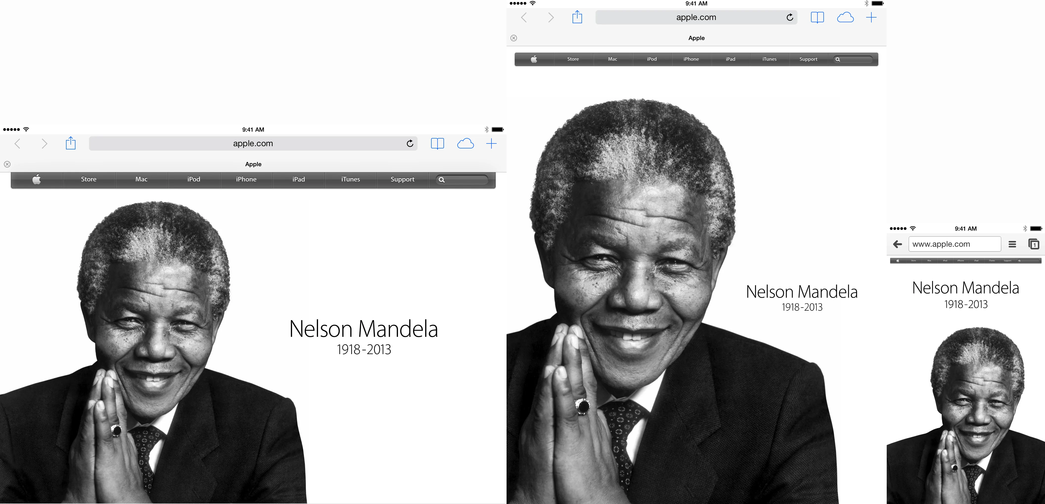
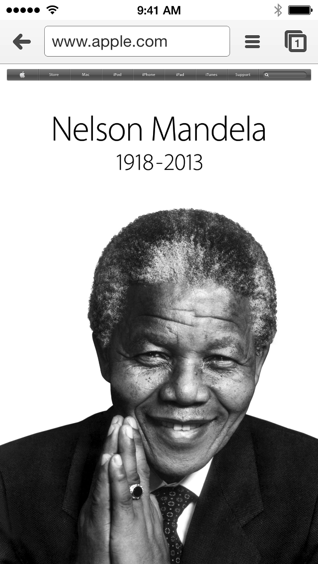
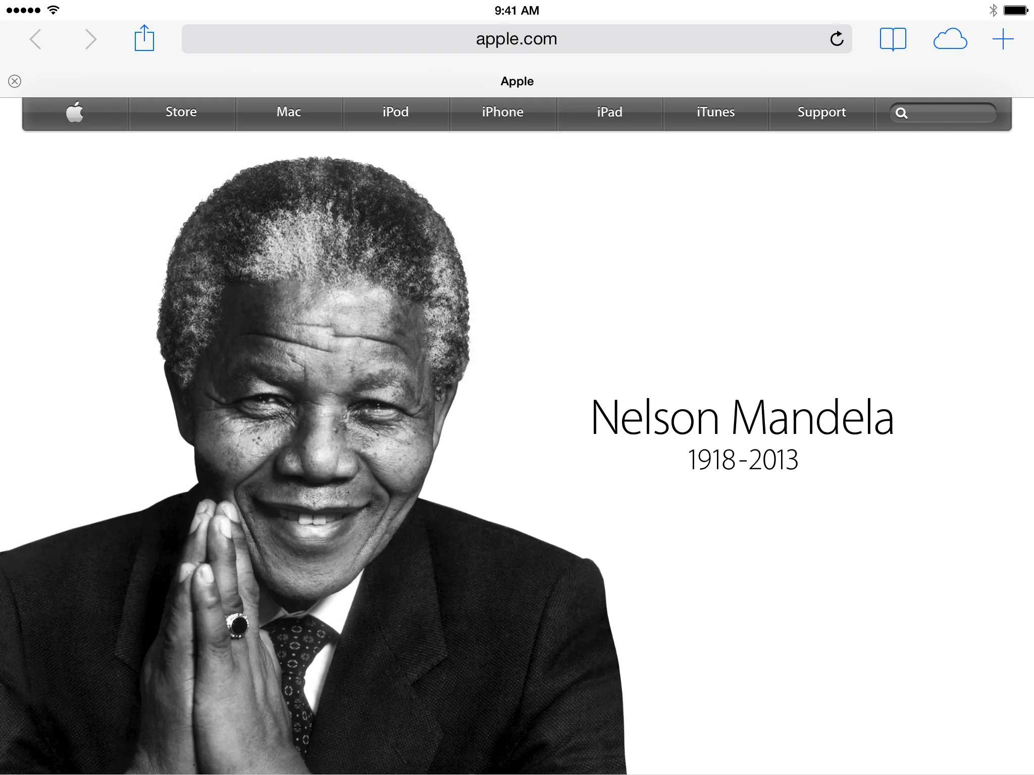
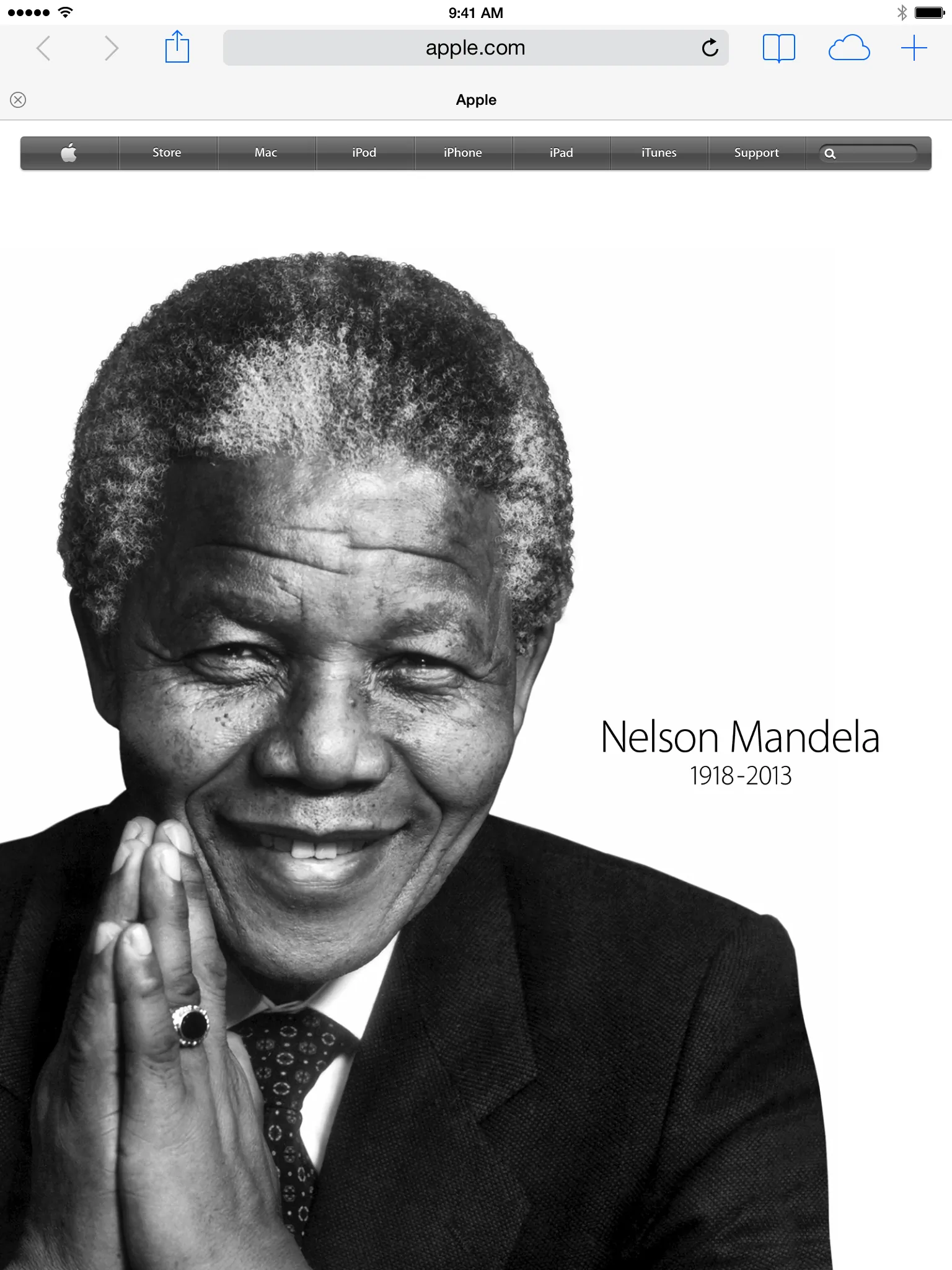
The first time I noticed Apple using anything other than min-device-pixel-ratio CSS3 media queries for retina displays was at the launch of the iPhone 5 where they ensured the new phone always fitted into the viewport. These were height queries. Now they’re using a series of min-device-width and orientation queries to position Mandela’s portrait (hero-image,) name and dates (title.)
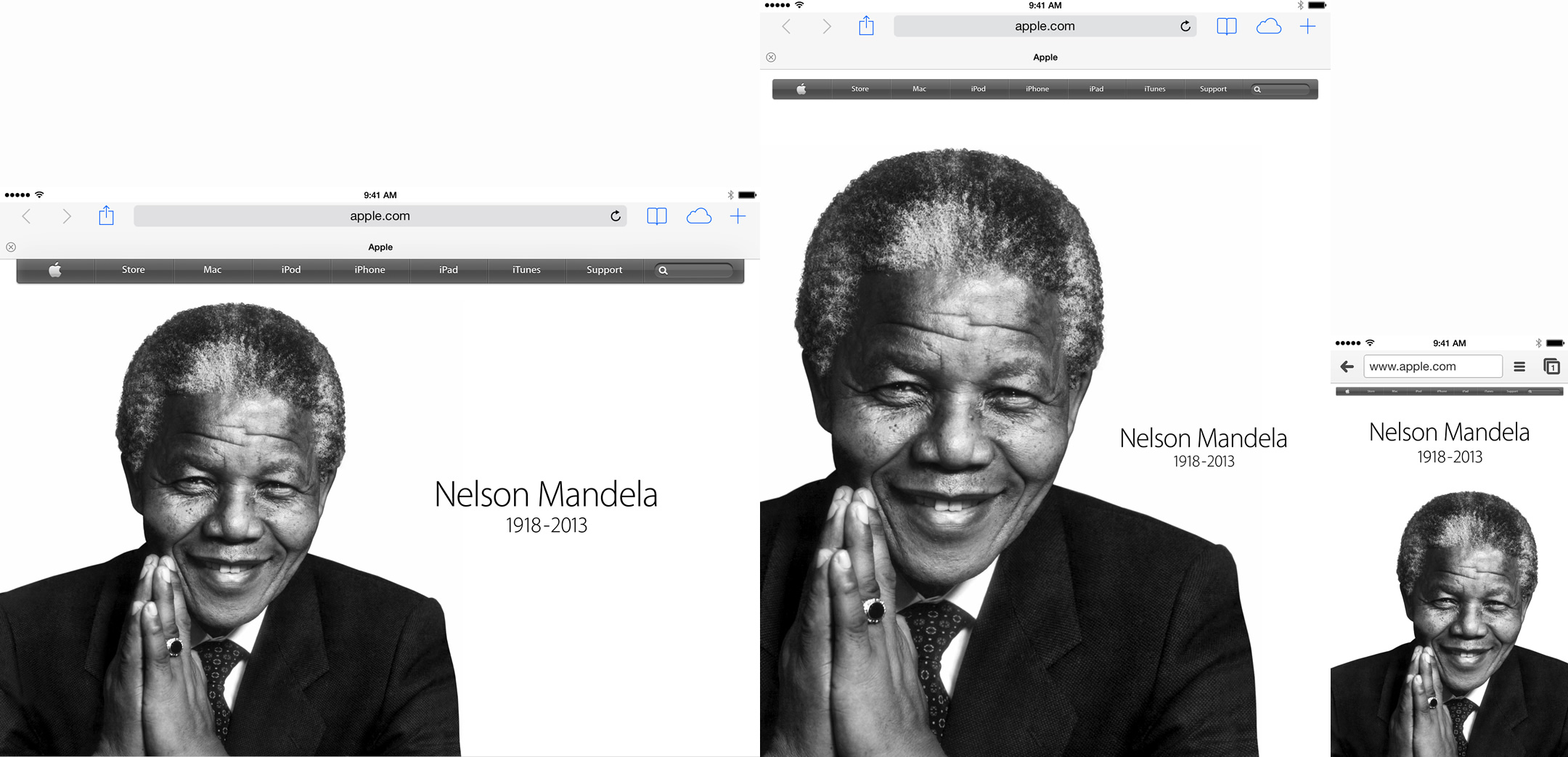
Here’s the (simplified) markup for the billboard:
‹article id="billboard"›
‹h1 class="title"›![]() ‹/h1›
‹div class="hero-image"›‹/div›
‹/article›
‹/h1›
‹div class="hero-image"›‹/div›
‹/article›They then use CSS3 media queries to change properties for all of those three elements at breakpoints that are unsurprisingly targeted at iPhones (image) and iPads in landscape (image) and portrait (image) orientations:
/* iPad */
@media only screen and (min-device-width:481px)
and (max-device-width:768px) { }
/* iPad landscape */
@media only screen and (min-device-width:481px)
and (max-device-width:768px) and (orientation:landscape) { }
/* iphone portrait */
@media only screen and (min-device-width:320px)
and (max-device-width:480px) and (orientation:portrait) { }
/* iphone landscape */
@media only screen and (min-device-width:320px)
and (max-device-width:480px) and (orientation:landscape) { }
/* iphone 4 portrait */
@media only screen and (min-device-width:320px)
and (max-device-width:480px) and (device-aspect-ratio:2/3)
and (orientation:portrait) { }
None of this is remarkable and I’m sure plenty would scoff at their device-based, adaptive-rather-responsive min/max approach, but I think it is worth noting that there’s merit in this as an example of using media queries to improve the presentation of a particular content module, rather than a complete page.
I know that in the past I’ve been guilty of simply making changes to elements only at ‘major’ breakpoints, rather than introducing ‘minor’ breakpoints when specific elements need them. I won’t expect Apple to move away from device-based, global queries any time soon but I need to get better at doing that.

I’m Andy Clarke. I’ve spent over thirty years helping clients create memorable websites. I’m also the author of five books on web design.
Planning a new website? I’d love to help you create something memorable.
A premium Eleventy starter kit for designers and developers who want to spend less time setting up the same project structure and more time designing websites.
Contract Killer is plain and simple and there’s no legal jargon. It’s customisable to suit your business and has been used on countless web projects since 2008.
Free compound grid and modular grid layout generators, plus a set of HTML/CSS layout templates you can call on to make more interesting layouts, available to buy.