Eleventy in a Box
A premium Eleventy starter kit for designers and developers who want to spend less time setting up the same project structure and more time designing websites.
It’s a couple more weeks until we break for our August break, so I’m trying to finish off my work on Lockrose and Portico Investments.
Portico has gone smoothly. There are still conversations about which pages should have a light-on-dark colour theme, but the creative direction is locked in, so I can concentrate on the illustrations.
Google “property investment” and you’ll find any number of websites which look identical, with their faded-back city skylines, generic interiors, and smiling people shaking hands over a laptop. That’s not the impression to give when you say you do things differently.
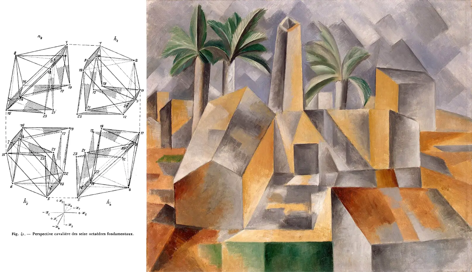
For Portico Investments, I wanted to create a series of abstract graphic illustrations with a strong architectural feel, rectangles, and diagonal facets. I had Picasso’s Cubist work in mind, where his diagonal divisions of rectangles created faceted planes.
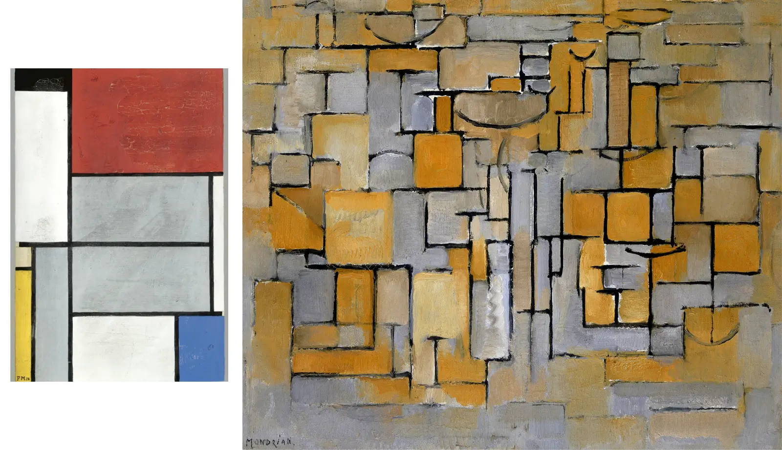
I was also reminded of some of Mondrian’s work in his De Stijl “style” with its rectangular modules.
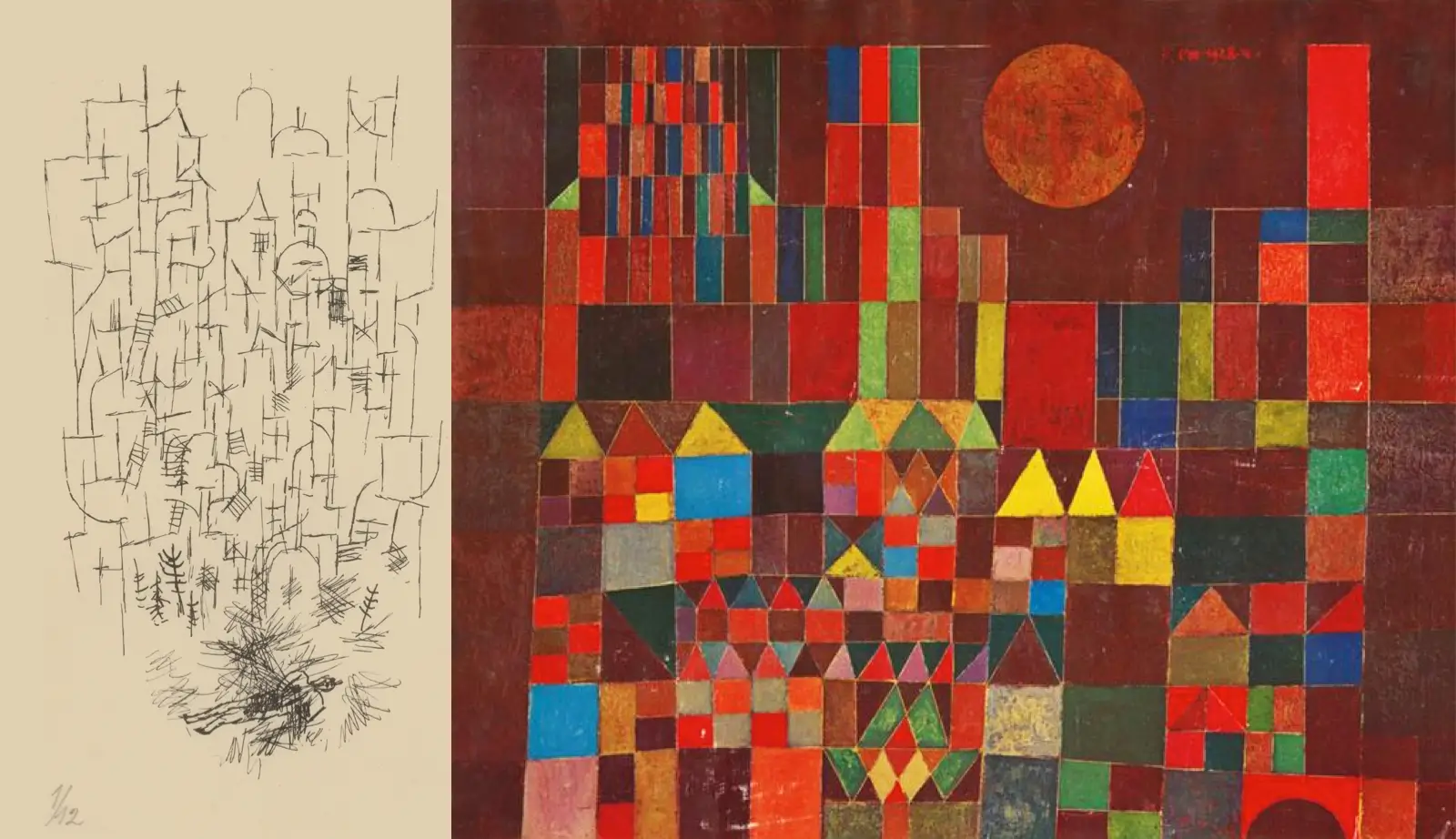
And Klee’s arrangement of shapes that represented buildings. That connection to Portico’s industry appealed to me.
So I sketched out my own version, which was a mixture of those influences. Every shape is split diagonally, and that repeated motif creates direction, movement, light, and shadow. When I was happy with the sketch, I colour-blocked it and added outlines.
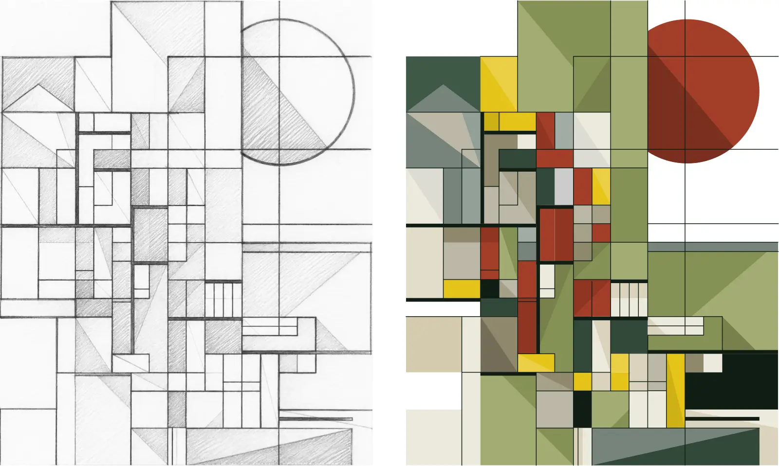
I made several different graphics, which all share the same underlying grid.
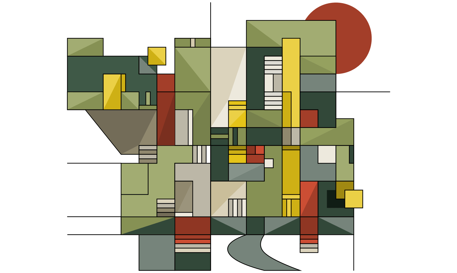
And intersecting architectural forms.
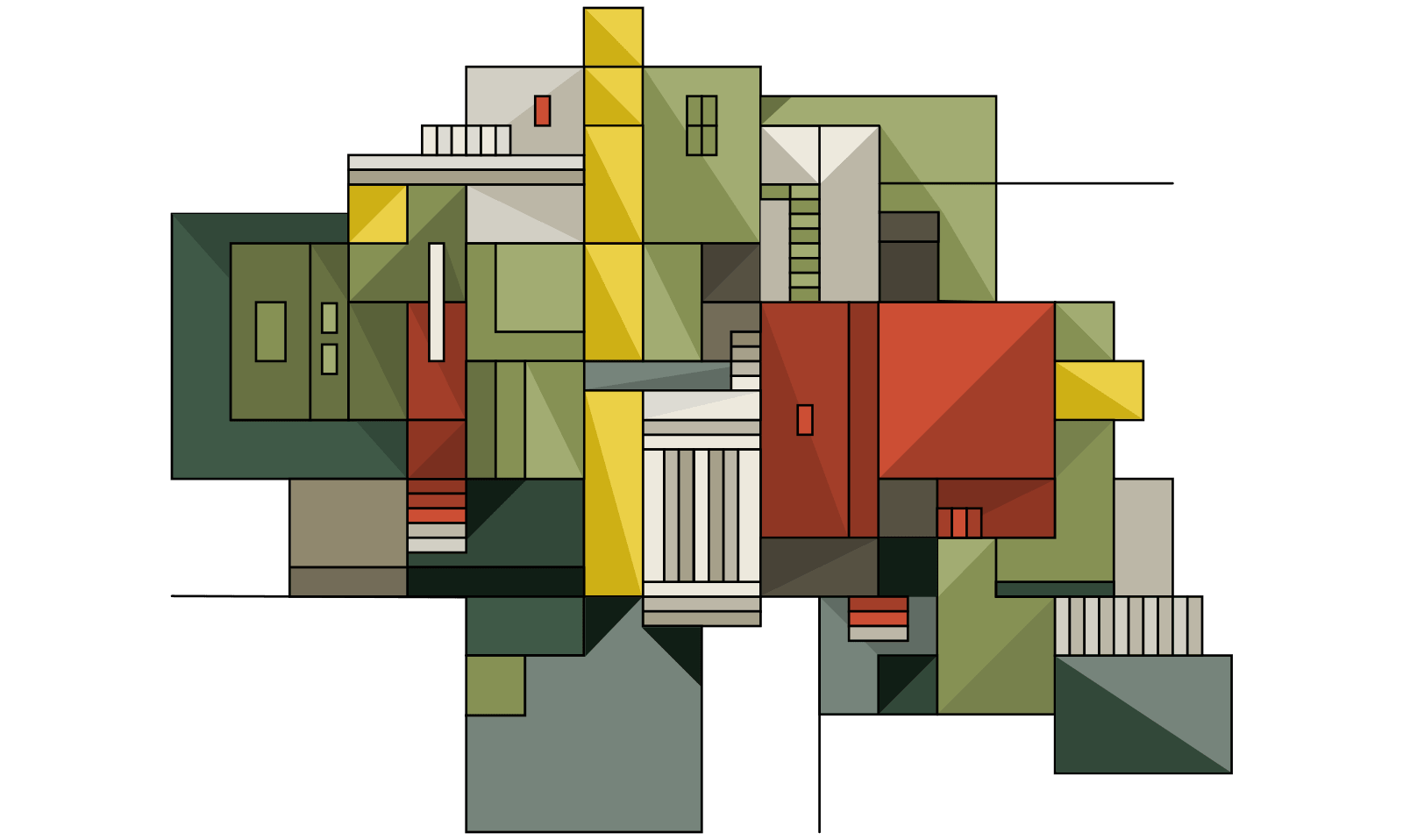
When I was happy with the earthy colour palette, I added one of the illustrations to a static mockup of my Portico Investments home page.
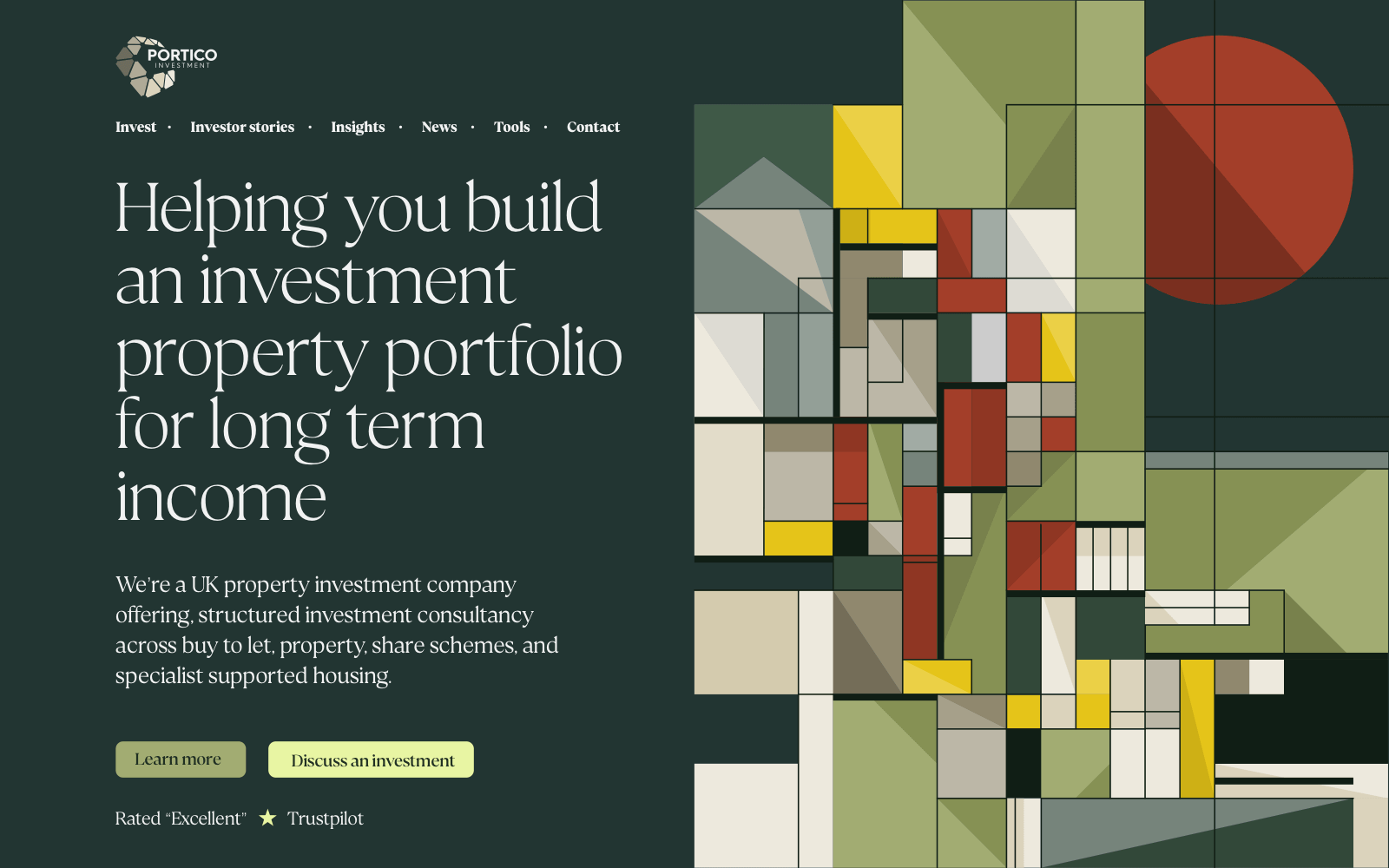
This section of the page has a version of Portico’s signature green which I feel is less dominant and provides better contrast behind text than the green in their brand “guidelines”.
I finished off the week by coding my designs in HTML and CSS. Using Eleventy in a Box meant that I could implement all their page designs in a little over a day.
The team at Lockrose sent me a document of copy revisions, and I edited the website, which is now hosted over at Netlify. All that remains for me to do is a graphic illustration for their homepage.
But I did complete an interface section which depicts their process through a series of illustrations which build from a loose sketch to a final piece of artwork.
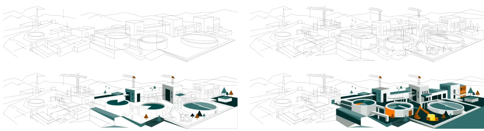
This coming week should see me put the finishing touches to both Lockrose and Portico Investments. I’ll need to tick off all the items on my checklist, not forgetting to create new favicons for both clients and responsive testing, plus a few more finishing touches.

I’m Andy Clarke. I’ve spent over thirty years helping clients create memorable websites. I’m also the author of five books on web design.
Planning a new website? I’d love to help you create something memorable.
A premium Eleventy starter kit for designers and developers who want to spend less time setting up the same project structure and more time designing websites.
Contract Killer is plain and simple and there’s no legal jargon. It’s customisable to suit your business and has been used on countless web projects since 2008.
Free compound grid and modular grid layout generators, plus a set of HTML/CSS layout templates you can call on to make more interesting layouts, available to buy.