Eleventy in a Box
A premium Eleventy starter kit for designers and developers who want to spend less time setting up the same project structure and more time designing distinctive websites.
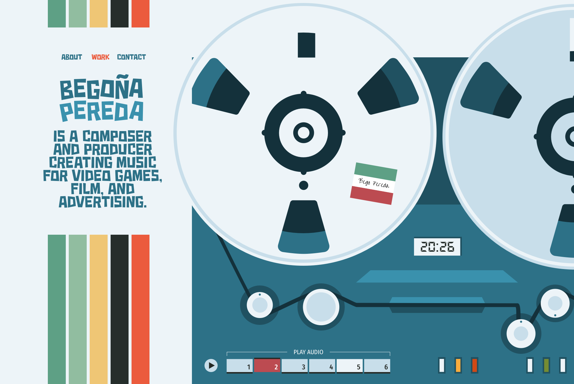
I designed a website for composer Begoña Pereda using typography and animated SVG graphics to reflect her personality and musical style. Here’s how I approached it.
Living and working in Mexico City, Begoña Pereda is a composer for films and video games. She’s an up-and-coming young artist who collaborates with filmmakers and makes music that supports video gameplay and narratives. Bego came to me on the recommendation of another composer client.
Bego was looking for a website to demonstrate her work and introduce herself to new clients. She wanted something which reflects her interests, personality, and the experience of working with her. This is exactly the type of project I love to work on.
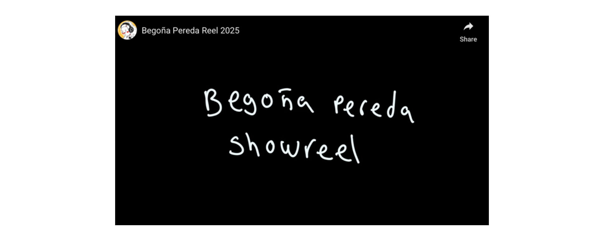
I always start with type, because it sets the tone for everything else. I’ve developed a process for selecting type that balances personality with readability. The typeface Bego chose for her YouTube showreel gave me some idea of the style she preferred: irregular, quirky, and unconventional.
Over the years, I’ve developed a process that lets me shortlist a handful of typeface options to present to a client. When I do that, I don’t ask clients to choose typefaces—that’s my job. Instead, I help them respond to how type feels. I asked Bego about which typefaces “felt right” for her and how she wanted to express herself.
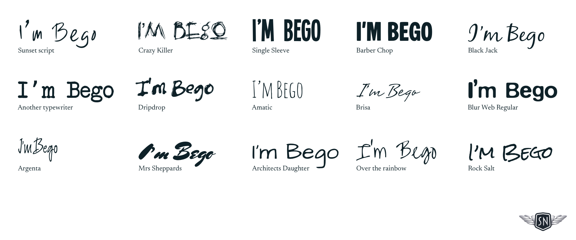
Typography isn’t just about readability—it’s about how something feels. That can be very subjective, so I always demonstrate the characteristics of several typefaces to find out how they make someone feel. Are they formal or informal? Approachable but still professional?
I explore how they look in branding, especially a person’s name, as that is possibly the most personal design element I can work on.
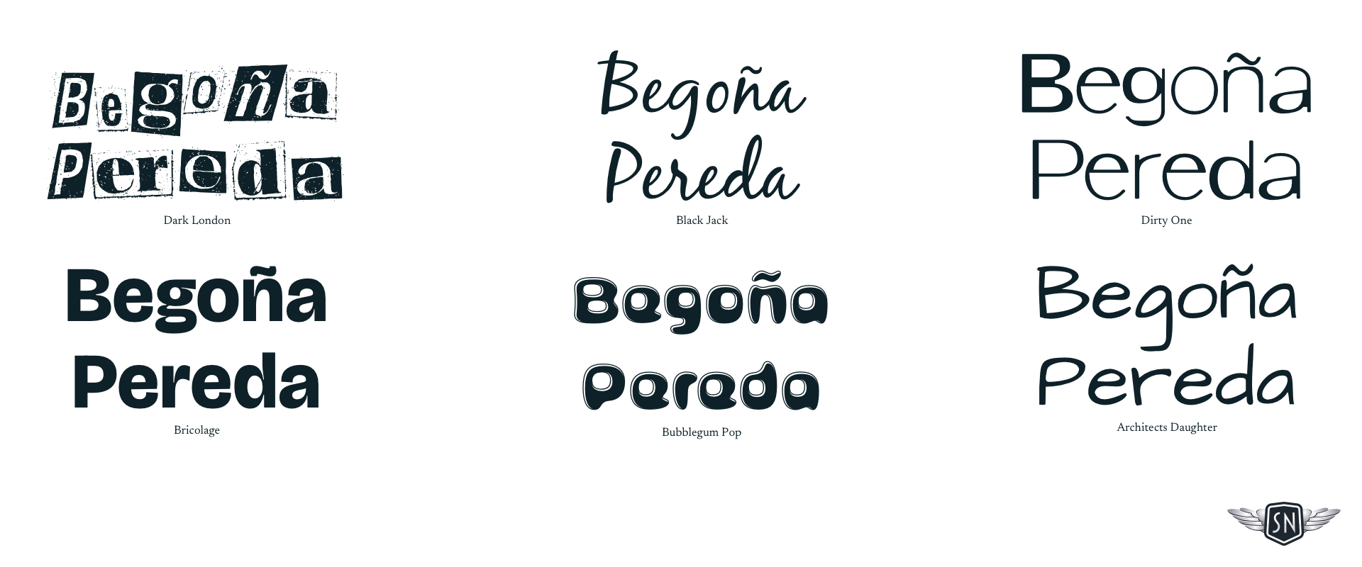
I also need to bear in mind other typefaces I might include in a design. In Bego’s case, this involved evaluating how the combination of a highly stylised typeface with another, more readable one for setting longer passages of text.
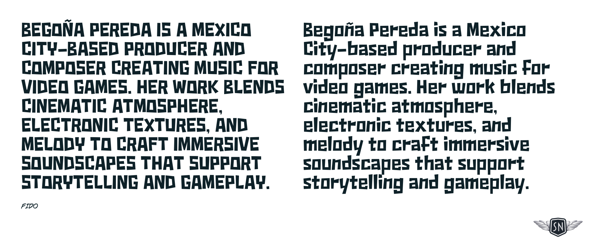
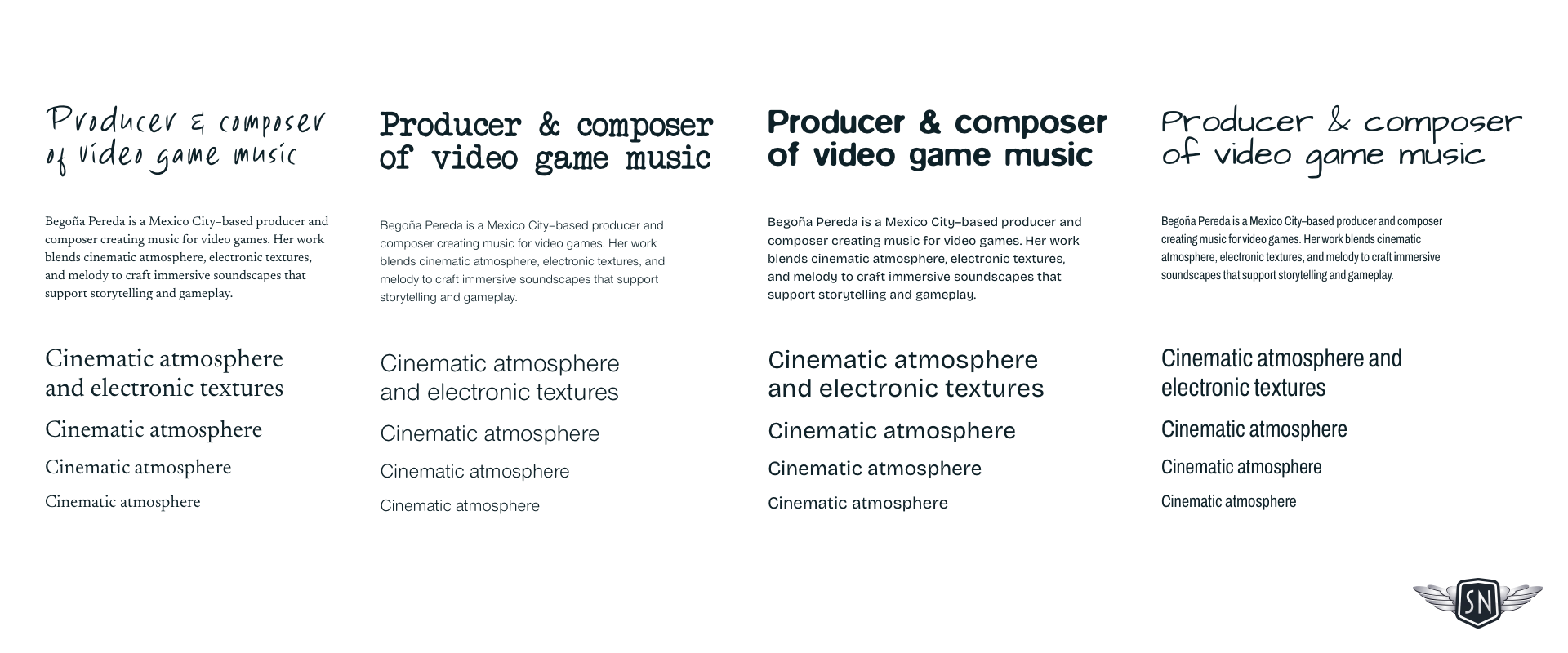
For stylised typefaces like this one, I need to understand how much text I can set and the size I need to make it legible in both upper and lowercase.
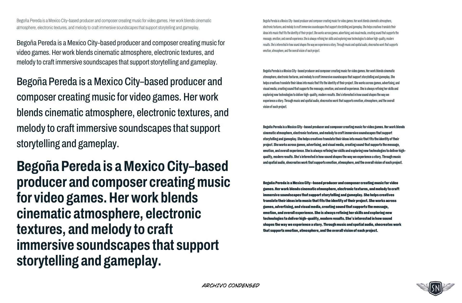
I always test typefaces in real contexts—names, paragraphs, and combinations—so I can see how they behave in the design, not just in isolation. I create what I call type sheets to determine at what size I should switch to a more readable typeface. I always use copy as close as possible to what I’ll be setting in the design. If copy’s not available—which it often isn’t at the start of a project—I write my own, rather than use dummy lorem ipsum.
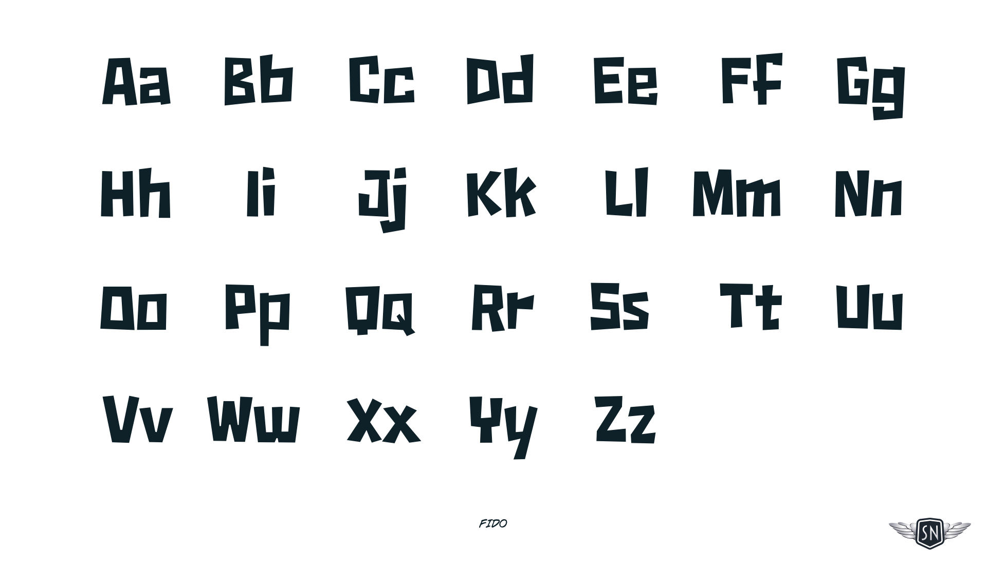
I study individual letterforms, looking for specific characters that can either add personality through a distinctive design or could be dealbreakers if they don’t look or feel right. This can be especially important when considering the letters in a company, person, or product’s name.
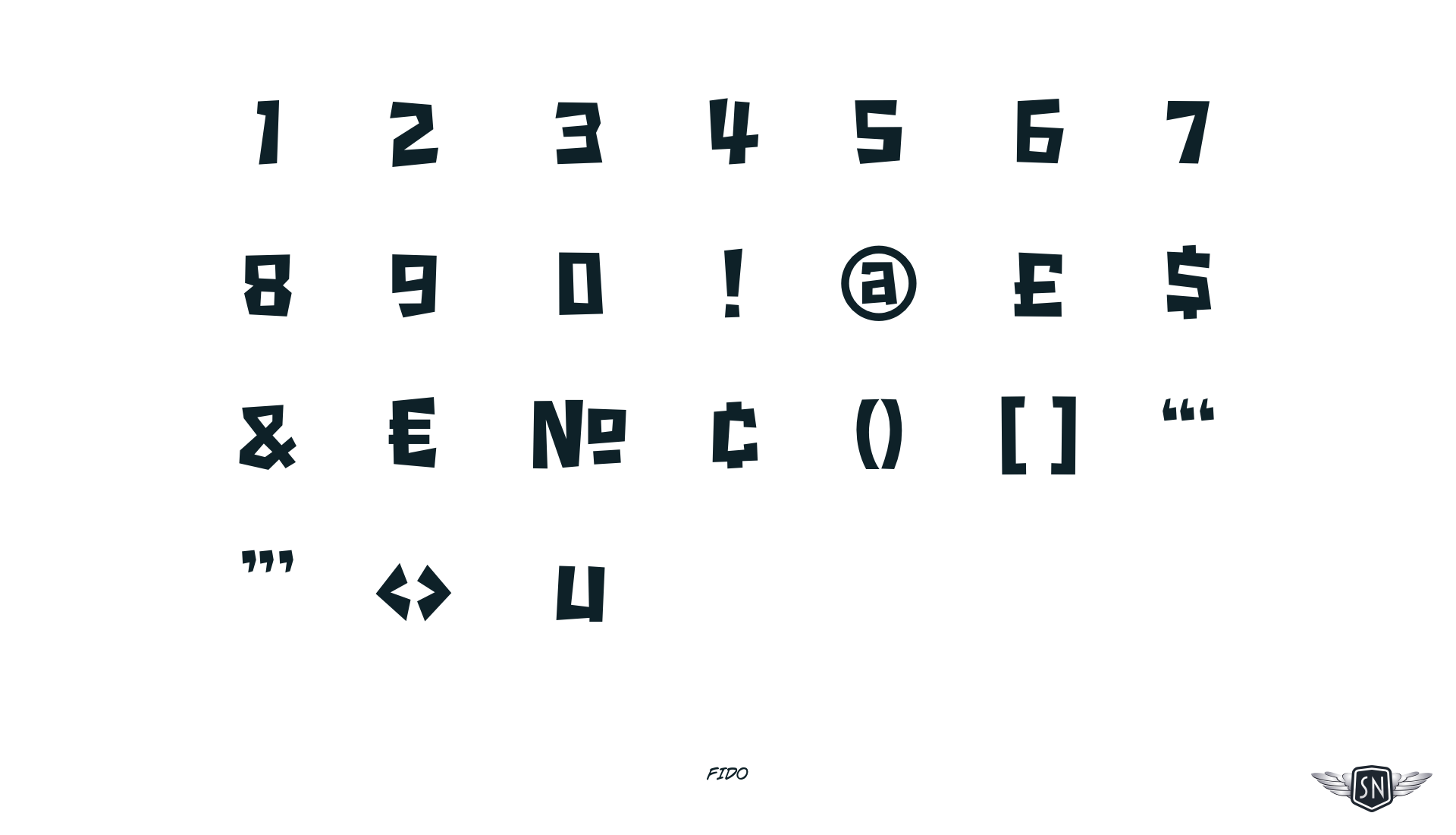
I also look at the design of numerals and special characters, which is important when client content will contain facts and figures.
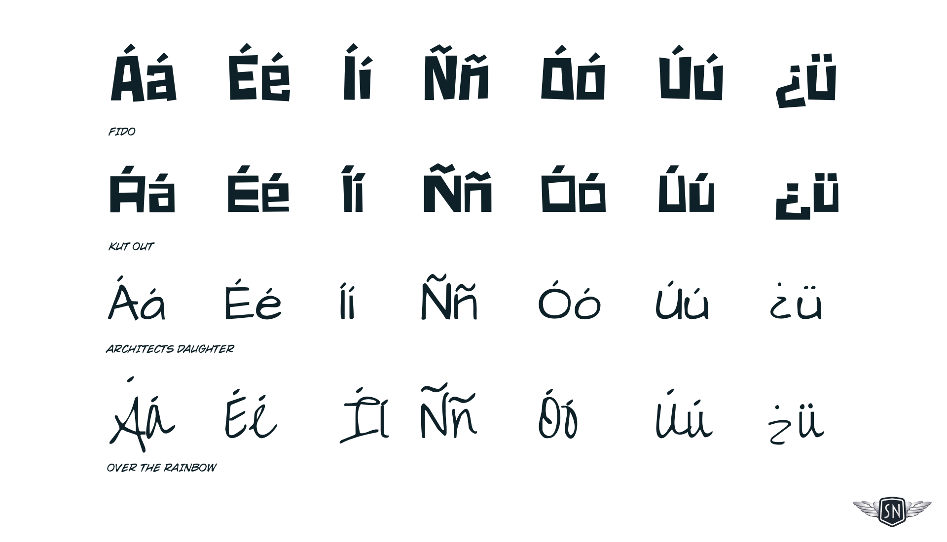
For someone like Bego, who speaks Spanish, I also need to ensure that any typeface I choose includes any accents, special characters, and punctuation we don’t have in English.
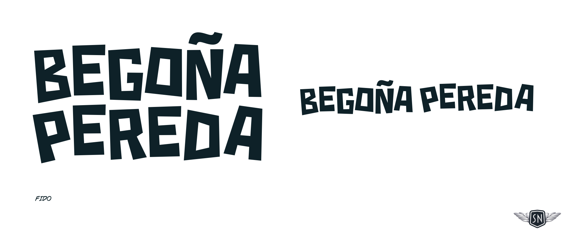
Finally, I settled on Fido—designed by Canada Type—for branding, headlines, and short blocks of text, and paired it with Archivo Condensed—by Omnibus-Type—for longer passages of copy. Archivo is available from Google, whereas Fido has a license fee I was happy to pay. This combination gave me a typographic system that felt distinctive but still readable.
I use a combination of CSS and JavaScript to animate SVG graphics—CSS for continuous motion and JavaScript to control when animations start and stop.
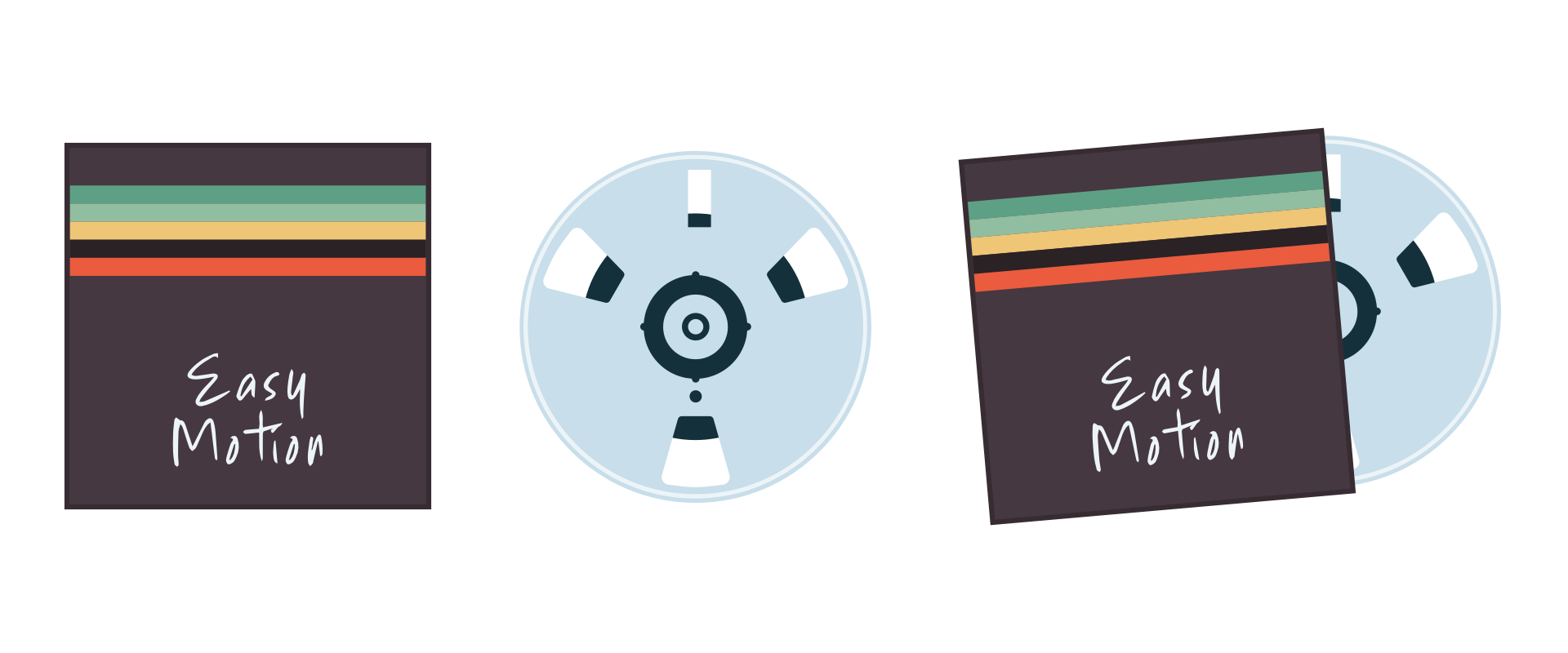
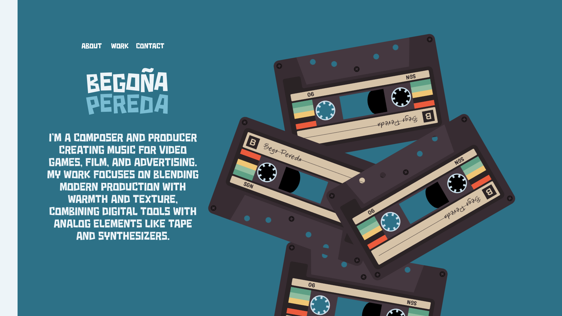
Bego loves retro music tech, especially cassette tapes and reel-to-reel tape recorders. I wanted to recreate them both using SVG and explore ways to connect animation with playing her music.

In my cassette tape, I created a base layer which contains its static elements. I optimise SVGs by reducing points, merging paths, and stripping unnecessary data to keep them lightweight. After optimising it with SVGOMG, the cassette graphic weighs less than 12 KB.
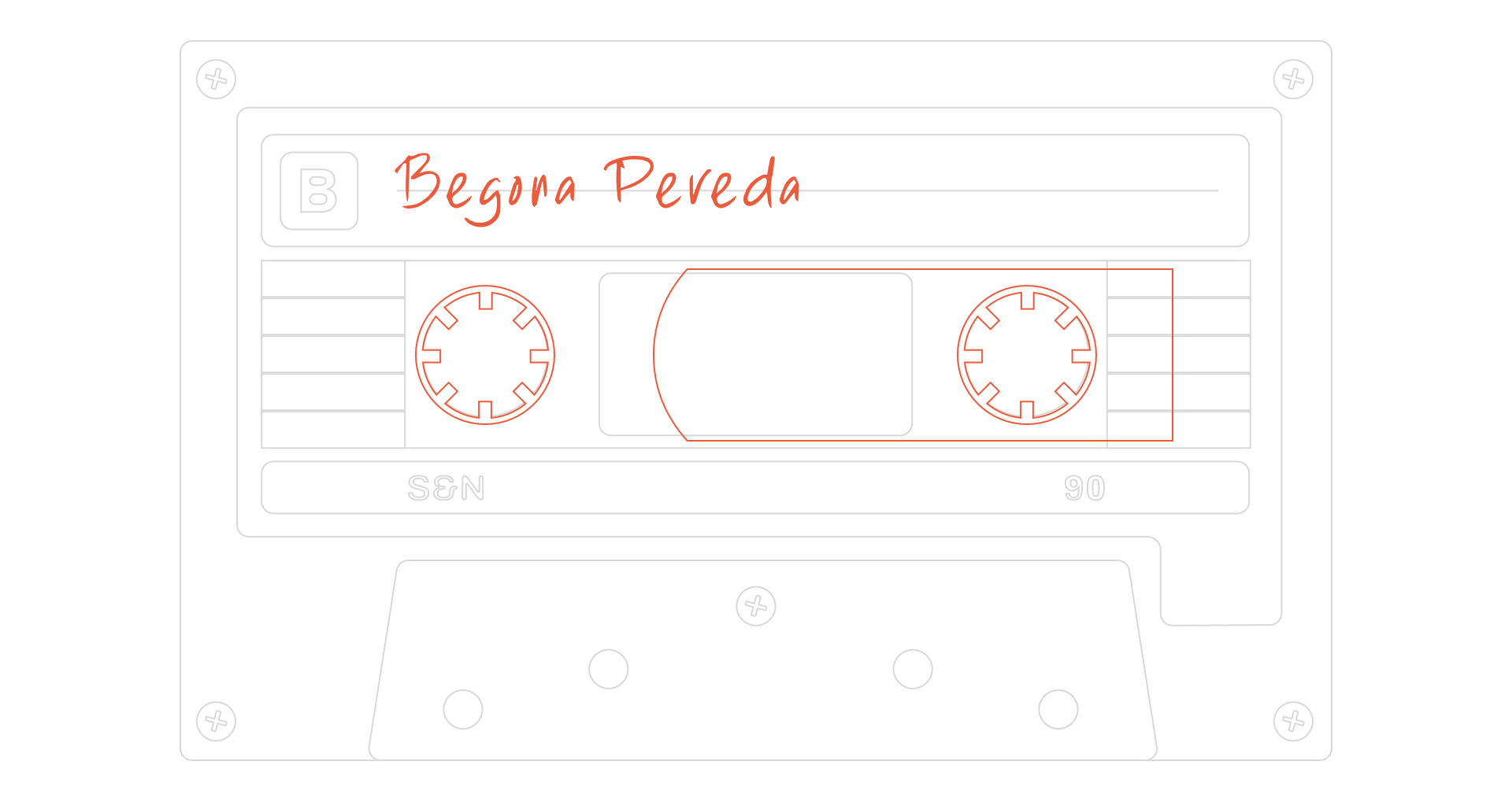
I separate every SVG into a static base layer and independent animated elements. That way, I can control motion without affecting the rest of the graphic. Then, I added the animated elements, including the cassette spools and tape, which moves between them.
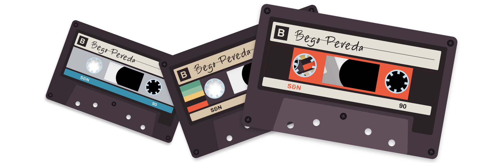
By naming paths and carefully structuring the SVG, I can reuse the same graphic in multiple variations—changing colours, labels, and details without duplicating the artwork. I was able to make as many cassette versions as I needed, with different colour branding, labels, and plastic cases.
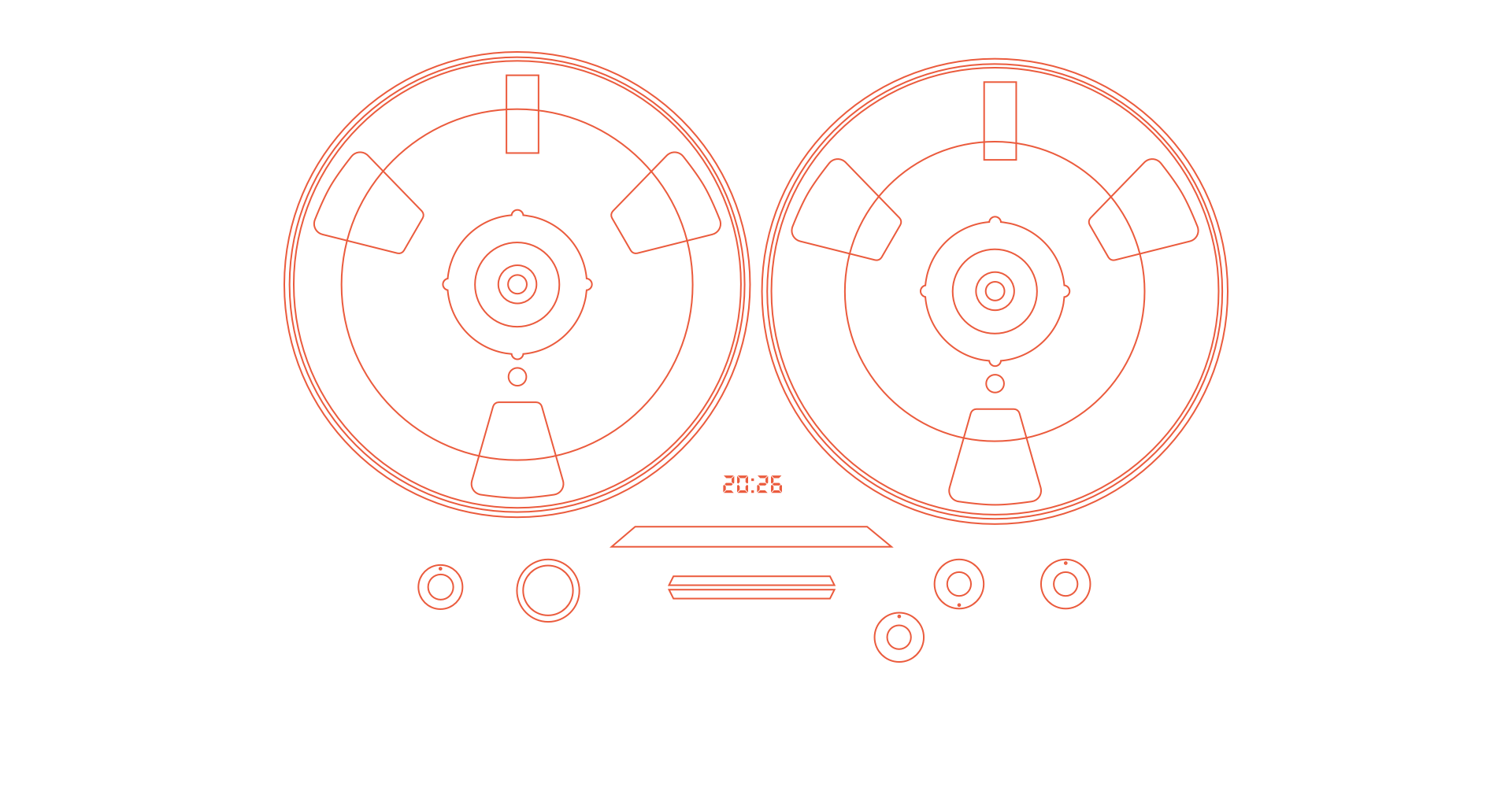
I used the same approach for Bego’s animated tape reels and covers, where the reel slides out of its cover when the cursor moves over it.
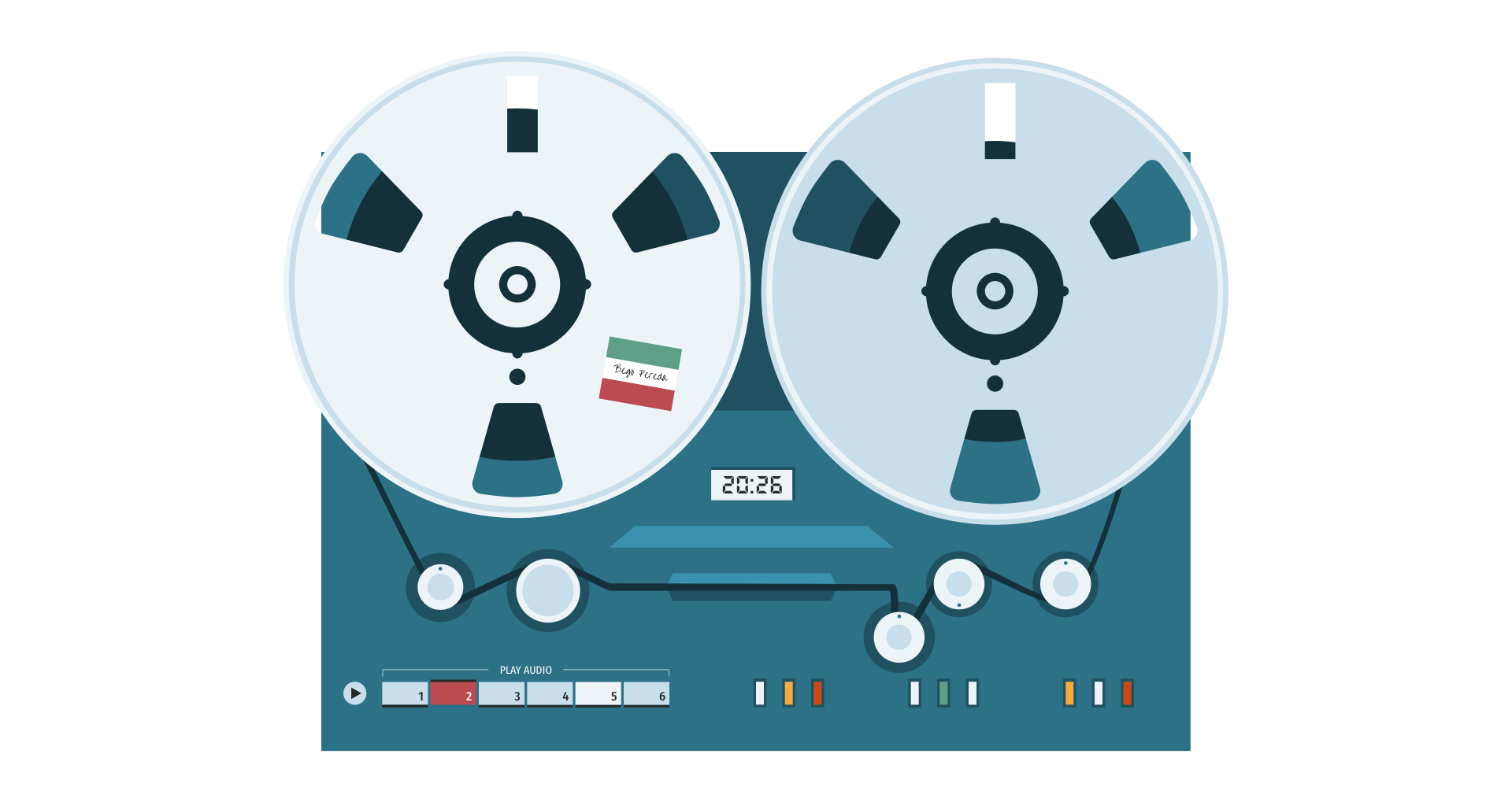
For more complex interactions, I use JavaScript to control when animations run, rather than how they move. The large reel-to-reel tape recorder on Bego’s home page was by far the most complex graphic, even though it again weighs less than 12 KB.

I broke this graphic down into its animated and static components.
I use CSS for continuous, predictable animation like rotation and movement, and JavaScript to control state—starting and stopping animations based on user interaction or audio playback. CSS handles the motion, while JavaScript adds an is-playing attribute so animations only run when Bego’s music is playing.
Static deliverables like PDFs, and even interactive tools like Figma, can give an indication of how a design will feel. But they can’t replicate the experience of interacting with a real website. For that, I need to work in the browser using HTML, CSS, JavaScript, and SVG.
I spend several days experimenting with interactions—building, testing, and revisiting a design repeatedly to ensure it still feels right. If it doesn’t feel right in the browser, it isn’t right, no matter how good it looked in a mockup.
When I design portfolio websites for artists like Bego, I try to express who they are, not just present their work. This project brought together everything I care about in web design—animation, illustration, layout, and typography working as a single system.
The type choices shaped the tone. The SVG graphics gave the design personality, and animation brought it to life—subtly, but meaningfully. For artists like Bego, a website isn’t just a portfolio. It’s an experience. And that experience should reflect not just what they make, but who they are.
That’s what I’m always aiming for.
A premium Eleventy starter kit for designers and developers who want to spend less time setting up the same project structure and more time designing distinctive websites.
Contract Killer is plain and simple and there’s no legal jargon. It’s customisable to suit your business and has been used on countless web projects since 2008.
Free compound grid and modular grid layout generators, plus a set of HTML/CSS layout templates you can call on to make more interesting layouts, available to buy.