How I designed composer Mike Worth’s website around his love of ’90s Disney animation
A composer’s website shouldn’t look like everyone else’s. Here’s how I designed a portfolio for Mike Worth that reflects the person behind the music.
The best creative portfolio websites do more than showcase someone’s work. They introduce the person behind it. Here’s how conversations about ’90s Disney animation shaped a website that feels unmistakably Mike Worth.
Designing a website should feel like discovering a story
Mike Worth creates exciting, retro-inspired music for game developers who want their games to feel like action-packed cartoons from the ’90s. His website needed to deliver that same energy visually, giving visitors a reason to explore and something memorable to discover along the way.
Meeting Mike Worth
A friend introduced me to Emmy Award-winning composer Mike Worth, and we clicked immediately. Mike already knew that he wanted a website full of personality. He loved Disney’s DuckTales and other animated series from the ’90s, and had collected reference images and mood boards to explain the atmosphere he wanted me to create.
Mike wanted to showcase his previous work, but just as importantly, attract more of the game projects he enjoyed. His music was bold, energetic, and full of character, but his existing website said little about the person who created it.
What interested me was that Mike already had a strong idea about how his website should feel. Most clients ask me to help uncover their visual direction, whereas Mike arrived with a head full of cartoons and an infectious enthusiasm for their graphic language. My job was not to copy DuckTales or create a nostalgic pastiche. It was to understand what Mike loved about those cartoons and translate those qualities into an original website that could only belong to him.
Take a look at my Mike Worth portfolio page to see how the finished website combines original illustration, playful storytelling, and lightweight animation.
Finding the right kind of ’90s
Describing a design as having a “’90s animation vibe” sounds straightforward until I start asking what that actually means. Was Mike responding to the characters, the colours, the title sequences, or simply the feeling those programmes gave him?
As I studied Mike’s references, several characteristics appeared repeatedly. Illustrations used strong outlines and flat colours with very little shading. Backgrounds combined simple shapes with punchy palettes, while exaggerated lettering and dramatic compositions made everything feel energetic. The result was playful and action-packed without becoming visually complicated.
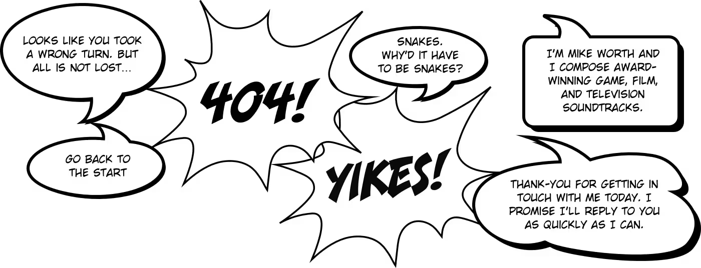
That distinction mattered. I could have decorated a conventional portfolio layout with cartoon graphics, but the result would have felt superficial. Instead, I wanted the website itself to behave like an animated adventure. Every page would become a new scene, and moving through Mike’s work would feel like following a story.
Creating Orango Jones
Rather than borrowing characters from Mike’s favourite cartoons, I created a new one. Orango Jones is an orangutan adventurer and archaeologist who returns to Borneo on a quest for the emerald flute. His story unfolds across Mike’s website, with every page revealing another scene from his adventure. The home page invites visitors to join the journey, while Mike’s work, biography, news, frequently asked questions, and contact information become destinations along the way.
Orango gave the project much more than a mascot. He connected pages that might otherwise have felt separate and gave me a reason for every illustration, animation, and interaction. Instead of adding decoration after designing the layouts, the story shaped the experience from the beginning.
It also gave Mike’s music its own visual world. Visitors did not simply browse a composer’s portfolio. They joined an adventure created around the same excitement, humour, and imagination people hear in his work.
Building a colour palette for the adventure
Colour needed to connect every part of Orango’s journey, so I developed a palette inspired by DuckTales and other animated series from the ’90s. I used the same colours throughout Mike’s branding, illustrations, interface elements, merchandise, and website.
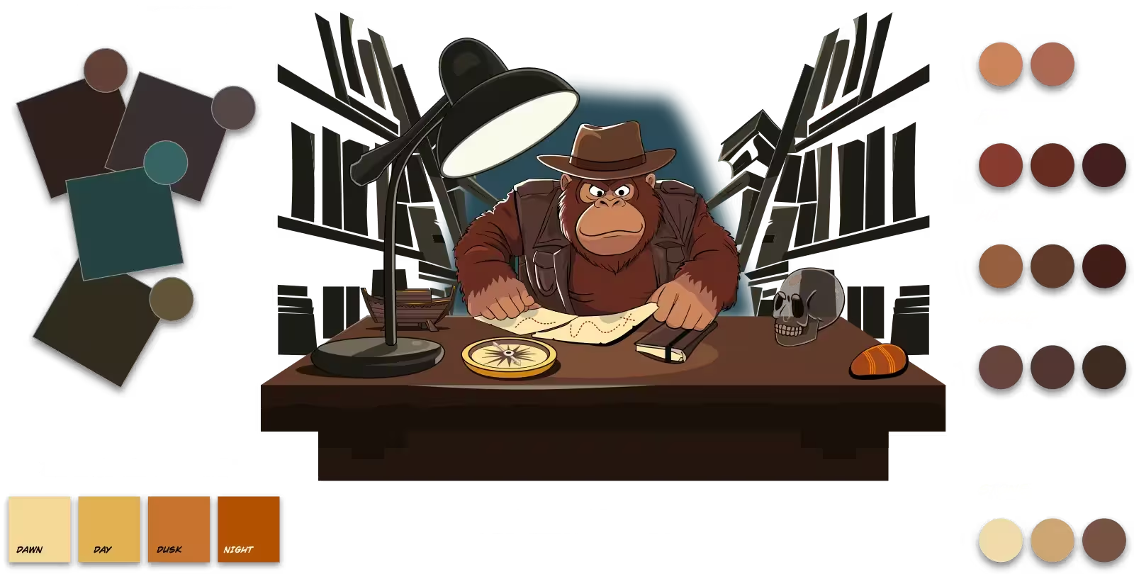
The palette uses punchy colours rather than subtle shades, which helps illustrations remain clear and gives each scene plenty of energy. Flat fills and minimal shading also kept the artwork connected to the production style of the cartoons that inspired it.
Consistency mattered more than simply choosing nostalgic colours. Repeating the palette across illustrations, buttons, icons, and type helped separate elements feel as though they belonged in the same fictional universe.
Sketching the journey
I think of wireframes as storyboards rather than diagrams of boxes. They help me decide what someone should discover, in what order, and how each part of a page leads naturally to the next.
For Mike’s website, I began with loose sketches on paper. Working quickly meant I could explore compositions, content hierarchy, and interactions without becoming distracted by polished design details. Those sketches helped me see where each scene should appear and how Orango’s adventure could continue without obscuring Mike’s work.
This was especially important because the story could never become more important than the reason people visited. Mike’s music, credits, news, and contact information still needed to be clear and easy to find. The adventure supported that content by encouraging exploration rather than competing with it.
Designing details that belonged in the story
Once I had established the story, colour palette, typography, and page structure, I could make even ordinary interface elements feel as though they belonged in Orango’s world.
I transformed Mike’s drop-down navigation into a large stone tablet. Portfolio images gained thick outlines and a glossy sheen. News stories appeared on animated scrolls, while buttons and social icons looked as though they had been carved from stone.
Those details were not there simply to make the website look more cartoon-like. They kept the illusion intact. A conventional menu or generic rounded button would have felt imported from another website, whereas stone tablets and carved controls extended the story into the interface.
That didn’t mean abandoning familiar behaviours. Buttons still needed to look clickable, navigation still needed to be understandable, and Mike’s content still needed to remain accessible. The challenge was making established interface patterns feel distinctive without making them difficult to use.
Using animation to reward curiosity
I filled the website with small animations that reward people for looking more closely. Lamps flicker, objects glow, scrolls unroll, and interface elements react when someone hovers or clicks.
Most of these are ambient animations. They add atmosphere without demanding attention or interrupting someone’s journey. The movement supports the fictional world while allowing Mike’s music and information to remain the focus.
The illustrations also needed to stay lightweight. I separated SVG artwork into animatable parts and used CSS for effects that did not need complicated sequencing. This kept the website fast and responsive despite the quantity of artwork and movement.
Working on Mike’s website later inspired my Toon Titles project, where I explored how CSS, SMIL, and GSAP could bring static cartoon title cards to life. That experiment began with the same principle I used here: animation works best when it adds character and atmosphere rather than movement for its own sake.
Taking the visual language beyond the website
Mike’s new visual identity did not need to end at the edge of a browser. I also created designs for button pins, caps, mugs, and T-shirts using his branding and scenes from the Orango Jones story.
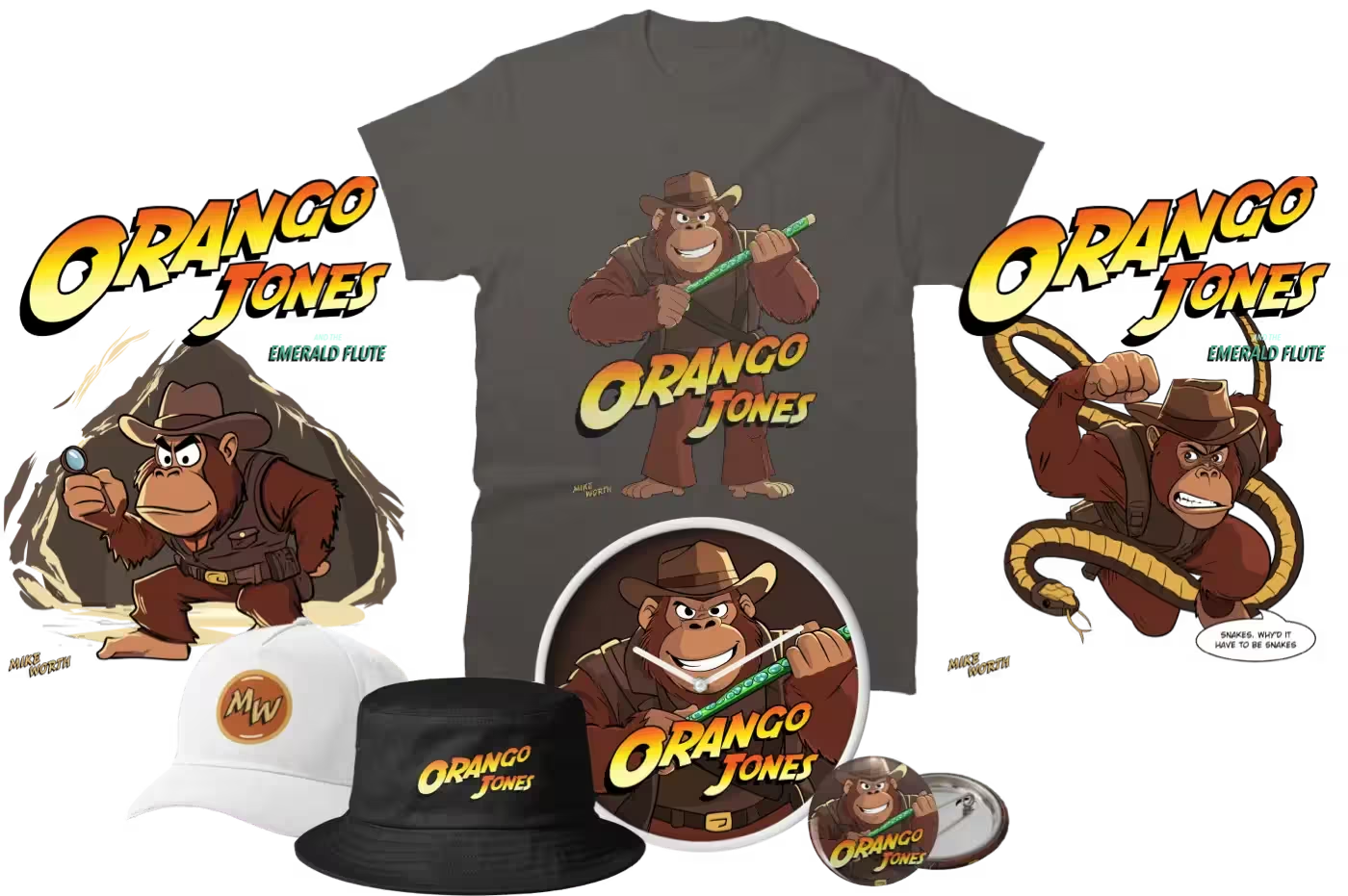
Because the colour, typography, characters, and graphic details had been developed as a connected system, they transferred naturally onto merchandise. The project had become more than a collection of website pages. It gave Mike a visual world he could continue using wherever he promoted his work.
What I learned
Working with Mike reminded me that inspiration and imitation are very different things.
Taking inspiration from DuckTales didn’t mean copying its artwork. It meant studying why Mike responded to its energy, colours, lettering, and sense of adventure, then using those qualities to create something new.
The project also reinforced the value of curiosity. Every hidden detail gave visitors another reason to explore, but those surprises only worked because they belonged to the same story. Personality did not come from any single illustration or clever animation. It came from hundreds of decisions which all pointed in the same direction.
The best creative websites do not simply show someone’s work. They help people understand the imagination behind it.
See the finished project
The finished website combines original illustration, expressive typography, playful interaction, and an adventure story that unfolds as people explore. Take a look at my Mike Worth portfolio page to see how the project came together.
Related reading
- My Mike Worth portfolio page
- Web design inspiration from ’90s cartoons
- Toon Titles Series 1. More than just a fun side project
- Design a new website or product
January 1, 2026 • Andy Clarke • design