How I gave Mountain Duck software a personality
Business software websites don’t have to look boring. Here’s how I gave Mountain Duck a website with as much personality as the product itself.
Most software websites look as though they’ve come from the same place. Swap the logo, change the colours, replace a few screenshots, and you’ve got another familiar landing page. They’re tidy, predictable, and perfectly functional. They’re also almost impossible to remember.
I don’t think business software has to be that boring. In fact, I think software with personality has an advantage. When a product is memorable, people are more likely to remember what it does, who makes it, and why they chose it in the first place. That’s the thinking behind Mountain Duck.
A memorable product deserves a memorable website
Mountain Duck is desktop software developed by Iterate that allows people to mount cloud storage and remote servers as local drives on macOS and Windows. It’s a serious tool used by developers, designers, and IT professionals. But unlike many products in this space, it has something most software companies would love to have. A memorable name.
The existing website had been developed in-house by the Iterate team using a framework and standard templates. It explained the software well enough, but visually it looked much like countless other software websites. It didn’t take advantage of the character already built into the Mountain Duck brand.
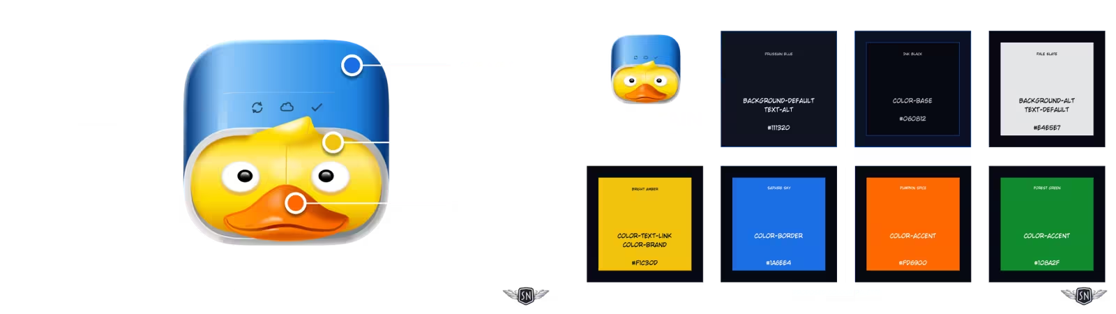
That immediately interested me. I wasn’t trying to make serious software look silly. I wanted to prove that personality and professionalism aren’t opposites.
If you want to know how that translated into the finished design, look at my Mountain Duck portfolio page, where I walk through the project from discovery to delivery.
Looking beyond templates
When people talk about framework-based websites, they often focus on the code. I think the bigger problem is what happens to the design. Frameworks encourage consistency, which is useful, but they also encourage familiarity. Before long, every pricing table, feature list, testimonial, and call to action starts looking suspiciously like every other one. There’s nothing technically wrong with that. It’s just forgettable. Mountain Duck deserved something better.
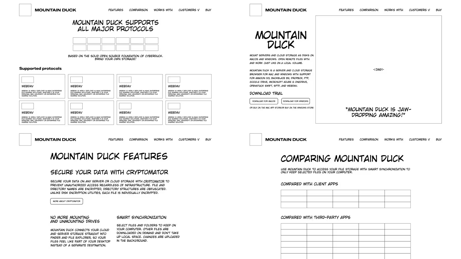
The challenge wasn’t to reject convention completely. People still expect software websites to explain features, compare editions, answer questions, and encourage downloads. The challenge was to wrap that familiar journey inside a visual experience that people would actually remember.
Conventions exist because they work
There’s nothing inherently wrong with software websites looking familiar. Visitors expect to find product features, screenshots, pricing, documentation, downloads, and support. Those conventions exist because they work. If someone can’t work out how to download your software, you’ve probably been a little too creative. The problem begins when convention turns into imitation.
Spend half an hour looking at software websites and you’ll see the same hero layouts, the same feature grids, the same floating cards, the same gradients, and the same anonymous illustrations. Swap the logo and the screenshots and it becomes surprisingly difficult to tell one company from another.
Frameworks aren’t entirely to blame, but they certainly encourage this kind of thinking. They make it easy to build competent websites quickly, and that’s no bad thing. The danger comes when the framework starts making creative decisions on your behalf.
Mountain Duck still needs a clear user journey
I wasn’t interested in rejecting convention simply for the sake of it. Mountain Duck still needed a clear user journey. Visitors still needed to understand what the software does, compare editions, and download it with confidence. Those conventions stayed.
What changed was everything wrapped around them. Instead of relying on generic illustrations, I created original duck-based machine illustrations. Instead of another interchangeable typeface, I designed custom lettering that gave the product its own voice. Instead of treating animation as decoration, I used movement to guide people through the page and reinforce the product’s personality.
The structure is familiar because that’s what users expect. The experience feels different because that’s what they’ll remember.
Designing a duck, not decorating a website
The illustrations weren’t there to make the website look fun. They existed because the product itself already had a personality.
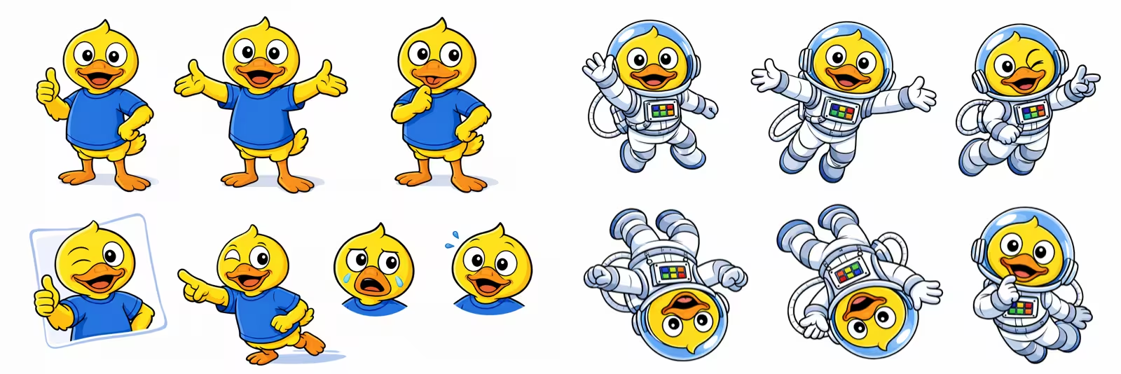
Rather than treating the duck as a logo that appeared occasionally, I wanted it to become a guide through the experience.
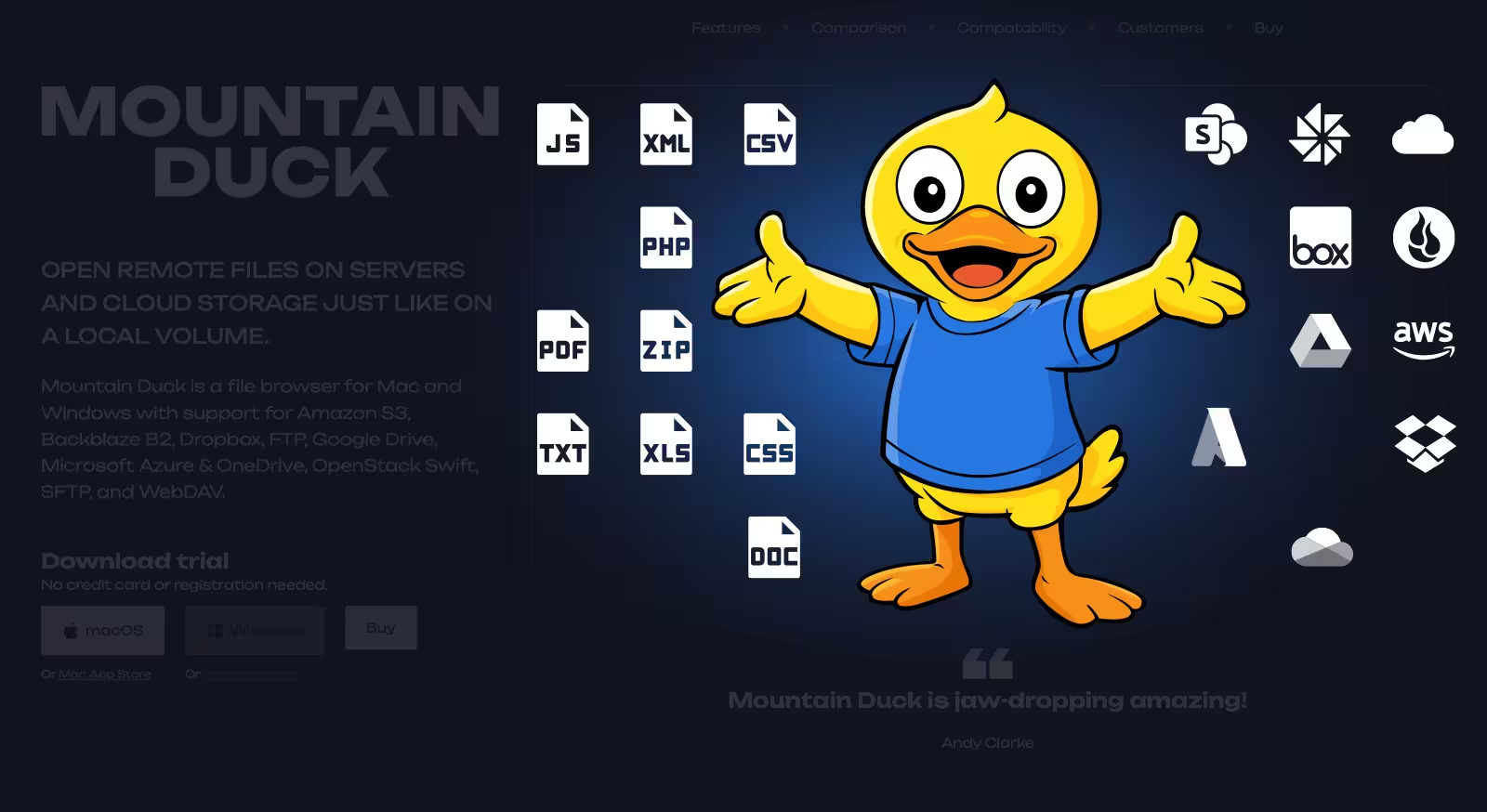
It introduces sections, reinforces ideas, and occasionally rewards curious visitors with the odd visual joke. One animation even hides a small Easter egg for anyone paying attention.
Every illustration started life as a rough sketch before being refined into vector artwork. From there I developed subtle SVG animations that add movement without overwhelming the page. The goal wasn’t animation for its own sake. It was to make the website feel alive.
Building personality into every detail
Illustration was only one part of the project. Typography helped establish the tone before visitors had even started reading. Layouts were designed to guide people naturally from one section to the next, introducing features progressively instead of presenting everything at once.
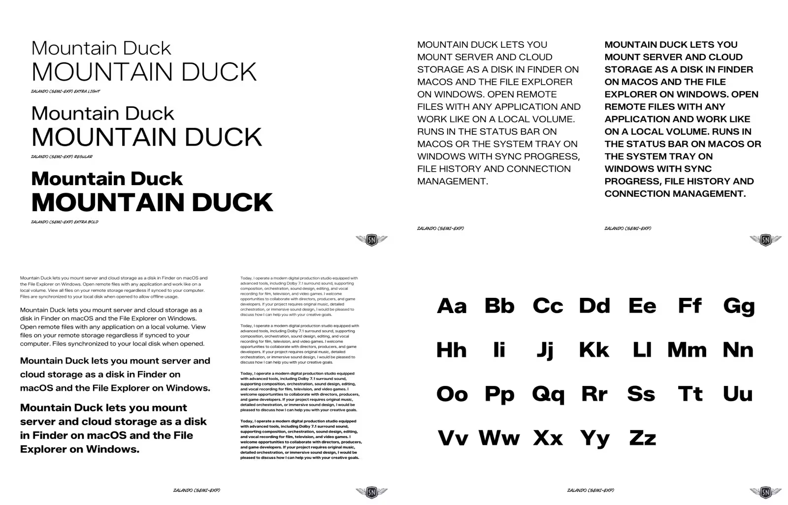
Behind the scenes, I designed the wireframes, developed the user experience, created the illustrations and animations, wrote the HTML, CSS, and JavaScript, then built the complete website using Eleventy before deploying it on Netlify.
Once everything was complete, I handed the project over to the Iterate team through GitHub, giving them complete ownership of the codebase and a workflow their developers were already comfortable using.
What I learned
This project reinforced something I’ve believed for a long time. Personality isn’t decoration. It’s communication. Too many websites treat branding as something that’s added after the important work has been done. I think it’s part of the user experience. It helps people recognise a product, remember it, and enjoy spending time with it.
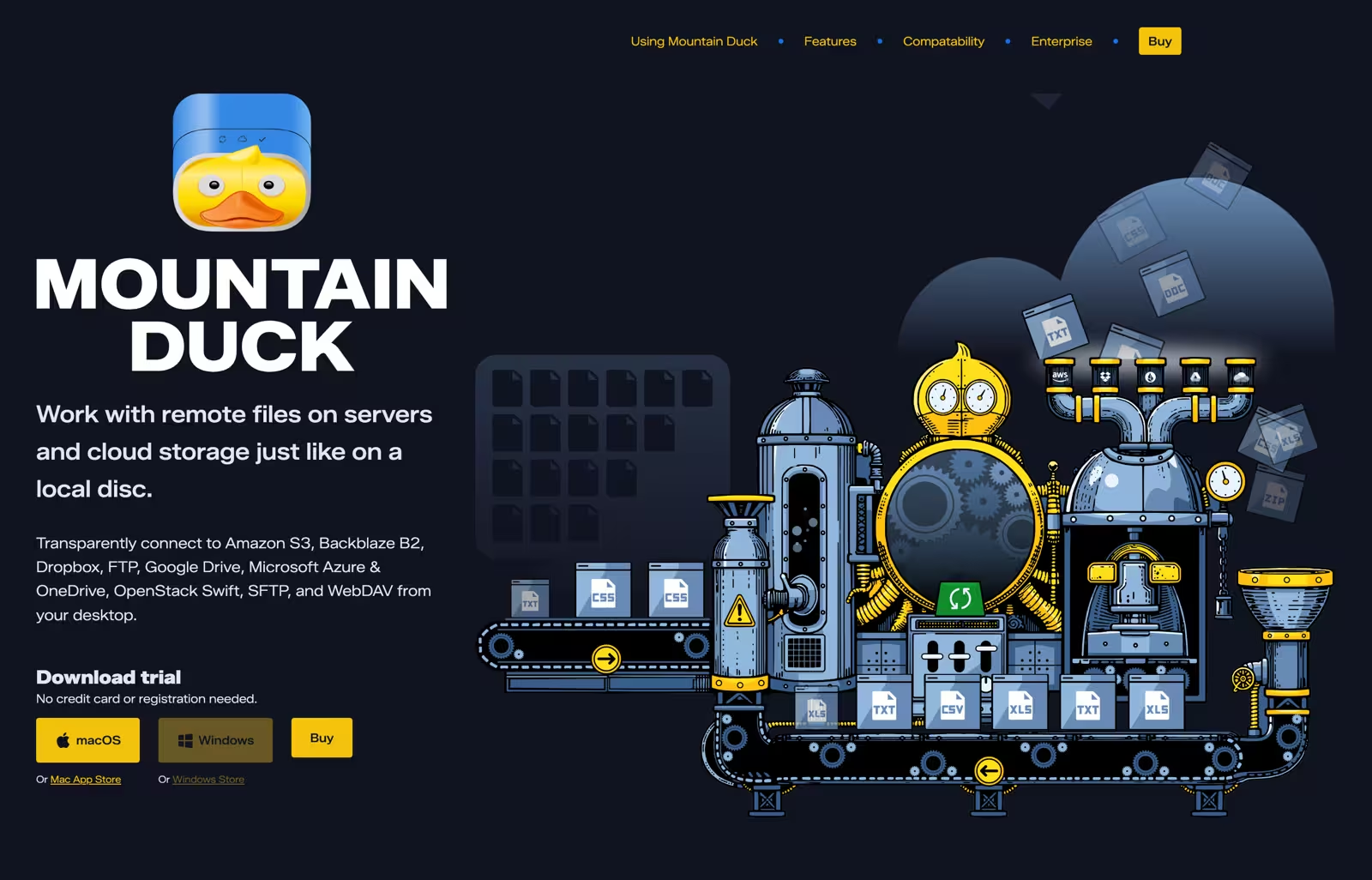
Mountain Duck succeeds because every creative decision supports the same objective. The illustrations aren’t competing with the content. The animations aren’t showing off. The typography isn’t trying to be fashionable. Everything works together to make a piece of business software feel more human. Personality isn’t something you add after the user experience has been designed. It is part of the user experience.
See the finished project
If you’d like to see how those ideas translated into the finished website—including the illustrations, animations, and final design—you can explore the final Mountain Duck website prototype.
Related reading
- My Mountain Duck portfolio page
- Last week in the studio (CW16-26): Finishing animations and refining graphics
- Last week in the studio (CW15-26): Animated graphics for a new website design
- Design a new website or product
March 1, 2026 • Andy Clarke • design