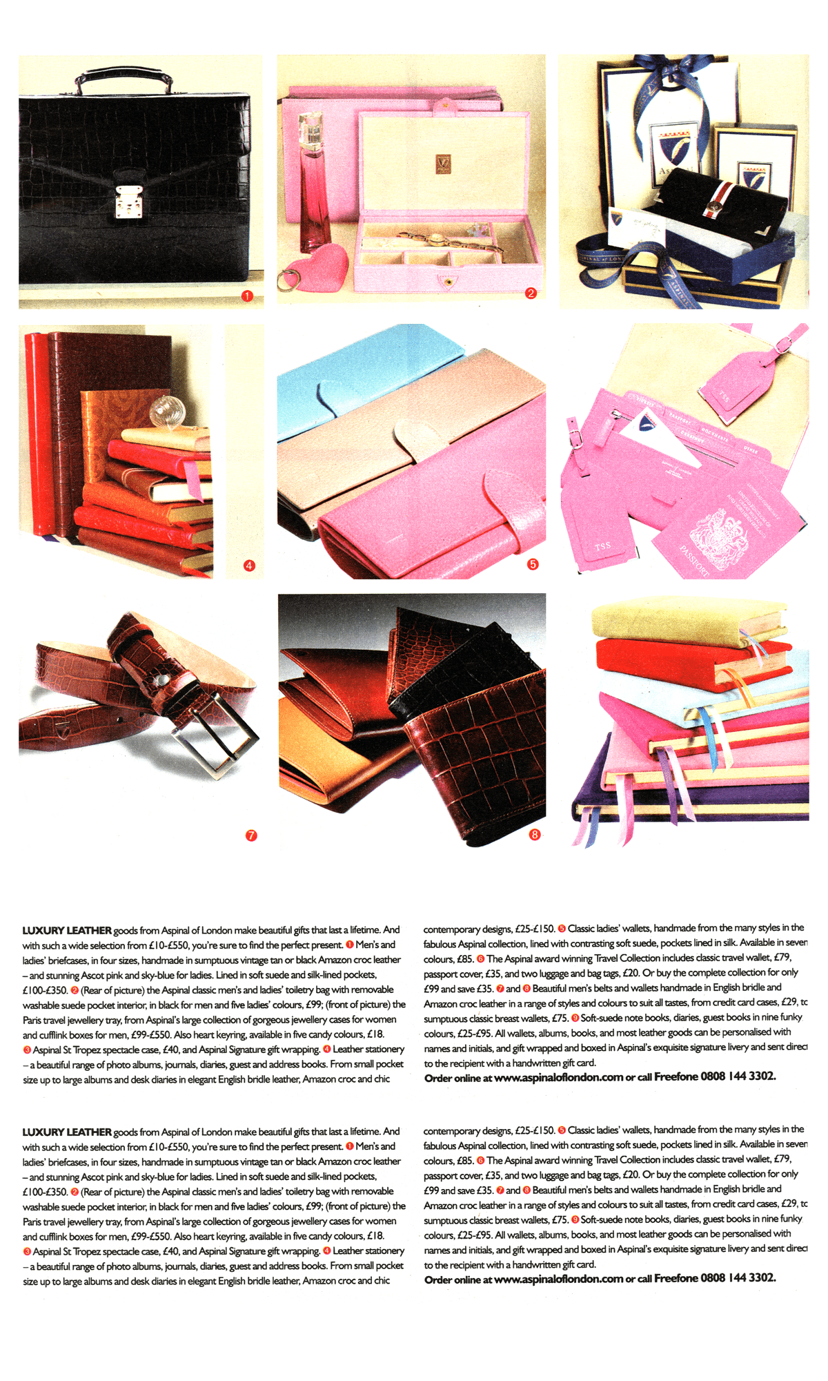
You’re getting closer to the end of this book, but the fat lady plus-size woman isn’t singing. In the following chapters, I’ll bring the principles and techniques I’ve taught you together. I’ll focus on using semantic HTML and CSS, and develop designs inspired by items in my scrapbook. I’ll explain how to combine several techniques and create incredible results. Not every example will look the same across all browsers, and I won’t include hacks or workarounds for legacy browsers.
Example 1: Absolute positioning
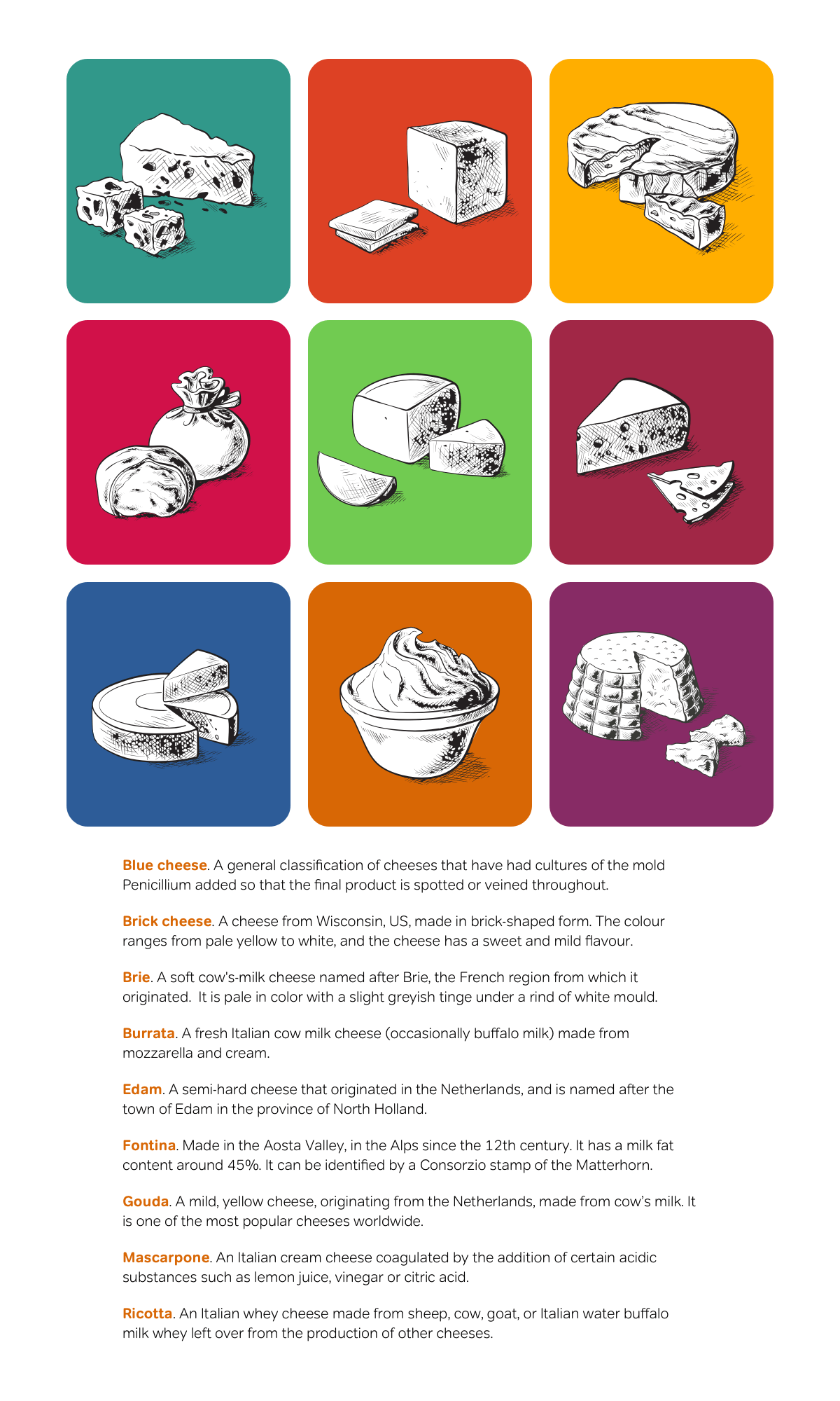
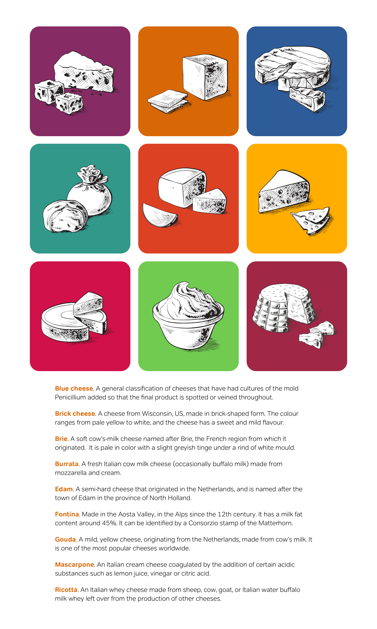
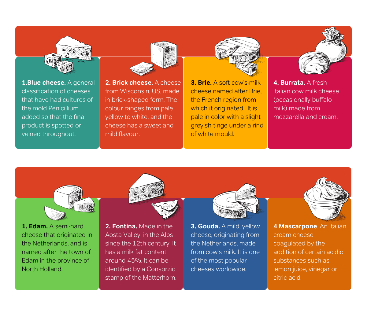
Here’s the inspiration for the design I’m implementing first. It’s from a recommended products feature in a magazine. This design could be used for an interface element, even a more attractive way to display products on an e-commerce website.

The HTML I need to implement this design is about as simple as it can get. I need only one unordered list. Each list item contains a heading, an anchor, image, plus a paragraph of text. Ordered and unordered lists are two of the most flexible HTML elements, and you can use them to present a wide variety of content:
<ul>
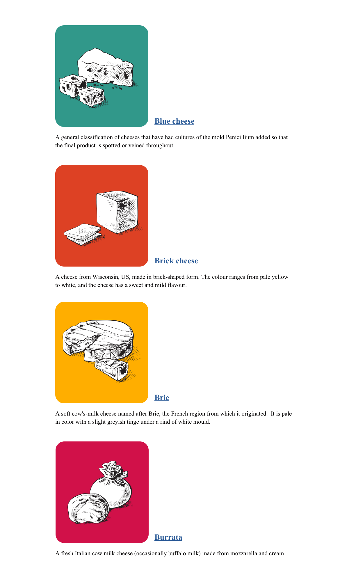
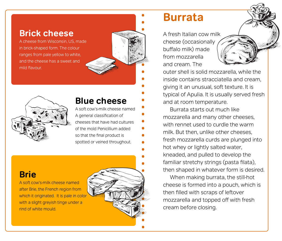
<li id="blue">
<h3><a href="#blue">
<img src="blue.png" alt="Blue cheese">Blue cheese</a></h3>
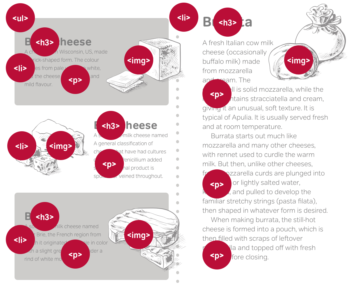
<p>A general classification of cheeses that have had cultures of the mold Penicillium added so that the final product is spotted or veined throughout.</p>
</li>
<li id="brick">
<h3><a href="#brick">
<img src="brick.png" alt="Brick cheese">Brick cheese</a></h3>
<p>A cheese from Wisconsin, US, made in brick-shaped form. The colour ranges from pale yellow to white, and the cheese has a sweet and mild flavour.</p>
</li>
<li id="blue">
<h3><a href="#brie">
<img src="brie.png" alt="Brie">Brie</a></h3>
<p>A soft cow’s milk cheese named after Brie, the French region from which it originated. It is pale in color with a slight greyish tinge under a rind of white mould.</p>
</li>
</ul>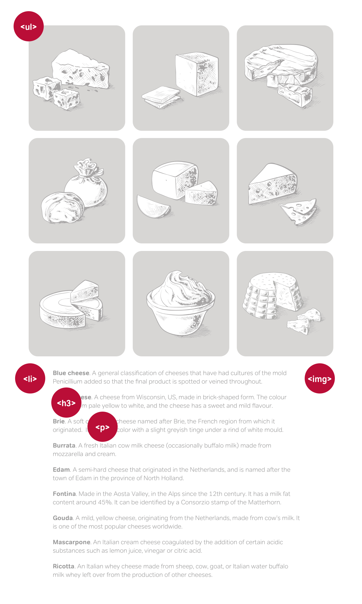
Before writing CSS, it’s always useful to look at a page “naked.” This checks whether a page is structured correctly and how it might appear to someone who’ll experience it without styles.
Set the stage by fixing a width of 500px and centring the <body> element. This is also an excellent time to apply colour and typography styles:
body {
margin: 0 auto;
width: 500px;
background-color: #fff;
font: 72%/1.6 Verdana, sans-serif;
color: #000; }This design relies on absolute positioning, which removes the images from the normal flow of the document and places them at the top of the viewport. To position those images absolutely, first establish the unordered list as a positioning context for its illustrations by applying position: relative with no offsets. This element will remain in its calculated place in the normal flow:
ul {
position : relative; }
My grid of images 500px tall, so clear a 520px space at the top of the unordered list to allow for them, plus space above the content which follows. To demonstrate this, I’ve added a dotted border where images will appear:
ul {
padding-top: 520px; }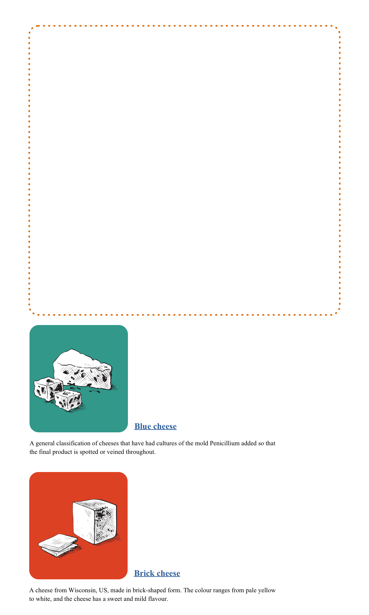
Absolute positioning
Whereas CSS positioning was the backbone in many early CSS layout techniques, designers have mostly replaced positioning with floats. This is unfortunate, as positioning is one of the most useful CSS properties. There are four positioning values:
Relative: Better described as offsetting, relative positioning moves an element from where it would usually appear in normal flow. For example, a top offset of 1em moves an element up and leaves a space where the element would have been before offsetting it.
Absolute: Positions an element according to its closest positioned ancestor element. Where there is no positioned ancestor, an absolutely positioned element takes its position from the root element.
Fixed: Always positioned to the viewport and stays in position even when a page scrolls. Fixed positioning is a type of absolute positioning.
Static: An element’s default position in the normal flow. This value is really only useful for overriding any previous positioning value.
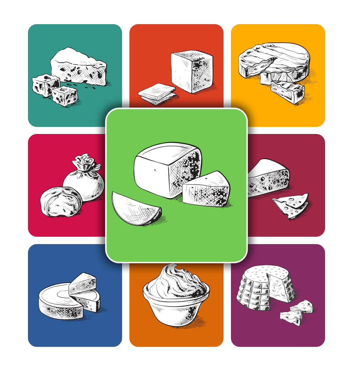
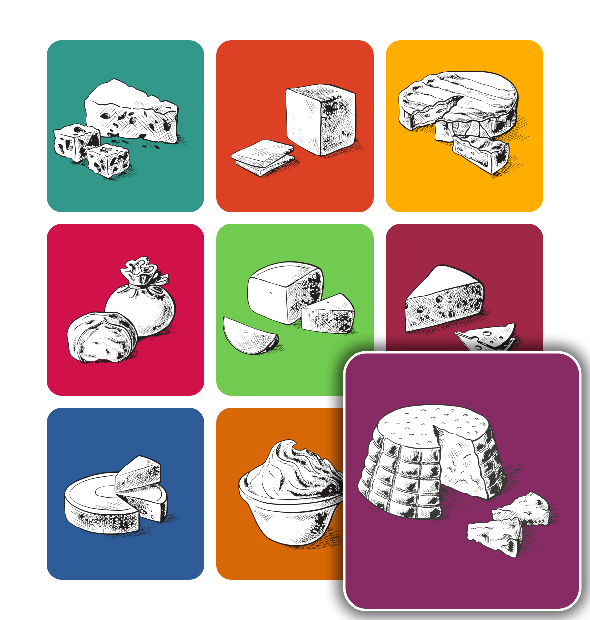
To implement this design, I use absolute positioning to remove my images from their place in the normal flow, and reposition them in the space created by that padding. First, I apply position: absolute to every image, then add top and left values for each image individually:
img {
position : absolute; }
#blue img { top: 0; left: 0; }
#brick img { top: 0; left: 170px; }
#brie img { top: 0; left: 340px; }
#burrata img { top: 170px; left: 0; }
#edam img { top: 170px; left: 170px; }
#fontina img { top: 170px; left: 340px; }
#gouda img { top: 340px; left: 0; }
#mascarpone img { top: 340px; left: 170px; }
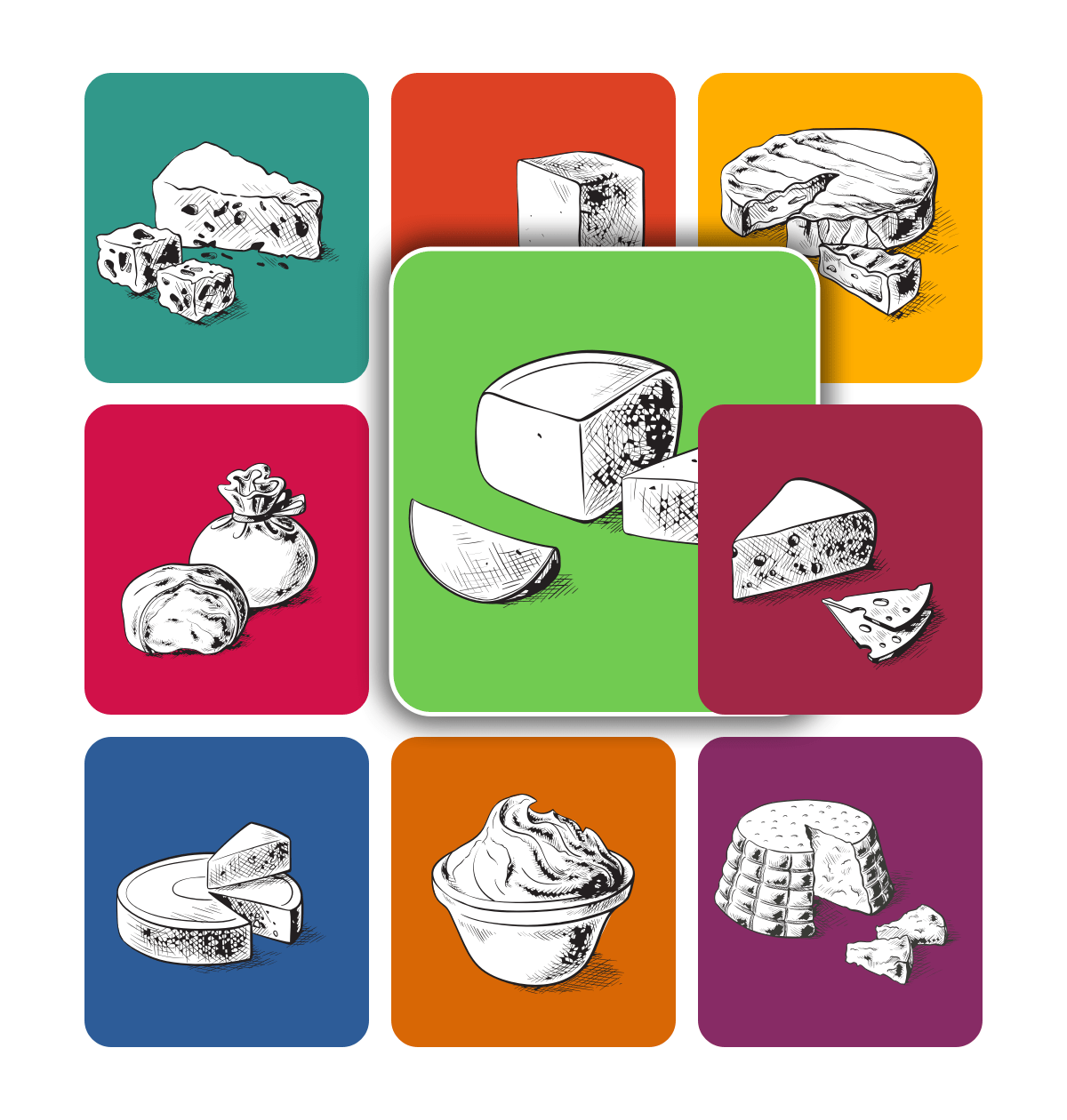
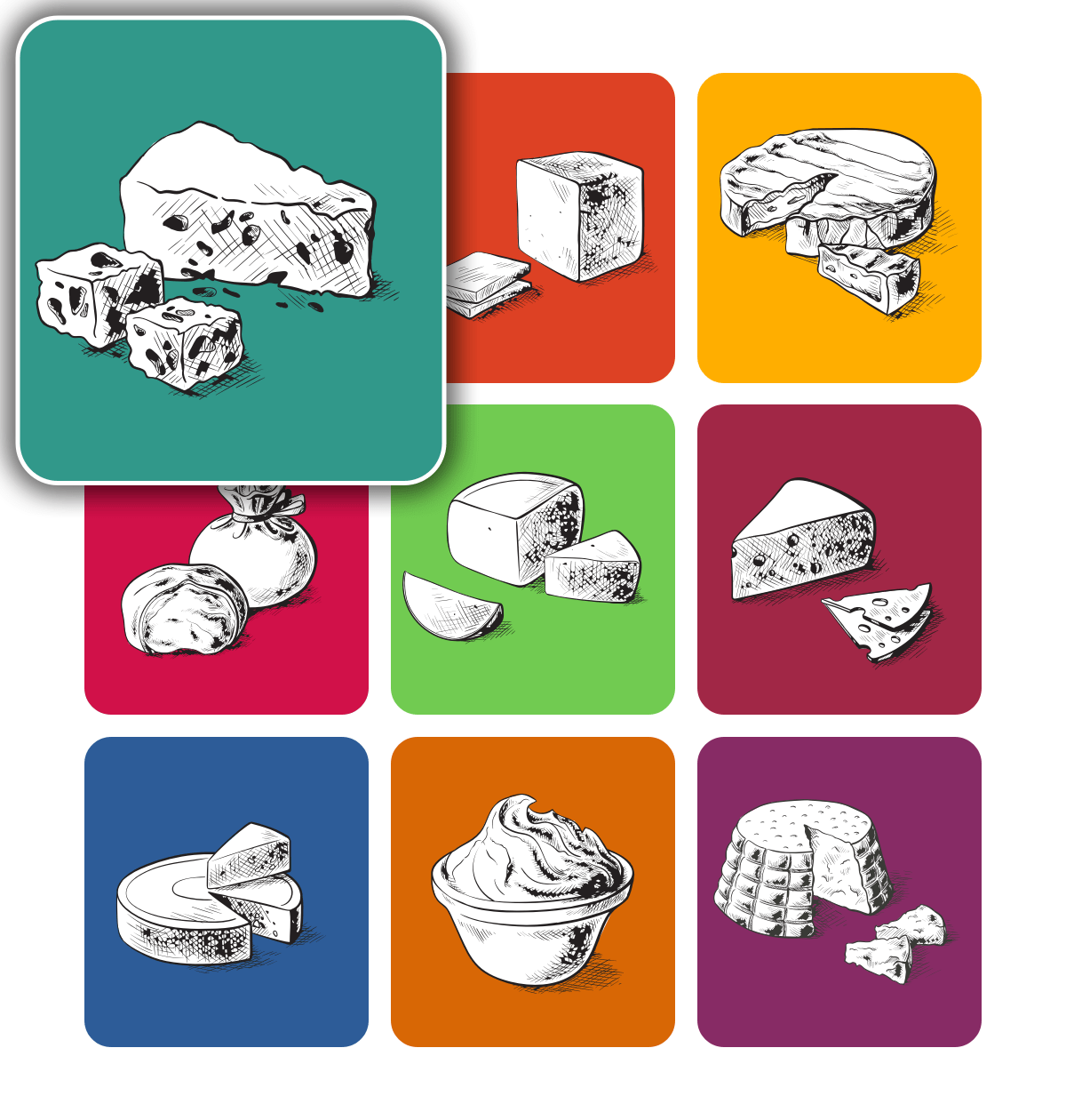
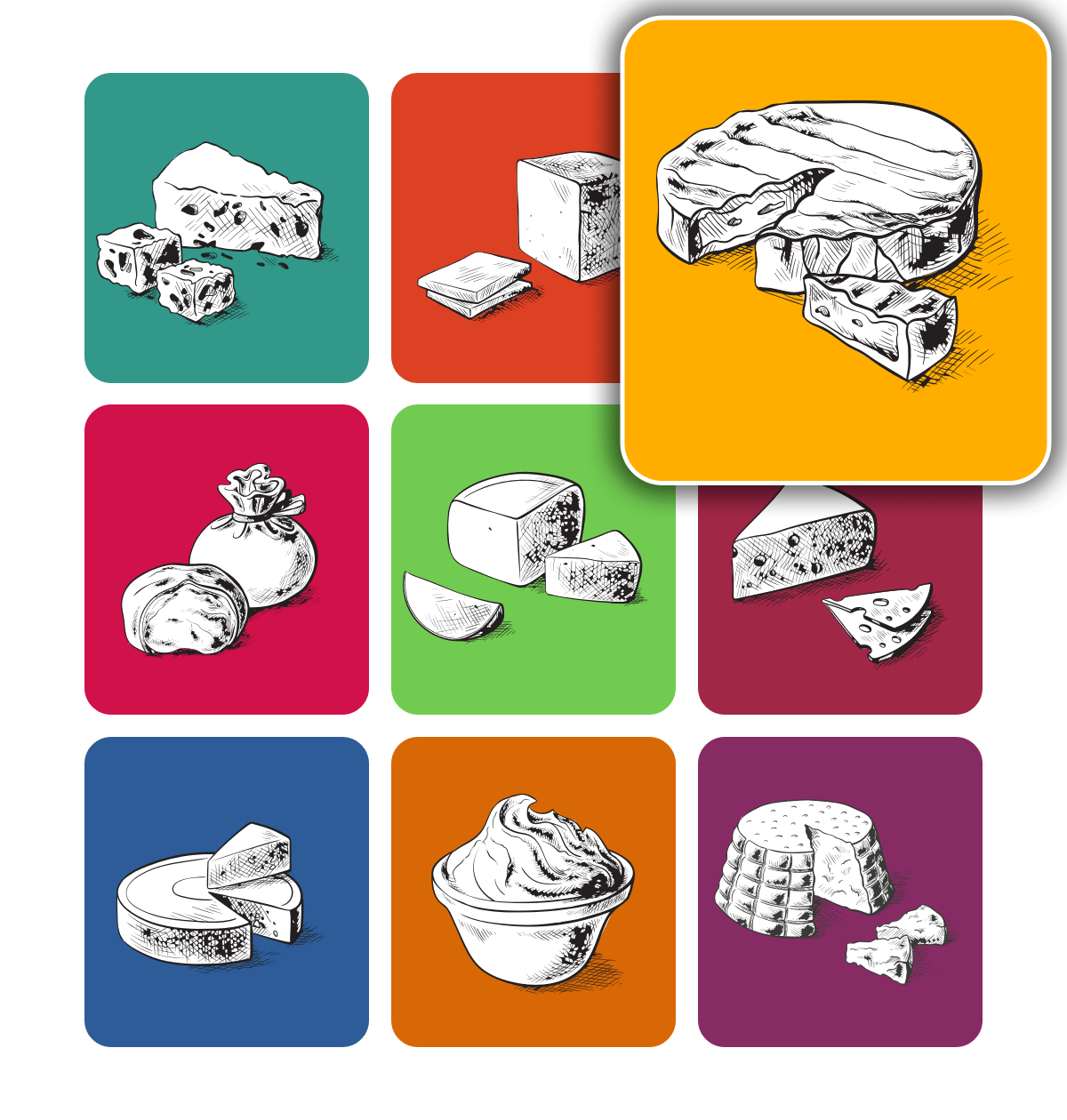
#ricotta img { top: 340px; left: 340px; }Apply a unique background colour to each image using the same attribute values:
#blue img { background-color: #31988A; }
#brick img { background-color: #dd4124; }
#brie img { background-color: #ffae00; }
#burrata img { background-color: #d11149; }
#edam img { background-color: #71cb51; }
#fontina img { background-color: #a12746; }
#gouda img { background-color: #2D5c98; }
#mascarpone img { background-color: #d86705; }
#ricotta img { background-color: #872b65; }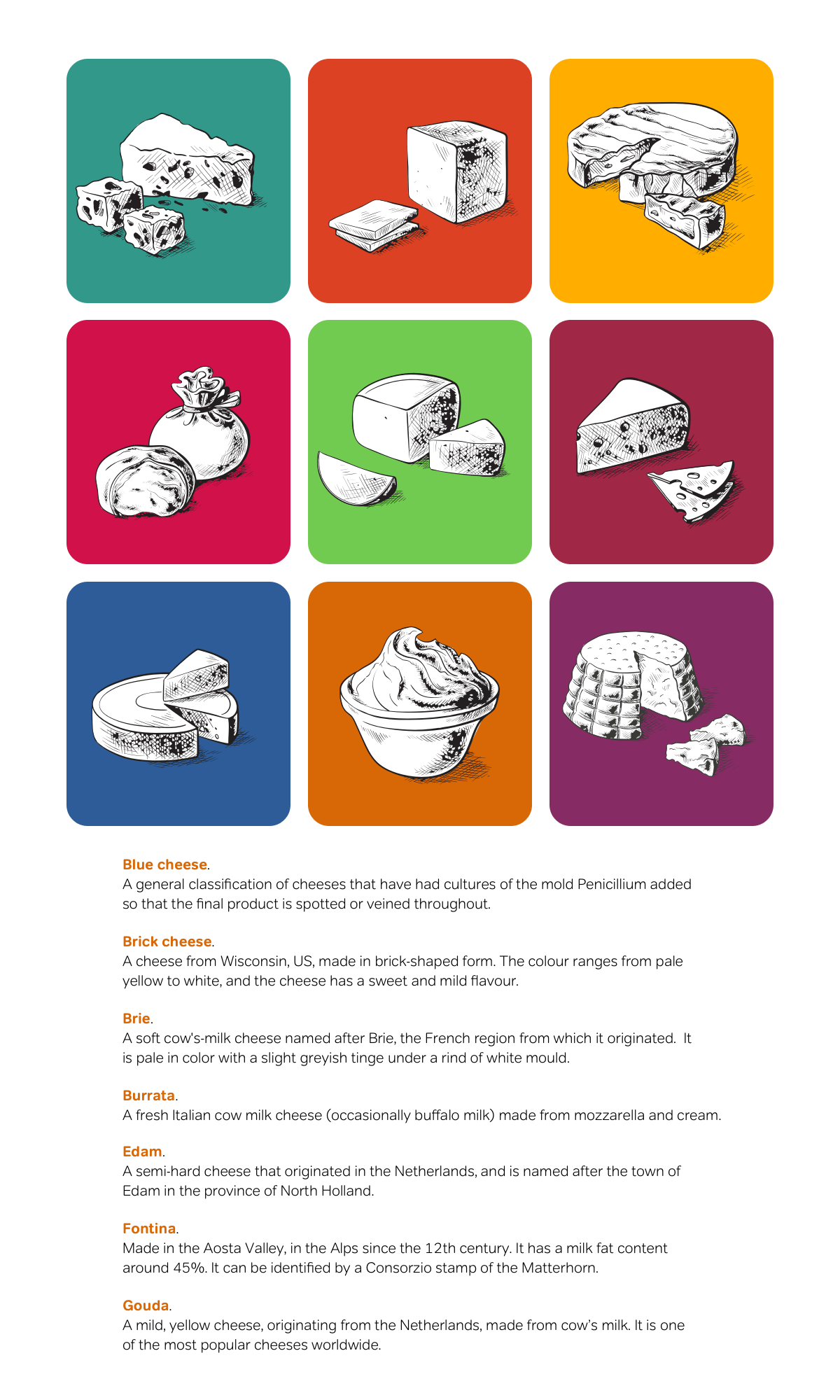
One of the most significant differences between designing for the web and print page is being able to make designs dynamic. Add a hover effect by replacing that background colour with white and adding an orange outline. You may not have used the outline property before, because of its patchy browser support. Drawn outside a border and on top of a box, outline does not affect the dimensions of a box:
a:hover img { outline : 5px solid #DD4124; }Interactive effects needn’t end with hover states. In the HTML, each image is inside an anchor, so put that to use with a :target pseudo-class:
<li id="blue">
<h3><a href="#blue">
<img src="blue.png" alt="Blue cheese">Blue cheese</a></h3>
<p>A general classification of cheeses that have had cultures of the mold Penicillium added so that the final product is spotted or veined throughout.</p>
</li>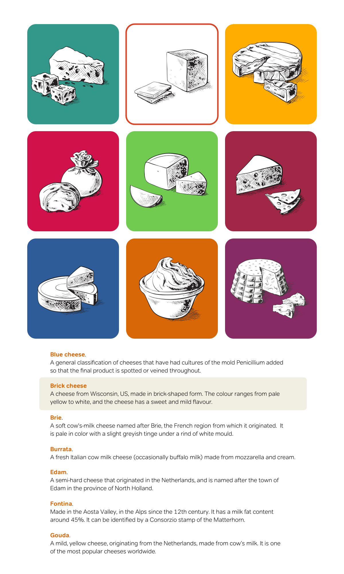
When someone presses a link, they’ll be taken to the parent list item. Highlight this targeted list item with a different background colour:
li:target { background-color: #F1EFE2; }I’m sure there will always be debates over which HTML elements are most appropriate for content like this. Some people might agree with me that unordered list items containing headings, images, and paragraphs are best. Others might argue the case for a definition list. What matters most is thinking hard about the choice of elements and being able to justify those decisions.
Magnify sidebar images
This technique is so flexible it can be used in many places, including a sidebar. This sidebar needs only a few changes to the CSS I wrote earlier. As flexible widths are often preferable to fixed widths, this time, my content fills 80% of the viewport width:
body {
width: 80%;
margin: 0 auto;
padding: 40px 0;
background-color: #fff;
font: 72%/1.6 Verdana, sans-serif;
color: #000; }
To develop my sidebar, I float the unordered list left and add styles which implement this new design. This includes a background colour and space for positioning my images:
ul {
position: relative;
float: left;
width: 500px;
margin-right: 20px;
padding: 500px 10px 10px ;
background-color: #f1efe2; }The images in my grid will be displayed at 160x160px, but I’ll need a larger size of 320x320px to maintain image quality when they’re magnified:
img {
width: 160px;
height: 160px; }
I place my images onto a grid using absolute positioning:
img {

position : absolute; }

#blue img { top: 10px; left: 10px; }
#brick img { top: 10px; left: 115px; }
#brie img { top: 10px; left: 220px; }
#burrata img { top: 115px; left: 10px; }
#edam img { top: 115px; left: 115px; }
#fontina img { top: 115px; left: 220px; }
#gouda img { top: 220px; left: 10px; }
#mascarpone img { top: 220px; left: 115px; }
#ricotta img { top: 220px; left: 220px; }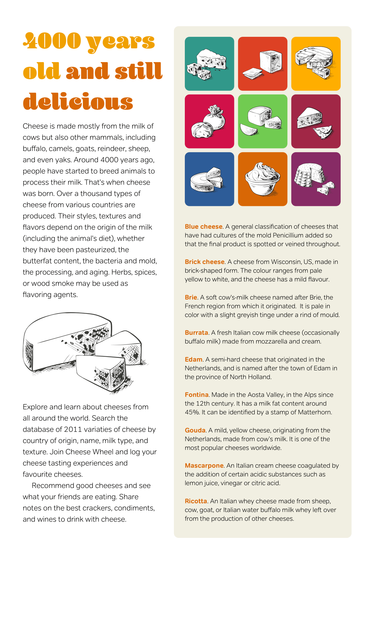
Image magnifying effect
An image magnifier turns my grid of pictures into an interactive component in this design. I use a dynamic pseudo-class selector which changes the size of my images when someone hovers over them:
a:hover img {
width: 320px;
height: 320px; }
This CSS should be all that’s needed to create my image magnifier, but there’s a problem because each magnified image will appear behind those which follow in the HTML order.
To bring my magnified images to the foreground, I add a low z-index value to all images in my grid, then replace that with a higher value when someone hovers over them:
img {
z-index: 1; }

a:hover img {
z-index: 2; }Preview the effect in a web browser and see the image magnifier in action.
Example 2: Relative positioning
One of the most important principles of Transcending CSS is separating the semantics in HTML from the presentation in CSS. My next design—which was inspired by a design element I found in a fashion magazine—has a very similar HTML structure to the previous example. This design again includes an unordered list, where list items contain headings, images, and paragraphs.
This component could be used in a variety of contexts, including editorial, e-commerce, and web applications.
This flexible layout expands to fill to 90% of the viewport width, and the min-width property ensures it will never shrink below 770px:
body {
width: 90%;
min-width: 770px;
margin: 0 auto;
background-color: #fff;
font: 88%/1.4 Verdana, sans-serif;
color: #333; }
I apply relative positioning without offsets to the unordered list to develop it into a positioning context for its absolutely positioned descendants:
ul { position : relative; }Then, I add an orange border plus a dotted background image in the centre of the list:
ul {
border : 2px solid #d86705;
background-image : url(dotted.png);
background-repeat: repeat-y;
background-position: 50% 0; }
Each item will fill half the width of this unordered list. I select each item using its id attribute and add background and foreground colours:
li {
position: relative;
width: 50%; }

#brick {
background: #dd4124;
color: #fff; }

#blue {
background: #fff;
color: #000; }

#brie {
background: #ffae00;
color: #000; }

#burrata {
position: absolute;
top: 0;
right: 0; }
To add movement to this otherwise highly structured design, I use a combination of CSS positioning and transparent images. These images escape their containers which gives my design a more organic look. I start by applying padding and margins to add white space around these paragraphs:
p {
margin: 0 10px;
padding-bottom: 10px; }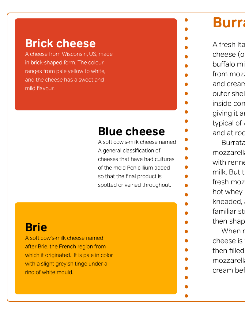
I add padding to these paragraphs, which provides space for my positioned images:
#brick p {
margin-right: 0;
padding-right: 100px; }

#blue p {
margin-right: 0;
padding-left: 150px; }

#brie p {
margin-right: 0;
padding-right: 100px; }

#barrata p {
margin: 0 30px 10px 30px; }
I can now position my pictures into the space created by that padding:
li img {
position: absolute; }

#brick img {
right: -50px; }

#blue img {
left: 0; }

#brie img {
right: -50px; }

#brie img {
right: -50px; }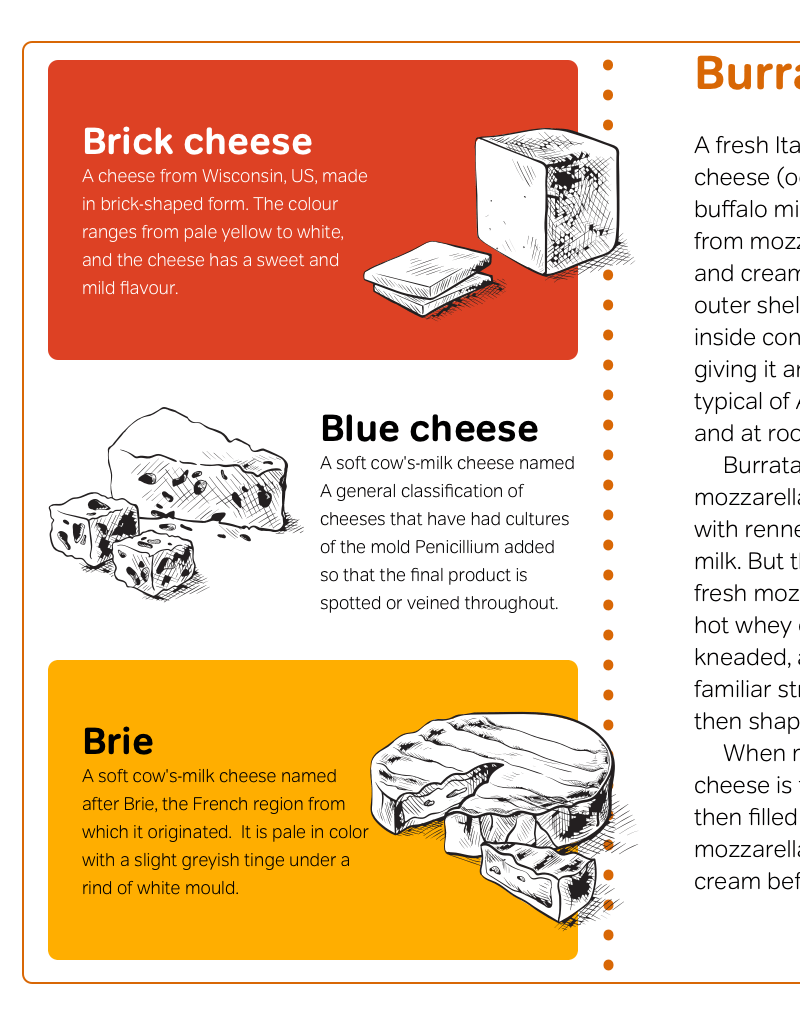
The burrata image need special treatment, so I float it right, which allows text to flow around it:
#burrata img {
float: right; }
Using relative positioning offsets this image from its place in the normal flow and moves it outside its parent element:
#burrata img {
position: relative;
top: -30px;
right: -50px; }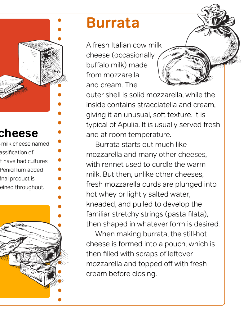
With a good knowledge of CSS positioning, you should have greater confidence to transform even the most meaningful and minimal HTML into distinctive designs which engage and inspire.
Example 3: Floating
Here’s the inspiration for the design I’m implementing next. It’s from a product list in a Sunday magazine and could be used to display products on an e-commerce website more imaginatively.
I start implementing this design by applying foundation styles, including background and foreground colours, and typography:
body {
background-color: #fff;
font: 82%/1.4 Calibri, Verdana, sans-serif;
color: #333; }
Many lists display products in no particular order, and so an unordered list is the most appropriate HTML element. The items in this design are listed in order, which means an ordered list is the most appropriate. First, I define the width of my ordered list up to a maximum of 92% of its parent element and down to a minimum width of 960px:
ol {
width: 92%;
min-width: 950px;
margin: 0 auto;
border-top: 100px solid #D86705; }Next, I float each list item, and because there are four items in each list, I set a width of 25% for each:
li {
float: left;
width: 25%; }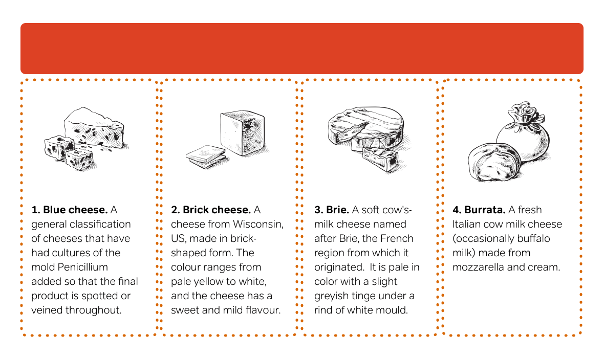
To implement this design, I use attribute selectors instead of conventional id or class selectors. Attribute selectors offer ways to style elements based on whether they have an attribute or the value of that attribute. I also use child selectors which provide the ability to style elements based on their parent element. I use both selector types to give my list items their own distinctive background colours:
li[id="blue"] {
background-color: #31988a; }

li[id="brick"] {
background-color: #dd4124; }

li[id="brie"] {
background-color: #ffae00;
color: #000; }

li[id="burrata"] {
background-color: #d11149; }
By offsetting these images using negative positioning values and margins, I enable my content to occupy the space my images leave behind:
img {
position: relative;
top: -75px;
margin-bottom: -75px; }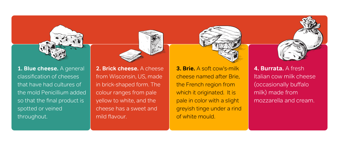
Dean Edwards’s IE7 scripts
In 2005, and with Internet Explorer development stalled at version 6, designers had grown increasingly frustrated by Microsoft’s. So Dean Edwards—a UK-based developer with a server in his kitchen and a passion for standards and scripting–decided to use Javascript to enable support for more modern selectors in Internet Explorer. Dean‘s IE7 scripts enable Adjacent sibling selectors, attribute value selectors, child selectors, :first-child, :last-child, :only-child, and :nth-child, structural pseudo-classes, plus :before and :after generated content. Dean‘s scripts also enable :hover, :active, and :focus dynamic pseudo-classes on all elements, and make fixed positioning possible. They also enable support for PNG alpha-transparency.
I can modify this layout in many different ways without making changes to my HTML. For example, I might float my images left and use relative positioning to place them between my list items:
li {
position: relative; }

img {
float: left;
position: relative;
top: -75px;
left: -50px;
margin-right: -50px; }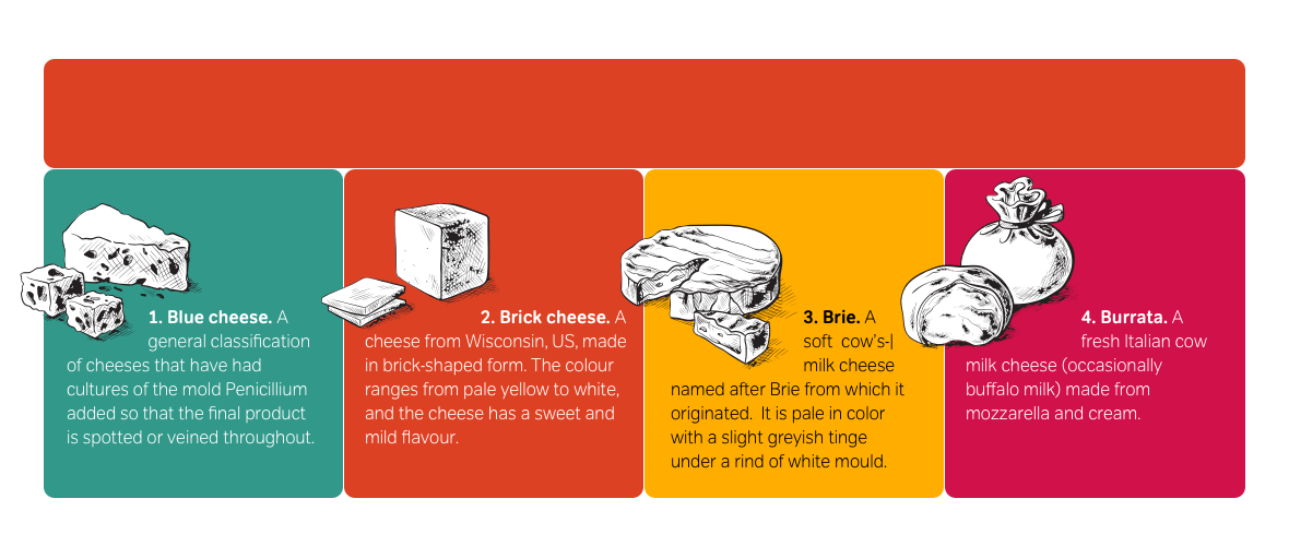
Developing a sidebar
I can quickly transform that HTML into a sidebar. As I’ve done in the past, I start by applying foundation styles:
body {
background-color: #fff;
font: 92%/1.4 Verdana, sans-serif;
color: #000; }
Add 300px of top padding into which I can place a background image of my website’s logo:
ol {
float: right;
width: 400px;
padding-top: 300px;
background-image: url(logo.png)
background-position: 50% 0;
background-repeat: no-repeat; }
Use those attribute selectors one more time to style each list item with its own background and foreground colours:
li[id="blue"] {
background-color: #31988a; }

li[id="brick"] {
background-color: #dd4124; }

li[id="brie"] {
background-color: #ffae00;
color: #000; }

li[id="burrata"] {
background-color: #d11149; }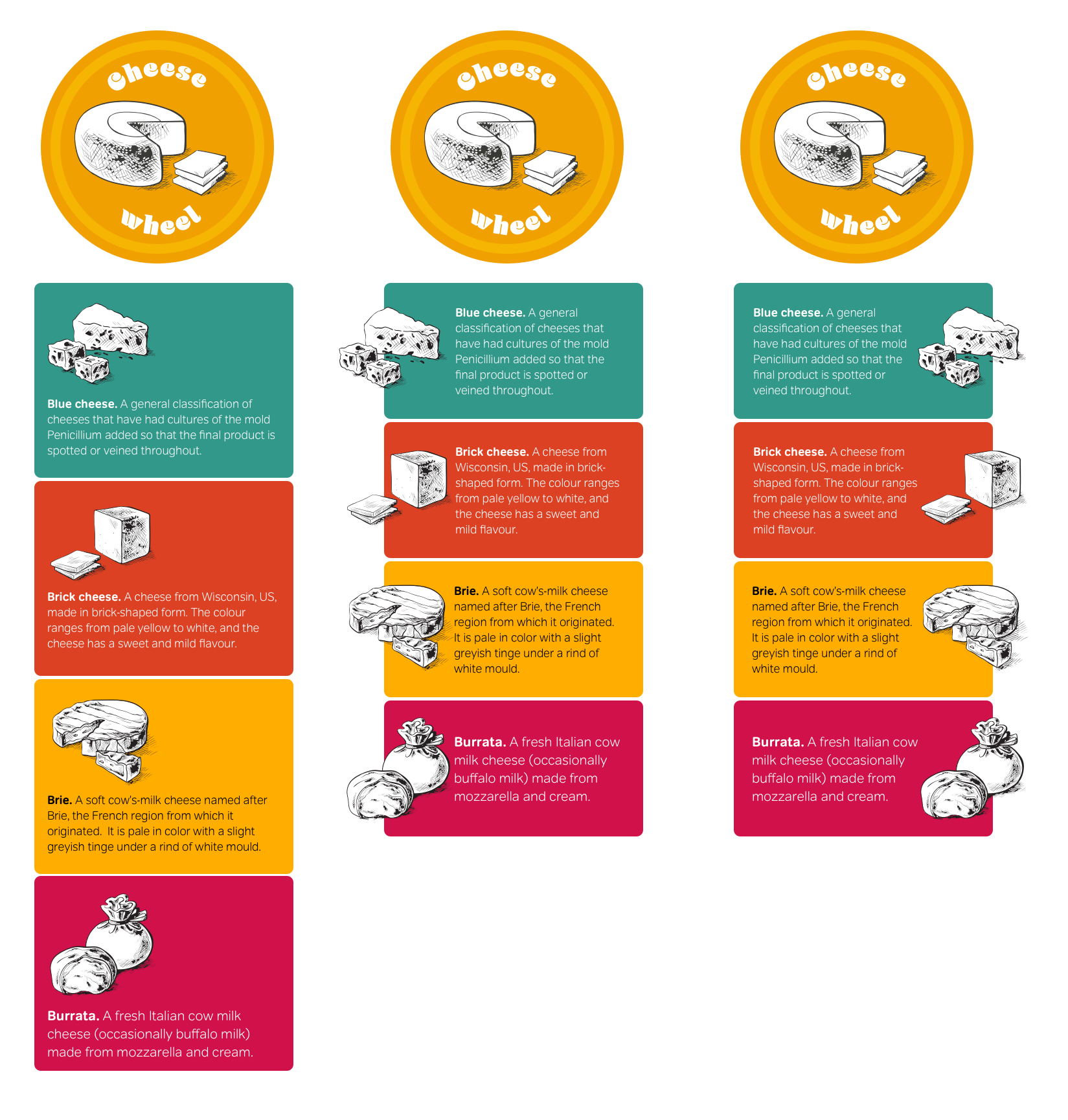
Note: Take care when using attribute selectors as they’re less specific than id and class selectors.
I relatively position and float these images, then use negative margins to enable neighbouring text to occupy the space created by their offsets:
img {
position: relative;
left: -50px;
float: left;
margin-right: -50px; }
With only a few minor changes to my CSS, I can place these images on the right to vary my design:
img {
position: relative;
right: -50px;
float: right;
margin-left: -50px; }
Example 4: Combining techniques
Why use floats or positioning alone when they can be combined to implement incredible designs from the most minimal HTML? This is a static design for my Cheese Wheel website. I aim to to develop a flexible layout which adapts to wider window widths and allows people to increase the size of text without affecting the design.
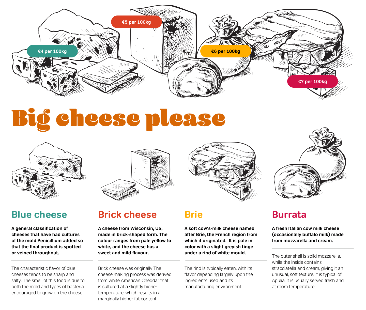
This design appears to require multiple divisions—perhaps one for images at the top, possibly another for main content, and even more for my columns. But, remember my content-out approach to HTML, and think about what you see. To implement this design, I need only one division, a heading, and one unordered list. Similar to my earlier examples, each list item contains a heading, an image, and paragraphs of text:
<div id="content">
<h1>Big cheese please</h1>

<ul>
<li id="blue">
<h1>Blue cheese <span>€4 per kg</span></h1>
<p> <a href="#blue"><img src="blue" alt=""></a>
A general classification of cheeses that have had cultures of the mold Penicillium added so that the final product is spotted or veined throughout.</p>
<p>The characteristic flavor of blue cheeses tends to be sharp and salty. The smell of this food is due to both the mold and types of bacteria encouraged to grow on the cheese.</p>
</li>
</ul>

</div>The key to implementing this design with so little markup is thinking beyond the conventional rows-and-columns approach to development. Using positioning, it‘s possible to place an element anywhere on a page. I’ll again start by applying foundation styles plus
position: relative; without offsets to set the content division as a positioning context for its positioned descendants:
body {
width: 80%;
min-width: 800px;
margin: 0 auto;
background-color: #fff;
font: 88%/1.4 Verdana, sans-serif;
color: #000; }

#content {
position: relative; }
To create columns from the items in my unordered list, I give them a width of 25%, then float them left:
ul {
overflow: hidden; }

li {
float: left;
width: 25%; }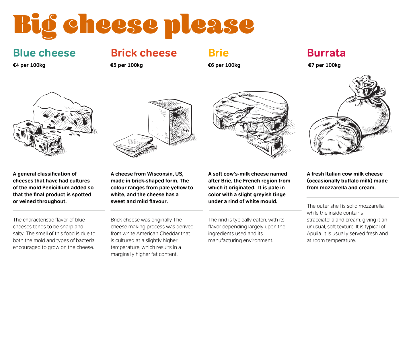
Did you notice that earlier I applied overflow: hidden; to my unordered list? I did this because when floating all child elements within a parent, any height is removed from that parent. In the past, many designers added breaks and divisions to act as clearing elements. These presentational elements should never be included in a semantic document, as there are other ways to resolve this issue. One of the simplest—and my preferred solution—is to use the overflow property. Peter-Paul Koch has written a detailed explanation of clearing floats without structural markup.
With the list items now appearing as columns, I can add a unique background image to each:
li {
background-repeat: no-repeat;
background-position: 50% 0; }

#blue {
background-image: url(blue.png); }

#brick {
background-image: url(brick.png); }

#brie {
background-image: url(brie.png); }

#burrata {
background-image: url(burrata.png); }
Because these background images are 350px tall, I create space for them by adding 350px top padding to each list item:
li {
padding-top: 350px;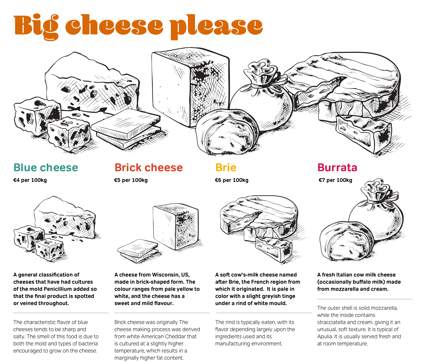
It‘s common for websites to include horizontal banners. While these often look attractive, they rarely contain useful features. To make mastheads more interactive, add navigation and other functionality which people will find helpful. This design is shaping up, but there’s still more I can do. My next task is to develop a banner at the top of my page:
li img {
position: absolute;
top: 0; }

#blue img {
left : 0; }

#brick img {
left : 200px; }

#brie img {
left : 400px; }

#burrata img {
left : 600px; }By now, I hope you realise the creative opportunities which positioning offers everything from a full-page layout to the smallest design details. One of these details will add extra interest and interactivity to my design. Do you remember that each of my headings contains the price of a kilo of cheese? That price was marked up using a <span> element:
<ul>
<li id="blue">
<h1>Blue cheese <span>€4 per kg</span></h1>
<p><a href="blue"><img src="blue" alt=""></a>
A general classification of cheeses that have had cultures of the mold Penicillium added so that the final product is spotted or veined throughout.</p>
<p>The characteristic flavor of blue cheeses tends to be sharp and salty. The smell of this food is due to both the mold and types of bacteria encouraged to grow on the cheese.</p>
</li>
</ul>
Note: The :target pseudo-class is currently supported only by Apple Safari, Firefox, and OmniWeb. People using Internet Explorer or Opera will be unaware this interactive feature in my design exists, but Mark Wubben (Wayback Machine URL) has developed a JavaScript solution to emulate this pseudo-class in Internet Explorer.
Look again at my static visual. The prices appear not next to the name of the cheese but at the top of the page and above my images:
h1 span {
position : absolute;
z-index : 2;
padding : 15px 20px;
font : bold 52% Verdana, sans-serif;
text-align : center; }I place each price in front of the relevant pictures. I help my prices stand out by giving them vibrant background colours:
#blue h1 span {
top : 100px;
left : -50px;
background-color: #31988a; }

#brick h1 span {
top : 50px;
left : 220px;
background-color: #dd4124; }

#brie h1 span {
top : 100px;
left : 440px;
background-color: #ffae00;
color: #0b1016; }

#burrata h1 span {
top : 150px;
left : 780px;
background-color: #a12746; }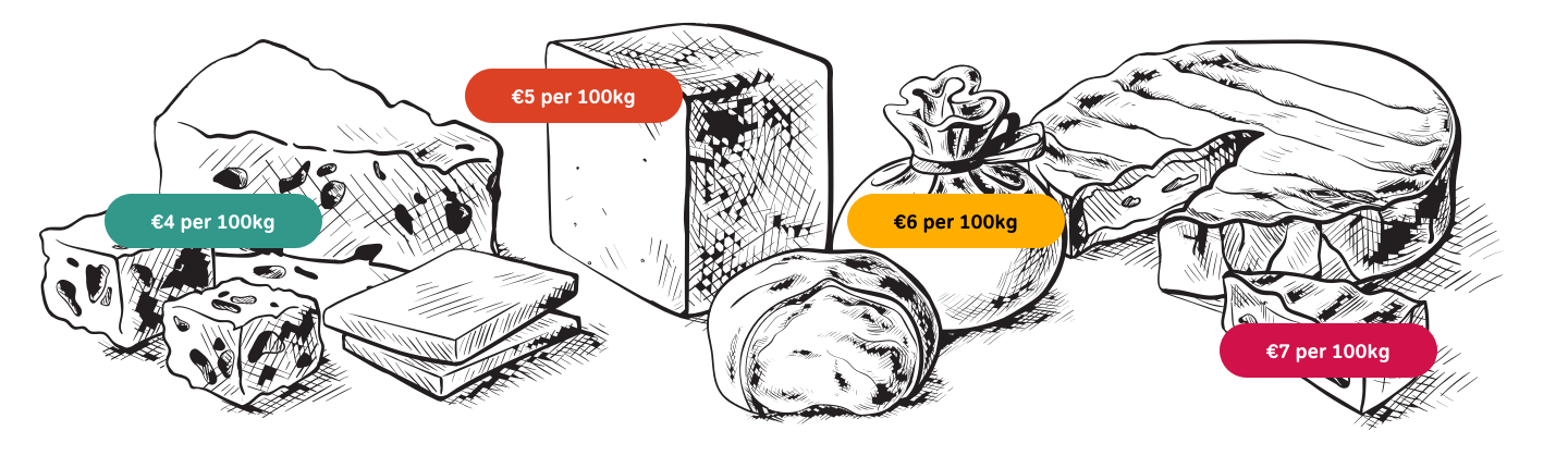
Now the lights have dimmed. The orchestra is playing, and the fat lady is on her way to the stage. If the prospect of listening to an opera which lasts several days has little appeal, don’t head for the bar. CSS3 is about to take you on a ride far more exciting than The Valkyries. In the next chapter, I’ll teach you about CSS3 and many of the new features it brings to website design.