
Last year, I went to the Tate Modern art gallery in London with a web designer friend. Browsing shelves in Tate’s bookshop, I was surprised that my friend rarely looks beyond the web for his design inspiration. Instead, he keeps bookmarks of sites he admires because of their layout, navigation, and other design elements. While we were munching a muffin in the gallery café and musing over what he told me, I realised my friend might not be alone in his approach.
Mood boards
Interior designers use mood boards to bring inspirational images, ideas, and materials together on a board to see how they work in combination. An interior designer might ask, “Are you looking for a modern, high-tech look—stripped floors, minimal décor, and shiny surfaces? Or do you want for a softer look with warm colours and soft textures?” Mood boards ask clients to think about how they want their room to feel, and the impact that colour, lighting, and texture with have on it. I always bring clients into my design process, and mood boards have proved to be a helpful tool for web design too.
What gets pasted to a mood board can come from almost anywhere. When the goal is a high-tech look, a mood board might contain adverts for shiny cars, or pictures of high-tech gadgets and brushed steel appliances cut from magazines. Even giant silver robots from 1950s sci-fi movies might find their way onto a mood board too.
If the aim is for a softer look, the mood board might be filled with pictures of cottage gardens, pastel paint charts, or cotton fabrics. Encourage people to make marks on the board using oil pastels to see how well colours and textures work together.
Scrapbooks
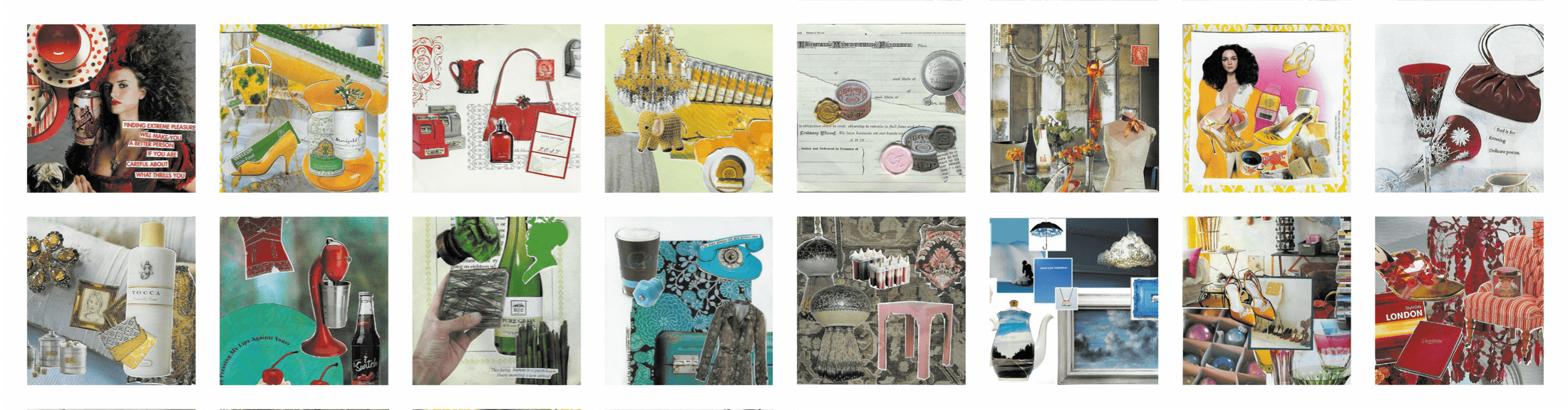
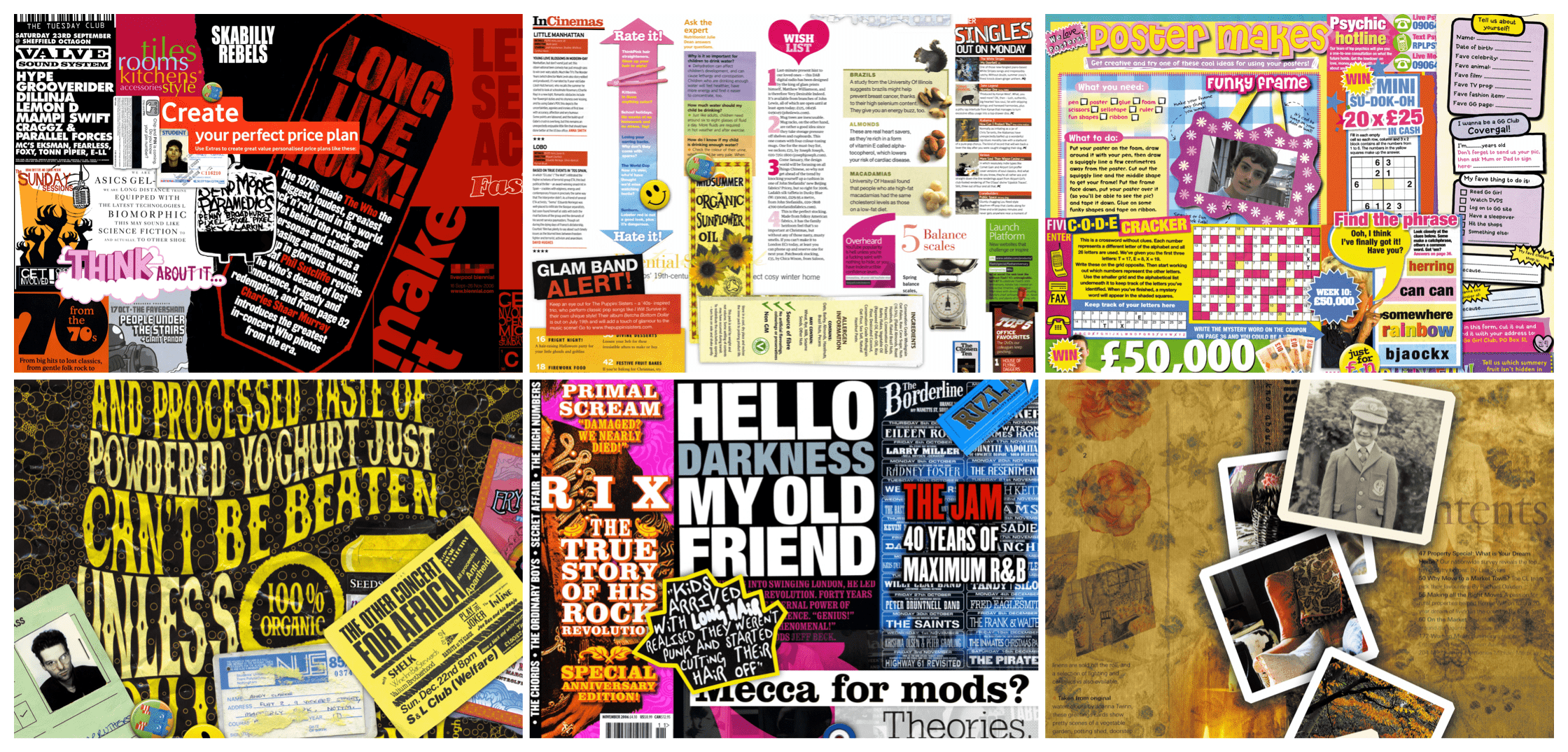
 Although I obsessed more about the sharpness of my pencils than I did scrapbooks while at art-school, I now keep paper scrapbooks which are full of cuttings from magazines and newspapers, postcards, and even old chocolate wrappers. I paste in anything which catches my eye because of exciting colours, shapes, or typography.
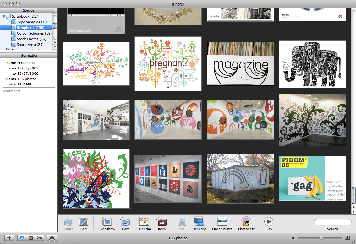
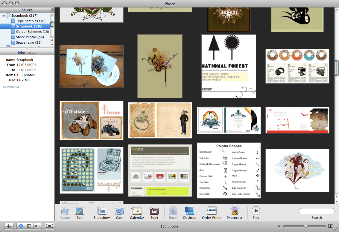
 The habit of keeping paper design scrapbooks is less common among Web designers than it is among traditional graphic designers. If paper, tape, or glue sounds too messy for you, then you do have less sticky alternatives. For example, Jon Hicks stores scans of his design ideas, paper sketches, and found inspirational type styles in Apple iPhoto folders. You could do the same in the photo storage application you use.
I prefer keeping a paper scrapbook instead of a folder on my computer because the often accidental combinations of random items can spark unexpected ideas. Mixing cuttings from broadsheets newspapers with snippets from comics or teenage magazines can lead to something surprising. This rarely happens when I store files in folders on a computer.
Inspiration
Next time you’re at the supermarket or in line for twenty Rothmans at your local newsagent, pick up a magazine at random. Don’t worry too much about the subject or the looks you may get from fellow customers; pick it up and flick through its pages.
Whatever you find yourself reading, you’ll almost always find an interesting idea for the design of an interface element. It might be a form on a puzzle page or a distinctive design for a sidebar. If you don’t feel like buying a copy of a celebrity tittle tattler, don’t despair, you can get magazine inspiration for free.
Once the inspiration bug has bitten you, tearing pages from magazines in a doctors’ waiting room can become a habit. If my kleptomania raises eyebrows from fellow patients, saying, “It’s OK, I’m a designer” keeps tutting noises to a minimum. Wherever you magazines, studying their page designs—from contents pages to the small ads—will inspire you to think differently about your designs.
Newspapers and magazines aren’t only great places to look for layout inspiration, they can be a fantastic source of typography inspiration too. But inspiration for type isn’t only found in print, it’s all around you. Whether you’re filling your supermarket trolley with everyday essentials or flipping CDs in a music store, you’ll find hundreds of typography ideas in one store alone. Plus, if you’re an enthusiastic scrapbook collector junky and chocolate eater like me, pasting empty wrappers into a scrapbook often creates interesting juxtapositions of typography styles.
Inspiring typography and lettering styles are all around us every day. Walk out your front door, and your eyes will fall on typography inspiration within minutes. There is always something interesting to find in the designs of advertising, posters, and signage, especially when they’ve been altered by wind and rain and have developed personalities all their own.
Tip: Andy Hume wrote a comprehensive guide to “The Anatomy of Web Fonts.”
sIFR for fine typography on the web
Typography has long been a source of frustration for web designers. The lack of choice of reliable fonts installed consistently across operating systems has meant little progress has been made in rich typography on the web. Over the past few years, designers have been working to overcome this limitation by developing new ways to allow for more creative typography. sIFR—scalable Inman Flash Replacement—enables richer typography with its combination of CSS, JavaScript, and Macromedia Flash.
sIFR enables the embedding of any font by including it within a Flash file. Flash has been heavily criticised for its lack of accessibility, but sIFR combines Flash with semantic HTML to preserve the semantics, structure, and accessibility of a document. sIFR enhances a design but leaves HTML untouched, maintaining accessibility and having a positive impact on search engine optimisation.
sIFR is particularly useful for styling headlines. JavaScript parses the content of a page, looking for the specific class or id attributes for replacement. The sIFR script extracts content from these elements and then creates a Flash file using any typeface. The Flash file is placed over the original content which helps maintain accessibility. sIFR is an elegant solution which combines standards-based HTML with Flash and degrades well. When either JavaScript or Flash is unavailable, people see HTML text styled with CSS.
Read about the background to sIFR by Mike Davidson.
Revisiting Flash
Flash designs have been rightly criticised for long download times, poor general usability, and lack of accessibility. Standards-aware designers have dismissed Flash and concentrated instead on CSS. CSS galleries multiplied because designers were hungry for both inspiration and examples of good CSS design. In the process, galleries including CSS Beauty (Wayback Machine URL) concentrated on design trends and techniques such as dark colour schemes or flexible layouts. Sites like Stylegala (Wayback Machine URL) grew to include articles and forums for discussing designs.
Outside the CSS world, Flash has continued to be a force in design, and many graphic design showcases are made almost entirely in Flash. Flash mostly frees designers from the constraints of HTML tables and CSS boxes. Flash liberates designers from browser compatibility problems and the typographical limitations of standard fonts. It provides a playground for creative ideas, so it’s no wonder so many designers still choose to work with Flash.
Many Flash designs could quickly be developed using HTML and CSS—albeit without slick motion effects and interactivity—so look outside CSS design galleries to see what’s being created elsewhere in the industry.
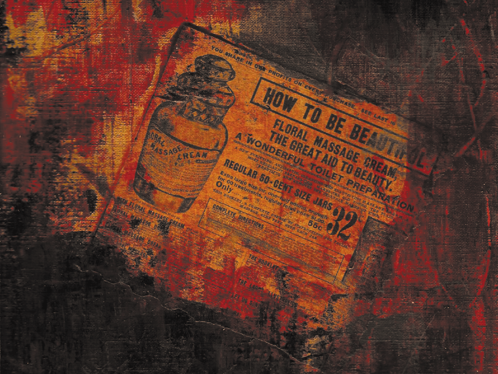
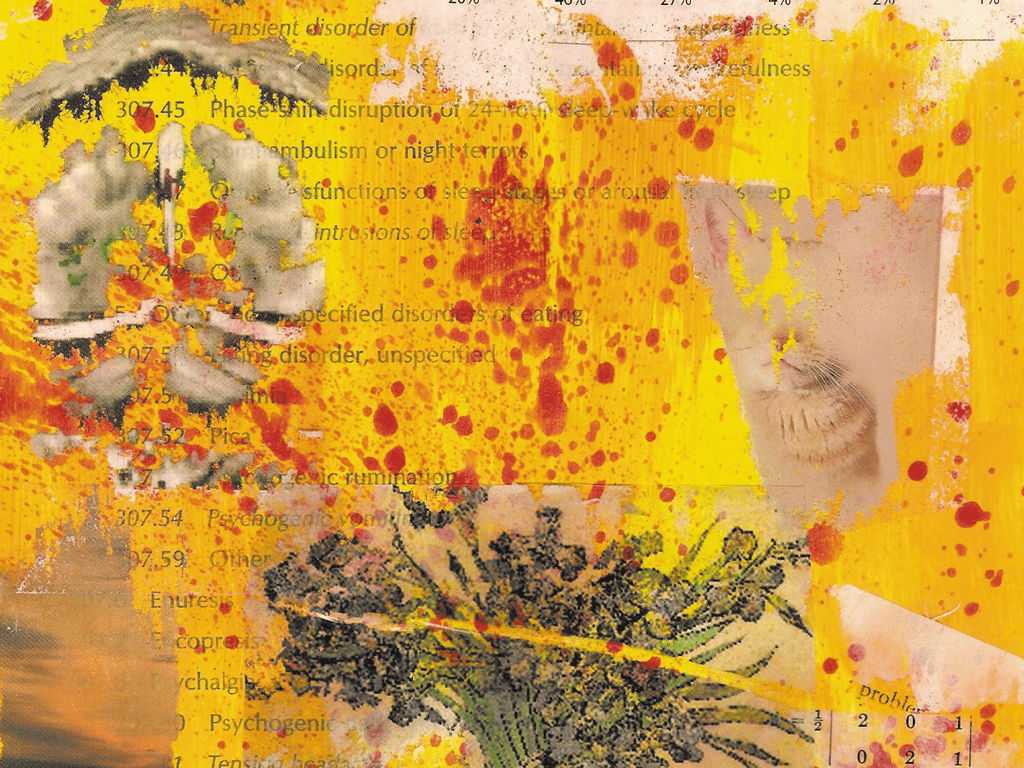
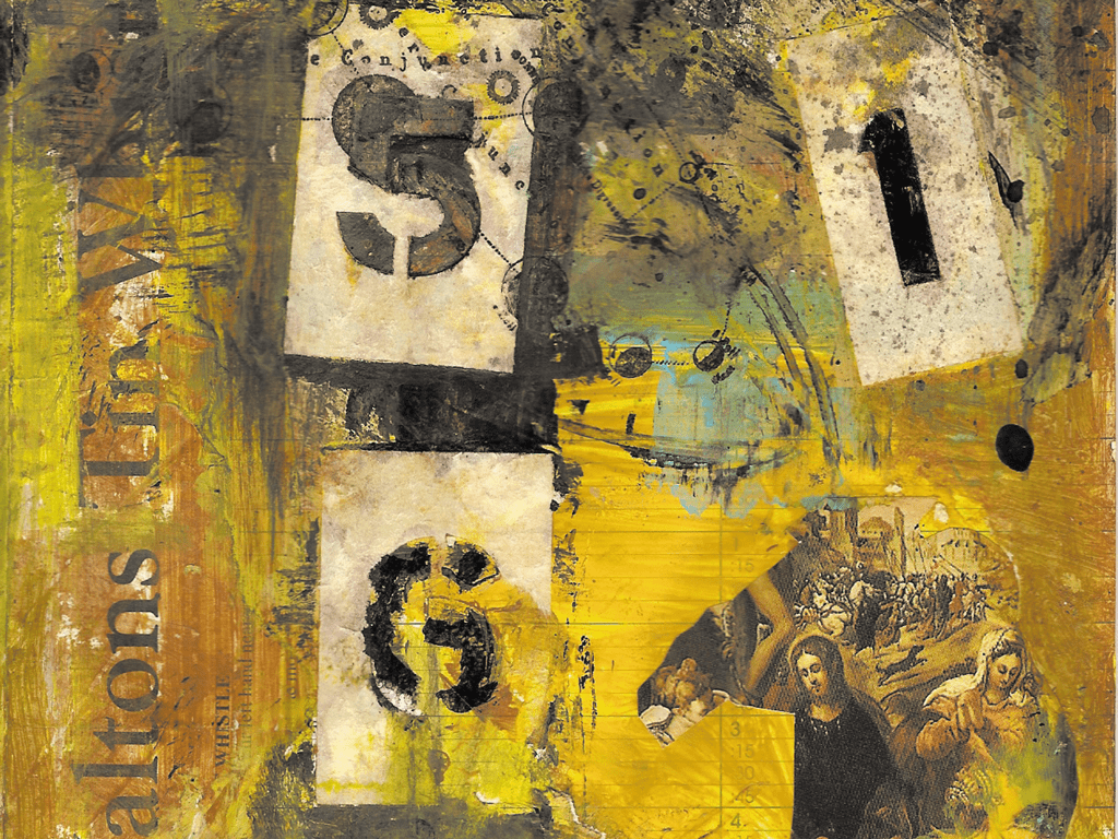
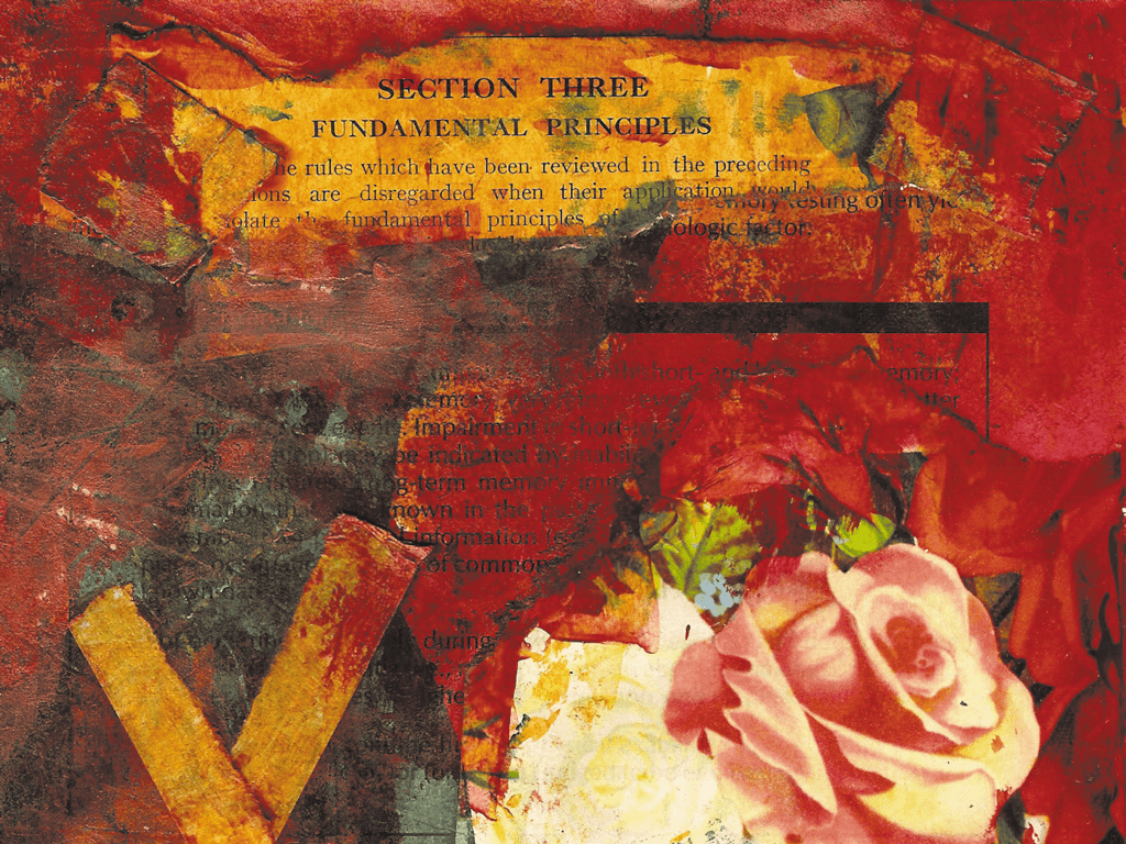
Photo inspiration
Photographs are a fabulous place to look for colour and layout inspiration, so thank heavens for the inventors of digital cameras and the clever people who invented free photo storage and sharing services like Flickr and Yahoo! Photos.
To find unexpected combinations of images, search for terms like “red”, “grid”, or “shiny”, rather than for specific topics. Because its many thousands of contributors update Flickr constantly, even waiting a few minutes will give you a totally new set of inspiring results.
It wasn’t so many years ago that the photography process was complicated, inconvenient, and expensive. It involved the choice of: “Do I buy a 24-shot or a 36-shot film?’ This was followed by the agony of indecision: “Should I take another shot in case the last one won’t come out?” Then, after an encounter with the white-coated teenager in charge of an automatic-processing machine, it involved the disappointment of finding only three photos were worth saving.
Tip: Many people using Flickr share their photos freely but always check for copyright and Creative Commons licenses. Flickr lets you search within a particular Creative Commons license, including those which allow for reuse without permission or attribution.
Colour palettes from photographs
I often find inspiration for my colour palettes in photographs, and one of my favourite techniques creates a selection of complimentary tones from just one or two sampled colours. I love Macromedia Fireworks, but you can adapt this technique to your favourite application:
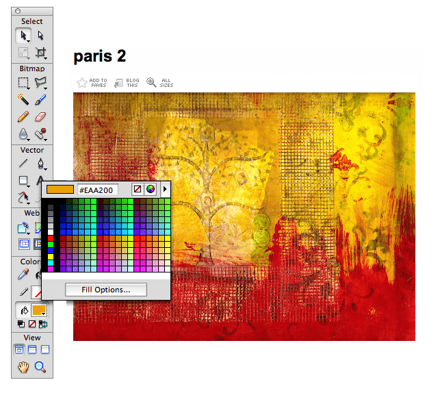

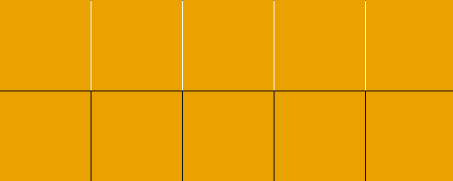
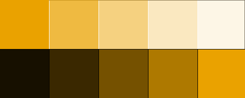
The changes in opacity allow progressively more of the base colour to show through these squares and will create ten tones from a single colour.
Note: If you prefer a more automated way to use my technique, Steve Chipman created a JavaScript Colour Palette Creator.
Focus on more than technology
So many discussions about web standards and design revolve around technologies like HTML, CSS, and JavaScript. These conversations are meaningful because developing and sharing new ideas and techniques benefits everyone. The fact these conversations have focused on technology isn‘t surprising as designers and developers have experienced fundamental changes while moving from using old-fashioned to standards-based methods. But, technology should only part of the story and not an end in itself. Remove beautiful design, and all that’s left is machine code.
CSS hasn’t revolutionized web design. The reason lies not with the technology (which is revolutionary), but with the designers using it. Most designers have simply swapped the old technology (tables and font tags) for the new technology, without fully exploring what’s so completely new.
Jeremy Keith, The unpushed envelope
It’s easy to think that design is making attractive interfaces, but it’s is more than that. Design should also be about evoking feelings and emotions in people who visit a website. Create the right mood and people are far more likely to engage with your website, no matter how much Ajax it contains. Design conveys brand values which is are important as usability. A well-crafted design provides a framework for interaction, not the other way around.
To design and develop websites which offer the best experiences for customers, designers and developers should find ways to work more closely together, to understand each other’s roles and have a better appreciation for everyone’s contributions. Here are a few exercises which will help broaden your creative horizons. If you’re a developer more at home in the command-line tool, you might be thinking about skipping to the next part where you will learn about CSS selectors. Don’t do that, as there’s plenty that developers can gain from learning about the creative process. Experienced designers shouldn’t fast-forward either, as it never hurts to recharge creative batteries and gain a new perspective.
Inspiration finding
Your first task is to collect materials for a mood board you can show to a client before starting a design. This client is launching a new, high-tech kitchen gadget, and the brief uses words like “shiny.” When collecting materials for a mood board, you won’t have to go far as there is a wealth of inspiration at home. Collect inspiration from everyday items, then paste them onto a mood board in unusual combinations to get unexpected results.
If you have a stack of magazines piling up in the corner, start with them. The more varied your reading material, the better. You might find advertisements for other shiny kitchen appliances or shiny cars which have been lit to show off their. Look for examples with reflective surfaces or where colours are muted to give a minimal, high-tech feel.
Where better to look for inspiration for a shiny new appliance than in the kitchen? Raid kitchen cupboards and drawers and dig out any shiny packaging you can find. Chocolate bars and crisp packets can be colourful and reflective. Open the wrappers and eat the contents. These wrappers will stick to a mood board much easier without their contents inside. If you don§’t feel like gaining a few pounds, ask someone else eat them for you.
Aluminium foil is excellent for roasting chickens, and it can also be crumpled, then smoothed, to make some incredible reflective patterns. Stick foil to a mood board and look at how it reflects the room around you and other elements on the mood board. These combinations of images and materials can spark new ideas, and mood boards can sometimes even become a piece of art.
Different perspectives
When I started art school, the first few weeks were different from anything I’d experienced before. Whereas during high-school, art lessons emphasised technique and passing an exam, at art school, we were encouraged to unlearn much of what we had been taught. The emphasis was on thinking differently, and early weeks involved activities designed to help us break from old-school thinking.
One of the first activities unsuspecting students were asked to do—and one I still love inflicting on unsuspecting conference audiences—involved standing on a chair or table to gain a different perspective on the space around us. If you don’t feel like attracting strange looks from work colleagues or passengers on a bus, look at the world around you in other ways which will cause much less embarrassment.
Just like the town or city you live in, the web will have become a familiar place, and many websites now look similar. When we see something regularly enough, we become desensitised to it, and if you walk around your town or city, you’ll already be familiar with most of its landmarks. You might hardly notice the fronts of office buildings, banks, cafés, and shops you see every day.

On your next journey, take your eyes off your newspaper or iPod and look around for things which are different. These don’t need to be additions to the urban landscape, they might be new to you because you haven’t seen them before. If you live in most parts of Europe or in much of the central and eastern United States, many buildings will less than a century old. Where I live, many older buildings have survived both World wars and overzealous urban planners in the 1960s. In one form or another, they retain their original character. At ground level, many of these older buildings have been redeveloped into modern shop fronts or offices with large areas of glass and modern signage. But, up above, you’ll often still see glimpses of a building’s past.
Gain a different perspective by climbing the fire escape to the roof of your building or lying down on a bench and looking up at the buildings around you. You will see a different view of what you thought was so familiar. Many towns and cities have a wealth of architectural history only a few feet above eye level. This might include old stonework or windows, which can be easily missed. Next time you’re travelling around where you live, look up above eye level to gain a different perspective on what you thought you knew. (Just be sure to keep half an eye on where you’re going to avoid walking into a lamppost.
Many sights in an urban environment can inspire new ideas. Look at grid designs in buildings for new ideas for website layouts. The proportions of buildings from different angles may inspire you to take a different direction. Where a building grid has been softened by nature, you might be inspired to make designs which have a more organic feel. All it takes to find inspiration is to go looking. When you find something new or interesting which inspires you, upload photographs of it so you can inspire others.
Scrapbook goals
I always look for inspiration without an end result in mind. Keep an open mind to what you see around you, and you won”t be limited by how useful an item might be. However, sometimes you’ll need to look for something specific, and you will set out to find that special something.
If you’re as bored as I am with the standard design of many e-commerce websites, start looking at the hundreds of ways products are presented in magazines and think about how those designs could be adapted for the web. Magazine contents pages can also inspire ways to display content on a homepage. Every element is there. Summaries and links to pages inside a magazine, featured stories, or even a letter from the editor which can become a company’s message to customers. Pages so full of content and links are helpful to readers and can enhance search engine visibility.
Merely copying a design from one medium to another will never achieve the benefits of that new medium. The web is not print, and a contents page is not a homepage, but looking at other media can help breath new life into even the most common website design. The sidebar, found on many websites can easily benefit from print design techniques. Images which escape from columns are familiar in print design and can add a more organic feel to websites, avoiding layouts which look boxy. Even form elements can be given a fresh look by adding details which may have been inspired by a teenage magazine’s puzzle page.
It can be a liberating experience to look differently at the elements you use every day. With today’s techniques and web technologies, there are fewer restrictions on creatively than ever before.
The Fine Art of Web Design
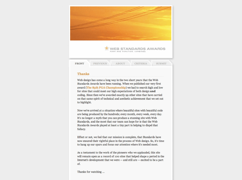
In these three chapters, I’ve shown you the importance of looking at both new and established media, then bring their proven ideas to the web. I’ve also taught you how to breathe new life to designs without being preoccupied with the constraints of legacy browsers. Thousands of websites today rely on CSS. So much so, that some experienced designers now wonder if there is still more to learn. Cameron Adams, the co-founder of the Web Standards Awards (Wayback Machine URL) gallery website, wrote about closing his gallery:
Now we’ve arrived at a situation where beautiful sites with beautiful code are being produced by the hundreds; every month, every week, every day. It’s no longer a myth that you can produce a stunning site with Web standards. We feel that our mission is complete, that standards have now ensured their rightful place in the process of Web design. So, it’s time to hang up our spurs.
Cameron Adams, Thanks (Wayback Machine URL)
Should we accept that we have taken CSS design as far as it can? Are we prepared to think there’s no more we can do? I believe we are still much we can learn and do to make website design match the creativity of print and other media. The web is still very young, and despite what usability experts like Jakob Nielsen might say, we haven’t yet learned all there is to know about designing for it. Jakob has said that we already know what good web design should look like and that comes from following rules; typically his rules. I’m not dismissing Jakob’s opinion, but I question his notion that just because people may be familiar with a design convention, that makes it correct.
Transcendance
Do we really know everything there is to know about what makes a good website design? Is Amazon the pinnacle of what can be achieved with e-commerce? Does Google’s anti-design mean search interfaces have reached their minimalist best?
Throughout the history of art, successive generations have rejected past conventions and invented new ways to challenge old thinking. Cubists, abstract expressionists, and pop artists looked at what went before, assimilated some ideas, and rejected others. They looked to the modern world for inspiration and incorporated contemporary ideas to create exciting new work.
We should be making and breaking the rules as we learn more about the web and how people use it. Now isn’t the time to stop moving forward. The recent buzz over Web 2.0 assumes we learned from Web 1.0, but the web is far from a version 2; it’s barely out of beta. I see many past mistakes being repeated, this time with added gloss, big footers, rounded corners, and often inappropriate Ajax.
We must never forget the web is a creative medium and designers and developers shouldn’t focus solely on technologies. We should instead focus on business and creative goals, and only after that, think about technology. The world around us is a collage of inspiration, and the web is a collage of technologies. This is what makes web design a fine art.