Web designers have seen the benefits of standards-based HTML and CSS, and have mostly turned their backs on old-fashioned table-based techniques. They also recognise that to implement richer interfaces, they need more from CSS. Developing CSS specifications isn’t an easy or quick process. CSS properties must be backwards compatible and, at the same time, provide new features. Even getting to today’s CSS 2.1 specification hasn’t been easy.
The first CSS specification, CSS1, was published in 1996. Its successor, CSS2, was published less than two years later, and an updated CSS2.1 followed to address several errors and inconsistencies. CSS2.1 still remains—in 2006—a candidate recommendation despite many browsers supporting most of its features, and standards-savvy designers using it every day.
Work on CSS3 started in 2000, but the progress of the World Wide Web Consortium (W3C) seems painfully slow. For designers who realise CSS2.1 cannot easily accomplish the visually rich interfaces which modern websites require, watching the process of CSS3 has been maddening.
One significant difference between CSS3 and CSS 2.1 is that CSS3 is a modular specification, and the W3C’s CSS Working Group has split their work into separate modules. CSS3 modules are being worked on separately and are at different stages of completion. Browser vendors will choose which modules to support and when to implement them.
| Module name | Description |
|---|---|
| Selectors | New selectors will make targetting an element based on attributes and position in the document flow easier. New pseudo-classes and pseudo-elements will achieve better control over typography. |
| Paged Media | Focuses on styling documents for paper publishing and uses generated content to add footnotes, leaders, markers, and notes. |
| Backgrounds and borders | New ways to style backgrounds or borders. Includes the ability to attach multiple background images to a single element and use images in borders. |
| Multi-column layout | Designed to make it simpler to flow text into multiple columns without additional markup using column counts, gaps, and rules. |
| Advanced Layout | Designed to solve common layout problems by fully separating layout from content. |
| Media Queries | Extend the functionality of media types when used in combination with the width or height of a browser and even the aspect ratio of a screen. |
Some browser vendors have been reluctant to implement CSS3 until the specifications have been completed or there’s widespread demand to do so. However, some parts of CSS3 are already widely supported in some certain browsers, and we should take advantage of these new features today.
Note: You can read more about new CSS3 selectors in my A Tribute to Selectors and in Roger Johansson’s CSS3 Selectors Explained.
CSS3 offers several new technologies which enable designers to implement creative designs without presentational HTML. I don’t have enough pages in this book to cover every development in CSS3, so I’ve chosen to concentrate on what I think are the most exciting modules: selectors, background images, columns, and finally Advanced Layout, one of the most exciting developments to come from the CSS Working Group.
Striping with pseudo-classes
There are so many powerful new selectors in CSS3, knowing how and when to use them can be confusing. New selectors include:
- Attribute selectors
- Dynamic pseudo-class selectors
- Structural pseudo-class selectors
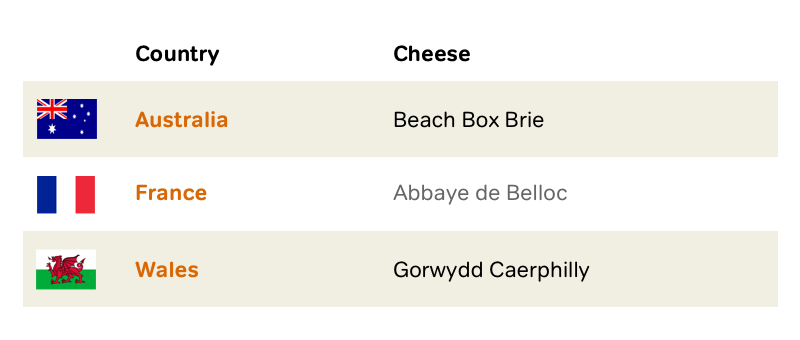
When you leave layout tables behind and use them just for presenting tabular information, their meaning is amplified. Tables often contain complex sets of data, so improve their readability, stripe alternate columns or rows by applying a different background or text colour.
In the past, this technique required presentational class attributes:
<table>
<thead>
<tr>
  <td scope="col">Country</td>
  <td scope="col">Cheese</td>
</tr>
</thead>

<tbody>

<tr class="odd">
  <th scope="row">Australia</th>
  <td>Beach Box Brie</td>
</tr>

<tr class="even">
  <th scope="row">France</th>
  <td>Abbaye de Belloc</td>
</tr>

<tr class="odd">
  <th scope="row">Wales</th>
  <td>Gorwydd Caerphilly</td>
</tr>

</tbody>
</table>
:nth-child pseudo-class
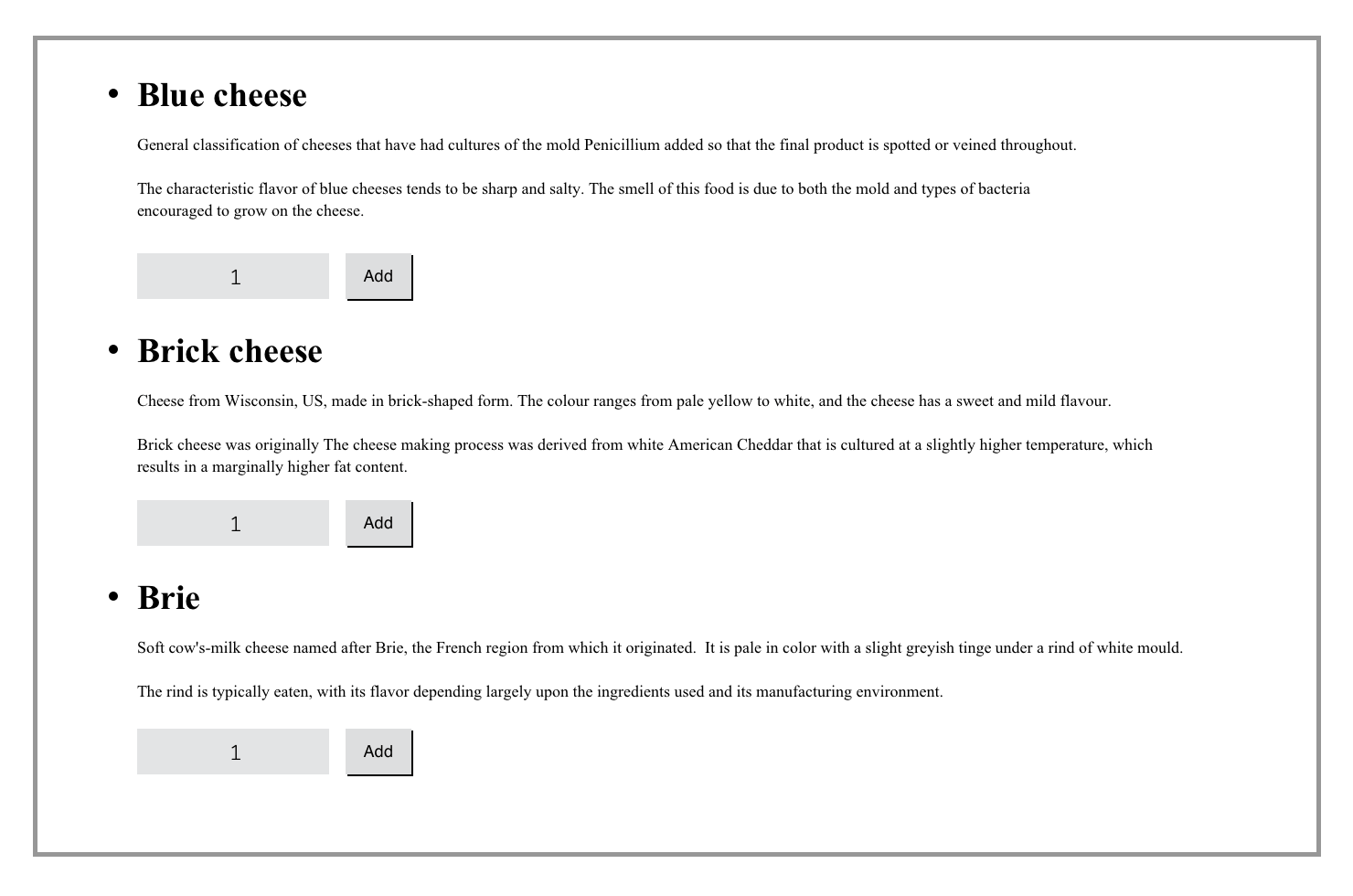
CSS3 provides an easy way to style alternate list items, table rows, and other elements in a series by using pseudo-classes. For example, I might implement a sidebar containing list items with alternating colours:
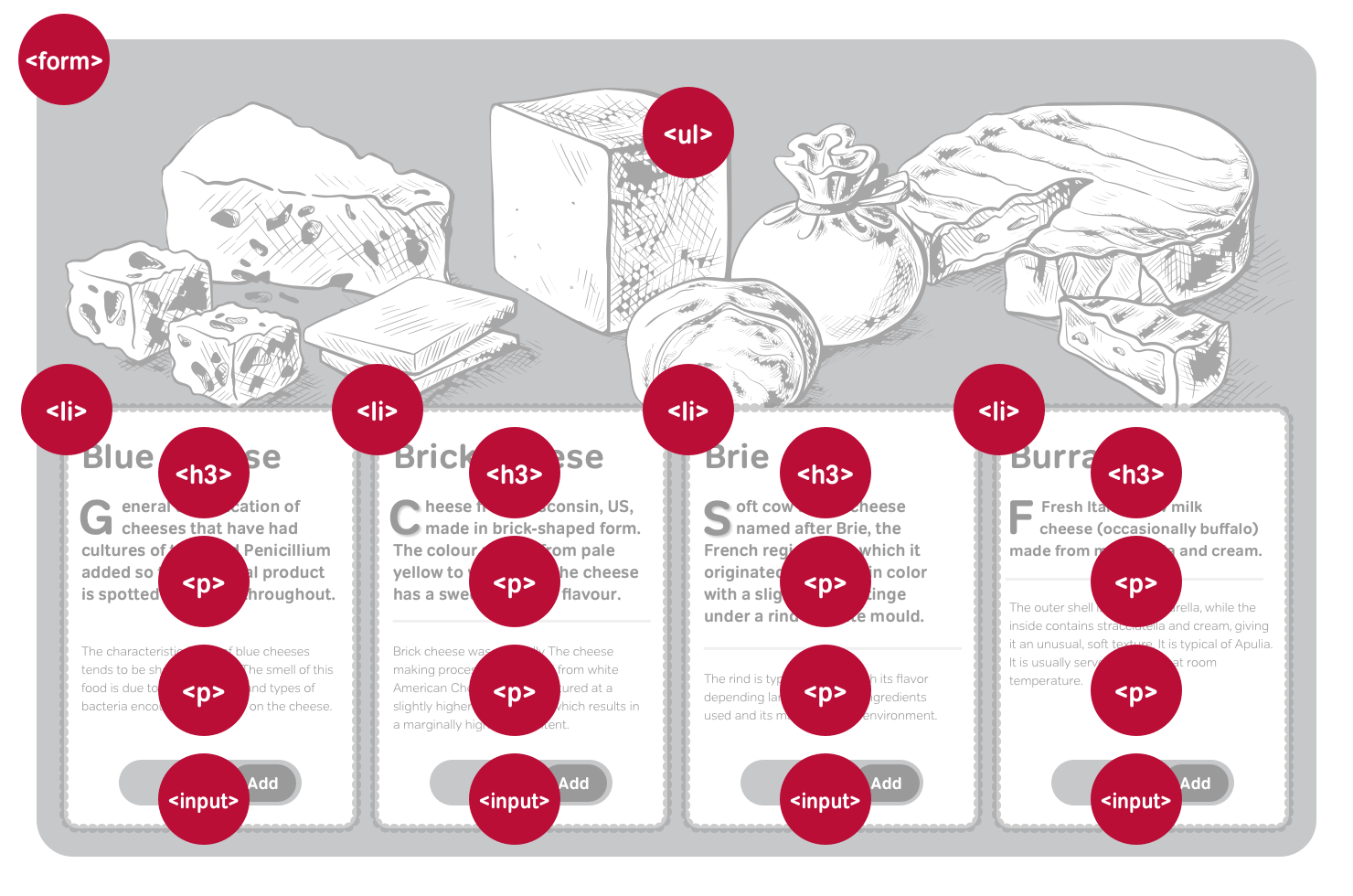
<ol>
<li>
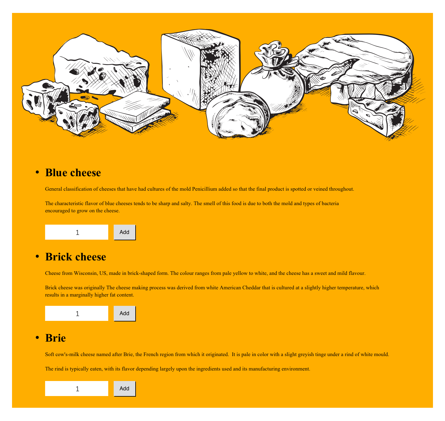
<h3>Blue cheese</h3>
<p><img src="blue.png" alt="Blue cheese">
A general classification of cheeses that have had cultures of the mold Penicillium added so that the final product is spotted or veined throughout.</p>
</li>
</ol>Support for :nth-child pseudo-classes is still rare. In 2006, only Konqueror 3.52 for Linux supports them, so designers have turned to JavaScript to emulate support for them. Aaron Gustafson (Wayback Machine URL) wrote a script for striping table rows and list items.
Floating each image left, and adding relative positioning and margins enables text within each list item to flow around them:
li {
overflow: hidden; }

li img {
float: left;
margin-right: -50px;
position: relative;
left: -50px; }
:nth-child pseudo-classes allow styling of odd and even items without presentational HTML. As is often the case with CSS, there are more than one ways to accomplish the same result, but the simplest method is using odd and even values. This next style adds a background colour to only even-numbered list items, which creates orange horizontal bands:
li:nth-child(even) {
background-color: #f0a001; }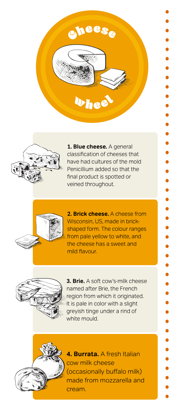
A dotted orange border separates my sidebar from other elements on the page:
ol {
list-style-type: none;
width: 500px;
border-right: 10px dotted #d86705; }
Finally, allow images to escape from their parents by using relative positioning to move them 50px to the left. A negative right margin of the same value will allow text nearby to flow into the space created:
CSS computation
As well as self-explanatory :first-child, :last-child, and :nth-child pseudo-classes, you can style elements based on the number of siblings which come before them. For example, imagine a table containing more than fifty rows. Finding specific information in a table this long might be difficult.
An tr:nth-child(10n-1) selector will count the number of rows in increments of 10 (10, 20, 30, and so on,) then style rows which come immediately before (-1), (9, 19, 29, etc.
Backgrounds and borders
Until CSS3, it was possible to apply just one background image to an element. Attaching more than one background image was on the wish list of every designer I know. Designers wore their fingers to the bone concocting ways to implement more than one background image, and considering the visual effect is so simple, these solutions became increasingly complex.
Adding rounded corners to a fixed-width element using CSS1 and CSS2.1 is straightforward, but a resizable rounded box with rounded corners, custom borders, or drop shadows has always been more complex and usually requires presentational HTML:
<div>
<div class="top-left">
<div class="top-right">
<p>Blue cheese. A general classification of cheeses that have had cultures of the mold Penicillium added so that the final product is spotted or veined throughout.</p>
<div class="bottom-left">
<div class="bottom-right">
</div>
This is hardly the most semantic HTML as the code weight of these presentational divisions easily matches that of my content. CSS3 eliminates this unnecessary HTML by attaching multiple background images to a single element:
<p>Blue cheese. A general classification of cheeses that have had cultures of the mold Penicillium added so that the final product is spotted or veined throughout.</p>
Add several background images to this paragraph by separating each one with a comma:
p {
background-image:
url("top-left.png"),
url("top-right.png"),
url("bottom-left.png"),
url("bottom-right.png"); }
Set repeat properties the same way, taking care to use the same order for repeat as the background images:
p {
background-repeat:
no-repeat,
no-repeat,
no-repeat,
no-repeat; }
Finally, position each background image to create a flexible box with rounded corners:
p {
background-position:
top left,
top right,
bottom right,
bottom left; }
This may not be the slimmest CSS, but it does keep presentation information where it belongs—in a stylesheet—rather than in HTML.
Note: In 2006, only Apple’s Safari implemented multiple backgrounds.
Multiple background images support with JavaScript
Rounded corners have become a standard design element in Web 2.0 websites and applications. To implement multiple background images in more browsers, designers have turned to JavaScript. Roger Johansson developed one solution which adds divisions to the DOM. These extra elements can then be styled to simulate multiple background images.
Designing multiple background images
To implement my next design, I use multiple background images to add an extra level of detail to an e-commerce website’s product list. Before getting started on implementation, I prepared a static visual and an HTML guide to illustrate the elements I need.
First, I add foundation styles, including background and foreground colours, and typography styles. This layout will be flexible, so I set my widths using em units:
html {
padding: 2em 0;
background-color: #fff;
color: #000; }

body {
margin: 0 auto;
width: 66em;
min-width: 48em;
font: 78%/1.5 Verdana, sans-serif; }

form {
position: relative;
padding: 0 1em;
min-height: 38em;
background-color: #f9cd03;
border-width: 0; }Add relative positioning without offsets to the unordered list to establish it as the positioning context for its absolutely positioned items. Then apply a combination of minimum height and padding to create space for the banner image. The image is 350px tall, so make sure the combination of minimum height and padding on the unordered list equals that height:
ul {
position: relative;
min-height: 50px;
padding-top: 300px; }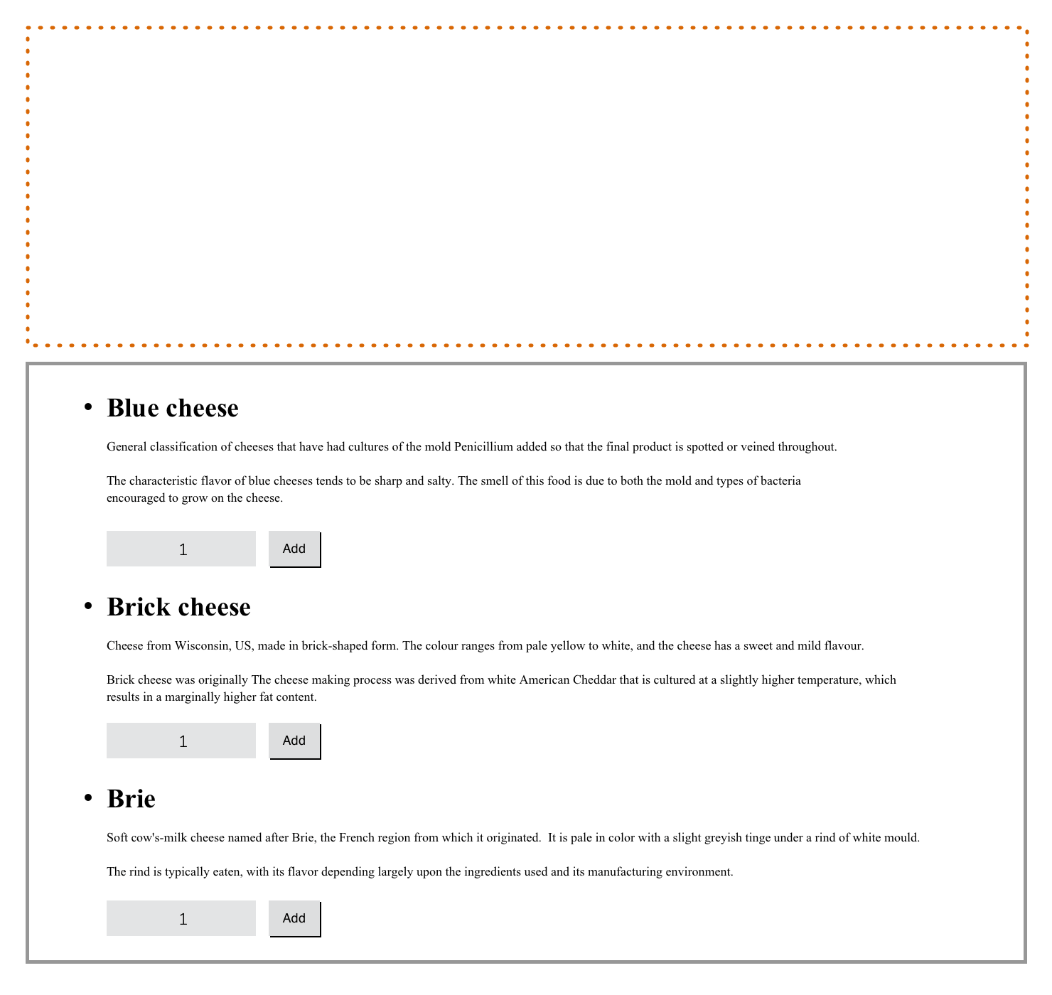
Finally, I apply a colour and banner image to the background of the unordered list:
ul {
background-color: #ffae00;
background-image: url(banner.png);
background-position: 50% 0;
background-repeat: no-repeat;
/* background: url(banner.png) 50% 0 no-repeat; */
}
Next, I position my four list items to create columns:
li {
position: absolute;
top: 300px;
width: 23%;
padding: 1em 1%; }
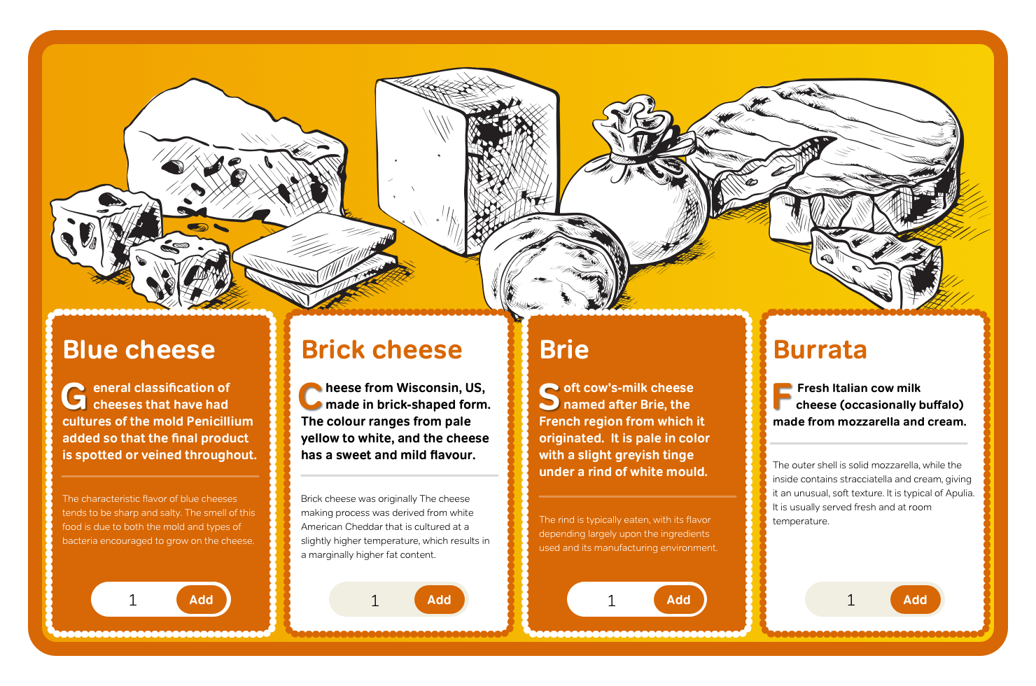
[id="blue"] {
left: 0;
background-color: #d86705;
color: #000; }
[id="brick"] {
left: 25%;
background-color: #fff;
color: #000; }
[id="brie"] {
left: 50%;
background-color: #d86705;
color: #000; }
[id="burrata"] {
left: 75%;
background-color: #fff;
color: #000; }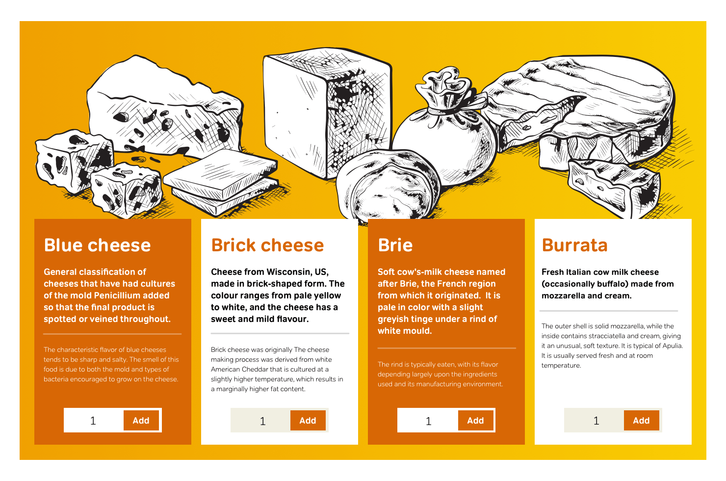
I want to add a little flair to my typography, and a drop-cap—with an enlarged first letter and subtle text shadow—is both effective and easy to implement using the :first-letter pseudo-element:
li > p {
font-size: 82%; }

li > p:first-of-type::first-letter {
float: left;
margin: 0 .15em 0 0;
font-size: 300%; }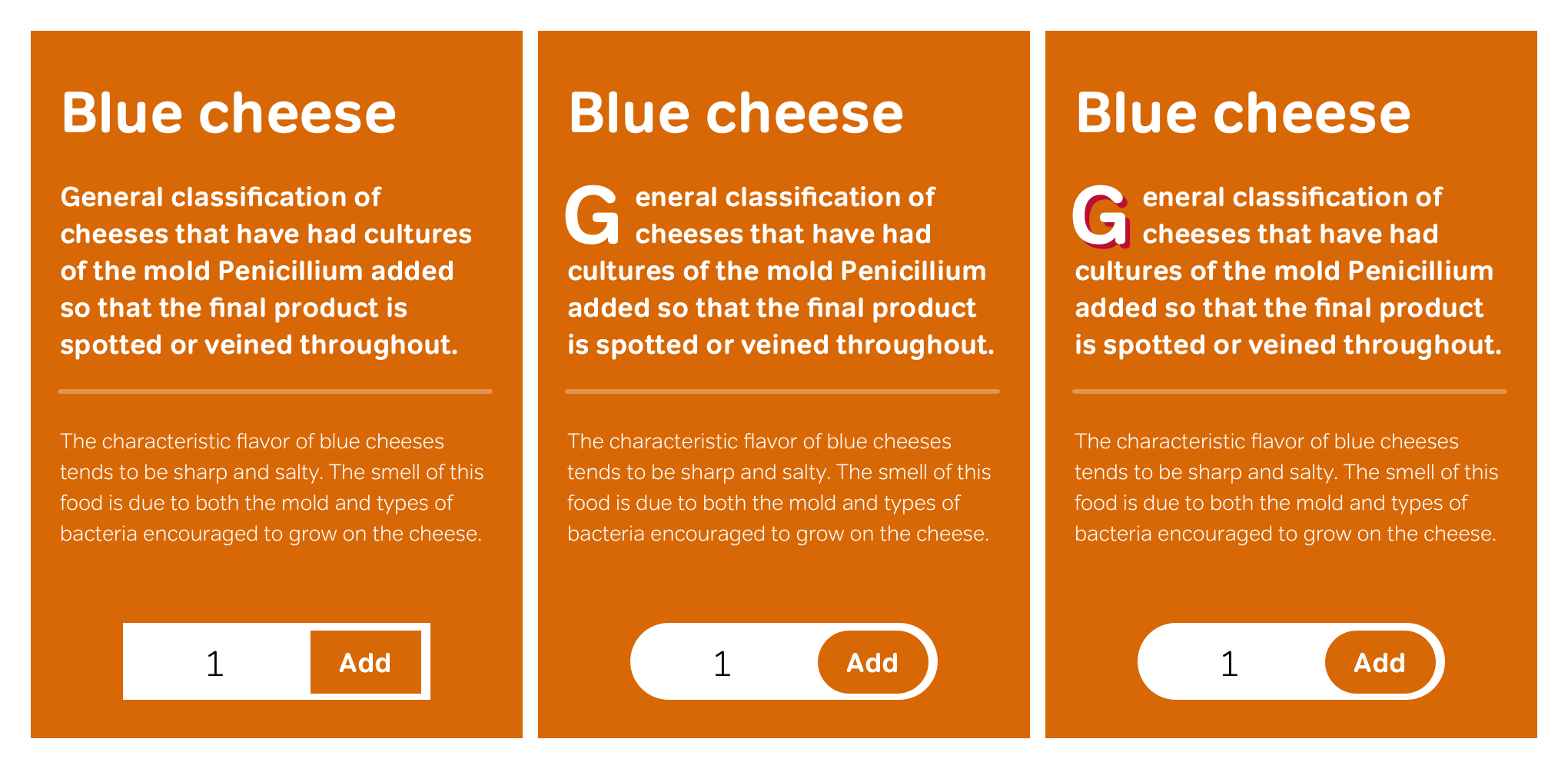
To add some interest to that first letter, I add a red text-shadow, offset by 3px on the horizontal and vertical axes. Sadly, in 2006, Apple Safari and Konqueror are the only browsers which support this useful property:
li > p:first-of-type::first-letter {
text-shadow: #D11149 3px 3px 0; }Multiple background images
This design requires two sets of background images; one for the form and the other for list items. Start by applying the eight images which make up the form’s rounded orange border. First, the image URLs:
form {
background-image:
url(form-top-left.png),
url(form-top-center.png),
url(form-top-right.png),
url(form-center-left.png),
url(form-center-right.png),
url(form-bottom-left.png),
url(form-bottom-center.png),
url(form-bottom-right.png); }
Followed by background-position values:
form {
background-position:
top left,
top right,
bottom right,
bottom left,
top left,
top right,
bottom right,
bottom left; }
And finally, values for background-repeat:
form {
background-repeat:
no-repeat,
repeat-x,
no-repeat,
repeat-y,
repeat-y,
no-repeat,
repeat-x,
no-repeat; }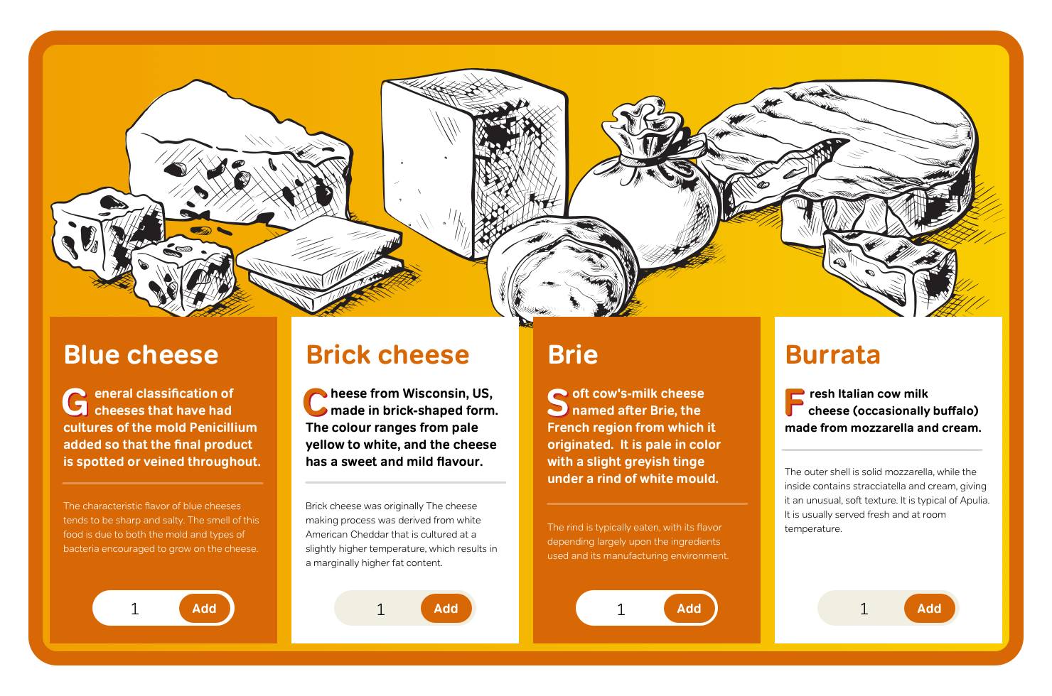
Use an identical pattern to apply multiple background images to all items in the unordered list:
li {
background-image:
url(li-top-left.png),
url(li-top-center.png),
url(li-top-right.png),
url(li-center-left.png),
url(li-center-right.png),
url(li-bottom-left.png),
url(li-bottom-center.png),
url(li-bottom-right.png);
background-position:
top left,
top right,
bottom right,
bottom left,
top left,
top right,
bottom right,
bottom left;
background-repeat:
no-repeat,
repeat-x,
no-repeat,
repeat-y,
repeat-y,
no-repeat,
repeat-x,
no-repeat; }
Multiple background images seem so essential to modern-day website design that I wonder why it’s taken so long for them to be developed and implemented in browsers find its way first into CSS and then into browsers. I can only hope that Microsoft, Mozilla, Opera, and other browsers follow Apple’s example and make implementing multiple background images a priority.
Multi-column layout
Dividing text into columns is common in many forms of design because it helps readability by limiting the length of lines of text. In the past, splitting up text blocks into multiple columns has always been problematic on the web. It requires breaking text across multiple divisions to form visual, rather than semantic, groupings of content:
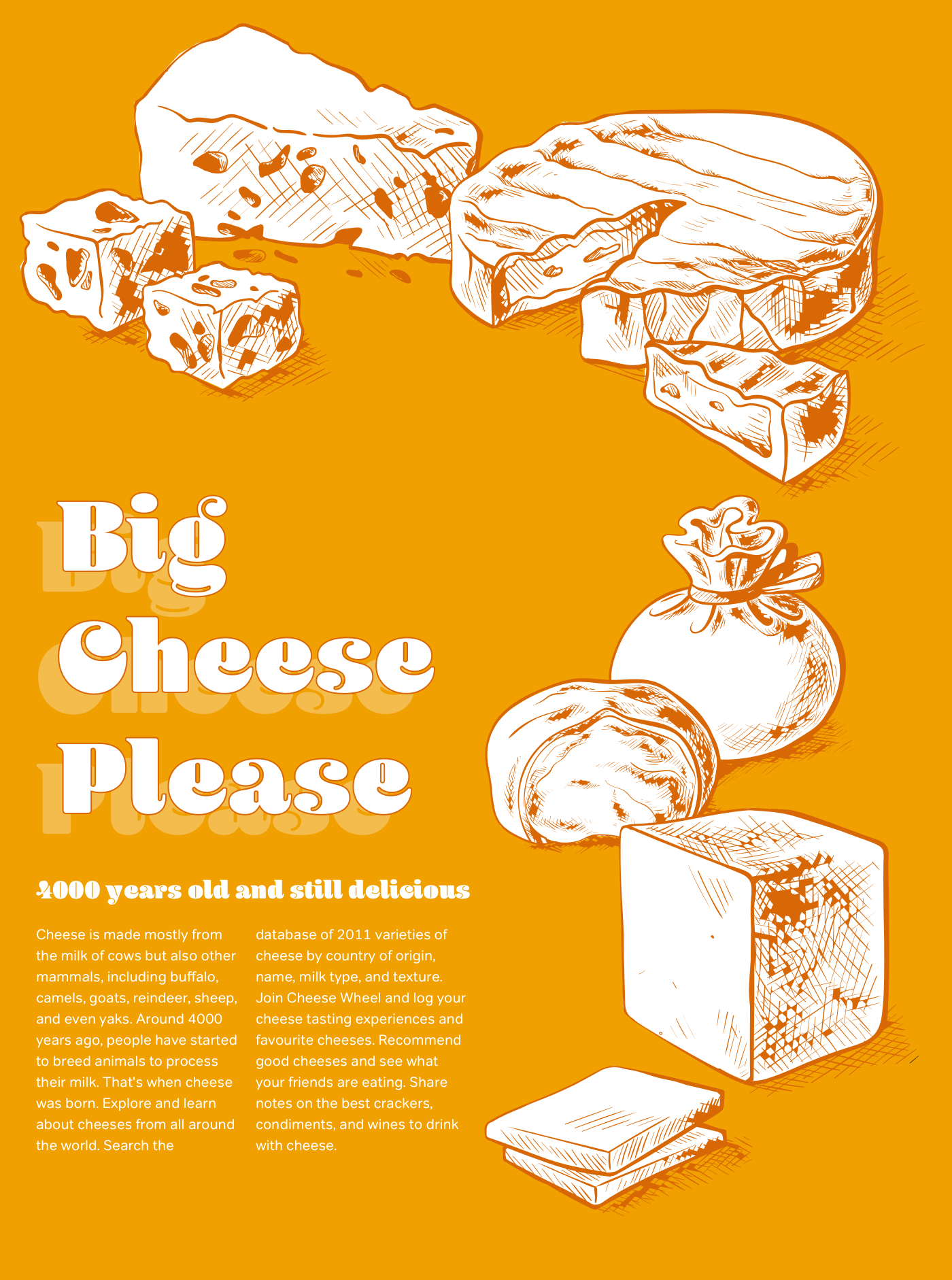
<h1>4000 years old and still delicious</h1>

<div class="column">
<p>Cheese is made mostly from the milk of cows but also other mammals, including buffalo, camels, goats, reindeer, sheep, and even yaks. Around 4000 years ago, people have started to breed animals to process their milk.</p>
</div>

<div class="column">
<p>That’s when cheese was born. Explore and learn about cheeses from all around the world. Search the database of 2011 varieties of cheese by country of origin, name, milk type, and texture.</p>
</div>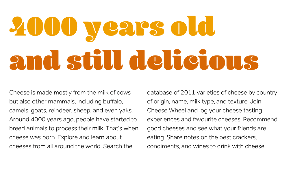
Using CSS3 Multi-column layout, you can implement columns in two ways. First is by specifying the number of columns using the column-count property. These three columns expand equally to fill available horizontal space:
div {
column-count: 3; }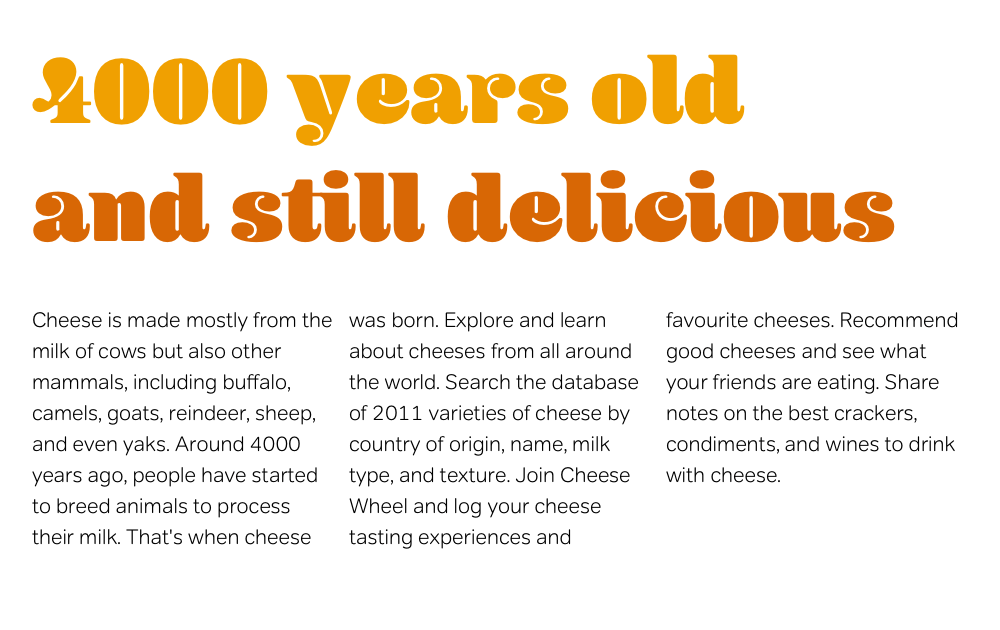
Alternatively, set the desired column width, and a browser will calculate how many columns can fit into the space:
div {
column-width: 8em; }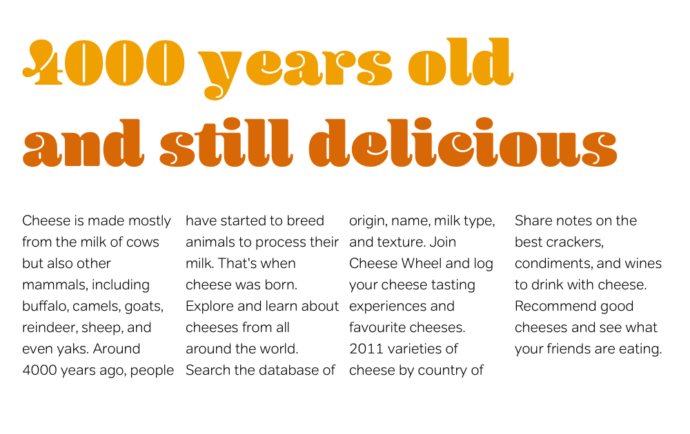
The ability for content to flow from column to column, and for columns to be added automatically when space allows have not been possible before.
To improve balance and readability, Multi-column Layout introduces two new properties, column-gap and column-rule. column-gap inserts gaps (gutters) between columns and column-rule adds rules (dividers.) Rules take up no space, and won’t alter the width of either columns or gaps:
You place a column rule in the middle of a column gap. These rules do not take up space. That is, the presence or thickness of a column rule will not alter the placement of either columns or gaps:
div {
column-gap: 1em;
column-rule: thin solid #000; }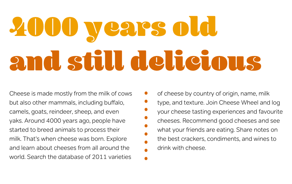
Note: In 2006, parts of the Multi-column Layout Module are supported only in Firefox 1.5+ and its siblings, using the -moz- prefix.
I’m thrilled by aspects of Multi-column Layout but underwhelmed by others. Paragraphs in columns often get separated from their headlines, and images can be separated from their captions. Fortunately, new properties do control where column breaks can occur:
h1 { column-break-before: always; }
h2 { column-break-after: avoid; }
h1, h2 { column-break-inside: avoid; }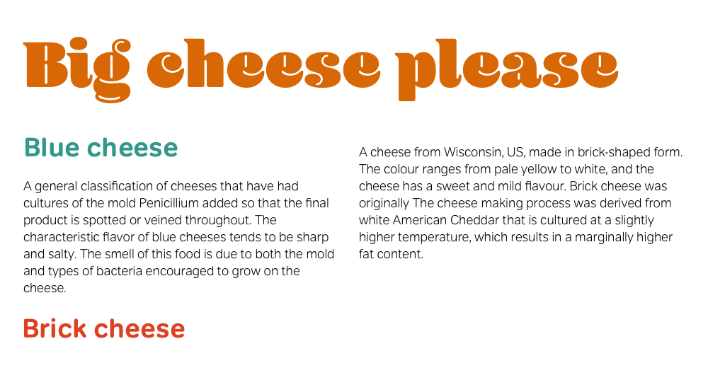
Earlier working drafts of Multi-column Layout included the now missing column-span property. This would’ve enabled elements to span across a designated number of columns.
The current Multi-column Layout working draft allows only for the basic styling of column-rule including dotted and dashed styles and other values from the CSS2.1 border style list, including ugly ridge and groove styles. The CSS Working Group hasn’t included a feature I imagine many designers would like: image rules.
Designers have turned to JavaScript to help simulate some parts of CSS3, including the Multi-column Layout Module. Cédric Savarese wrote the excellent Introducing the CSS3 Multi-Column Module at A List Apart and developed a JavaScript implementation of the CSS3 Multi-column Layout Module.
Since the CSS Working Group first announced Multi-column Layout, some people have been critical of the potential effects on readability. Spreading text across multiple columns can force a visitor to scroll up and down to follow the flow of an article.
Too many designers value creativity above readability, usability, and accessibility. Using multiple columns in a print stylesheet may be useful, but onscreen, for longer articles? No. Face it, the Web is not a printed magazine.
Roger Johansson, CSS3 Multi-column layout considered harmful
Designing with Multi-column Layout
For my next example, I use percentages and em units to implement a flexible layout. I add background images and Multi-column Layout to divide my running text into columns.
Set the stage for this design by adding foundation styles. Allow the layout to fill 92% of the viewport, with a minimum width of 640px:
html {
background-color: #f0a001; }

body {
width: 92%;
min-width: 640px;
margin: 0 auto;
font: 78%/1.5 Verdana, sans-serif;
color: #fff; }
To create space for the banner image at the top of this design, set padding-top on the <body> element to 360px, then apply the image to its background. Setting the horizontal position at 50% ensures it will always stay centred, no matter how wide the viewport becomes:
body {
padding-top: 360px;
background: url(body.png) no-repeat 50% 0; }
The design needs only two divisions. One acts as a container for the headings. The other includes my main content and running text.
To create space for the part of my background image which appears on the right of this page, set a right margin on the second division to prevent its contents from overlapping the background:
div#content {
width: 100%;
background: url(content.png) no-repeat 100% 0; }

div#content_main {
margin-right: 320px; }Finally, apply Multi-column Layout styles to the second division. Because Gecko-based browsers including Firefox have already implemented Multi-column Layout properties using their –moz- prefix, add two style declarations. The first for Gecko browsers, the second for browsers which will eventually support Multi-column Layout without a vendor prefix:
ul {
padding: 1em 0;
column-width: 18em;
column-gap: 25px;

-moz-column-width: 18em;
-moz-column-gap: 25px; }
The result is a flexible design with em-based column of text.