A wireframe is a black-and-white diagram which shows basic content blocks and functionality. They’ve become popular with designers and developers, and they’re broadly understood by clients because of their lack of colour and fidelity allows people to concentrate on content and structure. Wireframes are ideal tools to storyboard someone’s journey through a website and iterate functionality quickly before visual design and development begin.
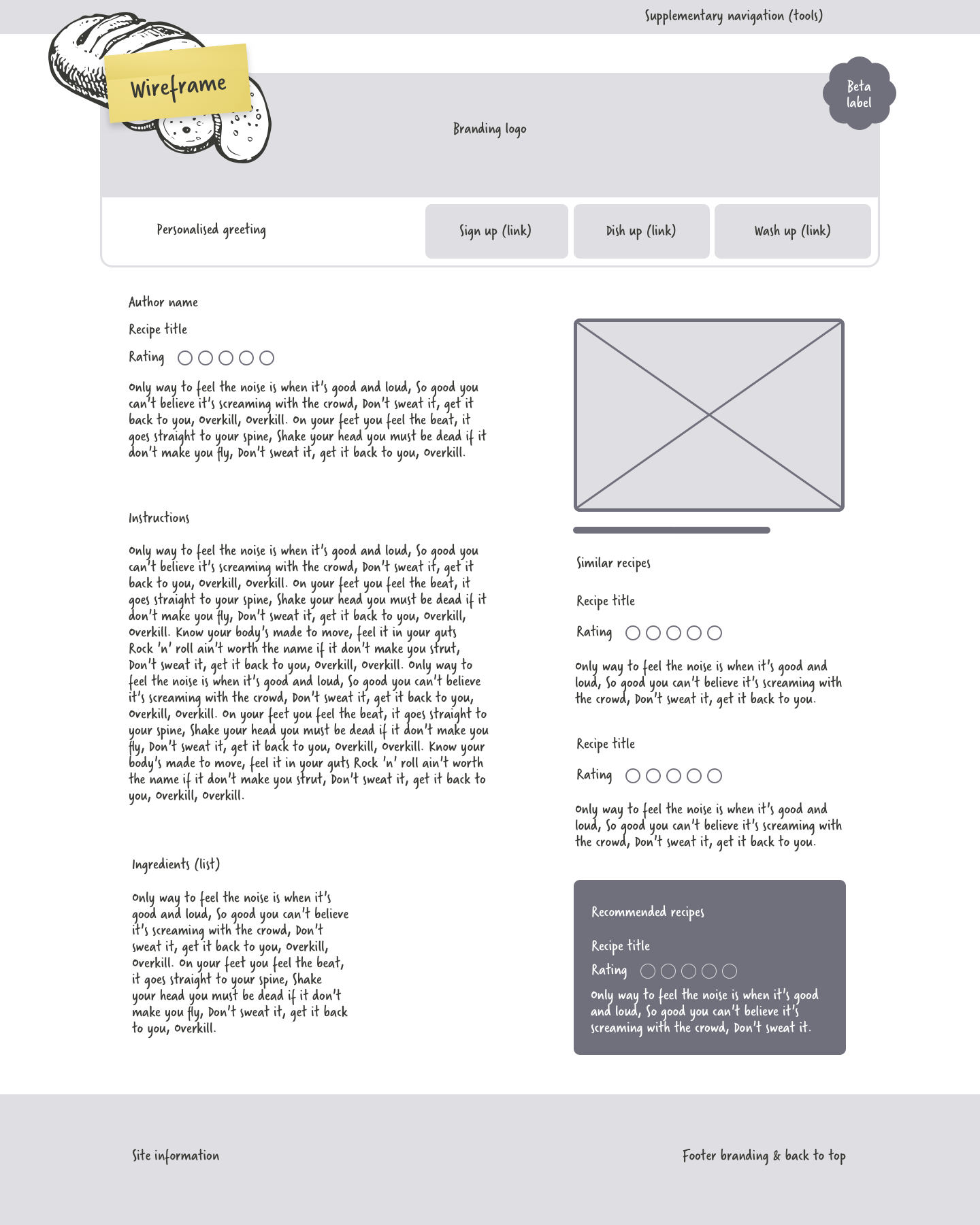
Used as a tool to communicate content and structure without the distractions of color and imagery, wireframes remain an important part of the design process. They can help designers to:
- Storyboard a visitor’s path through a website
- Work quickly through layout iterations
Just like pouring boiling water into a Pot Noodle, it’s easy to make wireframes using popular software like OmniGraffle or even Microsoft PowerPoint. That’s probably why so many people believe wireframing to be an inexpensive way to proof concepts.
Wireframes can fail
“A picture’s worth a thousand words,” said Frederick Barnard in the advertising journal Printer’s Ink. This isn’t true when it comes to pictures of websites, because no matter how much care you take or how detailed you make them, pictures can only hint at what will become rich content and functionality.
Pictures work fine for showing creative concepts but fail as prototyping websites because they’re unable to mimic even simple interactions including: hover, :focus, or :target states.
On some larger projects where I’ve worked as a designer, wireframes were made long before my job creating layout concepts began. When this happens, wireframes contain not just the types of content and functionality but include instructions for where to place it. Presented with this level of detail, it’s normal to feel there’s little room left for creativity.
Although wireframes should show what a finished product should look like broadly, too often people expect them to show how a layout should look. Wireframes can reinforce the idea websites should be pixel-perfect reproductions of frozen images. They lock designs into one fixed display type and rarely take into account users of alternative browsers, such as screen readers or mobile devices.
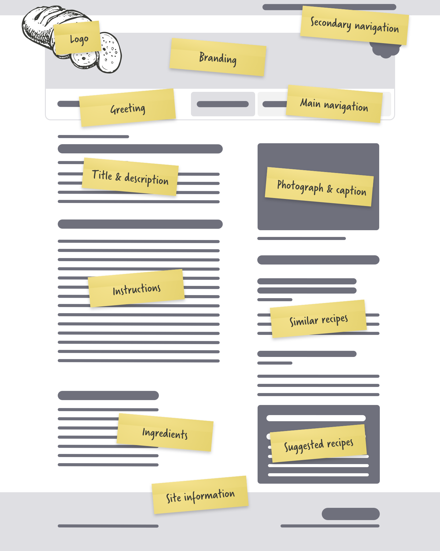
Granular wireframes
Granular wireframes can help avoid being overly prescriptive and dictating the complete layout of a page. They break content and functionality into components such as account creation, customer sign-in, customization options, e-commerce checkout, navigation, and search interfaces. But even though this type of wireframe doesn’t dictate the layout of a full-page, they’re still far from ideal as they cannot describe semantic meaning or relationships between elements. They also fail to describe in detail information needed by developers about complex functionality and interactions.
Are wireframes good value?
It’s a popular misconception that wireframes are an inexpensive part of the design process, but the reality is they often offer very little value for money. People understand wireframes are a means to an end and expect to throw them away at the end of a project. This is a dreadful, unnecessary waste of effort. When I think about the hundreds of wireframes I’ve made over the years—all now gathering digital dust in my archives—I remember the thousands of hours I spent creating them. I thought those wireframes were disposable and that’s exactly what they became.
Wireframes and interaction
While wireframes can sometimes be overly prescriptive when describing the layout, they can also lack the detail we need about messages, pagination, visitor feedback, or other aspects for designing a dynamic website. By not including this information, decisions about how a feature should work only gets postponed until later. When a project grows larger, keeping track of different versions of wireframes and supporting soon becomes a job in its own right.
If you think that flexible layouts are difficult to describe using inflexible wireframes, imagine for a minute how difficult it must be to describe the complex functionality common on sites which use Macromedia Flash, Ajax, and DOM scripting. Jeffrey Zeldman said it best:
Wireframing Ajax is a bitch
Jeffrey Zeldman, Web 3.0
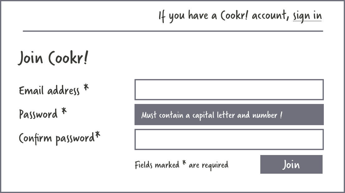
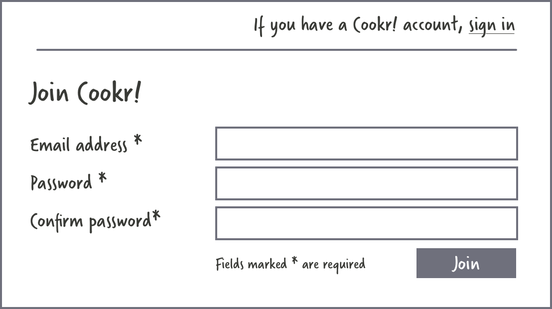
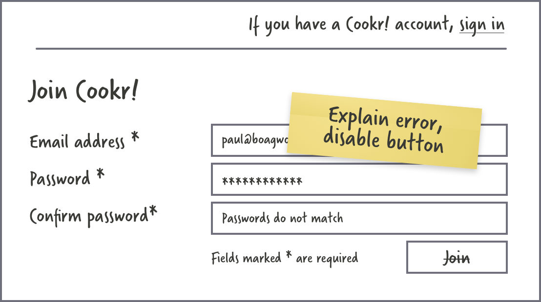
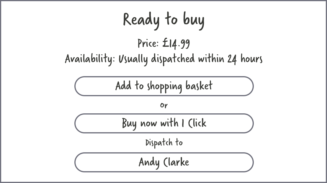
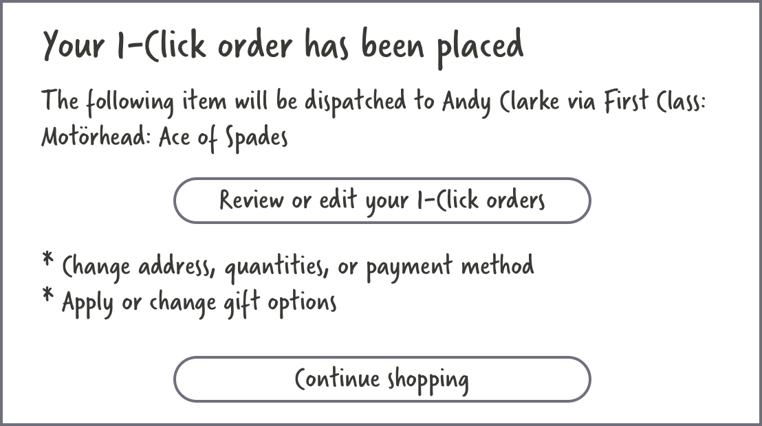
If you’re wireframing an e-commerce website, it’s easier to describe how a customer adds an item to their cart and moves through the checkout process. Even Amazon’s 1-Click ordering should present no real challenge to an experienced designer.

Note: For more thoughts on prototyping Ajax, read Kevin Hale’s article A Designer’s Guide to Prototyping Ajax.
But, in Ajax-driven applications, where people can invoke complex behaviours with just text input or mouse click, wireframes are rarely capable of describing an action in sufficient detail on a single screen.
One example of this is Flickr, Yahoo’s popular photo storage and sharing application. Flickr’s made from a complex mix of HTML, CSS, Flash, and Ajax, which gives visitors immersive user experiences. Some of Flickr’s tools—including adding tags, editing titles, or changing descriptions—could be easier to wireframe using images. But its more complex features—adding notes to photos or organising them into sets with a drag-and-drop interface—could prove more challenging to demonstrate, even with a series of images. Proofing functionality this complex is a tough job for even the most patient designer. It would involve creating pictures of every stage of user interaction, not something many designers would relish.
Many variables get overlooked when creating wireframes or other paper documents. Factors such as state, security, error messages, level of effort, page flow, DOM scripting and other dynamic elements can be ignored or misrepresented.
Garrett Dimon
The grey box method
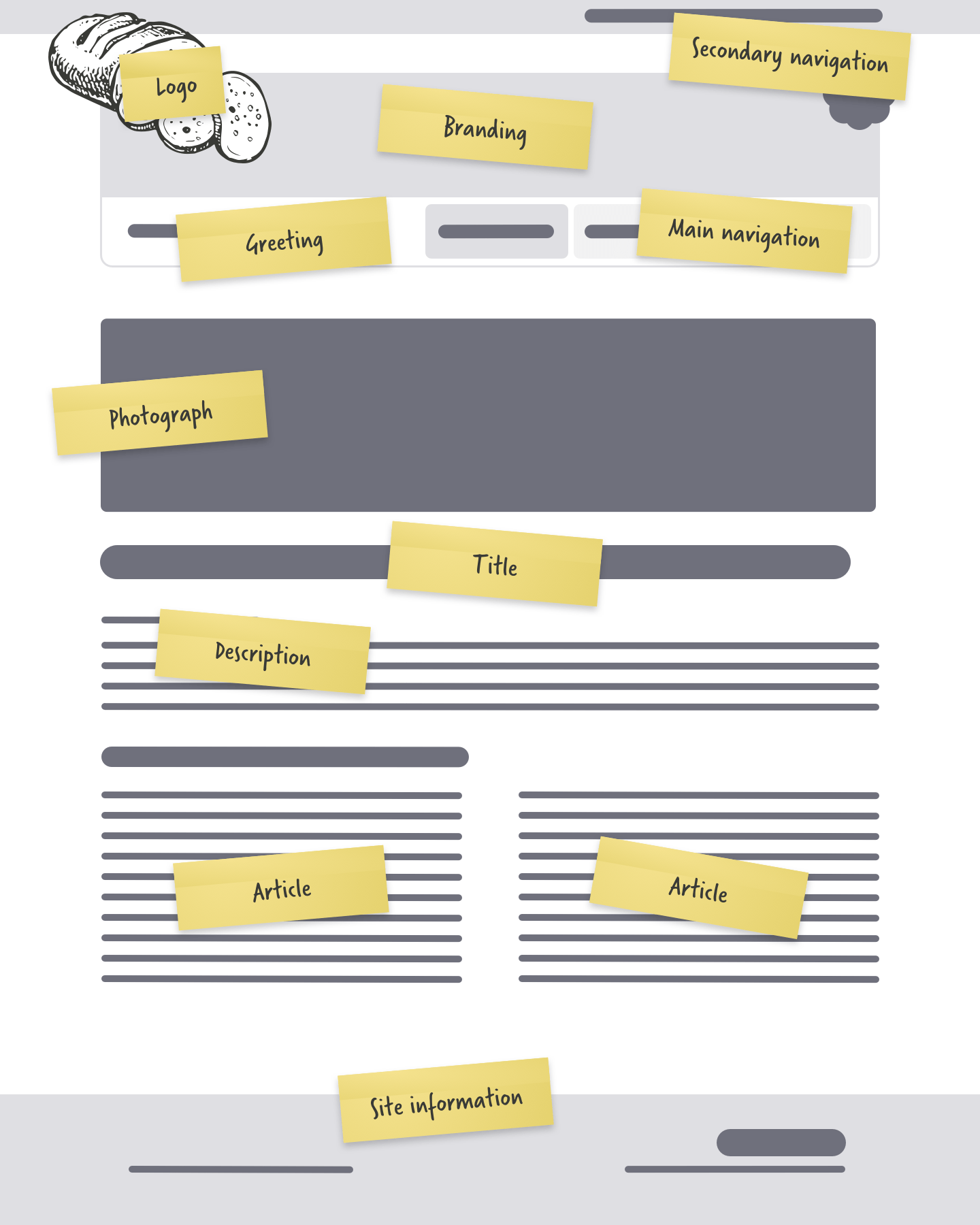
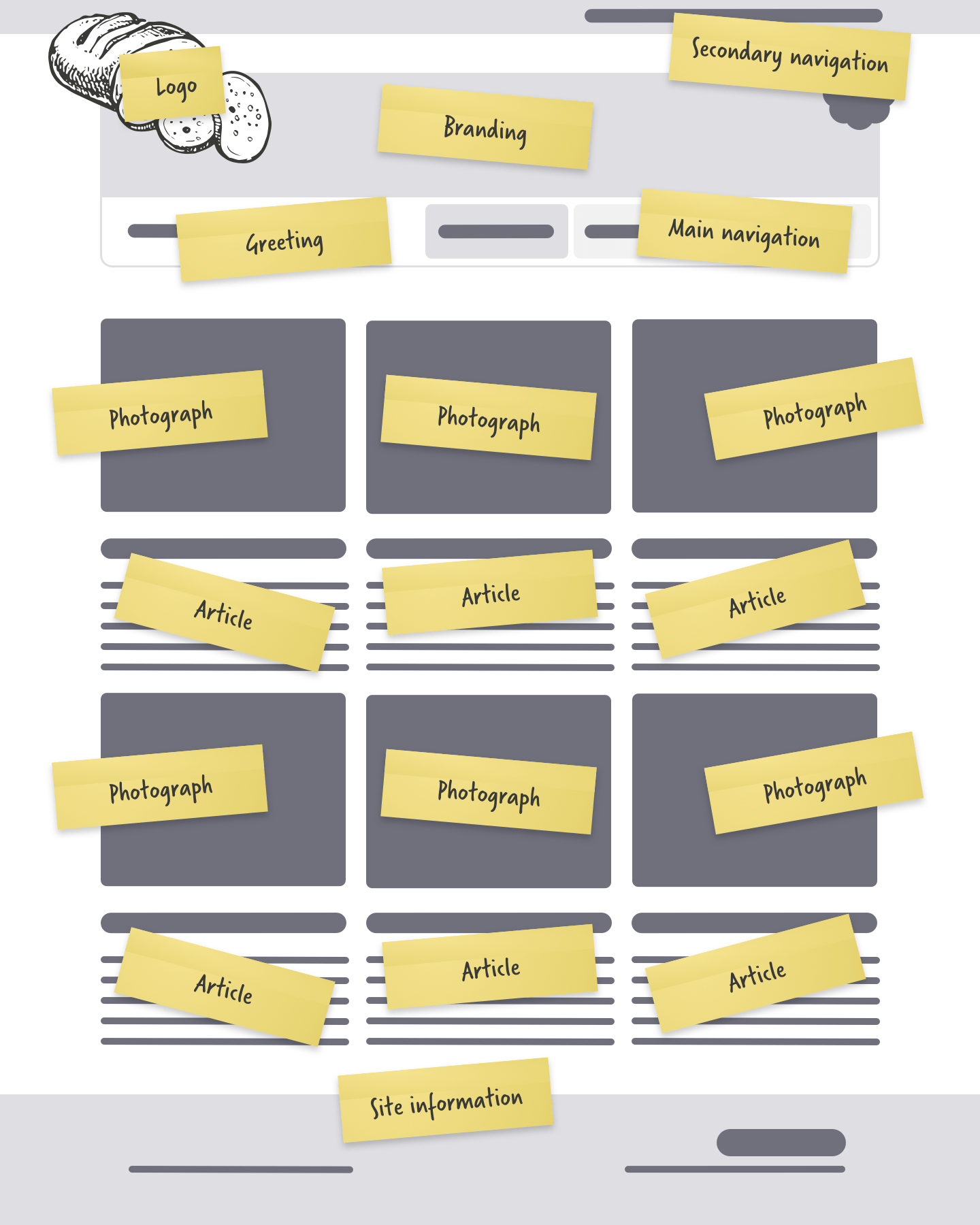
With the limitations of traditional wireframes obvious, we need a different way to communicate the semantics and structure of our content, one which isn’t overly prescriptive about the layout or puts limits on creativity. One solution comes from designer Jason Santa Maria.
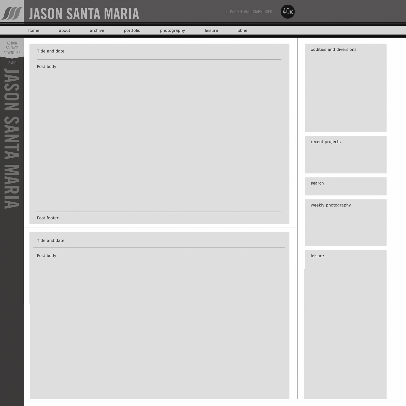
Jason’s grey box method (Wayback Machine URL) is based on simplified grey boxes which encourages content planners to define only rough placement and leaves designers free to decide composition and layout. Jason’s grey box method:
- Allows the design process to be spread over several, shorter stages
- Places focus only on structural elements of the page design
- Allows designers to work creatively and doesn’t limit their options
When you need more detail, add notes about the semantics and structure of your content. You can also develop a symbols library in your graphic design software which can be dropped into your grey box wireframes to add detail to the parts of a wireframe which need it. My preferred design software is Macromedia Fireworks, not least because of its ability to store symbols which I use from project to project. I made a symbol for every common interface element:
- Grid variations
- Greeking text
- Ecommerce elements
- Search interface
- Form elements
Tip: Keep symbols minimal and free from any creative flourishes. This technique’s also possible with other graphic design tools.
I find this process helps me organise content:
- Define the most logical order
- Consider how content will look without style
- Highlight relationships to identify necessary divisions
- Use established naming conventions