This brings me to the principles of Transcending CSS, which allow web designers to focus on their creative goals without being preoccupied with technical constraints. These principles also enable designers to look to the future without being compromised by the limitations of the past.
- Different browser, different design
- Use every CSS selector
- Look to the future
- Use Javascript to plug holes in CSS
- Avoid using hacks and filters
- Use naming conventions and microformats
- Share ideas, and collaborate with others
Different browser, different design
Whereas progressive enhancement begins with less capable browsers, Transcending CSS abandons the notion that less-capable browsers are a benchmark. Transcending CSS reverses the approach of progressive enhancement. It sets the benchmark where it belongs, with browsers which support modern CSS. It uses all available CSS properties—not to add visual enhancements, but—to accomplish the best designs for the most capable browsers. This approach results in some people seeing a reduced design. How much of a reduction depends on your preferences and the needs of your audience.
Use every CSS selector
Attribute selectors
Attribute selectors are amazingly powerful. They offer ways to style an element based either on whether an element has an attribute value such as href, or the value itself, such as https://stuffandnonsense.co.uk. In the following example, all images which contain an alt attribute have a grey border:
img[alt] {
border: 1px dotted #999; }
<img src="http://hicksdesign.co.uk/images/love/bp.gif" alt="Brit Pack: A proud member" />And all links which contain a title attribute will be red:
a[title] {
color : #c00; }
<a href="http://www.colly.com" title="Simon Collison">Former Notts County Defender</a>You can apply styles based on the value of an attribute:
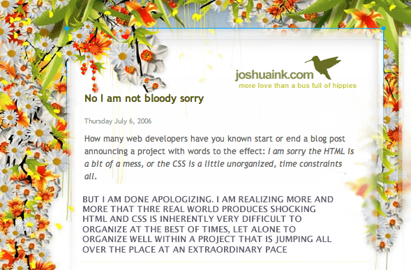
p[class="rant"] {
font-weight: bold;
text-transform: uppercase; }
<p class="rant">But I’m done apologising. I’m realising more and more that the real world
produces shocking HTML and CSS is inherently very difficult to organise at the best of times, let alone
to organise well within a project that is jumping all over the place at an extraordinary pace.</p>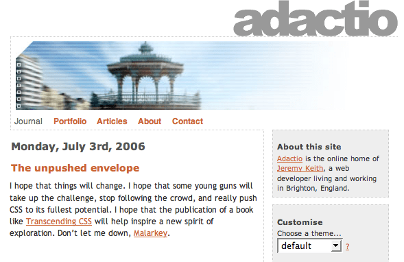
div[id="content_main"] {
float: left; }
<div id="content_main">
<blockquote>
<p>I hope that things will change. I hope that some young guns will take up the challenge, stop
following the crowd, and really push CSS to its fullest potential.</p>
<cite>Jeremy Keith</cite>
<blockquote>
</div>Style an element based on only part of its attribute, in this case the URL in a citation:
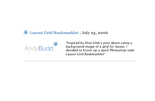
q[cite*="http://www.andybudd.com"] {
padding-left: 100px;
background: url(budd.jpg) no-repeat left top; }
<q cite="http://andybudd.com/archives/2006/07/">Inspired by Khoi Vinh’s post about using a background image of a grid for layout, I decided to knock up a quick Photoshop-style Layout Grid Bookmarklet.</q>I’ll teach you more about uses for attribute selectors later in this book.
Child selectors
A child selector matches a direct child of a given element. For example, this gives the potential to style anchors, which are children of list items differently from other anchors. Child selectors consist of two or more selectors separated by the > combinator.
Note: Combinators separate two or more selectors which make up a combined selector. Available combinators include white space, >, and + as well as a comma or a colon.
The following selector matches anchors which are children of a division element:
div > a {
text-indent: -9999px; }
This selector matches only anchors which are children—not other descendants—of divisions. If other elements appear between the division and the anchor—for example, an unordered list—the selector will not match, and the text-indent style won’t be applied.
<div>

<a href="#content">Skip to content</a>

<ul>
<li><a href="http://andybudd.com">Andy Budd</a>
<li><a href="http://adactio.com">Jeremy Keith</a>
<li><a href="http://clagnut.com">Richard Rutter</a>
</ul>

</div>
Adjacent sibling selectors
An adjacent sibling selector consists of selectors separated by the + combinator. It matches an element which is the next sibling to the first element. Elements must have the same parent, and the first must immediately precede the second:
h2 + p {
font-size: 1em;
border-bottom: 1px solid #666; }
When applied in the following example, the previous style will affect only the first paragraph:
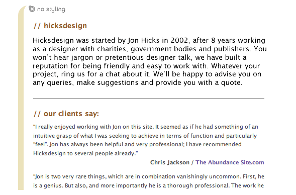
<h2>Hicksdesign</h2>

<p>Hicksdesign was started by Jon Hicks in 2002, after eight years working as
a designer with charities, government bodies and publishers. You won’t hear jargon
or pretentious designer talk, we have built a reputation for being friendly and
easy to work with.</p>
Pseudo-classes and pseudo-elements
Pseudo-classes and pseudo-elements style elements using information not available in the DOM. For example, it’s often useful to style the first line of a paragraph or the first letter of a headline. Pseudo-classes style elements based on characteristics other than their identifier, attributes, or content. This :first-child pseudo-class matches an element that is the first child of another element. Imagine wanting to give the first paragraph of a news article more visual prominence. If the article appears in a division with a class attribute value of “news,” the following rule styles its first paragraph:
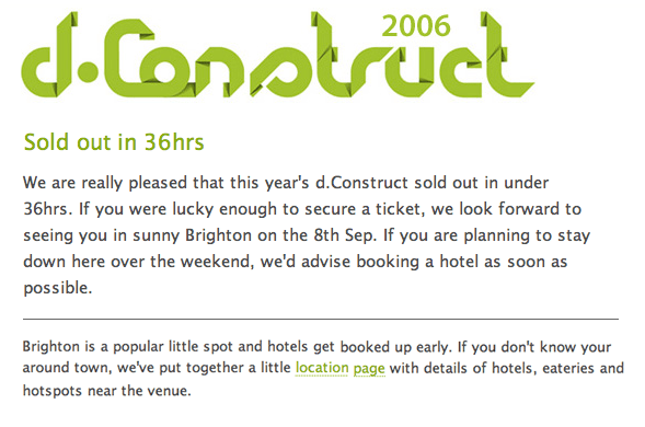
div.news p:first-child {
font-size: 1.5em;
font-weight: bold; }
<div class="news">
<p>We are really pleased that this years d.Construct sold out in under 36hrs.
If you were lucky enough to secure a ticket, we look forward to seeing you in sunny Brighton.</p>
<p>Brighton is a popular little spot and hotels get booked up early.</p>
</div>Dynamic pseudo-classes are a sub-set of pseudo-classes and have some dynamic features. Use dynamic pseudo-classes to style elements depending on specific actions. For example, :focus applies while an element has focus, someone clicks inside a form or tabs to an input:
input[type=text]:focus {
color: #000;
background-color: #ffc; }
Use the :lang language pseudo-class to style elements where content is in a particular language, perhaps one which differs from the primary language of the document. For example, the following style adds a small German flag icon to any blockquote written in the German language:
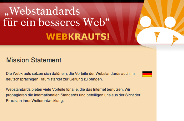
blockquote:lang(de) {
padding-right: 30px;
background: url(de.png) no-repeat right top; }
<blockquote lang="de">
<p>Die webkrauts setzen sich dafür ein, die Vorteile der webstandards auch
im deutschsprachigen Raum stärker zur Geltung zu bringen. Wir leisten Aufklärungsarbeit
durch Veröffentlichungen im Netz und in anderen Medien.</p>
</blockquote>Pseudo-elements also allow styling parts of the document which aren’t available as nodes in the DOM. The :first-line pseudo-element matches the first line of a paragraph of text. The number of words in any first line will vary according to the text size. The following rule applies to the first line of text in any paragraph on a page:
p:first-line {
font-size: 1.5em;
font-style: italic; }
The :first-letter pseudo-element allows you to target the first character. The next rule applies to the first character in a paragraph with a class attribute value of introduction:
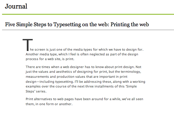
p.introduction:first-letter {
font-size: 3em;
font-weight: bold; }
Generated content using :before and :after
The benefits of generated content are still debated by those who believe CSS should only style content—not add to it—and those who think generated content has a rightful place in CSS. You can use :before and :after pseudo-elements to insert generated content either before or after an element’s content. For example, you can display the href attribute of an anchor using this:
a:link:after {
content: "("attr(href)")"; }
The following rule matches every second-level heading and inserts a decorative image before the content:
h2:before {
content: "";
display: block;
height: 20px;
width: 20px;
background : url(target.png) no-repeat 0 0;
margin-right: 20px; }
Standards-aware browsers support generated content, but not Internet Explorer 7 or perhaps future versions of Internet Explorer.
Look to the future
Although CSS2.1 is not yet a final recommendation—and the W3C’s CSS Working Group has much to do before completing its work on CSS3 draft modules—evolving browsers already support some new technologies. When practical, Transcending CSS makes it possible to use the CSS3 features already implemented. These include parts of the CSS3 multi-column layout module already supported by Firefox or multiple background images implemented in Safari. You may think it’s too early to use CSS3 heavily in everyday design, but it’s essential to use what’s practical today, so we can understand the opportunities which will be possible tomorrow.
Use Javascript to support CSS
We can work around browser limitations by using Javascript to enhance support for CSS, a technique which was made popular by Javascript developers, including Cameron Adams and Dean Edwards.
Two very popular DOM scripting plugs are Cameron Adams’s resolution-dependent layouts and Shaun Inman’s position clearing. In early 2006, Cameron published an experimental technique which uses Javascript to detect the width of a browser window and load different CSS rules according to that width. He made it possible to provide alternative layouts for screen resolutions lower than 1024x800 pixels.
Shaun developed an ingenious Javascript and CSS solution to force footers to drop below absolutely positioned content. You’ll be using Shaun’s solution later in this book.
Avoid CSS hacks
Hacking and filtering CSS have been a necessary evil since the earliest days of CSS layouts. From the first filter used to hide CSS from Netscape 4 to the now (in)famous box model hack, using hacks and filters has become a necessity for handling inconsistencies in some browsers’ implementations of CSS.
In 2002, Tantek Çelik’s box model hack—ugly though it was—made CSS layouts consistent across all browsers. It did this by working around the fact that that Internet Explorer for Windows incorrectly calculated the width and height of a box:
#content {
width: 400px;
voice-family: "\"}\"";
voice-family: inherit;
width: 300px; }
Those ugly voice-family values hid the second, correct, width of a box from Internet Explorer for Windows. It did this by giving it an incorrect width and then confused it with valid declarations it couldn’t interpret. Browsers which supported the voice-family property then implemented the correct width. CSS layouts were—as a result of this ugly hack—finally practical. Despite its unfamiliar syntax, Tantek’s box model hack contains valid CSS.
Toward the end of 2005, Tantek wrote Pandora’s Box (Model) of CSS Hacks And Other Good Intentions where he recapped the history of CSS hacking and recommended best practices. Tantek’s article forms the basis of the Transcending CSS approach to using CSS hacks—that you should avoid using them except as a last resort. When using a hack is unavoidable, target only abandoned browsers—such as Internet Explorer 5 for Mac—or browsers frozen in their development but still in circulation, including Internet Explorer 6 for Windows. Always avoid hacks which target a current version of any browser.
The demise of CSS hacks
In late 2005—with the beta version of their long-awaited Internet Explorer 7 released—Internet Explorer’s Program Manager for Layout and CSS, Markus Mielke, asked developers to abandon CSS hacks altogether and switch to using Microsoft’s proprietary conditional comments:
We ask that you, please update your pages not to use these CSS hacks. If you want to target IE or bypass IE, you can use conditional comments.
Markus Mielke, Call to action: The demise of CSS hacks and broken pages
Supported only by Internet Explorer for Windows, conditional comments made it simple to target or bypass different versions of Internet Explorer. For example, to provide a standard set of rules to all browsers, then a specific set of rules to all versions of Internet Explorer for Windows, you could use this:
<link rel="stylesheet" type="text/css" href="standards.css" />
<!--[if IE]>
<link rel="stylesheet" type="text/css" href="ie.css" />
<![endif]-->
Alternatively, we could target a specific version of Internet Explorer, in this example, version 5:
<!--[if IE 5]>
<link rel="stylesheet" type="text/css" href="ie5.css" />
<![endif]-->
With Internet Explorer 7’s improved support for CSS, perhaps the most useful conditional comment matches only Internet Explorer version 6 and older:
<!--[if lte IE 6]>
<link rel="stylesheet" type="text/css" href="ie-legacy.css" />
<![endif]-->
Since proprietary conditional comments could only be used only in HTML, some people avoid using them. They rely instead on hacks including the * HTML hack which exploits a bug in earlier versions of Internet Explorer CSS. However, with many bugs corrected in Internet Explorer 7, conditional comments are now a better solution.
Use naming conventions
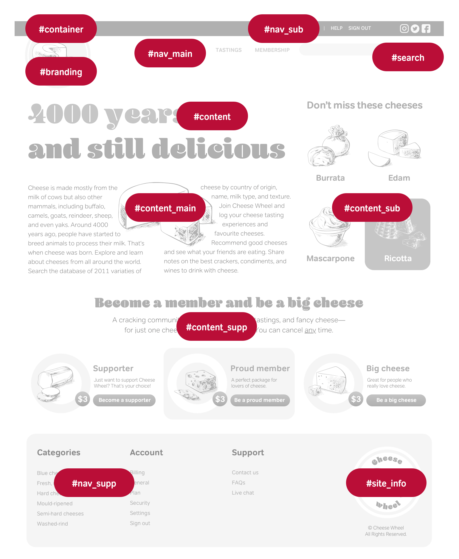
Unless you’ve been away for a while—sewing mailbags at Her Majesty’s pleasure—you’ll know naming elements and attributes has been a hot topic. Whereas you may not have thought twice about adding class="big-black-text", it’s now accepted that presentational values such as header, left, or red—which describes position or style—are poor choices. Some examples of presentational versus non-presentational attributes include:
| Presentational attribute | Meaningful attribute |
|---|---|
| header | branding |
| sidebar | content_sub |
| footer | site_info |
Note: Former CSS Samurai John Allsopp advocated for standardised attribute values. He created webPatterns (Wayback Machine URL) where you can contribute ideas for naming conventions.
There’s little consistency in the attribute values people choose, but this is one area where we should fit in with our peers. Designs don’t suffer from it, and the consistency makes working in teams and across companies easier. Developers appreciate naming conventions because they can develop applications to scrape calendars or contact information from pages and create relationships between websites.
In 2005, I turned my thoughts to the values designers were choosing for their attributes. Andy Budd wrote:
You’ll wrap a div or a span around another element to act as a hook for your style. By doing this, you’re adding meaningless HTML to your code for display reasons. This makes you feel bad, so you’ll try to give these hooks some meaning. You’ll put all your branding code inside a div called branding and your main content inside a div imaginatively called mainContent. The question that springs to my mind is, does it matter?
Andy Budd, Semantic Coding
Andy’s article—and the readers’ comments it inspired—made me wonder about the benefits of naming conventions. I realised that conventions do matter; in fact, they matter a lot. I began by surveying the websites of forty bloggers and designers. The result revealed that attribute values varied, even for something as common as a container. I found everything from the obvious page and wrap to Ethan Marcotte’s wonderful going-to-hell. When I wrote about my survey, the article sparked conversations about why we should adopt common attribute values and whom it would benefit.
In Elemental Nomenclature, Eric Meyer suggested if a convention were established, he would implement its values on his website to give people more control over his design and layout:
Does my site design not serve your needs, or bore you? Create something better suited to your tastes! I promise I won’t mind; in fact, I’d like to see what you devise. If a set of ID naming conventions does firm up, I’ll likely adopt it here so visitors can restyle my site consistently with others that use the same nomenclature. This is, it seems to me, the least I can do.
Eric Meyer, Elemental Nomenclature
Naming conventions help teams
Naming conventions leave you free to design or develop rather than wonder, “What should I call this?” Conventions also make it easier to understand the code written by someone else. They reduce the time it takes mentally deconstructing a document and reduces margins and costs of error. Naming conventions will help you even if you only work on personal projects. I’m sure I’m not the only person to open a stylesheet written months before, and scratch my head wondering, “What does clear:left; actually do?” You’ve probably wondered something similar.
You might also extend naming conventions to other aspects of development, perhaps by using the ID of an element for the filename of its background image. For example, brighton_pier.jpg might become branding.jpg, and flowers.jpg might become body.jpg.
Fun with naming conventions
Designers Douglas Bowman and Dave Shea made geeks smile on April Fools’ Day 2004 when they swapped stylesheets and stole each other’s website designs. Although they intended their swap to be fun, Doug and Dave inadvertently made a serious point. Much of the effort involved in swapping their designs was a result of the attribute values Doug and Dave had chosen. Dave’s page container was identified as container while Doug had chosen a class attribute value of container. The values for their side columns were also different, with Doug’s sidecol incompatible with Dave’s sidebar. Had they chosen the same values, swapping designs would have been much more straightforward. In the absence of any shared values, Doug and Dave had little choice but to edit their HTML to make the swap possible.
The CSS Love Child
As well as being an example of the chaos which can ensue when mixing one person’s HTML with another’s CSS, Cameron Adams’s CSS Love Child highlighted the benefits of when designers chose the same naming conventions as their peers.
What if you love Vitamin’s (Wayback Machine URL) content but prefer the typographical touches of A List Apart and want to combine the two? By using a shared naming convention, both websites would allow someone to apply A List Apart’s style to Vitamin. In an era when integrating content from different sources is a crucial part of Web 2.0 buzz, many more people would benefit if designers and developers used common naming.

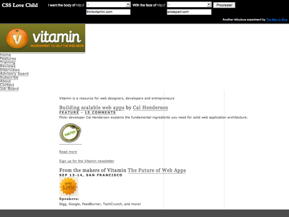
Note: In 2006, both Vitamin and A List Apart use attributes on their body elements. Neither gives visitors the control that either CSS signatures or shared naming would provide. A List Apart uses an empty class placeholder—potentially a sleep-deprived oversight or an erroneous CMS artefact—while Vitamin limits its visitors by using a site-specific homepage attribute. Both websites could help visitors if they adopted common naming and CSS signatures.
Gives people control
Do you enjoy the content of the Times but prefer the typography and layout of another newspaper? I’m sorry, but you’ve little choice but to stick with the Times’ more traditional feel. Establishing conventions gives people control over the websites they read regularly. What? Give people control over your pages? Yes, that’s precisely what I mean, and it’s a concept many designers find difficult to grasp. You know a Bézier curve from a CMYK conversion, so why let people tinker with a carefully crafted design? The truth is that designing for the web is unlike other media. The web is the first medium to give people the option of changing how they see content the presented.
Introducing microformats
HTML was always intended to add meaning and structure to documents. The trouble is that there are only about forty elements to do that. Headers, paragraphs, lists, and tables aren’t a problem. But where are the elements which can describe a title, review, or conversation about a book?
Developers have been hard at work, adding extra semantics to HTML. Currently, the best-known of these initiatives is microformats. These extend existing HTML and aren’t a new language. They’re easy to learn, as you need only add attribute values to your HTML to start using them. Let’s take my business contact information. This example contains a mailto: link, and should link my name to my website:
<p>Andy Clarke<br />
Head of Creative<br />
Stuff & Nonsense Ltd.<br />
example@stuffandnonsense.co.uk</p>
The HTML address element can describe my contact information, but what about my name, title, or the company I founded? You can look all you want through specifications, but I’ll save you the time. There aren’t any—no name, job, or company elements—nothing.
Microformats use class attribute values to add deeper semantics to HTML. Need an organisation element? Add class="org", and you’ve made one. Need to mark up a family name and can’t find an element precise enough? Add class="family-name", and you just created one.
You can mark up contact information so it can be extracted easily and saved in a format which can be imported into Apple Mail or Microsoft Outlook. Simply add class="vcard" to your address, and you’ve made a simple card useful to people and machines:
<address class="vcard">
<a class="url fn n" href="https://stuffandnonsense.co.uk">
<span class="given-name">Andy</span>
<span class="family-name">Clarke</span>
</a>
<span class="title">Head of Creative</span>
<a class="org" href="https://stuffandnonsense.co.uk">Stuff & Nonsense Ltd.</a>
<a class="email" mailto="example@stuffandnonsense.co.uk">example@stuffandnonsense.co.uk</a>
</address>The microformats community has already released some formats, with more being developed and proposed. New applications for microformats have already emerged, and software vendors, including Microsoft, are advocating for them. While being interviewed by Tim O’Reilly at Microsoft’s MIX06 conference, Bill Gates said, “We need microformats.”
If the Internet teaches us anything, It’s that great value comes from leaving core resources in a commons, where they’re free for people to build upon as they see fit.
Lawrence Lessig
Share and collaborate
Collaboration and sharing of knowledge and ideas helped moved the web forward since its early days. People who shared their knowledge developed most of the techniques you use today. From the earliest days of CSS layout, designers Rob Chandanais of the BlueRobot Layout Reservoir (Wayback Machine URL) and Owen Briggs’s Box Lessons shared their knowledge and their techniques. Todd Fahrner shared his findings on browsers’ rendering of font size keywords in 2001. Later, A List Apart published Sliding Doors of CSS by Douglas Bowman about transforming unordered lists into tabbed-style navigation. Since CSS began, there have been thousands of designers who contributed their expertise in magazines, on forums and their personal websites.
Whether what you share is useful for anyone, but yourself rarely matters. It’s the process of sharing, which is valuable. You’ll always get more from sharing an idea or technique than you will keeping it to yourself. I once made a chart to help me understand specificity in CSS using characters from Star Wars. Although I intended this chart for personal use, people have now translated my article into several languages. I got more satisfaction from my chart being useful to others than I did from making it.
People share new practices all the time and in October 2005—nine years after the release of the first CSS specification—In Search Of The One True Layout by Alex Robinson described a method for making columns independent of the HTML order. Alex’s solution came as a surprise to even seasoned CSS experts.
Major corporations such as Yahoo have also been publishing their internal libraries for public use. The Yahoo Developer Network’s YUI Library of CSS tools features CSS templates which can make more than one hundred layouts from a single file. There’s even a blog by Yahoo developers to keep up with their latest ideas.
Collaboration and sharing improve our knowledge of how much CSS can do. As CSS develops—and more browsers implement the newest modules—there’ll always be more to learn and opportunities to collaborate and create better work for the web.
Transcending CSS is possible now
For people new to CSS, it can be difficult to imagine a time when CSS layouts were hard to find. CSS layouts still occupy a small percentage of the total number of websites launched each year, but no doubt using CSS for layout is both desirable and practical.
As soon as images were allowed inline in HTML documents, the web became a new graphical design medium. Some people will want to put out text, but some will want to apply graphical design skills and make a document. These people are, at least, a sizeable minority, and there should be a means for them to achieve their ends.
Chris Lilley, May 1994
In May 2003, the CSS Zen Garden’s experimental playground proved CSS could create any number of designs from a single HTML document. Outside the walls of the CSS Zen Garden, the world was changing, and people were finding new ways to use CSS in more and more creative ways.
A forerunner to the CSS Zen Garden, Microsoft’s CSS Gallery (Wayback Machine URL) developed for Internet Explorer 3 included “Same Content, Different Style” and demonstrated how creative designers have become using CSS.
During the earliest days of CSS—when many CSS solutions to design challenges hadn’t been discovered—CSS designs were thought to be boxy and boring. Thanks mainly to the example set by the CSS Zen Garden, you can now find websites from small businesses to the largest organisations, all using CSS.
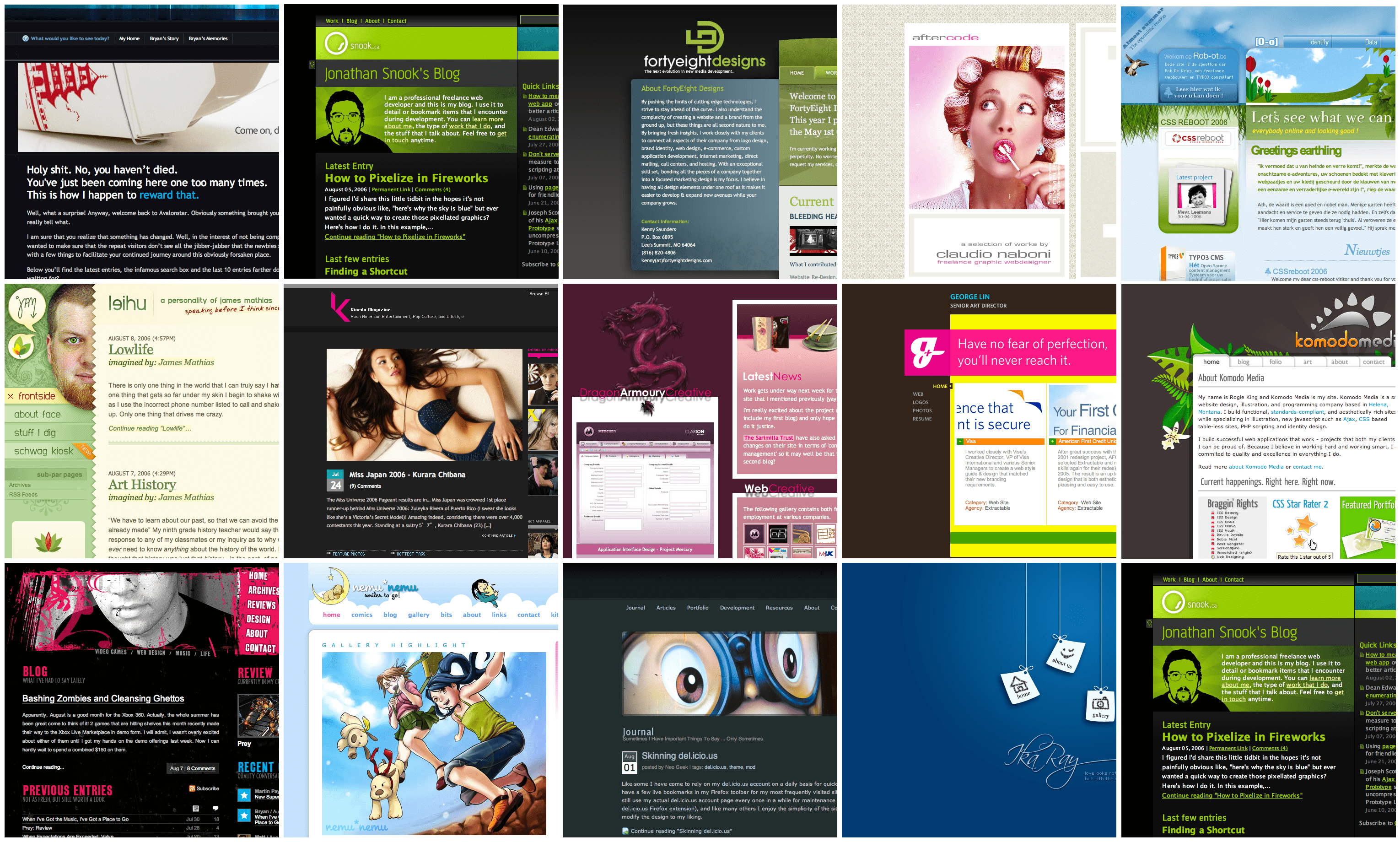
The virtual walls of CSS galleries such as CSS Beauty and StyleGala are full of website designs from all corners of the world. Regular redesign events like CSS Reboot encourage people to reveal redesigns on the same day, attracting hundreds of designers, including some of the industry’s best-known names.
CSS is everywhere
CSS has been cropping up in many unexpected places, from instant messaging applications to web browsers, and e-mail clients. Adium is an alternative chat client to iChat AV for Mac users, and it offers hundreds of interface themes. Whether you prefer chat windows which look like metal, shiny plastic, or a terminal window, the options should keep you entertained. Beneath the surface of Adium is a window made from HTML and message themes styled using CSS. If like me, you can’t live without a chat decorated with arrows, targets, and the Union Flag, you can create a whole new theme.
CSS is also a key component in Mozilla applications, including its Thunderbird email client and Firefox browser. In those applications, you can style buttons, windows, pages, menus, and sliders using CSS. Apple’s Dashboard widgets are also created using HTML, CSS, and Javascript, plus a little proprietary Apple Script.
Support does not mean that everybody gets the same thing. Expecting two users using different browser software to have an identical experience fails to embrace or acknowledge the heterogeneous essence of the web. In fact, requiring the same experience for all users creates a barrier to participation. Availability and accessibility of content should be our key priority.
Nate Koechley, Graded Browser Support (Wayback Machine URL)
Graded browser support
Until 2006, MOSe and progressive enhancement were used mostly on personal websites and experimental designs but rarely on large sites. Many people thought a progressive approach was too risky because the majority of internet users browsed with Internet Explorer 6 for Windows. Surprisingly, an affirmation that Transcending CSS techniques are practical even on large projects came from one of the web’s giants—Yahoo.
In February 2006, Yahoo standards evangelist Nate Koechley published a Yahoo Developer Network document called “Graded Browser Support.” Nate’s article made it clear it’s neither possible nor desirable for different browsers or devices to see the same design. A person should have a different experience when using a large display to someone using a small screen on a handheld PDA (personal digital assistant) or phone.
Graded browser support doesn’t exclude people who use older browsers from accessing website content or functionality. It acknowledges that not everyone will see the same level of design fidelity. Nate explained Yahoo’s approach:
An appropriate support strategy allows every user to consume as much visual and interactive richness as their environment can support. This approach builds a rich experience on top of an accessible core, without compromising that core.
Nate Koechley, Graded Browser Support (Wayback Machine URL)
The wider adoption of modern CSS has been blocked by the idea that designs should look the same in all browsers and on every platform. To solve this issue, Yahoo grouped browsers into three “grades:” C, A, and X-grade.
| Browser grade | Description |
|---|---|
| C-grade | Visitors using “incapable, antiquated, and rare” C-grade browsers experience a basic level that consists of core content and functionality. The content and experience is “highly accessible, unenhanced by decoration or advanced functionality.” Layers of style and behavior are omitted. |
| A-grade | Visitors using A-grade browsers can take full advantage of their browser’s “powerful capabilities of modern Web standards; the A-grade experience provides advanced functionality and visual fidelity.” |
| X-grade | X-grade browsers include “fringe or rare browsers.” Browsers receiving X-grade support are assumed to be capable and not “choke on modern methodologies.” |
Yahoo browser grading charts updated every quarter. This chart is as of August 2006.
Browser support standards
Compiling a table of supported browsers wasn’t a new idea. Many large organisations and content providers—including the BBC—developed what they called browser matrixes, and guidelines, for “target,” “supported,” and “unsupported” browsers. However, the BBC’s approach was still that the most popular browser should be the target, irrespective of its capabilities.
Note: Although it’s clearly showing its age, the BBC Browser Support Standards table (Wayback Machine URL) is still an interesting read.
What’s different about the BBC and Yahoo’s approaches is Yahoo’s idea that it’s acceptable to provide different levels of design experience, and that target browsers need not be the most prevalent. Yahoo demonstrated that Transcending CSS is possible and needed if the web is to move forward faster than the pace of the slowest browser. Yahoo’s approach is fabulous news for anyone who creates or consumes content on the web. Finally, it’s possible to use Transcending CSS with confidence and know you’re in good company.