Static designs are useful tools for conveying ideas about look and feel, interface designs, and layouts to clients and other stakeholders. Although they should simply indicate how a finished product might look, they’re too often mistaken as benchmarks for the finished product. There’s also the question of where static visuals fit best into a design workflow? Should we make them before wireframes or after? The answer might be different for every individual client or project.
Ask yourself, “what will static visuals accomplish?” If they’re designed to illustrate look and feel, you can work on them throughout a project and may refine them right up until the end. But, if you need static visuals to show specific details in your designs, they’ll likely need signing off on far earlier.
Often, making static visuals precedes other stages in the process of designing and developing websites. Writing HTML and CSS waits until much later and programming and scripting later still. One advantage to a content-based workflow is that HTML, CSS, programming, and DOM scripting needn’t wait until static visuals are complete. Grey boxes and their supporting materials can provide designers and developers with the information they need and give them a head start. Even while more complex functionality is being built into a prototype, designers can experiment with layouts, safe in the knowledge that CSS can implement their designs without undoing other peoples’ work.
HTML guides
Imagine for a moment a designer shows you two blocks of copy. Even though the two examples look the same, one’s a regular paragraph, the other is a quotation. A static visual can’t make this difference obvious, and so developers might not understand the semantic difference between them.
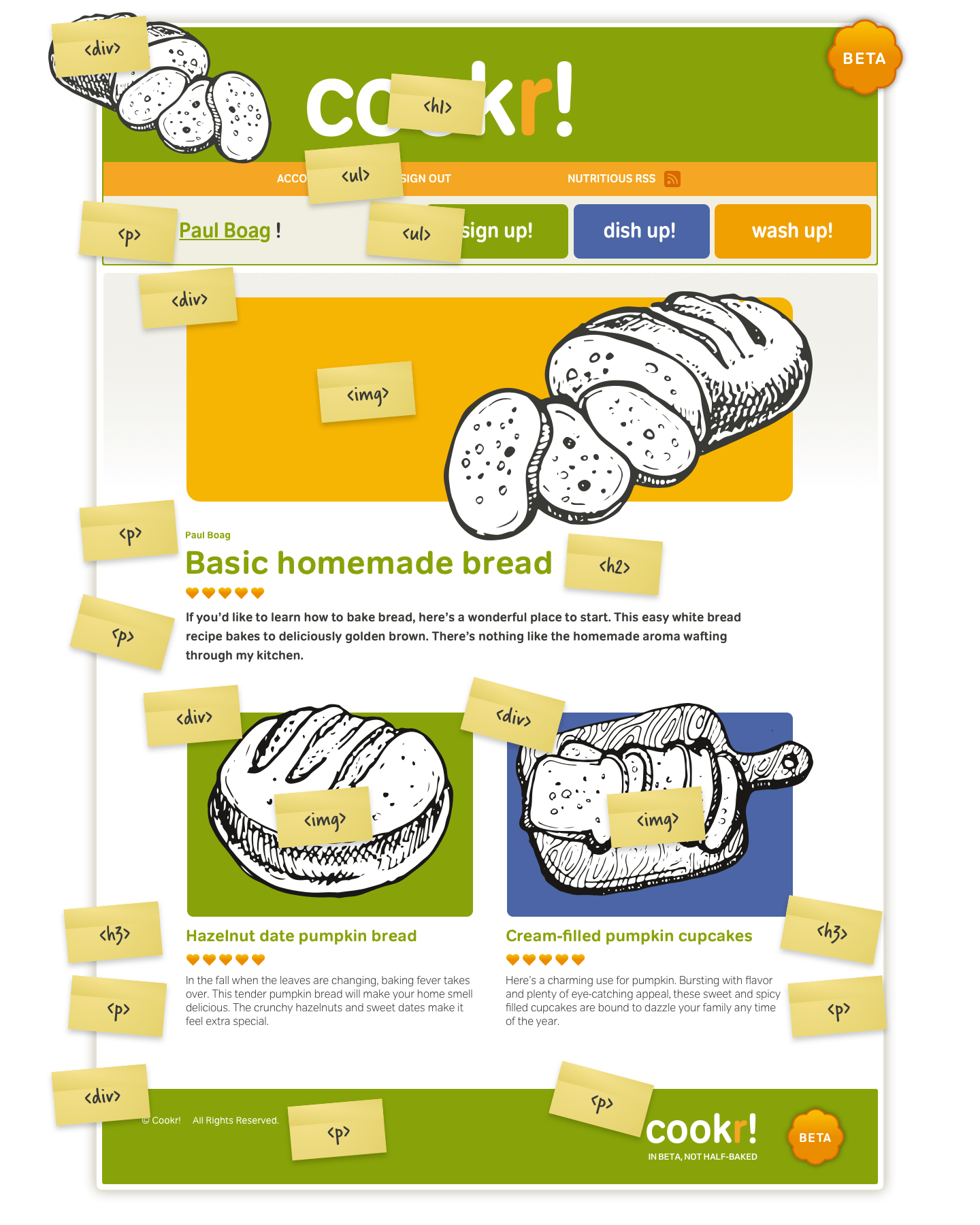
Not everyone is familiar with semantic rather than presentational markup and find it challenging to visualise layouts as code. HTML guides show the most appropriate elements and can help demystify the most common ones. Whether you print wireframes on paper and write details over them, or add them as layers in Adobe Photoshop or Macromedia Fireworks, HTML guides will:
- Show content hierarchy and structure
- Let developers know which elements to use
If you are following modern Web standards practices, these pages are probably built with XHTML for structure and CSS for markup. XHTML is an excellent structure that can serve as the basis for a wireframe that can later be transitioned into a prototype and eventually designed via CSS.
Nick Finck, “Recyclable Information Architecture.” (The original URL on Blue Flavor is dead and not captured by the Wayback Machine.)
Prototype with HTML
It’s understandable why many flow charts, site maps, and wireframes use images, even though they can only hint at how a finished interactive website will look. To get the most from the web, we should use the web to design it. By creating prototypes using HTML, designers can demonstrate their concepts in a browser. Developers can even add Ajax and related technologies to create fully interactive prototypes. You might think using HTML and CSS takes more time than making static visuals images—particularly if you have a library of symbols—but with HTML and CSS you actually work faster:
- Experiment with layout options
- Share colour, layout, and typography styles across any number of pages
- Iterate designs fast without changing your HTML
- Demonstrate design options using the same content
By interacting with a prototype, clients needn’t imagine how a feature might work, they can experience it, even though it might not yet be fully functional.
Clients become engaged when they can interact with HTML wireframes. Clients not only enjoy the process more, but they also get a better contextual understanding of the features than with paper prototypes.
Jeff Gothelf, Practical Applications: Visio or HTML for Wireframes
Reuse code
Investing in reusable HTML and CSS will ultimately save you precious time because you’ll spend less of it repeating the same work. To ensure most of your work as possible ends up in the final product—and won’t be thrown away—follow the same best practices while prototyping as you would for production code. Approach your prototypes with reuse as your goal, and over the whole project life-cycle, you’ll increase efficiency and speed and reduce costs for you and your clients.
WYSIWYG
The WYSIWYG environments, built-in templates, and drag-and-drop library items in software like Macromedia Dreamweaver have already played a part in the moving to HTML for prototyping. They’ve made it far easier to use HTML without needing expert knowledge of HTML, CSS, or best practices for working with them. WYSIWYG editors were developed to write markup for you, so you might think that hand-coding HTML and CSS would take longer, but that isn’t always the case. Here are a few advantages of hand-coding over WYSIWYG:
| WYSIWYG | Standards-based HTML and CSS |
|---|---|
| Requires an application like Adobe GoLive or Macromedia Dreamweaver | Needs only a text editor such as Notepad for Windows or TextEdit for Mac OS X |
| Needs experience with a specific application | Requires only a basic knowledge of HTML and CSS |
| Markup will be presentational and more difficult to maintain and reuse | HTML will be semantic and well structured. HTML and CSS can be reused |
| Changing the layout will mean changing HTML across several pages | Stylesheets can update any number of pages when changes are needed |
In the same way an author makes an outline before writing a book, [the grey box method] serves as my visual outline before creating a design. Breaking this into steps makes you consider your design choices and foundation before you are swept away by the details of your visual decisions.
Jason Santa Maria (Wayback Machine URL)
Choose a development browser
Sticking with a single browser as your development environment will save you both time and headaches. Let everyone know your choice, so they avoid using browsers where the results may look different. Your choice of development browser will depend on whether you’re designing for a corporate intranet where the use Microsoft Internet Explorer 5 on Windows 2000. In that case, Internet Explorer 5 might, sadly, be your most logical choice. It might also be appropriate to choose Apple Safari if your clients mostly use that browser. Where possible, avoid the quirks of older browsers and choose a modern browser which has strong CSS support and development tools which will make developing much easier.
Use browser extensions
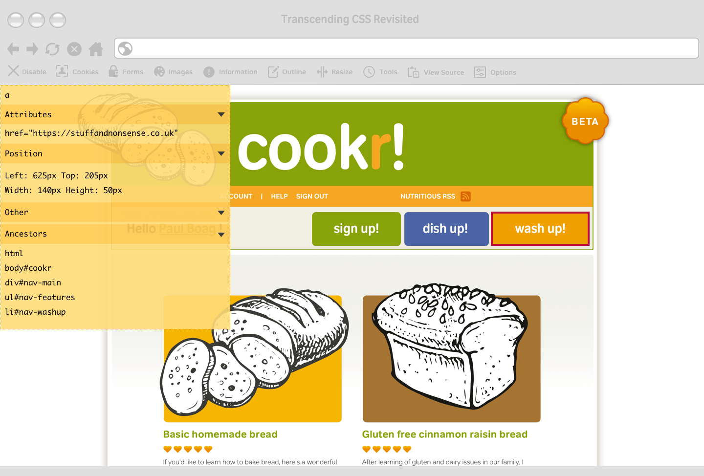
Microsoft Internet Explorer 7 has its own developer toolbar, Mozilla Firefox is the browser most standards-aware designers choose because of the quantity and quality of its developer extensions. The Mozilla website contains more than 190 extensions for Firefox, with more added almost daily. You’ll use browser extensions throughout the exercises in this book. Two of my favourite Firefox extensions are Chris Pederick’s Web Developer extension and Joe Hewitt’s Firebug. Chris’s extension includes so many features that I could write a book about them.
Firebug is a useful Firefox extension which makes it easy to explore the DOM using your keyboard. Any node you select will be highlighted on the page. Firebug then logs CSS, Javascript, and other errors to a console. You can also use your keyboard to move through the DOM, and any node you select will be highlighted on the page.
Web developer extension
The powerful tools within the Web Developer extension make it simple to change the look of a prototype page without directly editing your CSS in an external editor. I find using these tools particularly useful when I need immediate feedback from a client. The Edit CSS panel allows me to change and preview styles results without ever leaving the browser.
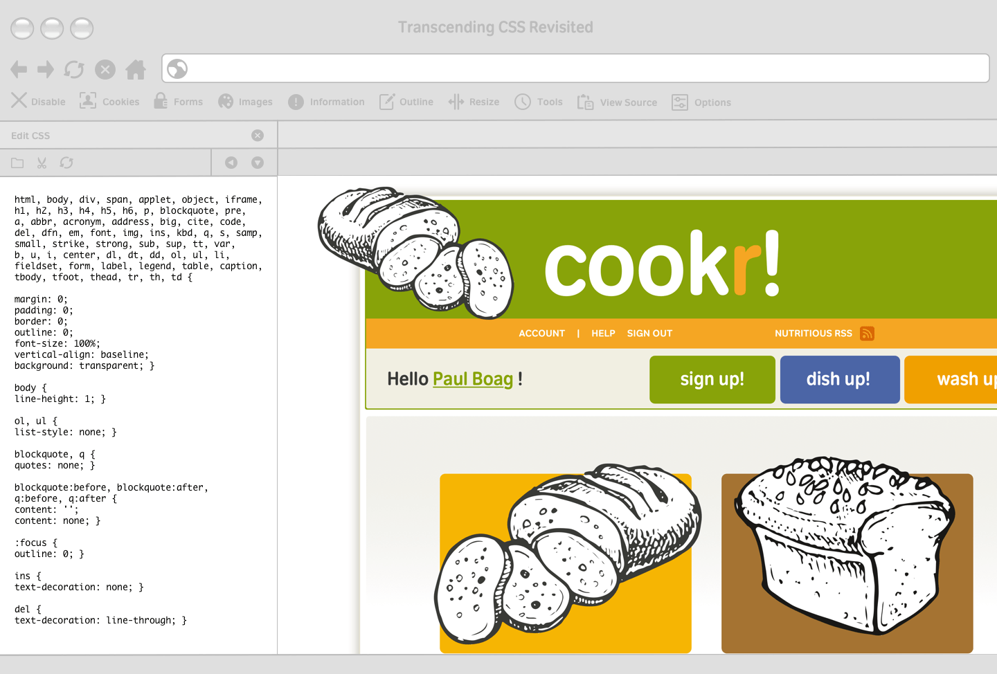
Imagine a client has feedback from user tests. This tells us our default text size is too small. Many designers set text so small it leaves older people with their noses pressed against the screen, so this isn’t uncommon feedback. Don’t take it personally. Select Edit CSS from the menu and a panel containing styling information all organised neatly into tabs will appear. To change your default font size, select the correct tab and increase the percentage:
body {
font: 82%/1.5 Verdana, sans-serif; }
When changes have been approved, use the Edit CSS panel to save this new size to your stylesheet. Working in a browser will save you considerable time. You can try, test, and (if successful) save even large-scale changes, all without reaching for a text editor.
Keep divisions to a minimum
Adding more divisions than you need will make errors far more likely, so keep your HTML as lean as possible. Start with structural elements such as headings, paragraphs, lists, and quotations, and when adding divisions work from the content out. Add divisions progressively which will keep your pages free from presentational or unnecessary elements.
Validate HTML and CSS
Poorly written HTML and CSS will force you to find and correct errors which will use more of your valuable time. Validating your HTML and CSS regularly is essential to working efficiently as it will reduce the margin for error and provide a solid foundation for your designs.
Tip: Validation is a terrific learning tool. The HTML Validator extension for Firefox and the Tidy plug-in for Safari will nag you by showing warning icons in the status bar when pages contain errors.
Use CSS positioning, not floats
Floats have become the standard tool for developing CSS layouts, but they weren’t intended for layout. Float-based designs are fragile, which can be frustrating, especially when even a line of italicized text can break a layout. Use CSS positioning instead during prototyping, even when you’ll develop your final product using floats.
The problem with floats
Modern browsers follow the W3C specification in which a 200px element should always be 200px, even if its child elements are larger. When this happens, those larger elements will stick out. The result might look ugly, but the layout will stay intact. But the developers of early versions of Internet Explorer had other ideas. They made their browser expand a container to fit the size of its contents. So, a 200px wide column containing a 220px wide image expanded to 220px. This will cause a floated column to drop down under another column, so breaking the layout.

Use PNG alpha transparency
Few jobs are more frustrating than exporting images over and over again to ensure they match background colours. If your development browser supports them, using alpha transparency in PNG images will save you plenty of frustration because transparency makes it possible to export just one set of images. If you change background colours in your design, you won’t need to reopen your image editor.
Organise CSS
There are so many ways to organise stylesheets that if a group of designers got together for a drink, the conversation about the right method would last well beyond closing time. As stylesheets grow in complexity and size, organising styles is essential. This organisation will help you write CSS more efficiently CSS and ensures other developers can work with your files more easily. Most designers have a preferred organising method. Some organise rules according to divisions in their HTML. For example, they place all #branding styles in one group and the #content styles in another:
/* =content_main */
div#content_main { width: 70%; }
div#content_main p { font-size: 100%; }
div#content_main p > a { text-decoration: underline; }

/* =content_sub */
div#content_sub { width: 30%; }
div#content_sub p { color: #666; }
div#content_sub p > strong { font-weight: normal; }
Making stylesheet sections easily distinguishable from each other—using comments, dashes as separators, and section markers—is one way to make finding styles easier. This type of section highlighting will save time when you come back to a project weeks or months later:
/* Main content –––––––––– */
/* Secondary content –––––––––– */
Others designers—myself included—prefer to organise styles by HTML element, grouping all heading, paragraph, and list styles together:
p { line-height: 110%; }
blockquote p { padding-left: 1em; }
div#site_info p { text-align: center }

ul { list-style-type: disc; }
div#nav_main ul { list-style-type: none; }
div#content_sub ul { border: 1px solid #ccc; }
Place a = character immediately before a commented section to create a CSS flag. Using your text editor’s Find command to search for =p will take you straight to your paragraph section:
/* =p –––––––––– */Spread styles across files
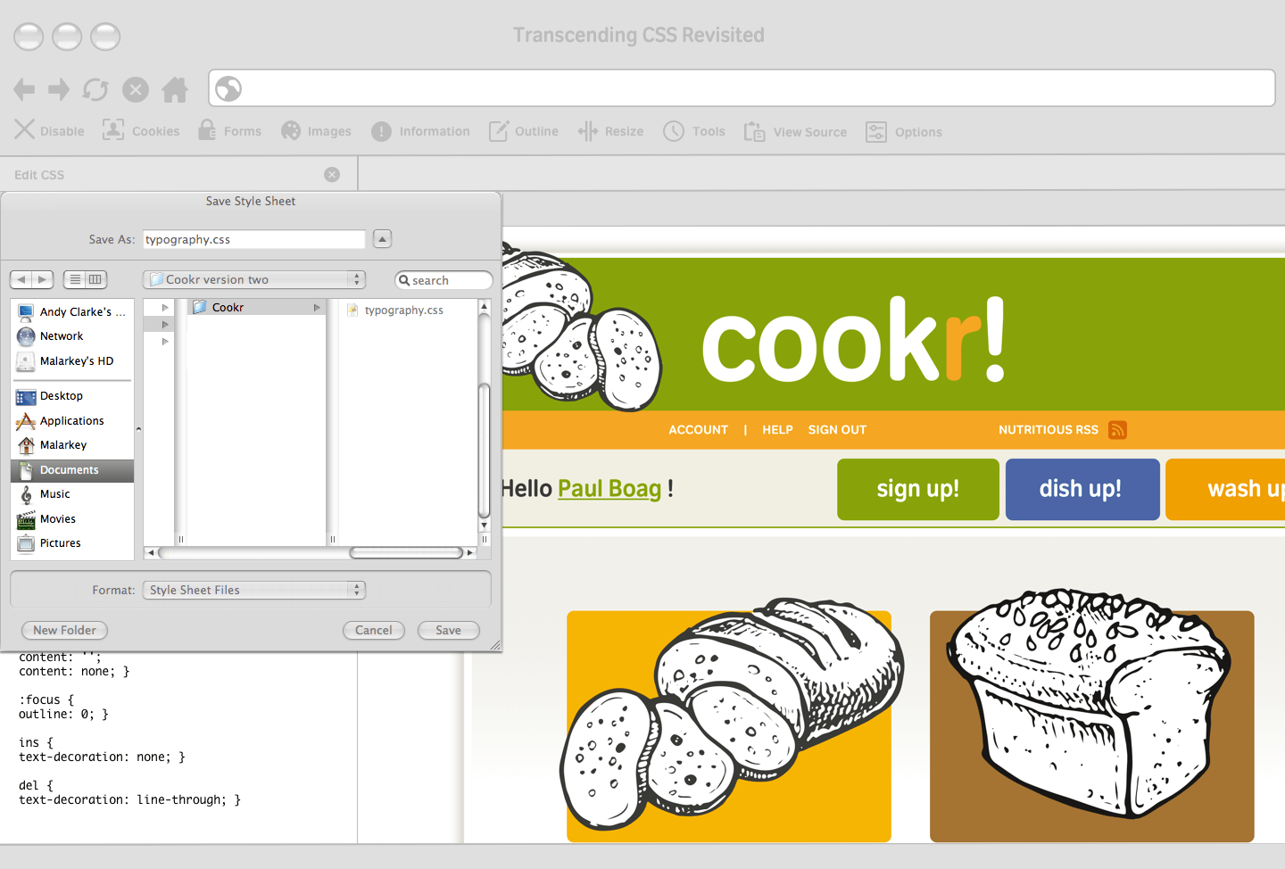
Whereas developers might disagree over whether one long stylesheet is more manageable than multiple shorter ones, one thing is sure. When developing prototypes, multiple files have several advantages. You might split a prototype’s styles into:
- Layout: display properties, dimensions, floats and positioning, padding and margins (layout.css)
- Colour: background, border, and text colours (color.css)
- Typography: font families and sizes, letter-spacing, line heights, and text-decoration (type.css)
To reduce the number of stylesheets linked to your HTML, link to a single stylesheet and import additional stylesheets into it using the @import at-rule. To work correctly, all imported stylesheets must appear above all other rules:
@import url(layout.css);
@import url(color.css);
@import url(type.css);
/* All other styles */
HTML prototyping and full-on agile development of Web applications are increasingly viable options that help minimize communication gaps and assumptions and deliver more accurate results sooner. If you haven’t considered it, now may be the time.
Garrett Dimon, “Just build it.” (The original URL on Digital Web is dead and not captured by the Wayback Machine.)