I’ve shown you how to use HTML and CSS to develop prototypes which are accessible, flexible, lightweight, and semantic. Now, it’s time to put that knowledge to use by developing a prototype for one of my designs. Imagine I’ve been given the opportunity to work with a brand new start-up company. The company’s called Cookr! and they’re developing an exciting new web application for sharing recipes. They might be missing a vowel, but they have plush new offices and enough venture capital to fund a small country. My first task is to gather and organise their content.
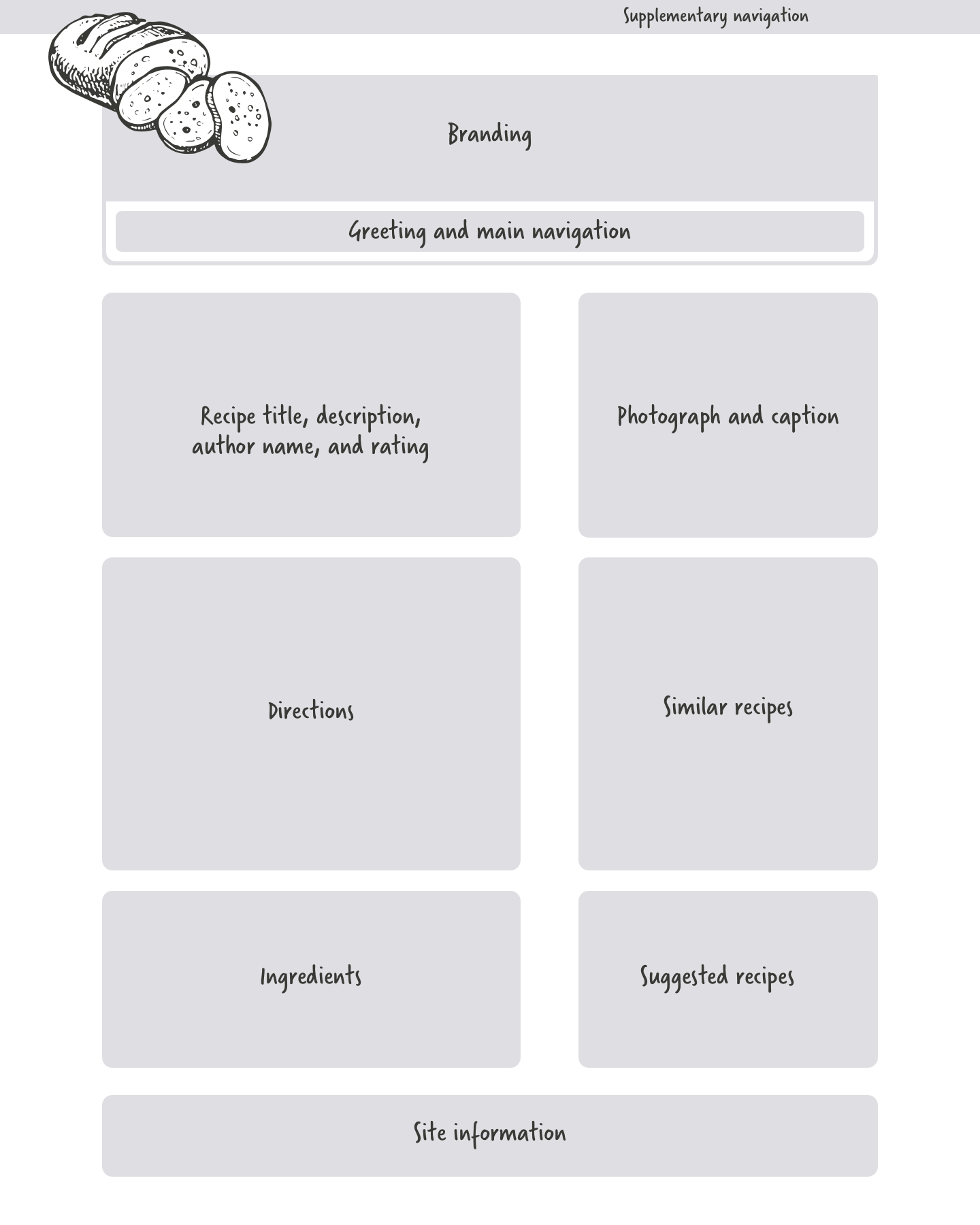
Grey boxes
Grey boxes are ideal for describing content areas and any relationships between them. They provide just the right level of detail but don’t define explicitly how a page should be laid out. Grey boxes can be part of a set of documentation which might include page descriptions and notes about functionality.
Static visuals
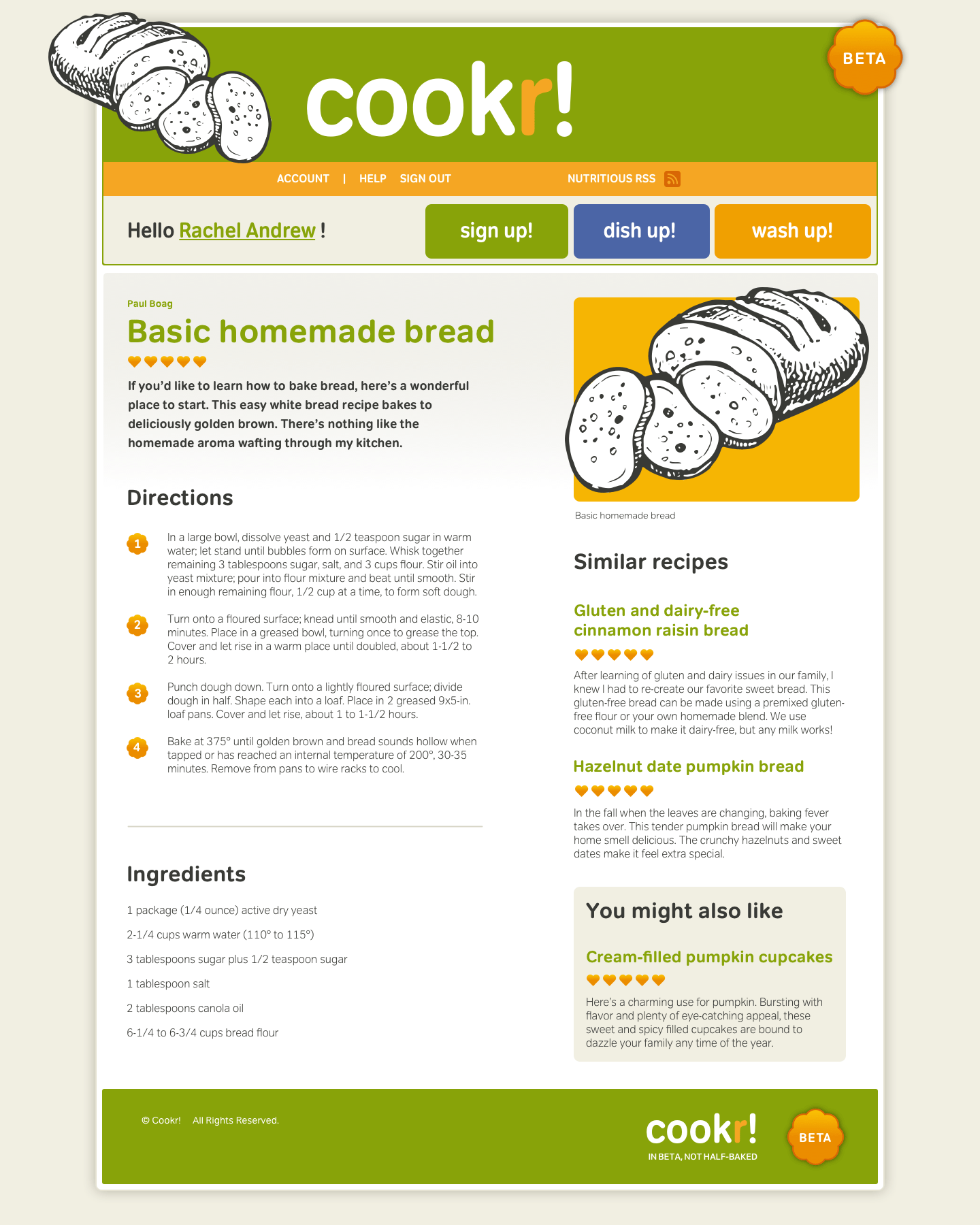
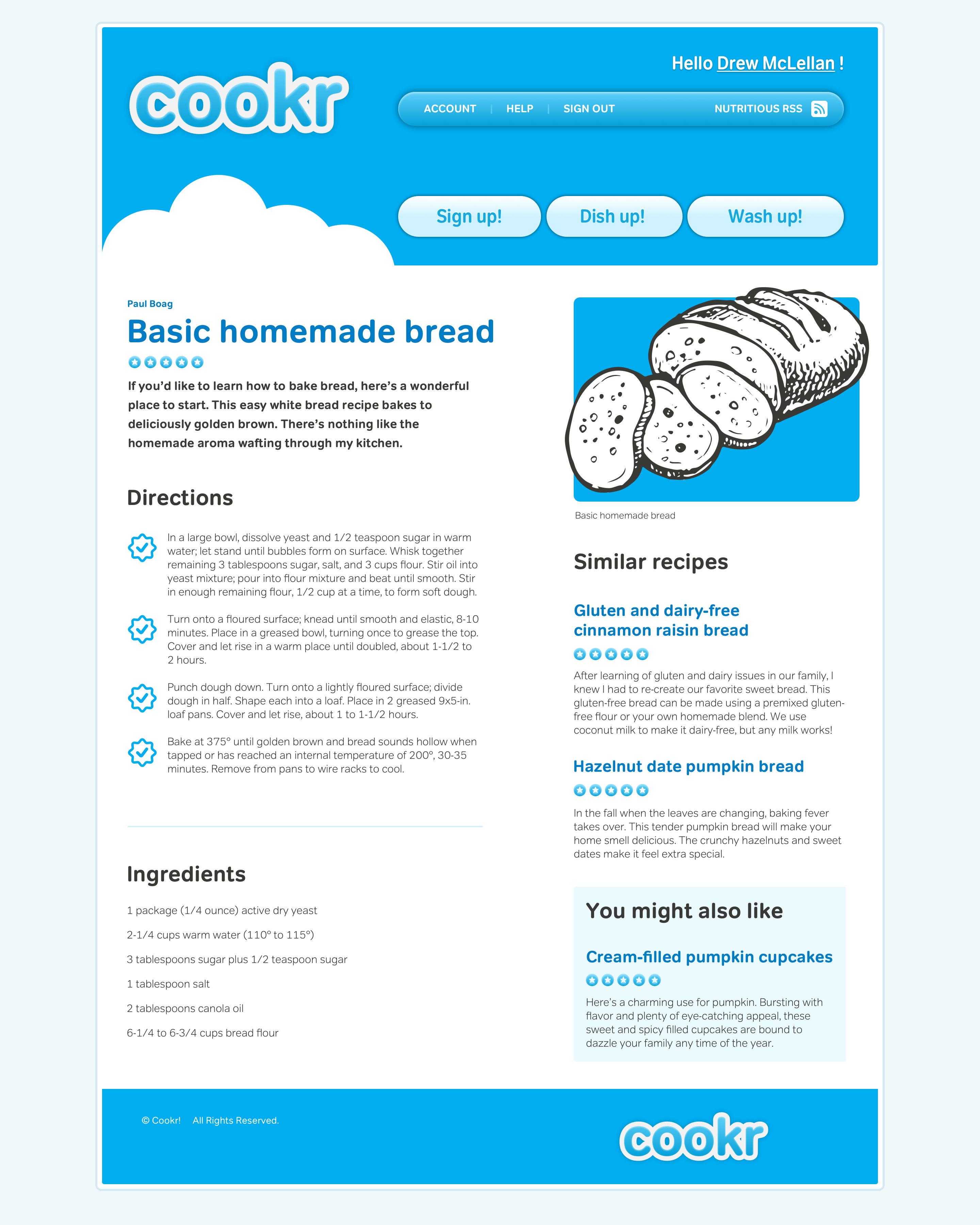
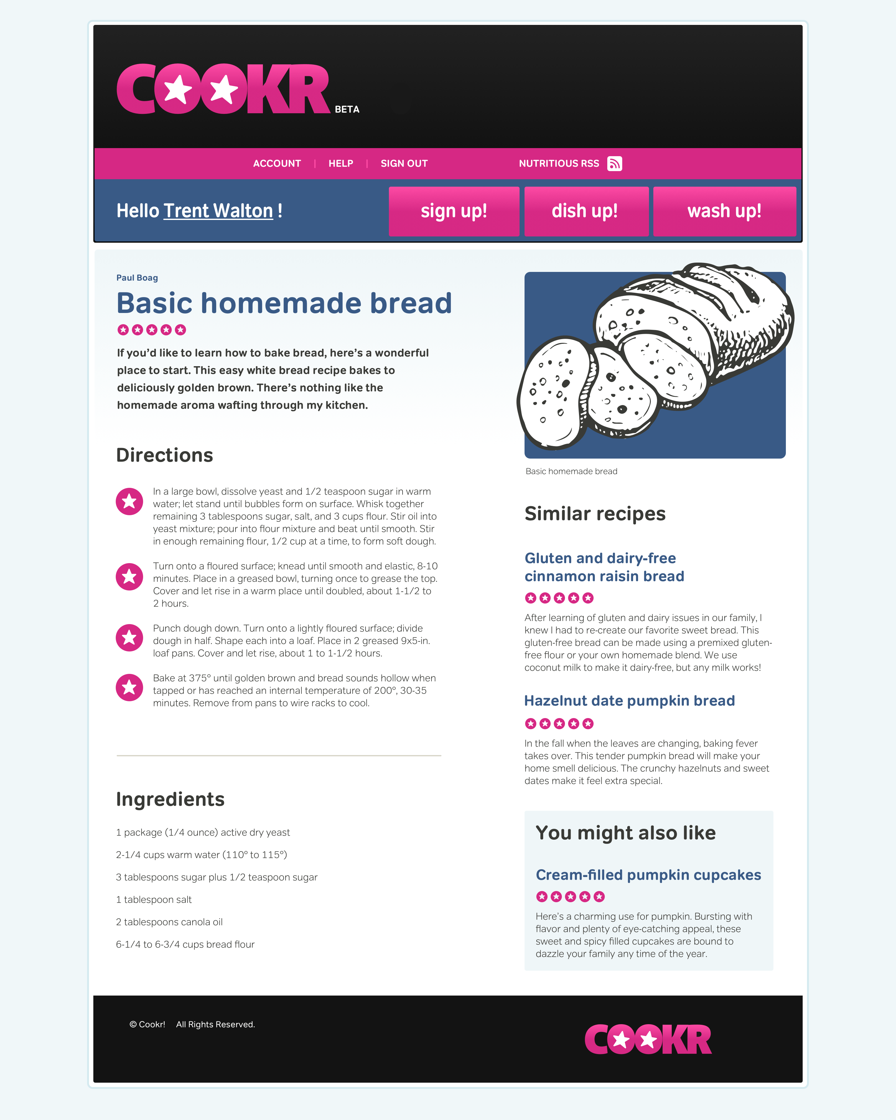
I find it difficult to imagine a creative design process without static visuals. For this project, I’ve designed three visuals and the Cookr! team can choose which one which reflects their brand best.
Content-out HTML
I’ll develop this HTML prototype from my grey box wireframes. I can work on it while my static visuals are being approved, which gives me a real head start.
Although it might be tempting to use my layout as the starting point for writing HTML, this can easily lead to presentational markup. To avoid adding unnecessary elements, start by with content and working outwards from that.
Marking up the main content
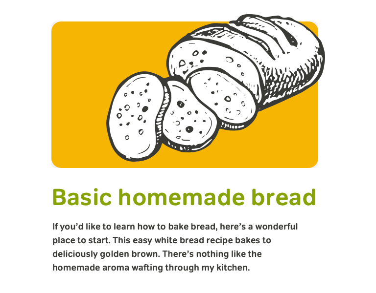
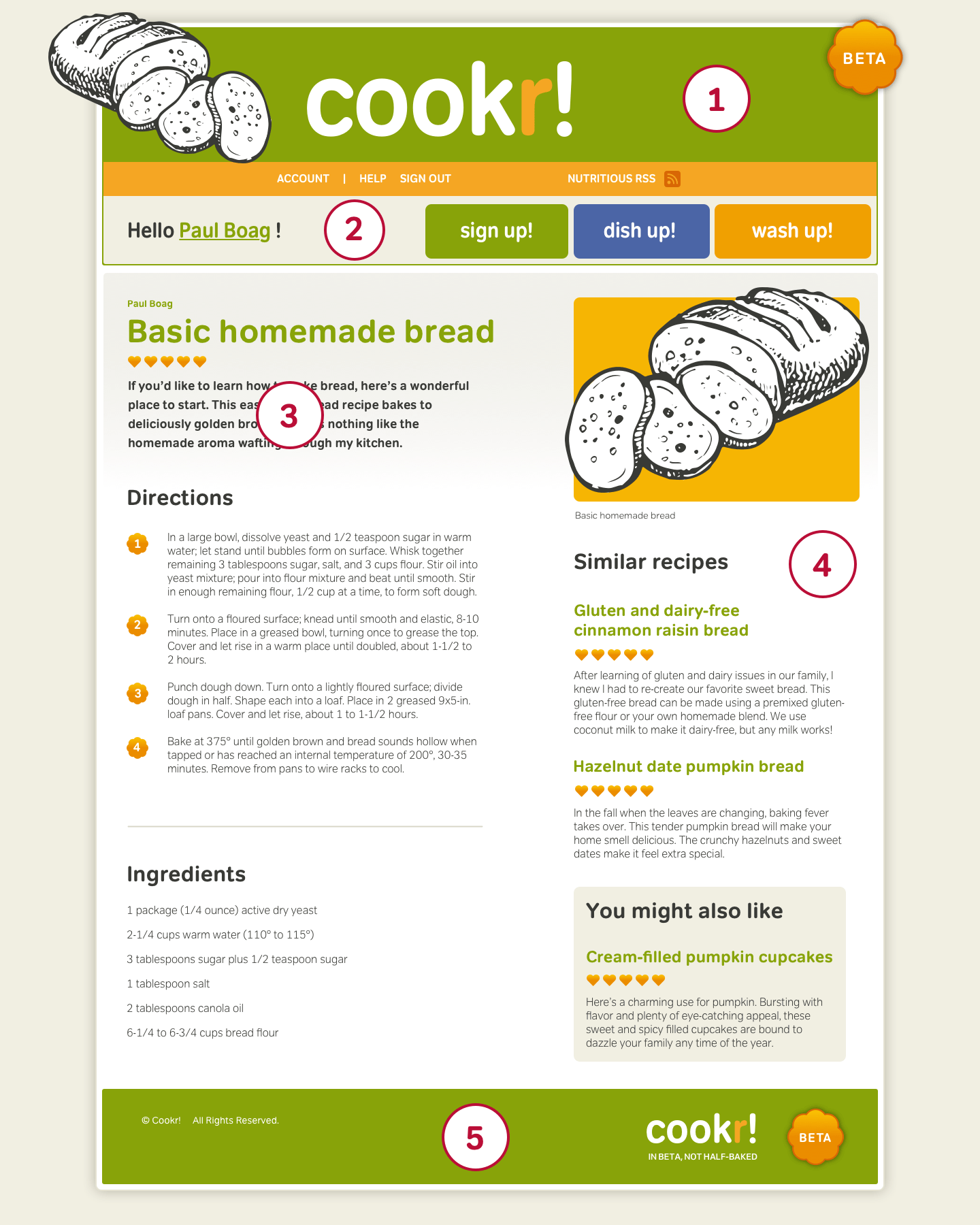
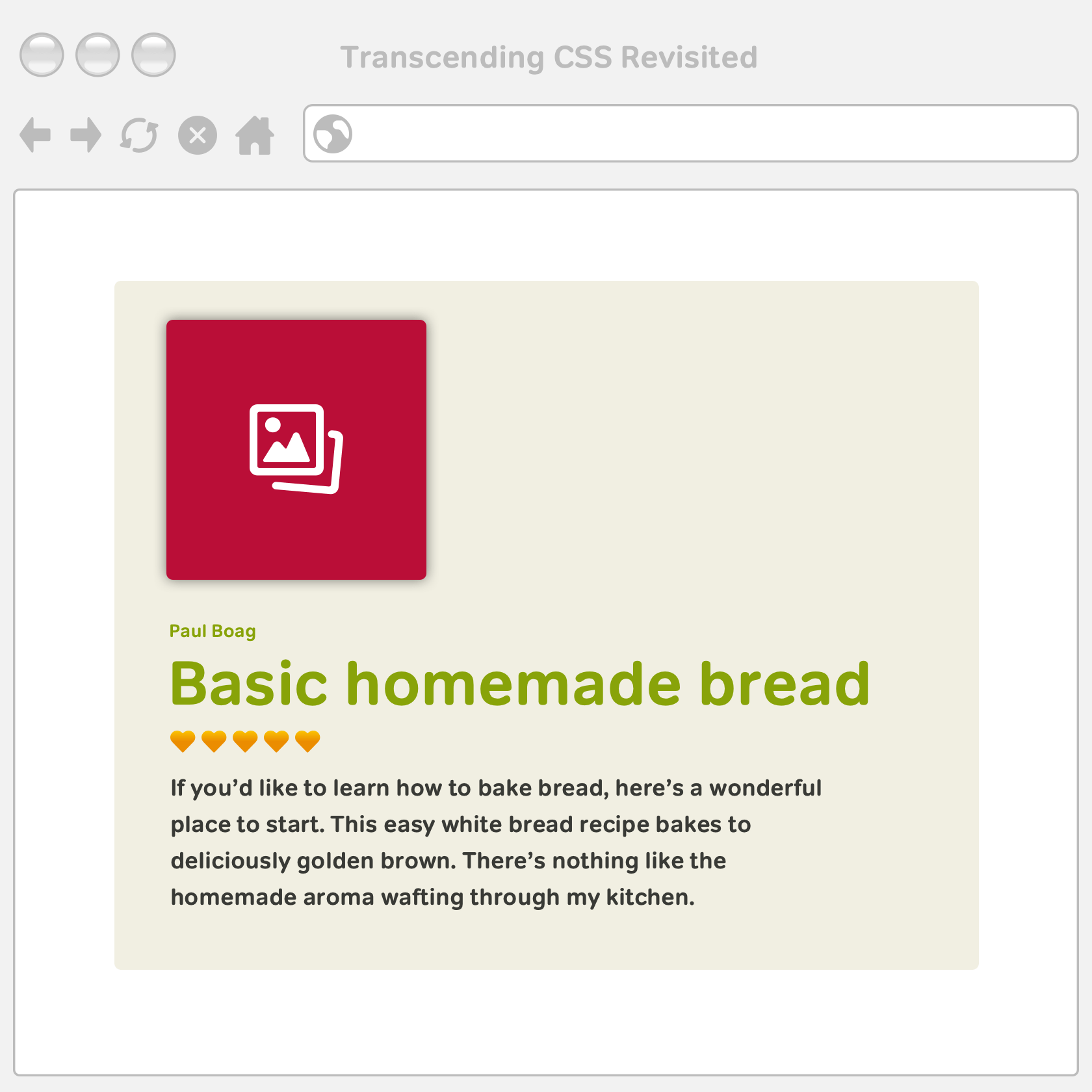
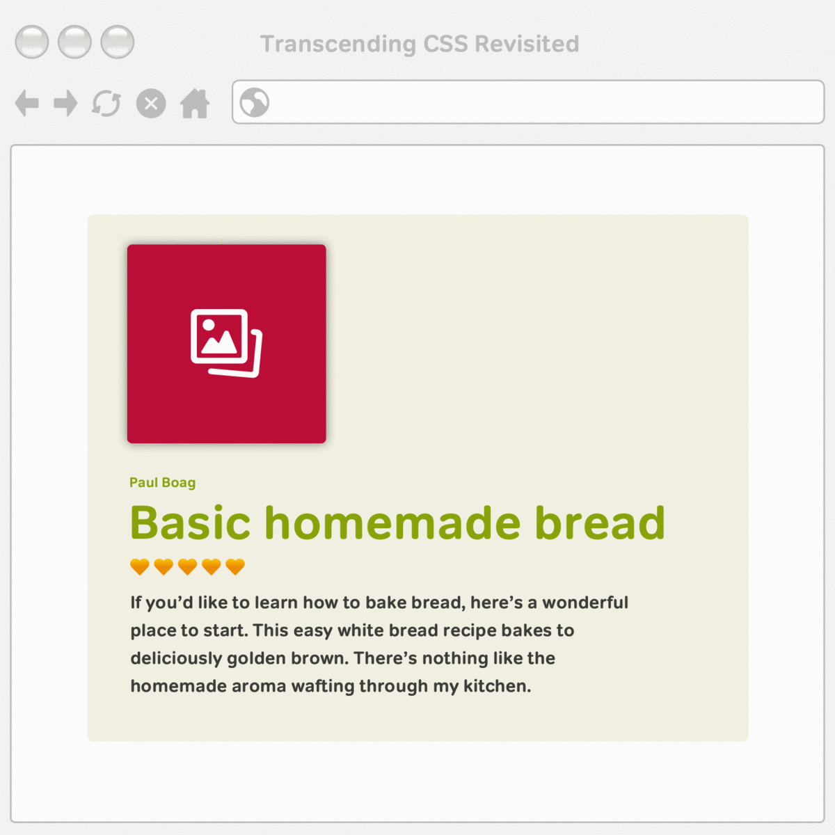
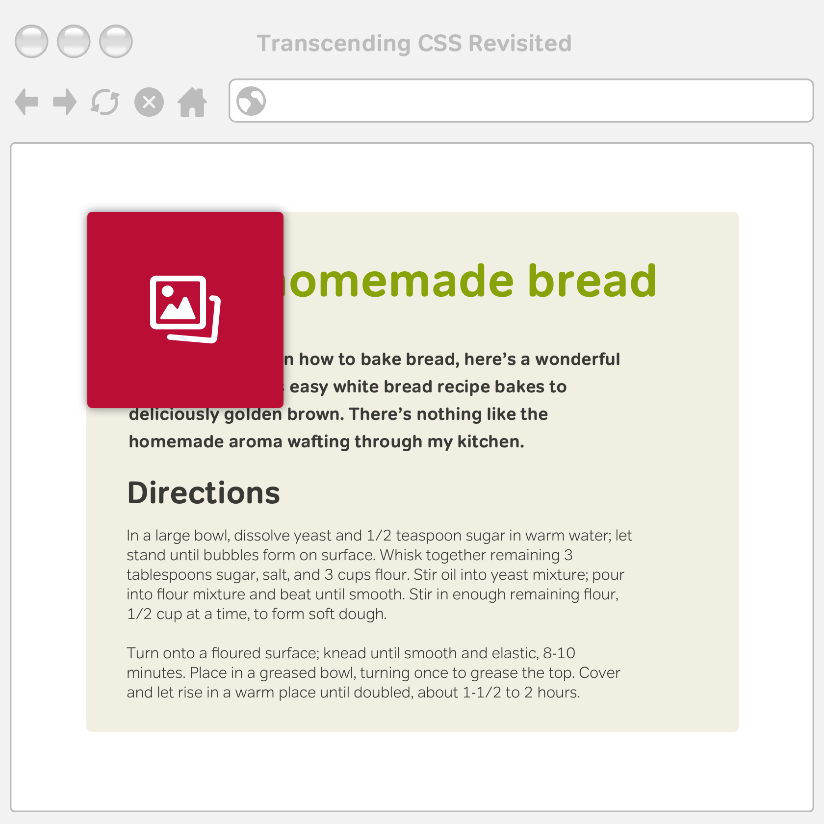
The name of this website is obvious; it’s Cookr!, and that’s important enough to warrant using a top-level heading to describe it. Some designers use a top-level heading for the name of the website on the home page only. On other pages, they use a top-level heading for the page title. Next, there’s recipe information including its title and description. Two HTML elements should be obvious:
- Heading for the recipe title
- Description paragraph
<h2>Basic homemade bread</h2>

<p>If you’d like to learn how to bake bread, here’s a wonderful place to start.</p>
There’s a similar structure to the baking directions, but with a subtle difference. As this heading follows the second-level heading for the recipe title, for a well-structured outline, choose a third-level heading for the directions:
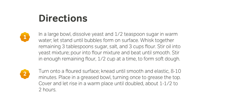
<h3>Directions</h3>

<p>In a large bowl, dissolve yeast and 1/2 teaspoon sugar in warm water; let stand until bubbles form on surface.</p>
Finally, there’s a list of ingredients. As there’s no order to these ingredients, an unordered list is the most appropriate element:
<h3>Ingredients</h3>

<ul>
<li>1 package (1/4 ounce) active dry yeast</li>
<li>2-1/4 cups warm water (110° to 115°)</li>
<li>3 tablespoons sugar plus 1/2 teaspoon sugar</li>
</ul>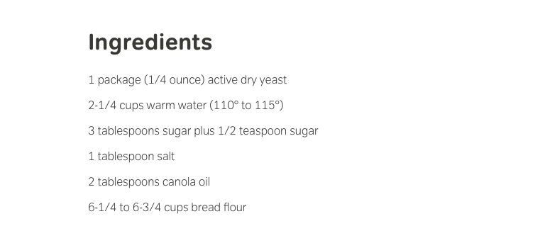
I hope you’ve noticed I haven’t once mentioned how I want my content to look. This is intentional as at this stage, it’s essential to concentrate on the semantics of content and the elements most appropriate elements to describe it.
Marking up secondary content
Similar recipes appear on the right of my static visual, but I needn’t be concerned about their position and should concentrate on describing their content, starting with another second-level heading.
<h2>Similar recipes</h2>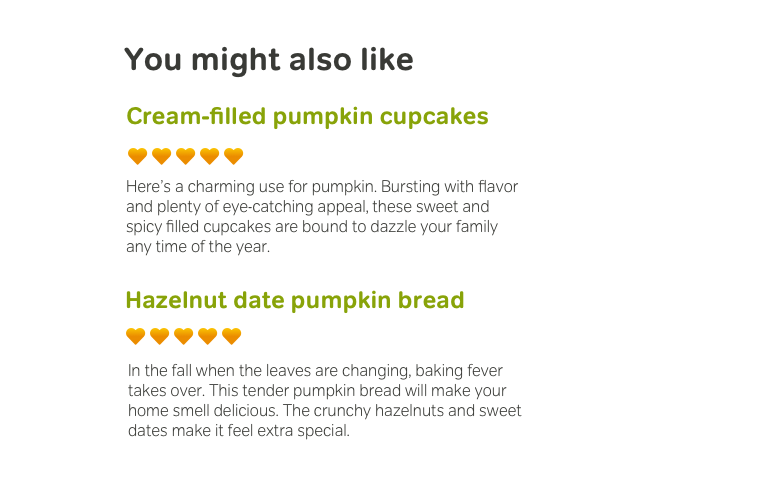
What about those similar recipes themselves? A third-level heading followed by a paragraph will describe them well:
<h3>Gluten and dairy-free cinnamon raisin bread</h3>
<p>After learning of gluten and dairy issues in our family, I knew I had to re-create our favorite sweet bread.</p>

<h3>Hazelnut date pumpkin bread</h3>
<p>In the fall when the leaves are changing, baking fever takes over. This tender pumpkin bread will make your home smell delicious.</p>
There’s one crucial aspect of semantics which is missing from that combination. Each recipe is one in a series, and so together they form a list. But what kind? Although you might think the titles and descriptions look like name/value pairs and that a definition list would be the right choice, those titles and descriptions aren’t strictly definition terms and descriptions. This list has no order so an unordered list and list items around each heading and paragraph pair would be a better choice. This combination of elements forms what’s known as an HTML compound:
<ul>
<li>
<h3>Gluten and dairy-free cinnamon raisin bread</h3>
<p>After learning of gluten and dairy issues in our family, I knew I had to re-create our favorite sweet bread.</p>
</li>

<li>
<h3>Hazelnut date pumpkin bread</h3>
<p>In the fall when the leaves are changing, baking fever takes over. This tender pumpkin bread will make your home smell delicious.</p>
</li>
</ul>
HTML compounds are combinations of two or more elements which each have their own individual meaning. When combined, these elements create more precise meaning. The concept of HTML compounds emerged from the microformats community rather than the W3C. Learn more about HTML compounds in “The Elements of Meaningful XHTML” by Tantek Çelik. I use the same compound for links to related recipes:
<li>
<h4>Cream-filled pumpkin cupcakes</h4>
<p>These sweet and spicy filled cupcakes are bound to dazzle your family any time of the year.</p>
</li>
With both main and secondary content complete, now’s a good time to preview this page in a browser to ensure its structure is correct. It’s also an opportunity to validate your HTML.
Add divisions
When content’s related, group it into divisions and give each one a meaningful identity which reflects its role:
<div id="content_main">…</div>
<div id="content_sub">…</div>
As the two divisons are siblings, wrap them in a parent division with an identity of content to further cement their relationship:
<div id="content">
<div id="content_main">…</div>
<div id="content_sub">…</div>
</div>
I can use these id attributes to bind styles to elements when implementing my design.
Marking up the branding
My page has two branding elements: the company name displayed as a logo, plus a tagline. I don’t want this tagline visible in my design, but including it in HTML could help SEO and will definitely help people who use non-visual browsers.
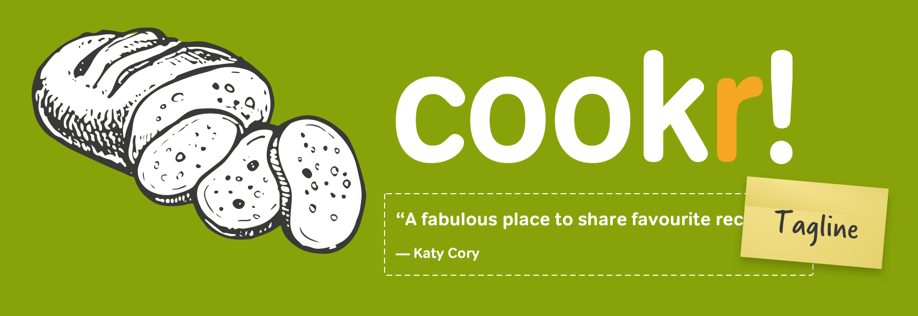
There’s already a top-level heading for the site name, but what about that tagline? Semantically, this is a quotation from a happy customer, and so the blockquote element is a perfect choice. This quotation can also include the name of the person quoted by including a citation:
<blockquote>
<p>A fabulous place to share favourite recipes</p>
<cite>Katy Cory</cite>
</blockquote>
Group the site name heading and blockquote tagline in a branding division to give them both additional semantics:
<div id="branding">
<h1>Cookr!</h1>
<blockquote>
<p>A fabulous place to share favourite recipes</p>
<cite>Katy Cory</cite>
</blockquote>
</div>Marking up navigation
It’s time to develop the Cookr! website’s navigation. With its mix of visual styles, this might look complicated, but by working from the content out, it’s no more complex than any other part of this design.

There are several types of navigation in this design:
- Welcome message plus a link from the members’s name
- Account, help, and sign-out (tools)
- “Sign up,’ “Dish up,’ and “Wash up’ (features)
- RSS feed
Decide on the proper order for these links:
- Welcome message
- Features
- Tools
- RSS
Then, choose the most appropriate HTML elements:
<p>Hello <a href="/">Paul Boag</a>!</p>

<ul id="nav_features">
<li><a href="/">Sign up!</a></li>
<li><a href="/">Dish up!</a></li>
<li><a href="/">Wash up!</a></li>
</ul>

<ul id="nav_tools">
<li><a href="/">Account</a></li>
<li><a href="/">Help</a></li>
<li><a href="/">Sign out</a></li>
<li><a href="/">Nutritious RSS</a></li>
</ul>
Extend the meaning of those list items by giving each one a unique identity which reflects its purpose:
<p>Hello <a href="/">Paul Boag</a>!</p>

<ul id="nav_features">
<li id="nav_signup"><a href="/">Sign up!</a></li>
<li id="nav_dishup"><a href="/">Dish up!</a></li>
<li id="nav_washup"><a href="/">Wash up!</a></li>
</ul>

<ul id="nav_tools">
<li id="nav_account"><a href="/">Account</a></li>
<li id="nav_help"><a href="/">Help</a></li>
<li id="nav_signout"><a href="/">Sign out</a></li>
<li id="nav_rss"><a href="/">Nutritious RSS</a></li>
</ul>
Clarify the relationship between those headings and lists by enclosing them in a uniquely identified division:
<div id="nav_main">
<p>Hello <a href="/">Paul Boag</a>!</p>

<ul id="nav_features">
<li id="nav_signup"><a href="/">Sign up!</a></li>
<li id="nav_dishup"><a href="/">Dish up!</a></li>
<li id="nav_washup"><a href="/">Wash up!</a></li>
</ul>

<ul id="nav_tools">
<li id="nav_account"><a href="/">Account</a></li>
<li id="nav_help"><a href="/">Help</a></li>
<li id="nav_signout"><a href="/">Sign out</a></li>
<li id="nav_rss"><a href="/">Nutritious RSS</a></li>
</ul>
</div>Marking up the footer
A footer typically includes a copyright statement, legal information, and perhaps a link to the top of the current page. The grey box wireframes explain the content which should be included. Deciding on the most appropriate HTML elements should be natural to you now. This footer contains a low-level heading, a back-to-top link, plus two paragraphs. Enclose these in another division:
<div id="site_info">
<h5><a href="#cookr" title="Top">Cookr!</a></h5>
<p>In beta, not half-baked</p>
<p>© Cookr! All Rights Reserved.</p>
</div>Now is another opportunity to preview the page in a browser and validate the HTML.

Content in semantic order
It’s time to put all these elements in meaningful order on a full page, but before diving back into HTML, write a list of the content. This will form the document outline:
- Branding
- Navigation
- Main content
- Secondary content
- Website information
Add html, head, plus body elements and an XHTML DOCTYPE to complete this document:
<!DOCTYPE html PUBLIC "-//W3C//DTD XHTML 1.0 Strict//EN"
"http://www.w3.org/TR/xhtml1/DTD/xhtml1-strict.dtd">

<html xmlns="http://www.w3.org/1999/xhtml" lang="en" xml:lang="en">

<head>
<title>Cookr!</title>
<meta http-equiv="content-type" content="text/html; charset=utf-8" />
</head>

<body id="cookr-co-uk" class="recipe">

<!-- 1. Branding -->
<div id="branding">

<blockquote>
<p>A fabulous place to share your favourite recipes</p>
<cite>Katy Cory</cite>
</blockquote>

</div>

<!-- 2. Navigation -->
<div id="nav_main">

<p>Hello <a href="/">Paul Boag</a>!</p>

<ul id="nav_features">
<li id="nav_signup"><a href="/">Sign up!</a></li>
<li id="nav_dishup"><a href="/">Dish up!</a></li>
<li id="nav_washup"><a href="/">Wash up!</a></li>
</ul>

<ul id="nav_tools">
<li id="nav_account"><a href="/">Account</a></li>
<li id="nav_help"><a href="/">Help</a></li>
<li id="nav_signout"><a href="/">Sign out</a></li>
<li id="nav_rss"><a href="/">Nutritious RSS</a></li>
</ul>

</div>

<!-- 3. Main content -->
<div id="content_main">…</div>

<!-- 4. Secondary content -->
<div id="content_sub">…</div>

<!-- 5. Website information -->
<div id="site_info">
<h5><a href="#cookr-co-uk" title="Top">Cookr!</a></h5>
<p>In beta, not half-baked</p>
<p>© Cookr! All Rights Reserved.</p>
</div>

</body>
</html>With all elements in their place, preview the page once more in a browser and take another opportunity to validate HTML before starting to implementing this design using CSS.
Styling this design
For flexibility, I split my styles across three stylesheets:
- Layout
- Colour
- Typography
To reduce the number of linked stylesheets, it”s common practice to link to just one stylesheet:
<link rel="stylesheet" href="styles.css" />Then, import the remaining stylesheets using the @import at-rule:
@import url(layout.css);
@import url(colour.css);
@import url(typography.css);
Normalise browser styles
All browsers use their own default styles, so start by normalising them:
/* Normalises margin, padding */
body, div, dl, dt, dd, ul, ol, li, h1, h2, h3, h4, h5, h6, pre, form, fieldset,
input, p, blockquote, th, td
{ margin: 0; padding: 0; }

/* Normalises font-size for headings */
h1, h2, h3, h4, h5, h6 {
font-size: 100%; }

/* Removes list-style from lists */
ol, ul {
list-style: none; }

/* Normalises font-style and font-weight */
address, caption, cite, code, dfn, em, strong, th, var {
font-style: normal;
font-weight: normal; }

/* Removes spacing in tables */
table {
border-collapse: collapse;
border-spacing: 0; }

/* Left-aligns text in caption and th */
caption, th {
text-align: left; }

/* Removes border from fieldset and images */
fieldset, img {
border: 0; }

/* Removes quotation marks from q */
q:before, q:after {
content: ''; }
Note: Read more about normalising browser styles by Tantek Çelik and Eric Meyer.
Style the body
The static visual for this design is a common, centered, fixed-width layout. For designs like this, use a container or wrapper division which keeps content in the center of the viewport. You can also use <html> and <body> elements to center a design. The fixed-width and automatic left and right margins center this <body> element in the viewport.
html {
text-align: center; }

body {
width: 770px;
margin: 0 auto;
text-align: left; }Establish a positioning context
Any absolutely positioned element will appear according to any offsets in relation to its closest positioned ancestor, or —in the absence of a positioned ancestor—the root element. Because this design uses the <body> element rather than a container division, apply relative positioning to that which establishes it as a positioning context for other positioned elements:
body {
position: relative; }
Use positioning to create the two columns in the static visual. The HTML contains a parent content division, plus two child divisions. Apply position: relative; to the parent to establish it as a positioning context for its children:
div#content {
position: relative;
width: 100%; }
Create columns
Make two columns using absolute positioning. Give them both equal width and position the main content on the left edge and the secondary content 50% from the left edge of its parent. Then, add padding at the top and bottom of both. An em unit will maintain a relationship between this padding and text size:
div#content_main {
left: 0;
width: 50%;
padding: 1em 0; }

div#content_sub {
left: 50%;
width: 50%;
padding: 1em 0; }
This positioning method creates two columns which are robust enough to include huge images or even gigantic text without breaking. But what will you do if a client asks if the main content would look better on the right, rather than the left? Positioning enables us to switch the visual order of these columns without changing the order in the HTML:
div#content_main {
left: 50%;
width: 50%; }

div#content_sub {
left: 0;
width: 50%; }It’s also easy to change layout proportions to 70%/30% by adjusting the percentage widths and horizontal positions of both columns:
div#content_main {
left: 70%;
width: 30%; }

div#content_sub {
left: 0;
width: 70%; }
With most of the layout complete, add a rule which gives the remaining divisions the same width:
div#branding,
div#nav_main,
div#site_info {
width: 100%; }But, there’s a gotcha hiding here. Preview this page in a browser and the footer which should be at the bottom has risen up to overlap the columns. This isn’t a bug. It’s the result of using absolute positioning to develop columns. Don’t worry, this is easily fixed using Sean Inman’s Position Clearing method. Sean’s method uses Javascript to position the footer under the columns. For his method to work, place the script immediately above the closing </body> tag:
<script type="text/javascript"
src="si-clear-children.js">
</script>
</body>| c | Content |
|---|---|
| pc | Primary content |
| sc | Secondary content |
| clear_children | Clears the footer |
| cc_tallest | The tallest column |
Then, add Sean’s class attribute values to divisions in the HTML:
<div id="content" class="c clear_children">
<div id="content_main" class="pc cc_tallest">…</div>
<div id="content_sub" class="sc">…</div>
</div>
.pc,.sc { position: absolute; top: 0; left: 0; }
.clear_children,.cc_tallest { position: relative; }
/*\*/* html .clear_children { display: inline;}/**/
.cc_tallest:after { content: ‘’; } /* PREVENTS SAFARI BUG */By adding these attributes and including the script, the footer will now take its rightful place below any columns.
Relatively speaking
Relative positioning can be confusing for people who are new to CSS, largely because the term relative makes people wonder “relative to what?” Relatively positioned elements are positioned according to the normal flow in a document where elements flow left–right, top–bottom unless you change their direction.
This relatively positioned element is offset from its natural position in the normal flow. When an element is positioned away from its original location, it leaves behind the space it would’ve occupied. Other elements can’t flow into its space.
Absolute positioning
An absolutely positioned element is positioned to its most recent positioned ancestor. If there’s no positioned ancestor, it’s positioned to the root element.
Absolutely positioned elements are considered out of normal flow, so other elements can occupy the space it leaves behind.
Now it’s time to add background colours and images to the page:
html {
background-color: #f1efe2; }

div#content {
background-color: #fff; }

div#site_info {
background: transparent url(site_info.png) no-repeat 0 0; }
Style the branding
The branding area has a green background, a logo, plus an image which escapes the top-left edges:
<div id="branding">
<h1>Cookr!</h1>
<blockquote>
<p>A fabulous place to share favourite recipes</p>
<cite>Katy Cory</cite>
</blockquote>
</div>Add space above the branding to adding padding to the top of the body element. This creates space for that escaping image:
body {
padding-top: 50px; }
Add height to the branding which matches that of its background image:
div#branding {
height: 120px;
background: transparent url(branding.png) no-repeat 0 0; }
Use negative offset values to position the image create the effect of it escaping its parent:
h1 {
position: absolute;
top: -10px;
left: -80px; }
This image overlaps the navigation below, so to ensure the branding remains in the foreground, add a high z-index value. You can read all about z-index and image replacement in my article “Z’s not dead baby, Z’s not dead”:
div#branding {
position: relative;
z-index: 10; }For this top-level heading, text is replaced by an image. There are plenty of image replacement techniques, but I recommend the Phark method which uses negative text-indent to move text off to the left of the viewport:
h1 {
position: absolute;
top: -60px;
left: -80px;
width: 588px;
height: 253px;
background: transparent url(h1.png) no-repeat;
text-indent: -9999px; }
Use the same method to move the tagline out of sight. It will still be accessible for people who use screen readers:
div#branding blockquote {
position: absolute;
top: -9999px; }
Now the header is styled, the logo is positioned, and the tagline moved out of sight, the branding is complete.
Style the navigation
The navigation includes a welcome greeting paragraph followed by two unordered lists of links to features and tools on the website:
<div id="nav_main">
<p>Hello <a href="/">Paul Boag</a>!</p>

<ul id="nav_features">
<li id="nav_signup"><a href="/">Sign up!</a></li>
<li id="nav_dishup"><a href="/">Dish up!</a></li>
<li id="nav_washup"><a href="/">Wash up!</a></li>
</ul>

<ul id="nav_tools">
<li id="nav_account"><a href="/">Account</a></li>
<li id="nav_help"><a href="/">Help</a></li>
<li id="nav_signout"><a href="/">Sign out</a></li>
<li id="nav_rss"><a href="/">Nutritious RSS</a></li>
</ul>
</div>There are plenty of attributes in that HTML which can be put to good use when styling the navigation. First, add a background image and height to the navigation division:
div#nav_main {
height: 50px;
background: #edc025 url(nav_main.png) no-repeat 0 0; }
Because so many of its children will be positioned and you’ll need them to appear behind other elements on the page, set the parent division as the positioning context and give it a low z-index value:
div#nav_main {
position: relative;
z-index: 1; }
Using absolute positioning to place the list of features to the right in the navigation:
ul#nav_features {
position: absolute;
top: 35px;
left: 325px;
margin: 0;
width: 440px;
height: 50px; }
Add a single background image to the features navigation which contains all three of the glossy buttons. Absolutely position list items over this image and give their links an explicit height and width. This forms clickable areas which match the button images:
ul#nav_features {
position: absolute;
top: 35px;
left: 325px;
margin: 0;
width: 440px;
height: 50px;
background: transparent url(nav_features.png) no-repeat; }

ul#nav_features li {
display: inline;  }

li#nav_signup {
left: 0; }

li#nav_dishup {
left: 150px; }

li#nav_washup {
left: 300px; }

li#nav_signup a, li#nav_dishup a, li#nav_washup a {
display: block;
height: 50px;
width: 140px;
text-indent: -9999px; }Develop the tools navigation using absolutely positioned links:
ul#nav_tools {
position: absolute;
top: 3px;
left: 280px;
margin: 0;
width: 460px; }
Style the list items so they appear on a single line and don’t flow onto the line below:
ul#nav_tools li {
display: inline; }
To add space between the links, use margin and padding on all the anchors, then remove that space them on specific links:
ul#nav_tools li a {
margin-right: 10px;
padding-right: 10px; }

li#nav_logout a,
li#nav_rss a {
margin-right: 0;
padding-right: 0; }
Position the link to the website’s RSS feed using both positioning and image replacement:
li#nav_rss {
position: absolute;
right: 0;
width: 120px;
height: 25px; }

li#nav_rss a {
display: block;
width: 120px;
height: 25px;
text-indent: -9999px; }Position the welcome message to returning visitors:
div#nav_main p {
position: absolute;
top: 45px;
left: 35px;
margin: 0; }
Absolutely position the headers outside the viewport to hide them:
div#nav_main h2 {
position: absolute;
top: -9999px; }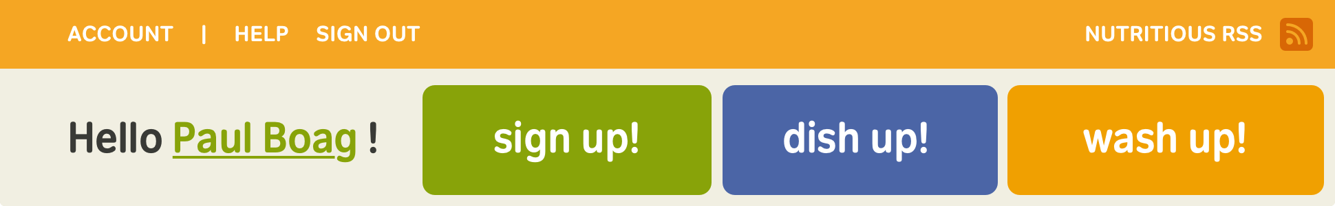
Style the footer
All that’s left is to style the footer. It contains a low-level heading and two paragraphs:
<div id="site_info">
<h5><a href="#cookr-co-uk" title="Top">Cookr!</a></h5>
<p>In beta, not half-baked</p>
<p>© Cookr! All Rights Reserved.</p>
</div>Use absolute positioning to place the heading and move one of the paragraphs out of sight. Establish the footer as a positioning context for its children and add a height which matches its background image:
div#site_info {
position: relative;
width: 100%;
height: 120px;
background: transparent url(site_info.png) no-repeat 0 0; }Replace the text of this heading with an image using the Phark method again:
div#site_info h5 {
position: absolute;
right: 10px;
bottom: 10px;
width: 150px;
height: 70px;
background: transparent url(h5.png) no-repeat; }

div#site_info h5 a {
display: block;
width: 150px;
height: 70px;
text-indent: -9999px; }The semantic framing of the pages in (X)HTML makes it all the way to production in 95% of the projects. The time savings with XHTML wireframes has been about a quarter to a third of the development time saved.
Thomas Vander Wall
The final task in styling this footer is positioning the copyright paragraph. Although the HTML includes two paragraphs, the visual only shows the second. Use adjacent sibling selectors instead of presentational class attribute values:
div#site_info p {
position: absolute;
left: 10px;
top: 10px;
margin: 0; }Preview the result in a browser and you’ll see both paragraphs now occupy the same space, not exactly the result I’m aiming for. Hide the first paragraph by moving it outside the viewport using an adjacent sibling selector and a large negative text indent:
div#site_info h5 + p {
text-indent: -9999px; }
Elements of typographical style
With the major styling work complete, it’s time to focus on typography. Keep these styles in a typography only stylesheet:
body {
font: 72%/1.5 "Trebuchet MS", sans-serif; }

h2, h3, h4, p, ul, blockquote {
margin: 0 20px .75em; }

h2, h3 {
margin-bottom: .15em;
font: 200% "Trebuchet MS", sans-serif;
font-weight: bold;
letter-spacing: -1px; }

li > h4 {
margin-left: 0; }

p {
font-size: 100%; }

h2 + p {
font-size: 110%; }

li > p {
margin-left: 0; }

a:link, a:visited {
text-decoration: none; }Add colours to the text:
body {
color: #333; }

h2, h3 {
color: #88a308; }

div#nav_main p {
font-size: 160%;
color: #88a308; }

div#site_info p {
color: #fff; }

a:link, a:visited {
color: #f90; }

ul#nav_tools a {
color: #fff; }With typography styles added, this HTML prototype is complete.

Transcendance
HTML prototypes make the most from web standards technologies, but they’re about more than just HTML and CSS. If you’re a designer who creates static visuals and also uses HTML and CSS, HTML prototypes allow you to try new ideas. You can quickly understand how your designs will change when implemented as flexible layouts.
They give designers a better way to collaborate with developers, describe content more accurately, and explain the HTML elements which should be used to implement it. HTML prototypes offer developers a foundation for development which no other design deliverable—static visual, wireframe, or paper prototype—can do.