Plenty of times in the past, my layout decisions happened spontaneously, and weren’t backed by logic, and never by mathematics. I had a happy-go-lucky, feel-good, approach to layout. It was only recently that I saw the creative opportunities designing with grids offers. I want to share some of my personal favourite websites and explain how their designers made good use of grid designs.
Subtraction
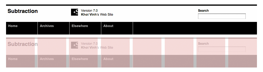
One of the most talked-about grid designs online is Khoi Vinh’s striking black-and-white Subtraction. In addition to its stark imagery and minimalist typography, Khoi used an eight-column grid which underpins every element in his design.
In many designs, the grid takes a back seat. With Subtraction, Khoi’s grid climbs into the front seat and grabs the steering wheel. Every aspect of his design is placed on the grid. This also informs the size of element with almost obsessive precision.
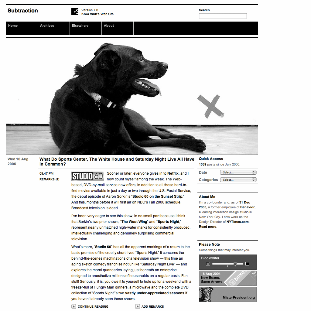
Khoi simplified his eight columns into four wider columns to focus readers’ attention on articles in the main content area. To add movement to what could be a static composition, Khoi allows his titles to break out into another column on the left. This also highlights publication time and the number of reader remarks.
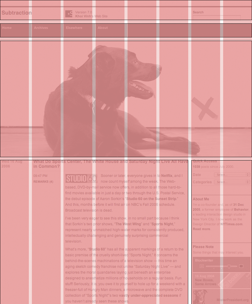
Some designers leave no pixel unclaimed, and Khoi’s complex composition could have felt overwhelming. But, by using whitespace and keeping his left column mostly empty, Khoi allows his content to breathe.
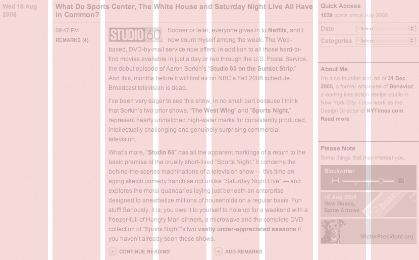
Khoi uses his eight columns in a variety of ways throughout his design. His layouts emphasise the difference between internal content and external links, and he cleverly reinforces the change in context by using large, column-spanning images.
Subtraction succeeds because of Khoi’s deep understanding of grid design. Not only does a grid allow Khoi to present his content in ordered, structured ways, but it also helps him create a distinctive and powerful design.
Airbag Industries
 Compared to Subtraction’s prominent structure, Airbag Industries’s grid is understated. Airship enthusiast Greg Storey developed his design using a four-column symmetrical grid. Two columns combine to form an area for Greg’s articles. His central column—adorned with a Hawaiian beauty and palm trees—breaks the standard three-column convention and the background colour and imagery draws attention to the centre and where someone should start reading.
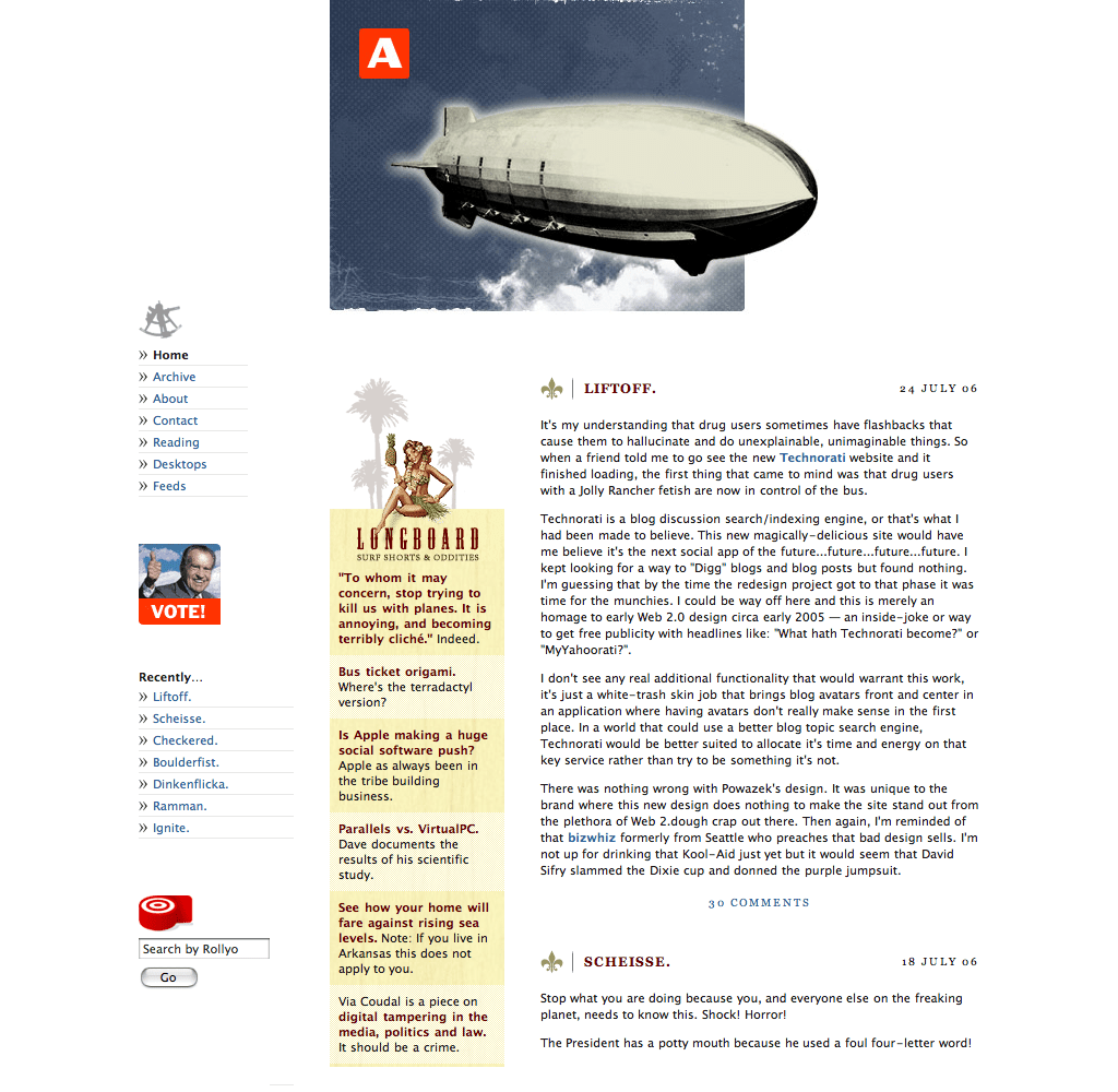
When I initially saw Airbag Industries, it irritated me how Greg’s left column starts 60px above the other two and so the tops of his columns aren’t horizontally aligned. But later, I understood how that left column alignment visually connects the airship image with Greg’s content below.
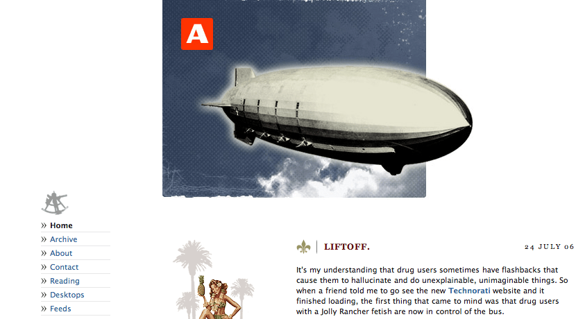

On Greg’s Airbag Industries homepage, I appreciate how he used his grid to determine the width of his distinctive airship picture.
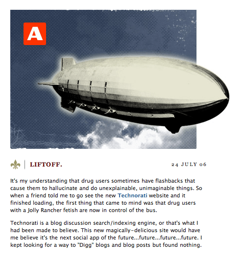
Look closely, and you’ll see the width of the airship picture match two of his columns but also that the airship itself, floating gracefully out of its bounding rectangle, is the width of those two columns.
Greg’s attention to his grid continues at the bottom of every page. Down there, the bear image perfectly matches the width of the centre column. The picture bleeding off the bottom of the window is a smart way to tell people they’ve reached the end of the content. I’m not sure I agree with Greg’s choice of alternative text for his bear image though:
<img src="fin.jpg" alt="Grrrr">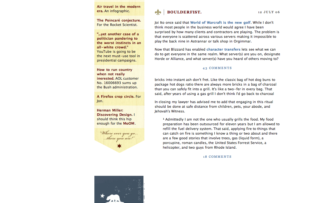
I find the decisions Greg Storey made fascinating, and his clever use of a simple, symmetrical four-column grid intriguing. What makes Airbag Industries especially interesting is how Greg Storey used a single grid in many different ways throughout his design to achieve both consistency and variety at the same time.
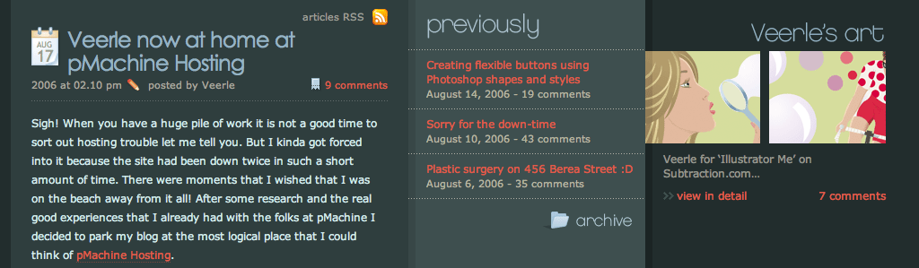
Veerle’s Blog
Whereas Airbag Industries has a light and airy feel, Veerle Pieters’ blog uses a dark grey background to emphasise her bold choice of vibrant colours. Veerle used a four-column symmetrical grid which paradoxically results in an asymmetrical rather than symmetrical layout.
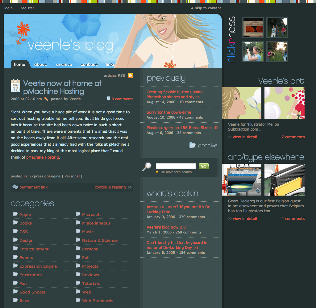
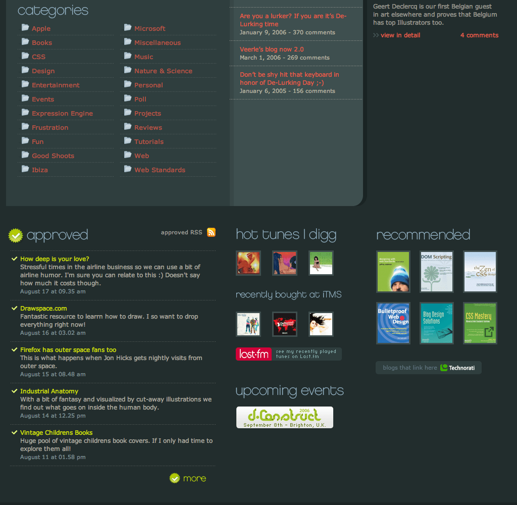
While Veerle’s colourful illustration spans three of her four columns, her articles occupy just two.
When I first saw Veerle’s website, I was confused why she’d chosen a lighter grey background for her links to older articles, because my eye was drawn to them and not her article content. But having become a regular visitor, I now see how this lighter colour helps emphasise the structure of the content on her pages.
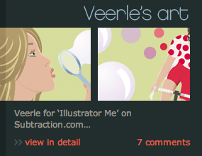
One feature of Veerle’s website I particularly enjoy is how she used a shadow to emphasise the border between the third and fourth columns. Instead of fully separating her layout with these columns, Veerle cleverly used pictures to bridge them. The effect is subtle but effective at drawing the eye across all columns.
Throughout her website design, Veerle plays with her four-column grid, switching effortlessly between content that spans two or sometimes three columns. Veerle’s website is a fabulous example of how to use a grid to add structure without constraining creativity.
Grids outside the web
Grids were used in design long before the web, so we can look at other media for our grid design inspiration. Sometimes, inspiration drops through your letterbox in the form of your daily newspaper.
Whether you live in Baltimore, Bangkok, Beirut, or Bournemouth, newspapers share a common substrate. Text and pictures are printed with millions of tiny ink dots, whether you read a highbrow broadsheet or a tacky supermarket tabloid. As well as lining pet cages the world over, newspapers can be a rich source of inspiration for a grid-hungry designer.
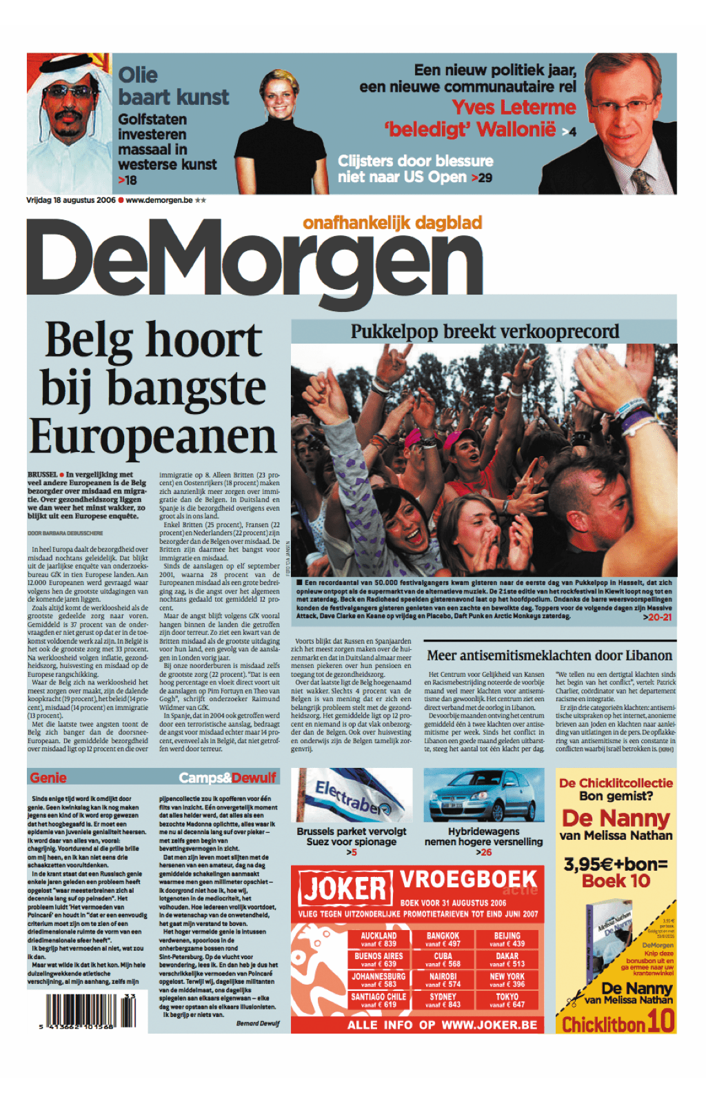
Eight-column broadsheet grid
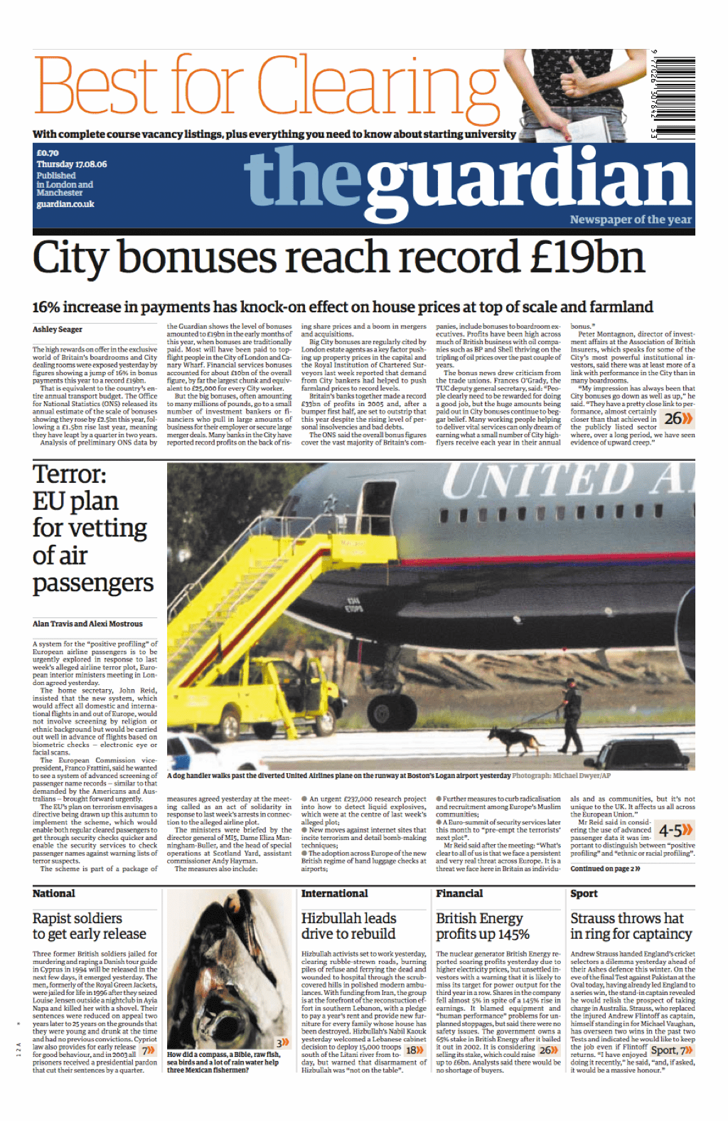
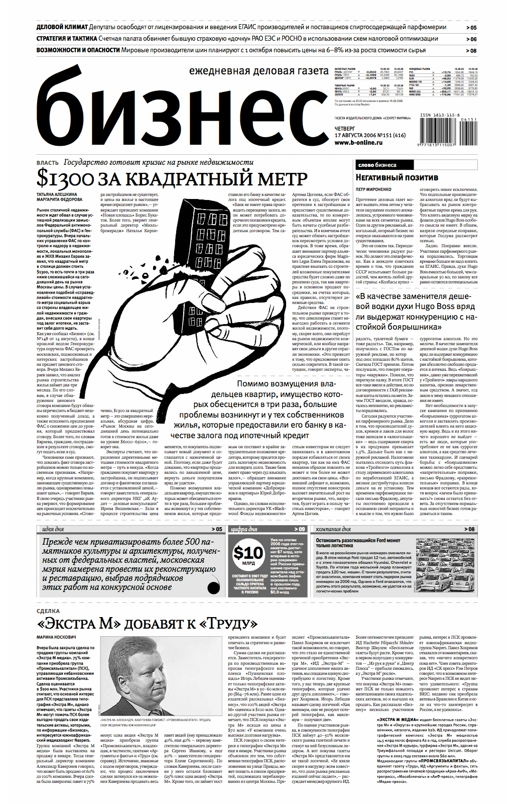
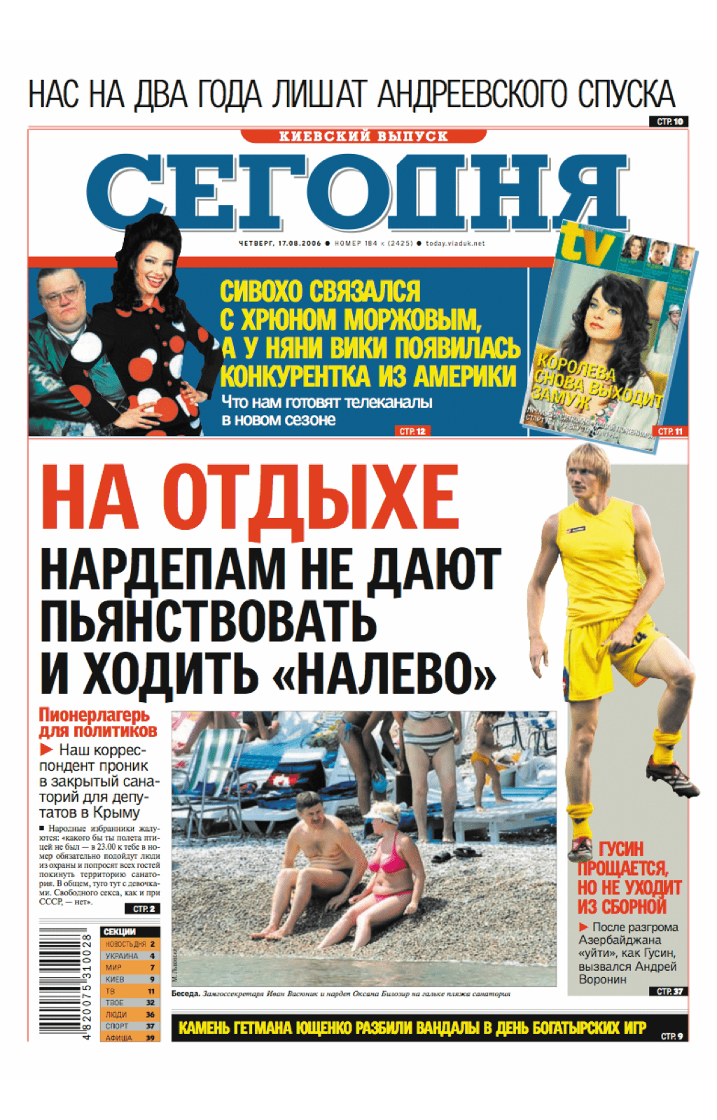
Broadsheet newspapers are often printed on larger sheets of paper than tablets, so can accommodate more columns in their grids. Many broadsheets share an eight-column grid which enables a large amount of content to be presented. This format helps to order content as well as allowing readers to fold their newspapers into quarters; particularly crucial to readers on crowded commuter trains.
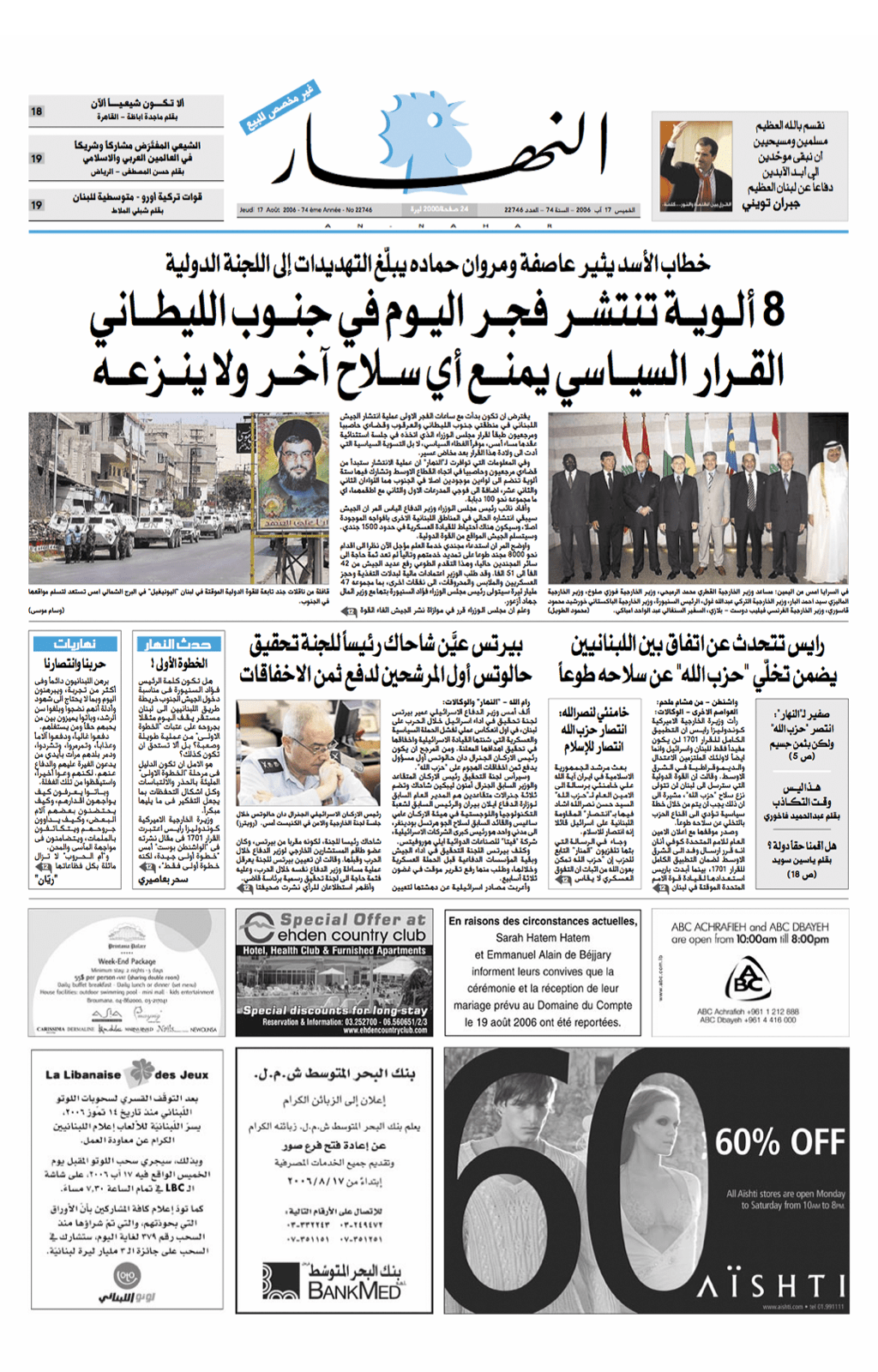
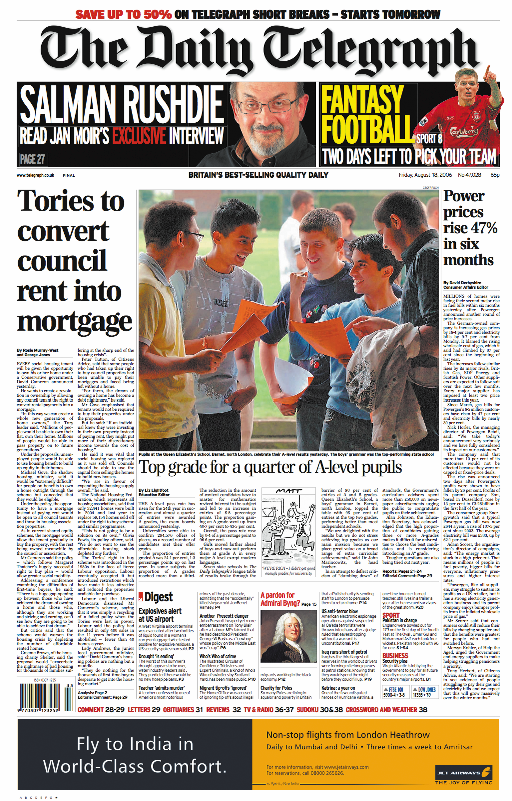
In newspaper design, how many columns a story occupies will be dictated by its importance. To enforce hierarchy and improve readability, a headline always spans all of a story’s columns. Pictures can span columns in the same way, as can the masthead, nameplate, and even advertising. This technique can easily be adapted for the web although, needing to present content in eight narrow columns is unlikely. This next design uses an eight-column grid:

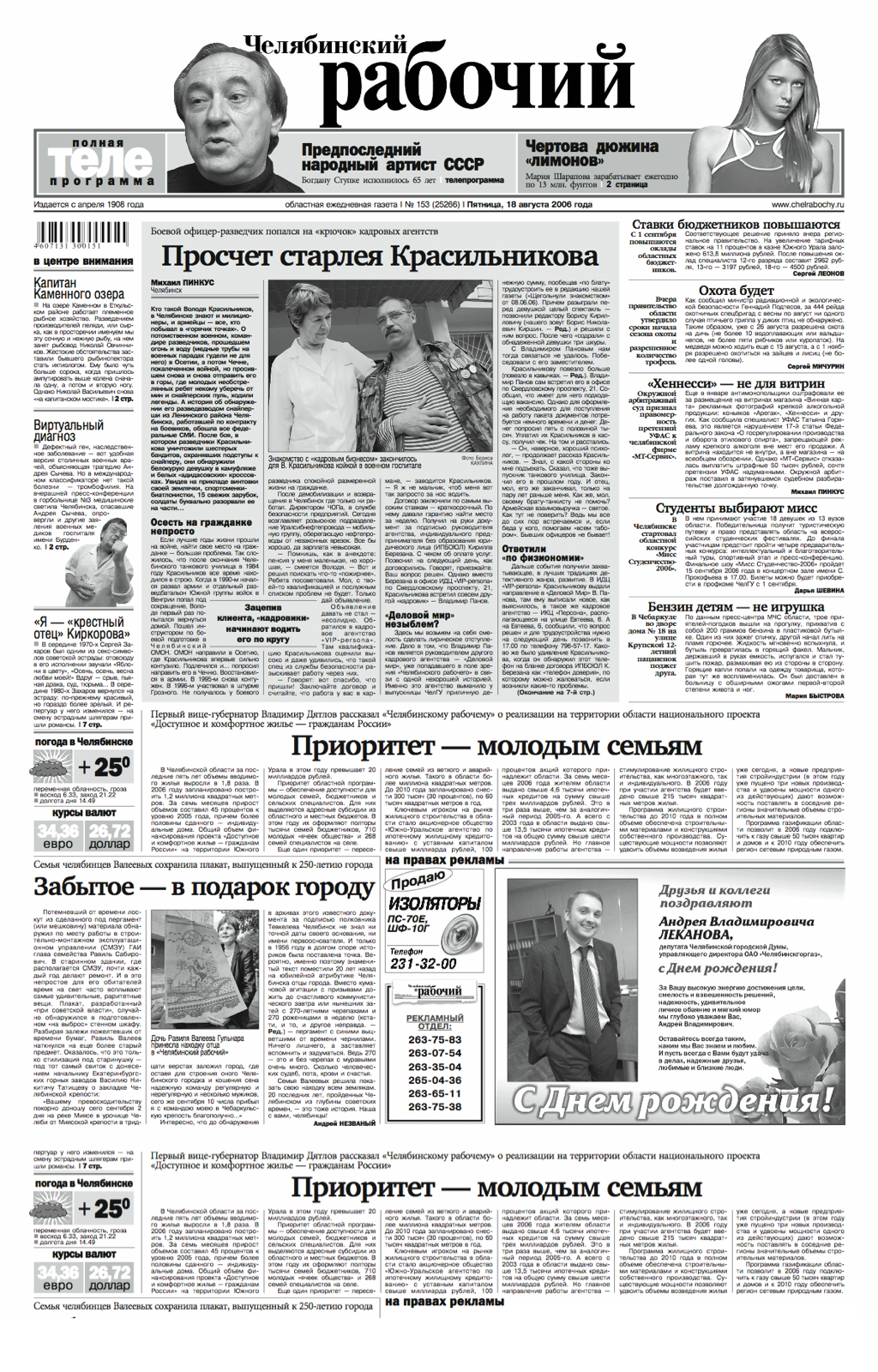
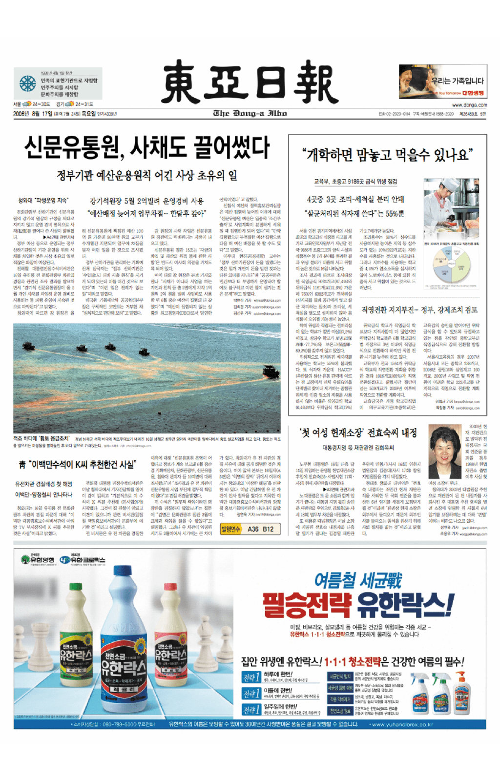
Six-column tabloid grid
Sales and the number of broadsheet newspapers declined as the tabloid format gained popularity. Whereas broadsheets commonly use an eight-column grid, tabloids often opt for a simpler six-column grid. Even though tabloids use fewer columns, that doesn’t mean the number of creative options is lower too as a study of newspaper designs from around the world quickly proves. Across Africa, America, Asia, Australia, and Europe, millions of people consume news from papers designed using six columns.
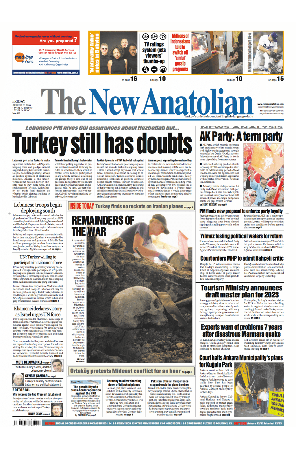
Sometimes, six-columns are supplemented by a seventh, wider column on either the left or right. This column often contains summaries of items from inside the newspaper, not unlike a website’s sidebar. This next design uses a six-column grid:
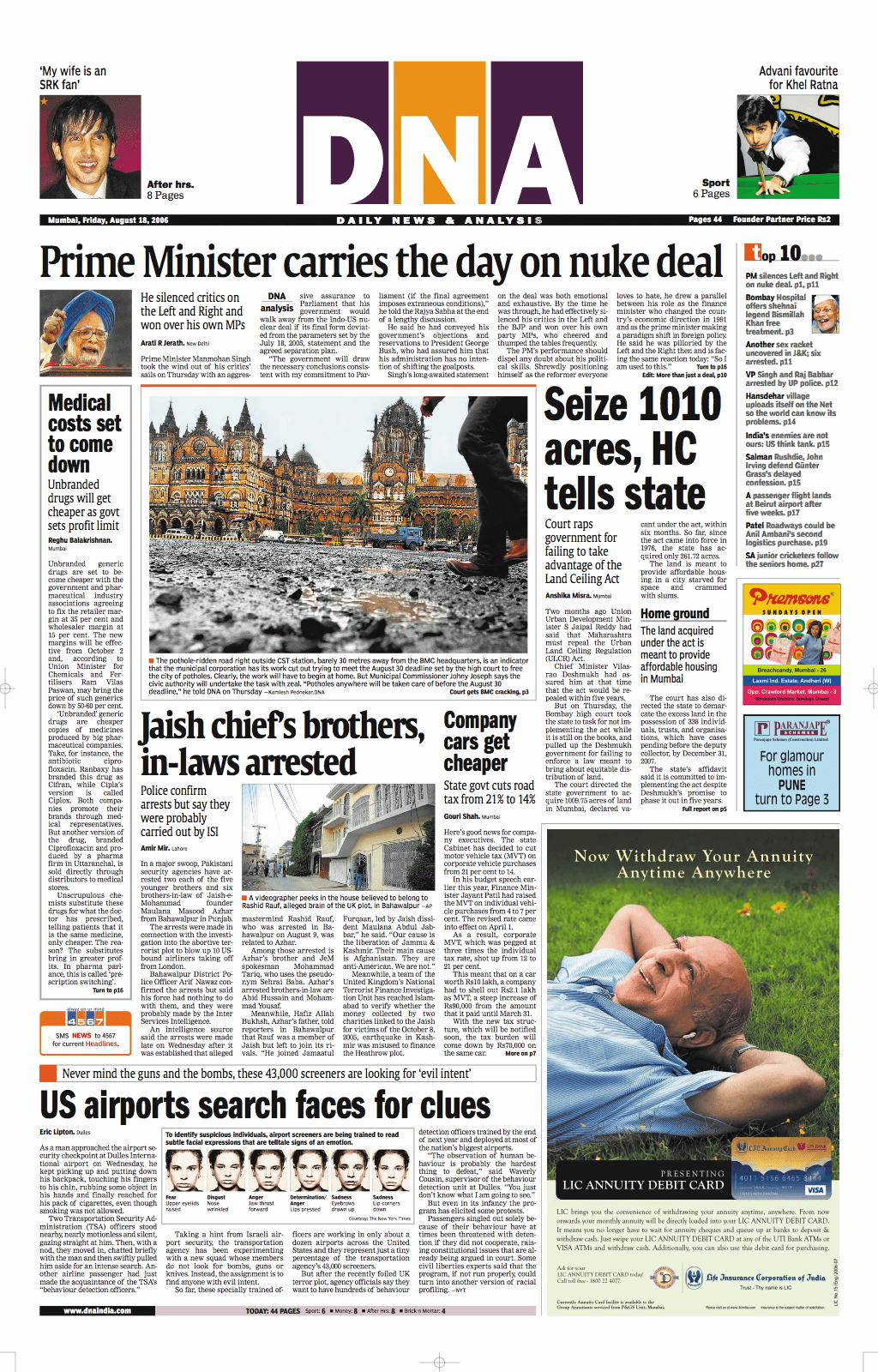
Alternative newspaper designs
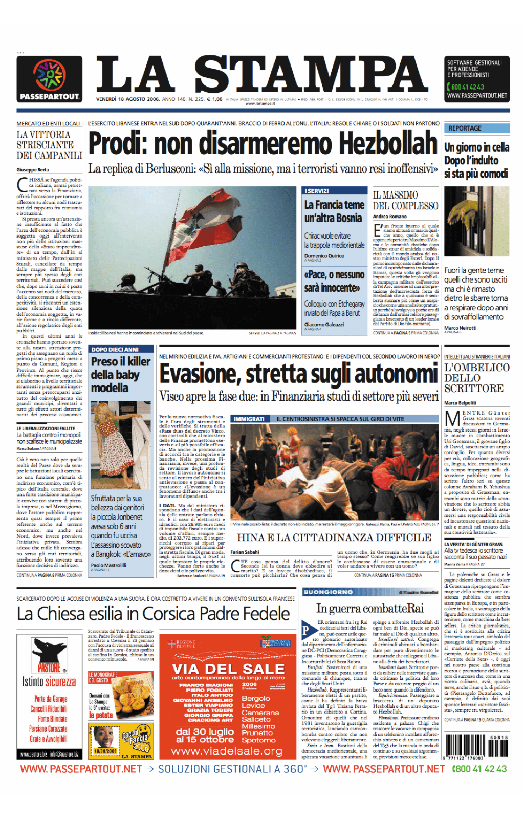
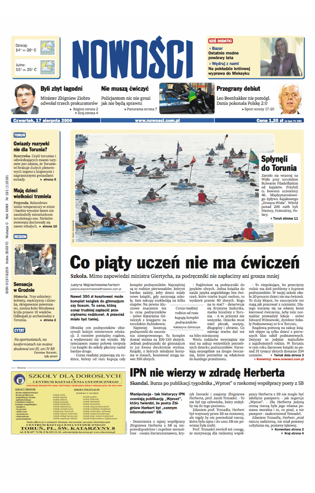
Neither six or eight columns will suit every publication, culture, or language. Sometimes an odd number of columns—five or seven— suits a newspaper’s audience and content better.
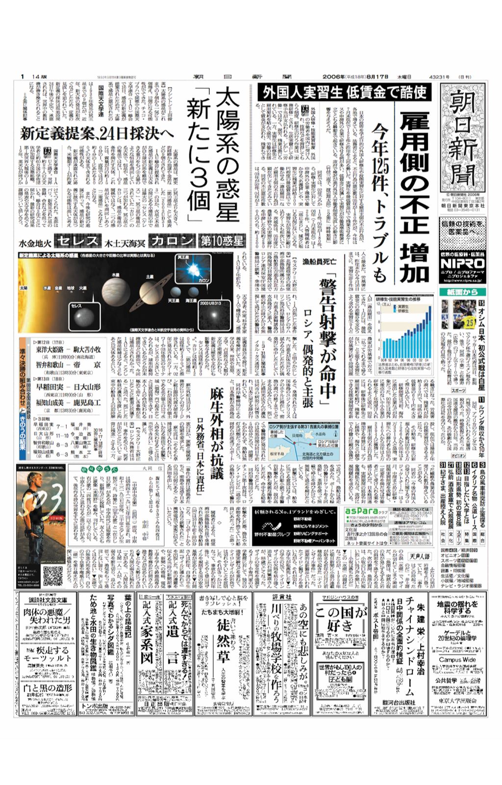
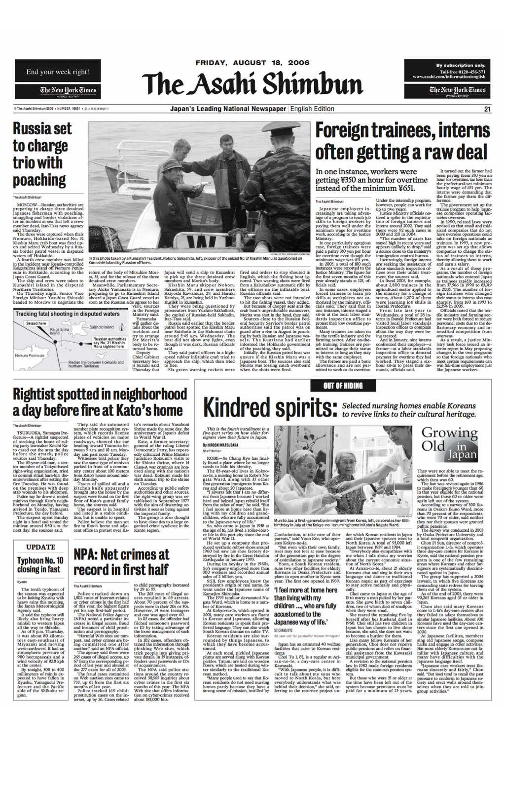
The way some newspapers use a grid may not be familiar to a Western audience. The seemingly chaotic layout of Japan’s Asahi Shimbun—with its Japanese characters and vertical text— may look strange to Western eyes.
Note: Newseum is devoted to reproducing newspaper front pages from around the world every day. It publishes more than 500 pages from almost 50 countries.
After a journey around the world of newspapers, it’s time to bring grids closer to home with the homepage of Newsvine, a popular news site.
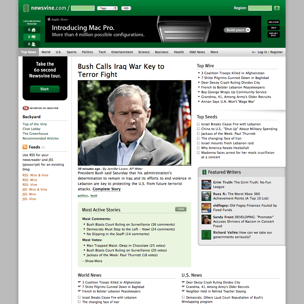
A new grid for Newsvine
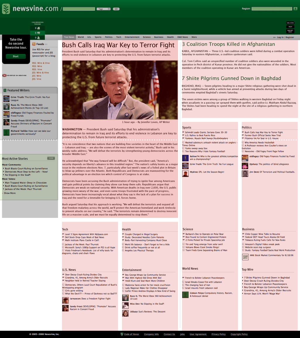
Launched in 2005, Newsvine has become a popular news website with more than 400,000 unique visitors per day reading and commenting on its news. Newsvine topics include politics, sports, and technology. Its sources include mainstream news agencies such as Associated Press, and its own member-contributed stories. Newsvine’s 932px fixed-width, centred layout succeeds in presenting large amounts of content. However, its grid use is imprecise.
I wanted to re-imagine Newsvine with a more precise grid. During this experiment, I:
- Create columns, gutters, and margins
- Add sub-grids to design details
- Make pictures flexible
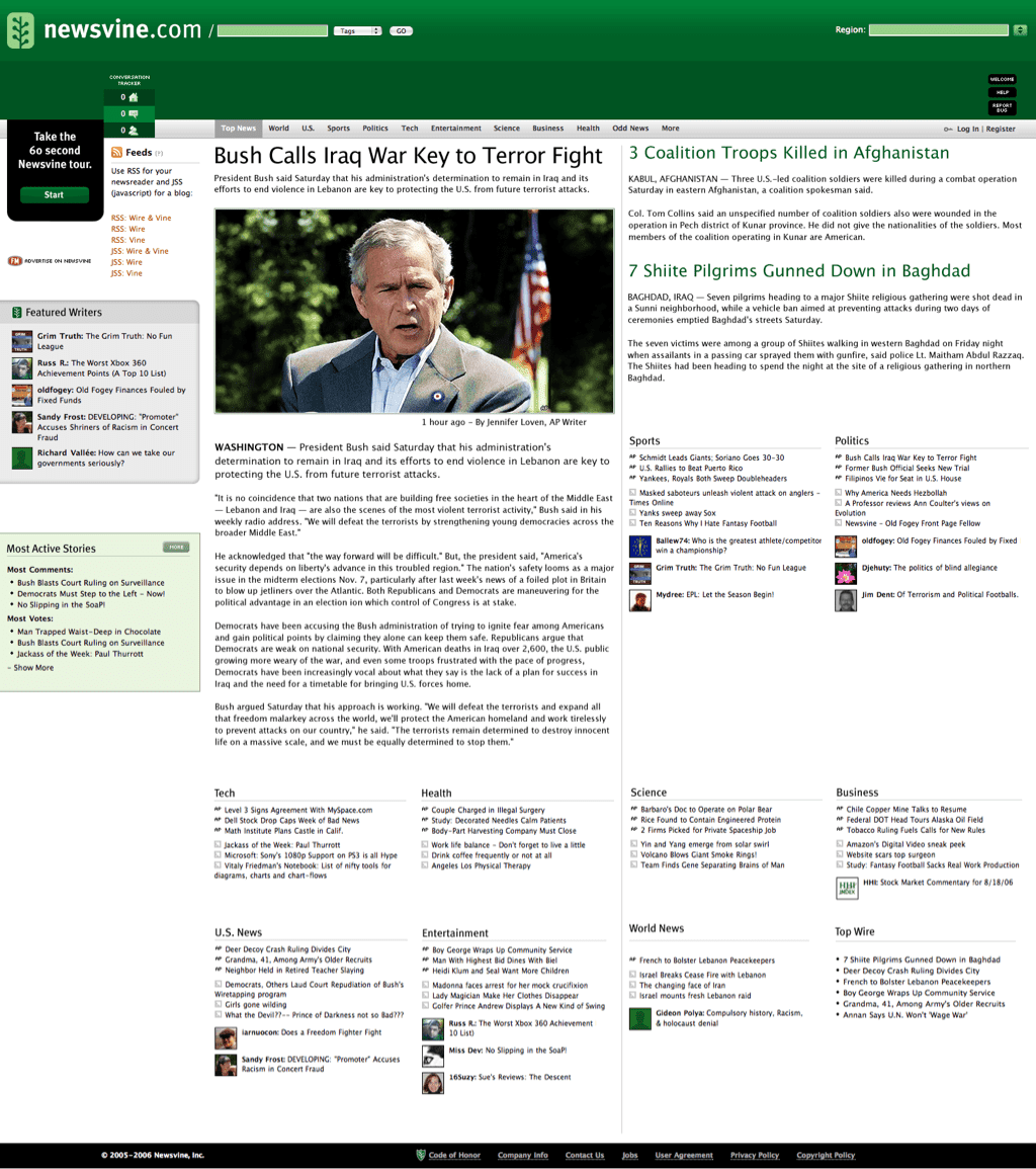
There are two major differences between my re-imagining of Newsvine and their current website:
- Contemporary five-column grid often seen in tabloid newspapers.
- Overall flexible width replaces current fixed-width layout.
Each of the five columns is wide enough to accommodate a variety of content. This includes the article titles in news categories and several boxes in the sidebar which occupies the first column.
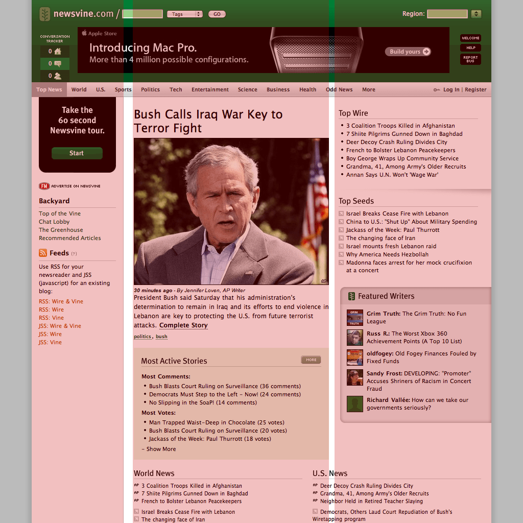
I want the readers’ focus to the most recent or most important article, so I combine two columns to create space for that article’s photograph—of George W. Bush—and its running text. The next level of stories also occupy two columns on the right of the layout, but to reinforce the story hierarchy, their headlines are set smaller than in the main article. This coloured overlay shows the column structure more clearly.
Good grid design is as much about arranging content horizontally as it is creating columns; it is about the horizontal as well as the vertical. Whereas in print, horizontal flowlines can be accurately placed, the fluid nature of the web makes it difficult to control horizontal alignment. Judging the precise position of an online “fold” is almost impossible. The height of the viewport—the area of a web browser through which you view a page—varies with the screen resolution window size and the number of browser toolbars. If specific content must appear above the fold, test your design in as many browsing environments as possible.
Now the content areas are ready, I import the content. Designing with accurate content is essential, I’ve used real content from Newsvine. I can further divide each grid module, using the same proportions or even the divine proportion. This develops sub-grids which I use to precisely position even the smallest elements.
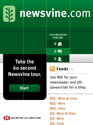
Zoom into the branding area to see a sub-grid helped to neatly arrange tools underneath the logo. To achieve this precision, I divided the area into four equal-width columns. This sub-grid ensures the conversation tracker and Take the 60 Second Newsvine Tour panel are accurately positioned. But this sub-grid also informs the width of those elements as well as their position. Did you notice I increased the logo size to match the width of its parent grid module?
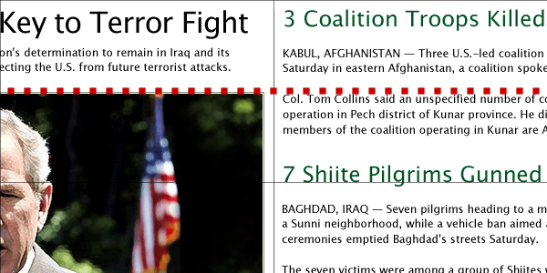
Look back into the design to see how the baseline grid helps with the horizontal alignment of elements. For example, the paragraph of text to the right is aligned with the top of the main image. Although horizontal alignment can be challenging to maintain when pictures and text sizes vary, good horizontal, as well as vertical alignment should always be something to strive for.
If you’ve been paying close attention, you should have noticed that in my redesign, the main story’s photograph is wider than in the current website. Like Newsvine, many sites were developed using fixed-widths. In flexible layouts, fixed-sized images often cause headaches because they retain their fixed size regardless of the flexible layout around them. Unlike vector graphics, bitmap images rarely scale successfully even when resized using percentage or em units. To develop a wide image at wider window sizes and a narrow image at narrower width, I find this technique useful. I place this image in the background of a division with a flexible width:
.img-main {
width: 100%;
height: 300px; }
Create an image which is wider than it will probably be needed. It’s essential to ensure that its main focus remains in the centre. You can attach this image as a background image using CSS; it should be positioned centrally (note that if the browser window is enlarged, such as it is in, more of the background image is revealed):
.img-main {
background-image: url(ihatetimvandamme.jpg);
background-repeat: no-repeat;
background-position: center; }


When a browser is resized, more of this background image will be revealed. For websites where images are populated from a CMS, adding a background image from an external stylesheet may not be an option. However, this technique is still possible via a combination of external and inline styles:
<div class="img-main" style="background: url(ihatetimvandamme.jpg) no-repeat center;">.img-main {
width: 100%;
height: 300px; }With all the pieces in place, the press gathered in the briefing room, and fingers poised over camera shutters, my re-imagining of Newsvine can be revealed. I hope this exercise had demonstrated how thoughtful use of a grid can improve even an already impressive website.
In the next chapter, I’ll tell you how to get into the mood for making more creative designs for the web, beginning by encouraging you to look outside the web for inspiration.