A grid is a combination of vertical columns, horizontal fields, and white space gutters and margins. Some designers think grids limit their creative options, that columns and rows will stifle their ability to break out of the box, but the opposite is true. Designing with grids leads to more creative opportunities and ways to improve your designs.
Like with many designers who work on the web, I didn’t learn about the importance of grids at art school but after I started working professionally. Most of the information I found about grids had little relevance to current web design. Some of it focussed on mathematics and the famous Fibonacci sequence. As someone who finds it difficult to remember their credit card PIN numbers, maths was never my strong point. But, I quickly realised the creative potential of using grids and started looking for interesting grids in unusual places.
Grids help designers organise branding, content, and navigation into spaces, and maintain consistency over multiple pages. Consistency helps people navigate individual pages and entire websites more easily, one of the main goals of good usability.
Note: In The Book of Calculating in 1202, Fibonacci’s number progression involved adding two numbers to arrive at the next in the sequence: 1, 2 (1+1), 3 (2+1), 5 (3+2), 8 (5+3), and so on. That’s always a handy thing to remember.
When you start looking for grids, you won’t have to go far. Open your morning newspaper or a favourite magazine, and you’ll find a diverse range of grids. When you drive around your local area, grids will appear in the design of buildings and even the layout of the roads you’re driving on.
Designing grids is an important skill every designer should learn. Understanding composition and proportion is the foundation for designs which feel comfortable and natural.
At some level, every designer is trying to bring order to the world; it’s the secret reason we all practice this craft for a living. And there’s no better tool for achieving order in design than the grid.
Khoi Vinh
Sometimes, a grid isn’t apparent and merely influences someone to follow a particular path. Other times, the presence of a grid can be noticeable and will define the design. Whether you place a grid centre stage or allow it to fade into the background will depend on the goals of your design.
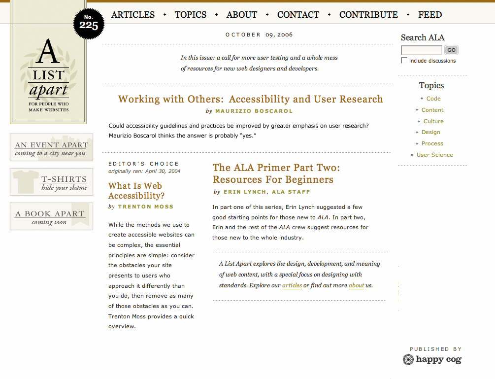
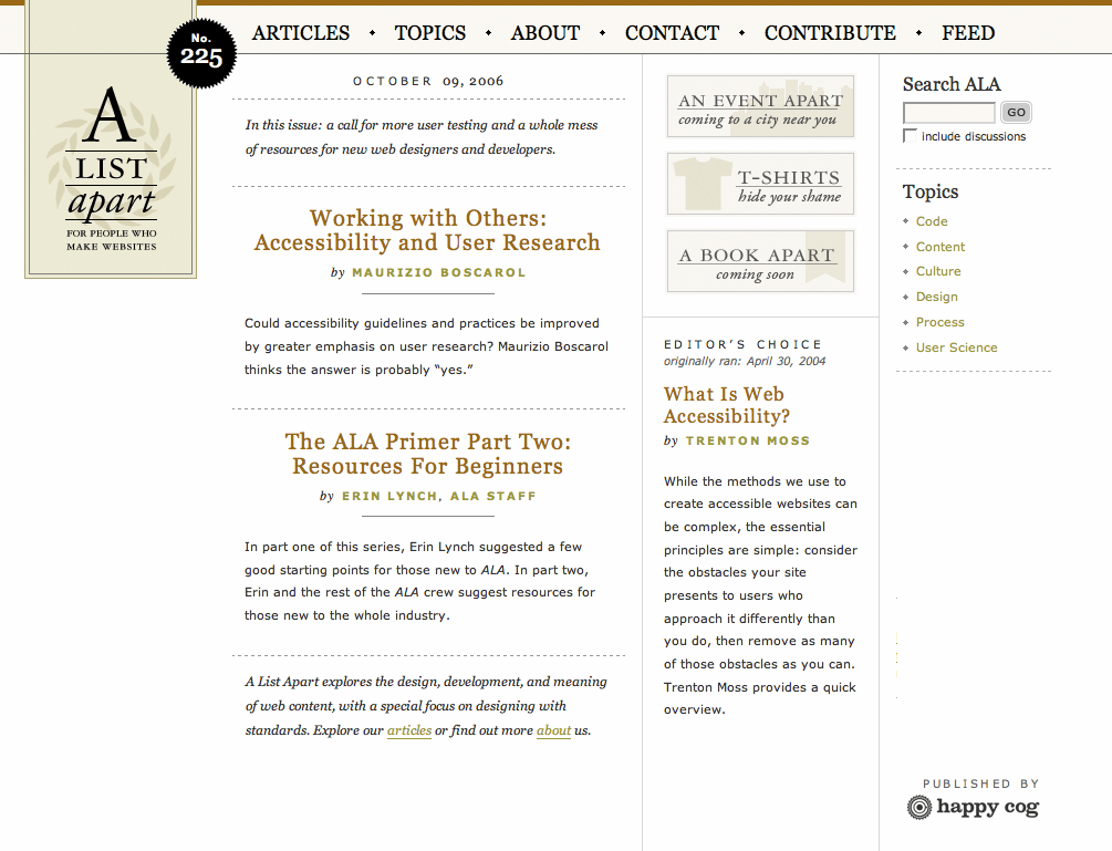
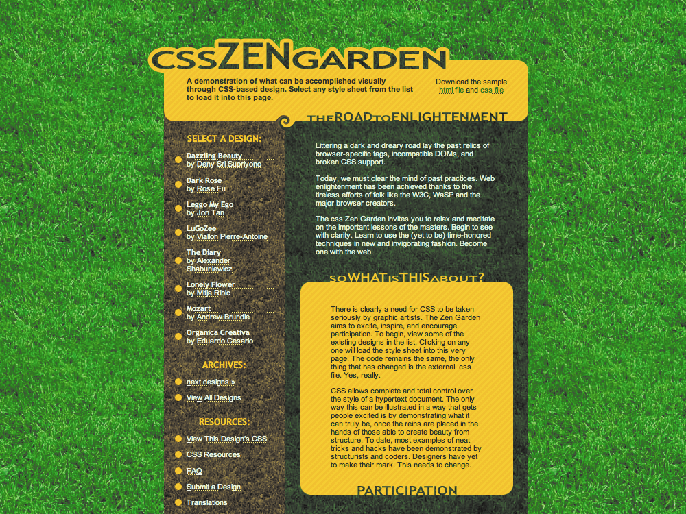
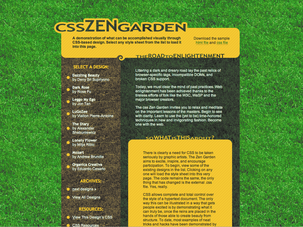
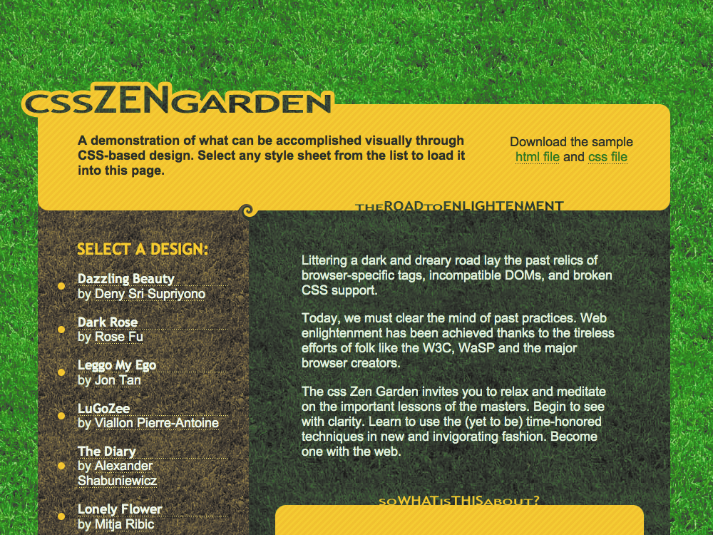
Look at this example from A List Apart. On the left, the lack of structure makes the page seem cluttered and chaotic. On the right, a grid helps the reader to understand the structure of the content more easily.
A List (Taken) Apart
As displays get larger and resolutions get higher, many designers are tempted to make designs which fit inside the now standard 1024x800 pixel resolution. When A List Apart launched a new design in 2005, much of the discussion around its design centred on their decision to use a fixed-width, 1024-pixel layout.
After the design was launched, I interviewed designer Jason Santa Maria and asked him about his decision to not support widths smaller than 1024px. Jason explained:
ALA (A List Apart) has always tried to be one of those sites at the front of the pack. We don’t support 800x600 anymore, nor do we 640x480. Do you? People flipped when sites stopped supporting 640x480, now no one says a word. Things change. Trust me, you are going to see more sites stretching out their legs and putting their feet up.
Jason Santa Maria
Although a desire to design for the highest resolutions is understandable, it’s important to remember that resolution doesn’t always equal the width of someone’s browser. People running the Windows operating system often keep windows maximised but many will run those browsers with sidebars containing bookmarks and browsing history. Those sidebars reduce the amount of horizontal screen space available, even on high resolution screens.
Mac users rarely extend their browsers to the full width, so even if you consider the widescreen format of many Apple displays, you can never trust a browser window will be as wide as the screen. Designer John Oxton explained:
I will continue to allow the 800x600 platform full access to my sites because until a month ago I had a screen that could only cope with a maximum of 1024x768 and with my browser sidebar open, sites that allow access for 800x600 worked nicely.
John Oxton 800 by 600 (Wayback Machine URL)
There’s no doubt the topic of screen resolution and browser width will be hot for a long time to come. Whether designers should develop fixed-width, liquid, or elastic layouts will be debated for a long time too.
The divine proportion
Many grid design theories have a basis in the natural world and even on our own bodies. Take a look at your arms and note the distance between the tips of your fingers and your wrist. Compare it to the distance between your fingertips and your elbow.
Unless your genes include more gorilla DNA than you’d like your friends to know about, I’m guessing the distance between your fingertips and wrist is a third of the length to your elbow. It’s this divine proportion which has found its way into the thinking of artists and designers throughout history.
The divine proportion is a visual representation of the number Phi (pronounced “fi”), or the number 1.618033988749895. Don’t worry, there’s no need to dig out a scientific calculator.
This proportion has been used throughout the history of architecture, art, and design. What does a number like that mean for design? Why is a centuries-old composition method relevant to a modern medium like the web? Whether your designs are fixed-width or flexible, using divine proportions will help improve their balance.
In print, the canvas size is fixed by the media—newspaper, magazine, or even a poster—but a website canvas isn’t set. It’s determined by the variable height and width of a browser window. Put the theory into practice by creating harmonious layouts for both fixed-width and flexible designs using the divine proportion.
Fixed-width design
I’ll design a fixed-width layout which fits inside an 800px browser window. It’s become common practice to reserve 30px for scroll bars, meaning a working width of 770px.
Fire up a calculator, and divide 770 by 1.62. Unless you need new batteries, you should arrive at 475px, a useful width for the main content and a comfortable length for reading the text. Now subtract that 475px from the total width. This equals 295px, which is ample room for supplementary material and even a good-sized search input.
Designers often start with an arbitrary width which they stick to regardless of content, but you can work the divine proportion in the opposite direction instead. When a design includes a large image—perhaps one carried over from an advertising campaign—using the divine proportion, calculate the correct overall width from the dimensions of the picture.
For example, the width of the image in this sidebar is 400px. Multiply 400 by 1.62 to arrive at an overall width of 648px. This is narrower than standard layouts but can be used to create exciting effects. Divide that 648 using the same proportions to create sub-grids which balance the smallest elements on a design.
Class rule
There are several tools available to help place elements accurately on a grid. Download a handy ruler image courtesy of Greg Storey. Andy Budd’s Layout Grid Bookmarklet is available for you to bookmark. Chris Pederick’s Web Developer extension for Firefox contains a handy ruler which can be dragged over a browser window, plus guides which ensure elements line up as intended. To add measuring tools to any browser add a use transparent PNG image of a grid to the page or any element in it. These tools can prove extremely useful when placing elements onto a grid.
Visual tools including Macromedia Dreamweaver have tracing images features, and Khoi Vinh has reinvented this grid imposition method.
Elastic design
In newspaper design, column count and proportions aren’t chosen arbitrarily but are based on the width of the number of characters in a horizontal line. This is called the measure. Broadsheet newspapers use a larger format so they can use more columns and yet keep the measure to a width which makes reading comfortable.
Line length and readability are just as important on the web as they are on paper. Designs developed with em units will adapt when someone alters the text size in their browser. This keeps the measure at an optimal width for easy reading. This elastic technique can prove extremely effective. It’s been put to use on designs in the CSS Zen Garden as well as the Mozilla website.
For his Elastic Lawn design for the CSS Zen Garden, Patrick Griffiths chose a width of 48em. To use Phi to find the divine proportions for this design, divide 48 by 1.62:
| Overall content | Main content | Sidebar | 48em | 29em | 19em |
|---|
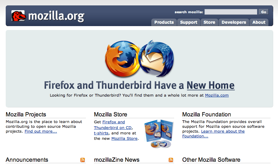
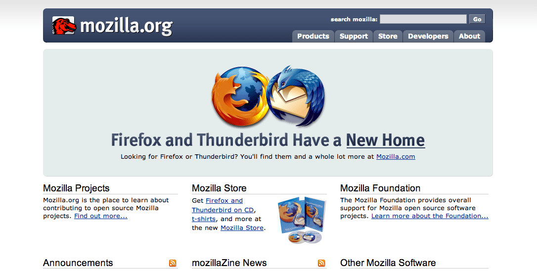
The Mozilla homepage shows elastic design in action. Using em units allows content areas to adapt when someone changes their text size. To ensure lines never stretch beyond comfortable widths, Mozilla limit the overall maximum width to 70em:
body {
min-width: 610px;
margin: 20px; }

#container {
max-width: 70em;
margin: 0 auto; }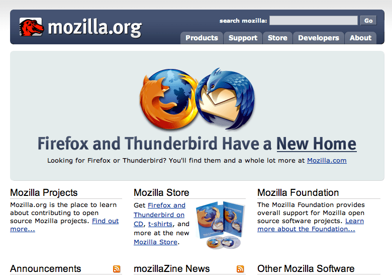
Using the Mozilla width as a starting point, divide its 70em by 1.62 to arrive at the divine proportions for an elastic content area and sidebar:
| Overall content | Main content | Sidebar | 70em | 43em | 27em |
|---|
Grid systems have historically been based on fixed sizes, but web designers must deal with a variety of platforms, window sizes, and browsing environments. It’s this user control over the browsing environment which makes the web so different from other media. Changes to text size, screen sizes, or browser windows can have an enormous impact on a design. The challenge is for web designers is to create designs which are flexible to adapt to changing environments.
A well-designed grid can help with this challenge. A grid using percentages can develop the most flexible layouts. A fluid grid will adapt to someone’s chosen text size, regardless of browser size or screen resolution.
The measure
Reading on a screen is more tiring than it is on paper. If you want readers to enjoy reading on your website, you must ensure content can be read comfortably. The Web Style Guide: Basic Design Principles for Creating Web Sites says:
Research shows that reading slows and retention rates fall as line length begins to exceed the ideal width, because the reader then needs to use the muscles of the eye and neck to track from the end of one line to the beginning of the next line. If the eye must traverse great distances on the page, the reader is easily lost and must hunt for the beginning of the next line.
Patrick J. Lynch and Sarah Horton
Using max-width is one way to make content more readable. To ensure reading text stays comfortable, limit the overall width of your content. Mozilla, for example, limits their content to 70em:
body {
width : 100%;
max-width: 70em;
Rational grids
All the grids I’ve explained so far have been based on the divine proportion and are known as asymmetric grids. Symmetrical grids are just as useful but are found less often online. Symmetrical grids are divided into several equal width columns—six, eight, or sometimes even more—in what are known as a rational ratio. For more layout options, create super-columns where content spans two or more columns.
Designing a grid is one of my favourite jobs. I then enjoy shaping content into a design where proportions are defined by the grid. Placing these elements on the grid, and allowing them to sometimes overlap, often gives me ideas for exciting new designs.