Eleventy in a Box
A premium Eleventy starter kit for designers and developers who want to spend less time setting up the same project structure and more time designing websites.
Lockrose wanted to reach new markets without losing the credibility they’d built in the energy sector. Here’s how I designed a website that helped them tell a bigger story.
Every business has stories to tell. That might sound obvious when designing a website for a restaurant, a retailer, or a charity. Their stories are often easy to spot. But technical businesses tend to believe that their credentials, facts, and service lists are enough. Trust me. They’re not. The most successful websites don’t just explain what a business does. They explain why that matters. That was certainly true of Lockrose.
Lockrose are project management consultants with years of experience delivering major infrastructure projects across the energy sector. Their reputation wasn’t in question. Their clients already trusted them. The challenge was perception.
They wanted to expand into transport, utilities, and the public sector, but their website positioned them almost exclusively as energy specialists. Anyone outside that world could easily assume their expertise stopped there. Their website wasn’t telling the whole story.
If you want to know how that translated into the finished design, look at my Lockrose portfolio page, where I walk through the complete project from discovery to delivery.
Before I started designing, I spent time understanding how Lockrose had grown. The more conversations we had, the clearer it became that their greatest strength wasn’t a particular sector. It was their ability to deliver complicated projects with confidence. Energy just happened to be where they’d built their reputation.
Once I’d understood that, the direction of the website became obvious. Instead of trying to make Lockrose look like a completely different company, the website needed to demonstrate that the qualities which made them successful in one sector naturally transferred into others. That’s a very different story.
Like many projects, my first ideas weren’t the ones we eventually built. I explored combining photography with bold graphic elements, but the team weren’t convinced.
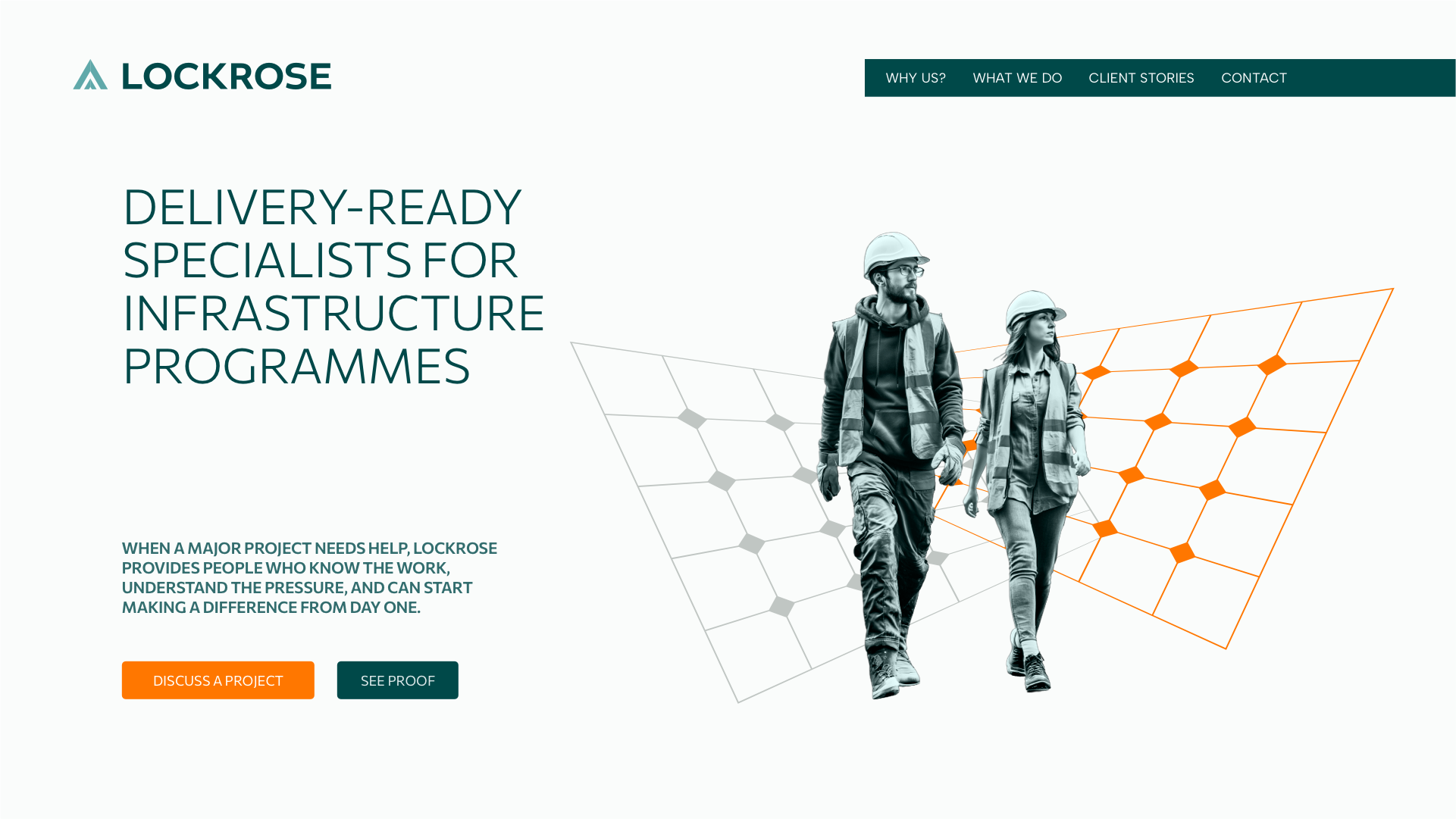
More importantly, they didn’t want the website to rely on photographs of people at all. So I went back to the drawing board. Literally.
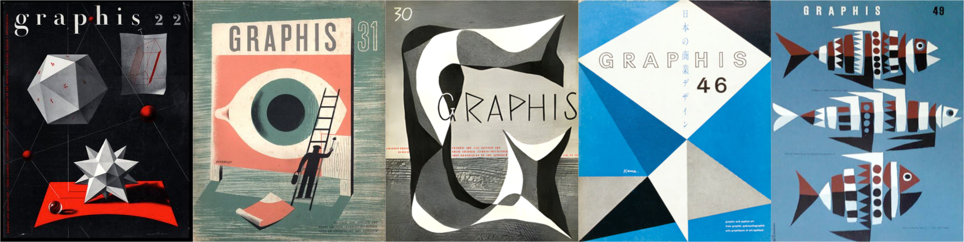
While looking for inspiration, I pulled a few vintage issues of Graphis from my bookshelf. Their simplified geometric illustrations immediately felt right. Flat colours. Strong shapes. Clear compositions. They had personality without feeling decorative. That became the foundation of the project’s visual language.
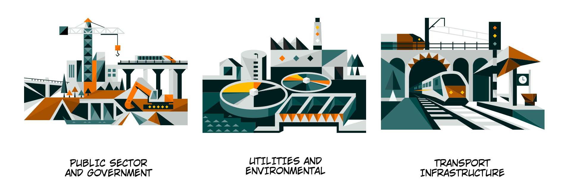
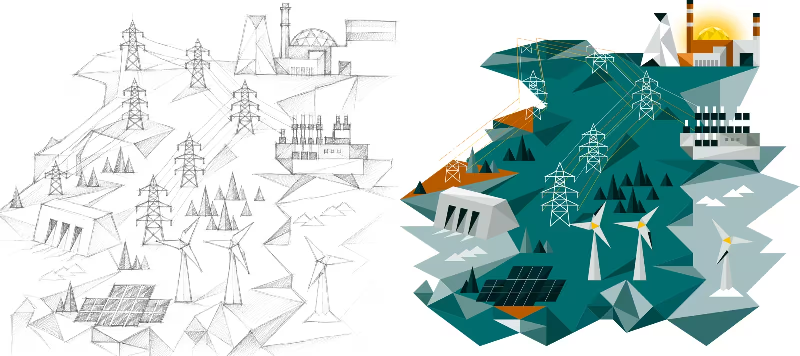
Every illustration began life as a loose pencil sketch. I explored different ways of representing the industries Lockrose work in before reducing them into simple geometric forms built around intersecting triangles. The triangle wasn’t an arbitrary shape either—it echoed the company’s own identity and gave every illustration a consistent underlying structure.
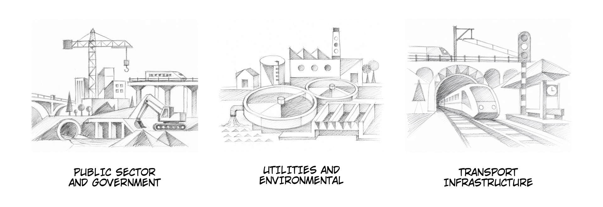
Once I was happy with the sketches, I developed them into vector illustrations, refined the colour palette, and eventually animated several of them using SVG and CSS.
The homepage illustration combined hydro, solar, wind, and nuclear power into a single scene.
Elsewhere, a sequence of illustrations showed Lockrose’s delivery process gradually evolving from loose sketch to finished artwork.
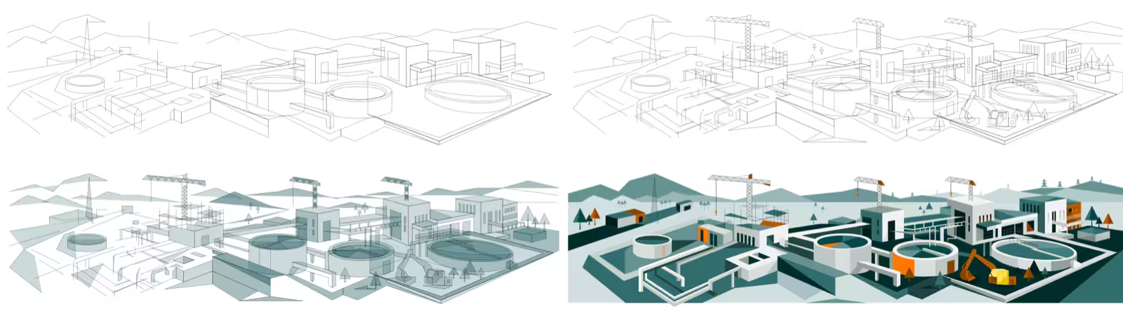
Looking back, that’s probably my favourite part of the project. The illustrations don’t simply decorate the website—they reinforce its central idea that successful projects develop through clearly defined stages.
One unexpected benefit of developing the website using my Eleventy in a Box starter kit was that most of the technical work was finished surprisingly quickly. Instead of spending days building templates and infrastructure, I could invest more of the project’s budget in content, illustrations, and refining the visual language.
That’s always a trade I’d rather make as clients rarely remember which static site generator I used. They remember whether the website communicates their business well.
This project reinforced something I’ve believed for years. Technical businesses often think they’re difficult to communicate because their work is complicated. Usually, the opposite is true. The expertise is already there. The experience is already there. The story is already there. Someone simply needs to uncover it.
That’s why I enjoy projects like Lockrose so much. They remind me that good design isn’t about making businesses look different. It’s about helping people understand what already makes them different.
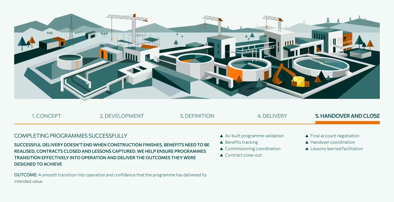
If you’d like to see how those ideas translated into the finished website—including the illustrations, animations, and final design—you can explore the final Lockrose website design.

I’m Andy Clarke. I’ve spent over thirty years helping clients create memorable websites. I’m also the author of five books on web design.
Planning a new website? I’d love to help you create something memorable.
A premium Eleventy starter kit for designers and developers who want to spend less time setting up the same project structure and more time designing websites.
Contract Killer is plain and simple and there’s no legal jargon. It’s customisable to suit your business and has been used on countless web projects since 2008.
Free compound grid and modular grid layout generators, plus a set of HTML/CSS layout templates you can call on to make more interesting layouts, available to buy.